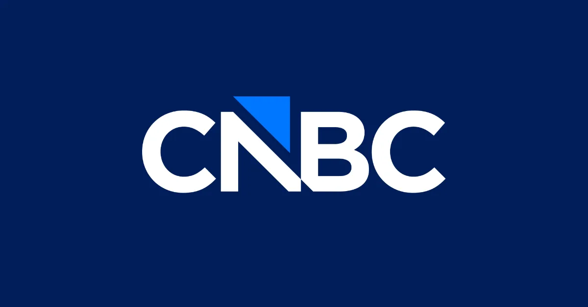
The new CNBC logo is already controversial

Sign up to Creative Bloq's daily newsletter, which brings you the latest news and inspiration from the worlds of art, design and technology.
You are now subscribed
Your newsletter sign-up was successful
Want to add more newsletters?
The ditched Cracker Barrel rebrand will surely be remembered as 2025's most controversial logo design, but the US financial news network CNBC is making a late bid for the title. The classic peacock design that's also used in the NBC logo will be replaced with a more minimalist wordmark.
The new logo was inspired by the brand's history while also including an arrow motif intended to point up and forward. But a lot of people think this logo's heading in the opposite direction (see our pick of the best logos for designs that work).
A photo posted by on
The fate of the CNBC peacock logo is the tale of a death foretold. The network can no longer use the iconic bird because its current owner, NBCUniversal, is spinning this and a bunch of other assets off into a new company called Versant, which will be owned by Comcast shareholders (you're keeping up, right?).
Article continues belowThe manoeuvre already claimed one branding and graphic design victim earlier in the year when MSNBC was rebranded as MS NOW, supposedly standing for My Source News Opinion World.
In CNBC's case, it gets to keep its name, but it will have a new logo from 15 December. K.C. Sullivan, the network's president, has described the design as “a symbol of the direction where we’re headed and the exciting new chapter we’re headed into.”
The fused N and B in the centre are intended to hark back to the original CNBC logo from 1989, when the network was launched as a joint venture between NBC – part of General Electric at the time – and Cablevision (you are keeping up, right?).
The blue upward arrow between the fused letters is intended to reflect the 'square motion theory' of the network’s on-air design language, which uses the arrow as a repeating symbol. The arrow's also there to reflect the brand's expertise in financial news, representing stock prices climbing.
Sign up to Creative Bloq's daily newsletter, which brings you the latest news and inspiration from the worlds of art, design and technology.
That's the idea. But viewers, including designers, have other interpretations.
“Looks like a sinking ship with a blue sail, and the little cleft between the N and B provides extra emphasis of the ship sinking,” one person writes on Reddit.
Others think the notch on the bottom between the N and the B and the way the triangle rises above the letters makes the design feel “finicky and disjointed” and that the design appears to read 'CABC' rather than 'CNBC'.
One designer has an even more cutting analysis, suggesting it's the kind of logo that appears when a client’s team can't agree on anything and all the good ideas have been rejected.
“Eventually you hit that point where the path of least resistance becomes the only path left,” they say. “After months of deliberation fatigue, everyone convinces themselves they adore it: "OMG, the team and I decided last night that we love it, it’s 'just perfect,'” and that the blue triangle "really just pulls the whole thing together, you have such an EYE, it really pops!
“The result is a logo like this: a boxed-in, oddly proportioned, personality-free form where Pathfinder meets Boolean subtraction, and a supposedly clever N-stem gets repurposed into the spine of a B, complete with an X-Acto-knife wedge for emphasis. I’m sure everyone involved was simply relieved to call it done.”
Fixed it to match your ratings. pic.twitter.com/B7cVLLEzqWDecember 5, 2025
Inevitably, some are suggesting that the logo is another victim of the trend of minimalism in logo design, with some saying it has the corporate personality of a bank or looks like the logo for a for Delta Airlines in-flight news programme.
“The old logo broadcasted color and perspective. This one broadcasts hierarchy. When a news brand trades a living symbol for a geometric control glyph, it tells you everything about where the narrative is headed,” one person reckons, writing on X.
Others are already comparing it to some of the most controversial logo designs of recent years, including rebrands what were dropped. “Reminds me of the GAP logo redesign disaster, but they had the good sense to revoke it within a few hours,” one person writes on X. “Cracker Barrel vibes,” another person simply says. Ouch!

Joe is a regular freelance journalist and editor at Creative Bloq. He writes news, features and buying guides and keeps track of the best equipment and software for creatives, from video editing programs to monitors and accessories. A veteran news writer and photographer, he now works as a project manager at the London and Buenos Aires-based design, production and branding agency Hermana Creatives. There he manages a team of designers, photographers and video editors who specialise in producing visual content and design assets for the hospitality sector. He also dances Argentine tango.
You must confirm your public display name before commenting
Please logout and then login again, you will then be prompted to enter your display name.
