From Apple to YouTube: these logos are a lesson in longevity
Sign up to Creative Bloq's daily newsletter, which brings you the latest news and inspiration from the worlds of art, design and technology.
You are now subscribed
Your newsletter sign-up was successful
Want to add more newsletters?
There's a particular kind of meeting that every designer dreads. The one where a new marketing director walks in, surveys the brand guidelines you've spent months perfecting, and says the four most expensive words in design: "Let's freshen things up."
It happens all the time. And yet some of the world's most valuable brands got there by doing the exact opposite. As in, keeping their logos virtually untouched for decades, and in one extraordinary case, for over two centuries. Because if you've already got one of the best logos, why change it?
They haven't stood still out of laziness or lack of budget. They've stood still because they understand something that's easy to forget in an industry obsessed with the new: a great logo doesn't follow trends. It outlasts them.
Article continues belowIn this article, I'll look at eight marks that prove my point, and explain what each one can teach us about designing for the long haul.
01. Twinings wordmark
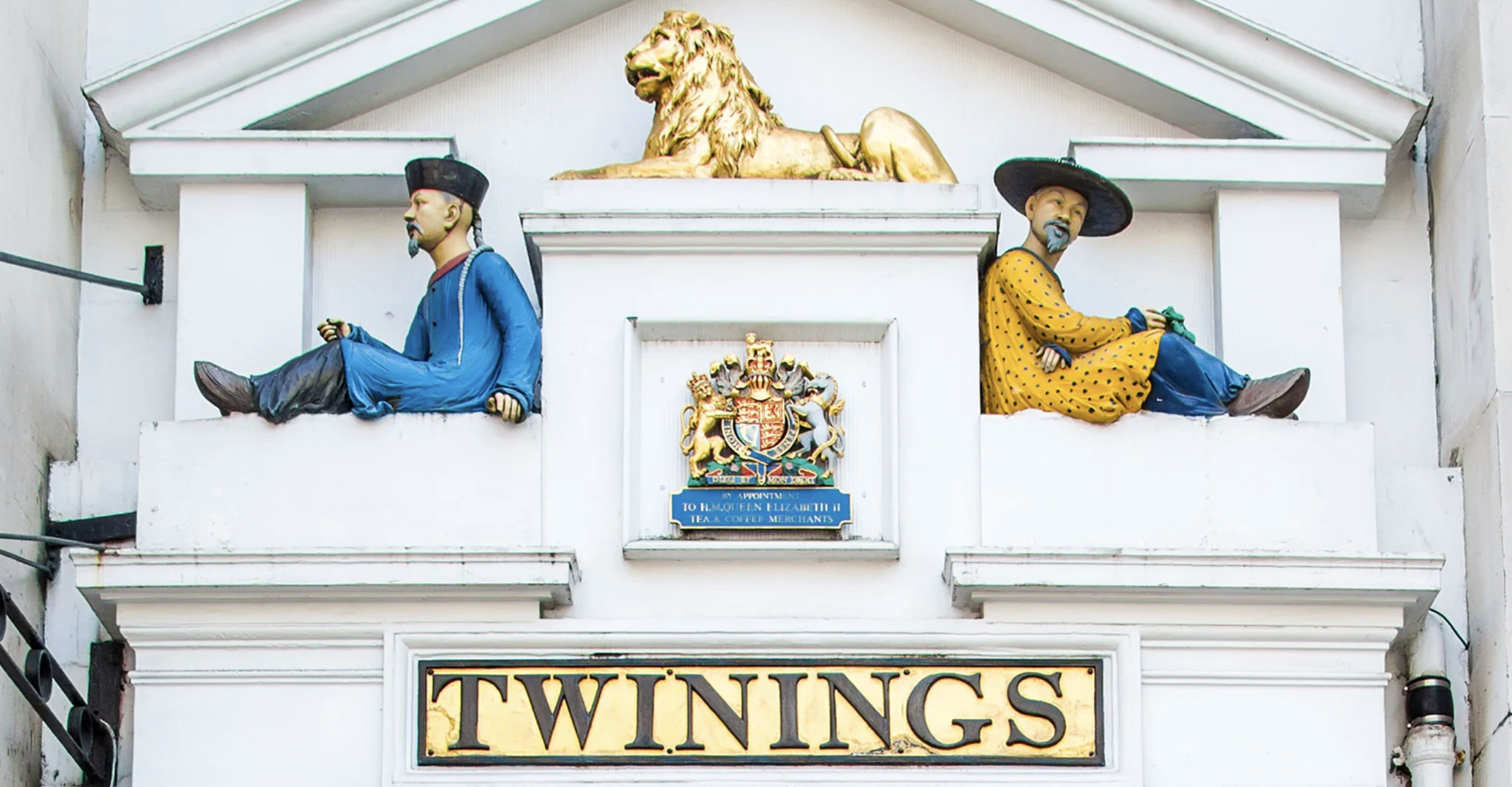
Often cited as the oldest unaltered commercial logo in the world, the Twinings wordmark has been doing its job since Richard Twining I commissioned it for the entrance of the family's Strand tea room in 1787. That's not a typo. The same classic serif capitals that sit on a box of Earl Grey today were chosen when King George the Third was on the throne.
The lesson here is simple: if you own a look so completely that it becomes synonymous with your category, changing it doesn't signal progress – it signals uncertainty. Twinings' wordmark whispers British elegance, heritage and quiet authority. Over 230 years later, nothing communicates those values better than the original. Sometimes the bravest creative decision is to leave well alone.
02. Coca-Cola script
Frank Mason Robinson, bookkeeper and partner to Coca-Cola inventor John Pemberton, had the foresight to see that two capital Cs would look striking in advertising. He rendered them in Spencerian script: the elegant, flowing handwriting style used for correspondence in the late 19th century.
Sign up to Creative Bloq's daily newsletter, which brings you the latest news and inspiration from the worlds of art, design and technology.
Although it was fashionable at the time, every other brand using it has long since moved on. Coca-Cola, however, never did.
Why? Because the script stopped being about penmanship decades ago. It became pure emotional resonance: warmth, nostalgia, shared moments. It's so deeply embedded in global consciousness that during the Share a Coke campaigns, the brand removed its own name from bottles entirely. People still knew exactly what they were holding. That's not a logo. That's a feeling.
For more details, read our article The Coca-Cola logo: a history.
03. Levi's Red Tab
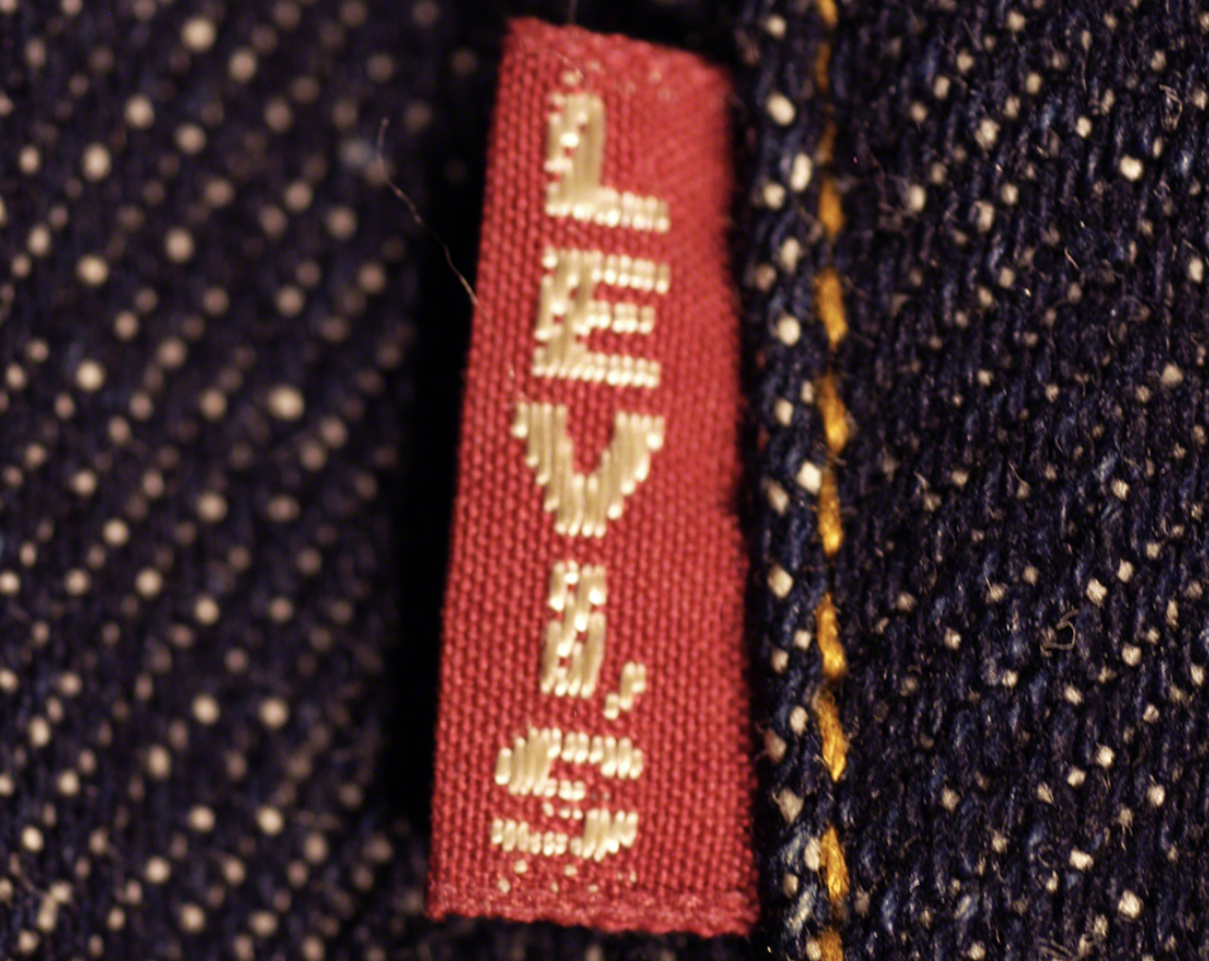
Levi Strauss patented riveted denim trousers in 1873, and in 1886 the brand introduced a leather patch showing two horses trying to pull a pair of jeans apart. The iconic Red Tab followed in 1936. It's barely been touched since.
There's a beautiful coherence here. The jeans are designed to be rugged, durable and authentic; so is the branding. Levi's has never chased "cool" because it understands that cool is temporary and authenticity is permanent.
For any creative working on a brand with genuine heritage, Levi's is the gold standard. The key takeaway? Let the product's values and the logo's values be the same thing.
04. Nike Swoosh
Carolyn Davidson was a graphic design student at Portland State University when she presented Phil Knight with a handful of logo options for his fledgling sportswear company. He chose the curved checkmark ("the Swoosh") and paid her $35 for it. It's now one of the most recognised symbols on Earth.
The genius of the Swoosh is what it doesn't do. It doesn't depict a shoe, a sport or a person. It's pure abstraction: a sense of movement, of speed, of momentum. It's not tied to any literal object, so it can never look dated.
The Swoosh transitioned seamlessly from a logo into a global ideogram, and by 1995 Nike felt confident enough to drop its wordmark entirely. For designers, it's the ultimate argument for resisting the urge to be too literal. For more details, see our article The Nike logo: a history.
05. Apple silhouette
Not a lot of people outside of design know this, but Apple's first logo, designed by co-founder Ronald Wayne, was a detailed engraving of Isaac Newton sitting under a tree. It lasted about a year. In 1977, graphic designer Rob Janoff replaced it with the bitten apple silhouette — and that silhouette has remained the shape of the company ever since.
What Apple does brilliantly with this logo is change its texture without ever changing its form. Rainbow stripes in the late seventies. Glossy aqua in the early 2000s. Chrome, then flat black, then sleek silver.
Each surface treatment makes the logo feel native to its era, but the underlying shape is sacrosanct. It's evolution over revolution; a masterclass in staying modern across multiple decades without sacrificing a single pixel of recognition.
For more details, read our article The Apple logo: a history.
06. YouTube

It seems weird to think of it now. But when three former PayPal employees launched YouTube on Valentine's Day 2005, they needed a logo that explained what the platform actually was. The solution was elegant: the word "Tube" set in white inside a red, rounded rectangle that resembled an old television screen, with a play-button triangle at its centre.
Over the years, the TV shape has flattened, the play button has moved beside the wordmark, and the red has shifted hue; but the core elements have remained. That red screen and play icon have become the universal symbol for online video. Changing it now would be like redesigning the stop sign.
For digital-first brands, YouTube demonstrates that once your icon becomes a piece of visual infrastructure, you protect it at all costs.
For more details, read our article The YouTube logo: a history.
07. Chanel
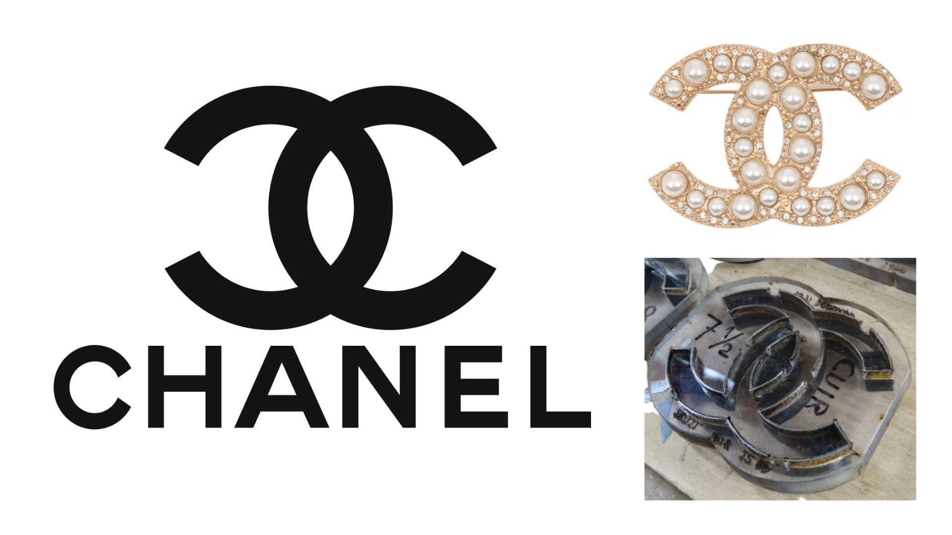
Coco Chanel designed the interlocking double-C monogram herself, and it first appeared on perfume bottles in 1925. Over a century on, it has never been altered. Not once. In an industry where trends shift every six months and entire aesthetics are born and buried within a single fashion week, that consistency is extraordinary. It does, however, make perfect sense.
Why? Because in the world of luxury, stillness is power. A logo that never changes becomes the ultimate anchor of status; it tells the customer that the brand is above the churn of fashion, not subject to it.
Every competing house has tweaked, modernised or simplified their marks over the years. Chanel simply hasn't needed to. The interlocking Cs are proof that true elegance doesn't fidget.
08. IBM
When Paul Rand designed the eight-bar IBM logo in 1972, the horizontal stripes weren't just an aesthetic choice; they solved a practical printing problem. On the low-quality paper stock commonly used for corporate communications at the time, large areas of solid ink had a tendency to bleed and distort. The stripes broke up the letterforms just enough to keep them crisp.
That technical fix became one of the most iconic pieces of corporate identity ever created. The bars suggested speed, efficiency and precision… exactly the qualities a technology company wanted to project.
Over half a century later, the eight-bar logo hasn't changed, and it remains the quintessential logo design in corporate branding. Rand proved that the best design solutions often come from constraints, rather than freedom.
What's the common thread?
Eight logos. Eight different industries. Founding dates that span from 1787 to 2005. And yet they all share something fundamental: the confidence to stop designing.
That might look counterintuitive on a website aimed at people who design things for a living. But the truth is, knowing when a logo is finished – truly finished – is one of the hardest and most valuable skills in the profession.
These brands all understand that a logo isn't a piece of content to be refreshed with the seasons. It's a container for every experience, memory and emotion a customer will ever associate with the brand. The longer it stays the same, the more it holds.
So the next time someone slides a brief across the table asking you to "modernise" a perfectly good mark, maybe consider pushing back. Point to Twinings, to Coca-Cola, to the Swoosh. Remind them that the most powerful thing a logo can do is simply, stubbornly, brilliantly endure.

Tom May is an award-winning journalist specialising in art, design, photography and technology. His latest book, The 50 Greatest Designers (Arcturus Publishing), was published this June. He's also author of Great TED Talks: Creativity (Pavilion Books). Tom was previously editor of Professional Photography magazine, associate editor at Creative Bloq, and deputy editor at net magazine.
You must confirm your public display name before commenting
Please logout and then login again, you will then be prompted to enter your display name.
