What designers can learn from 130 years of the Louis Vuitton logo

Sign up to Creative Bloq's daily newsletter, which brings you the latest news and inspiration from the worlds of art, design and technology.
You are now subscribed
Your newsletter sign-up was successful
Want to add more newsletters?
The best fashion logos tend to stand the test of time, and that's certainly true of the Louis Vuitton logo. The design turns 130 years old in 2026, and it's still going strong.
Whether you see it as a sign of quality and status or of gaudy conspicuous consumption, it's hard to deny that the LV logo was a milestone in branding. A relatively simple monogram became a global symbol of luxury and exclusivity and played a role in turning logos into cultural icons.
The mark shaped how fashion houses and other industries use visual identity to build prestige and loyalty. But what made it so successful, and what can it teach us today about the best logo designs?
Article continues belowThe history of the Louis Vuitton logo

Unlike most contemporary logo designs, the Louis Vuitton monogram wasn't primarily conceived to communicate a corporate identity or even to be used as a standalone mark across applications. It was created to form part of a pattern for a canvas design that was part decorative and part anti-counterfeiting measure.
By the late 19th century, the French luggage maker's revolutionary flat-top trunks were all the rage, and this had led to problems with knockoffs. The company had changed its canvas several times, trying first stripes and then a checkerboard design, but both were widely copied.
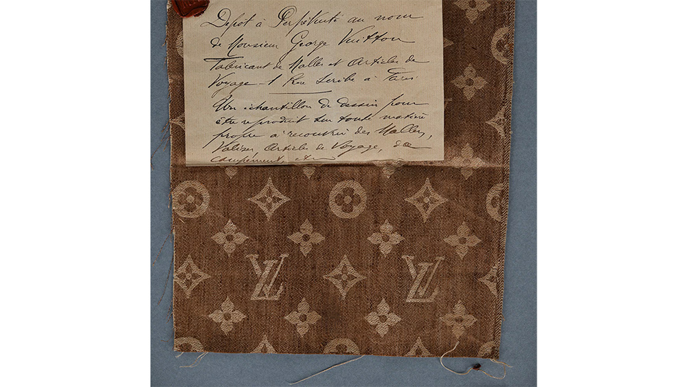
Georges Vuitton, the son of Louis, began searching for a more unique design to identify the company's genuine articles. That led him to create the ornamental pattern of interlaced LV initials in tribute to his father, combined with stylised floral motifs whose forms were botanical but also geometric.

The floral motifs were apparently inspired by kitchen tiles at the family's home in Asnières-sur-Seine, which were in turn inspired by Neo-Gothic ornamentation and Japanese mon crests.
Sign up to Creative Bloq's daily newsletter, which brings you the latest news and inspiration from the worlds of art, design and technology.
For the implementation on canvas, Georges maintained the colour palette of the brand's previous Damier design. He defined the design in 1896, and patented the LV canvas the next year.

This early example of brand identity creation unknowingly anticipated a cultural shift in how brands are seen as the LV logo became a lifestyle symbol, representing wealth and aspiration.
Celebrities and influencers wearing reinforced the logo’s aspirational value, setting a precedent for modern luxury branding. By the late 20th century, logos had become such a sign of status that head-to-toe monogrammed looks would be seen as a bold fashion statement.
That hasn't been without risks for the brand. Ironically, the design's popularity has made it one of the world's most counterfeited logos, and the ubiquity of the LV monogram has risked diluting its association with exclusivity.
What designers can learn from the Louis Vuitton logo today

The history of the Louis Vuitton logo shows the importance of authenticity – and of putting product first. Since it was designed as a pattern for canvas, the logo is intrinsically linked to the brand’s artisan roots. From their practical flat-top design to its 'unpickable' locks, it was the quality of Louis Vuitton's craftstmanship that initially gave the logo value, not the other way around.
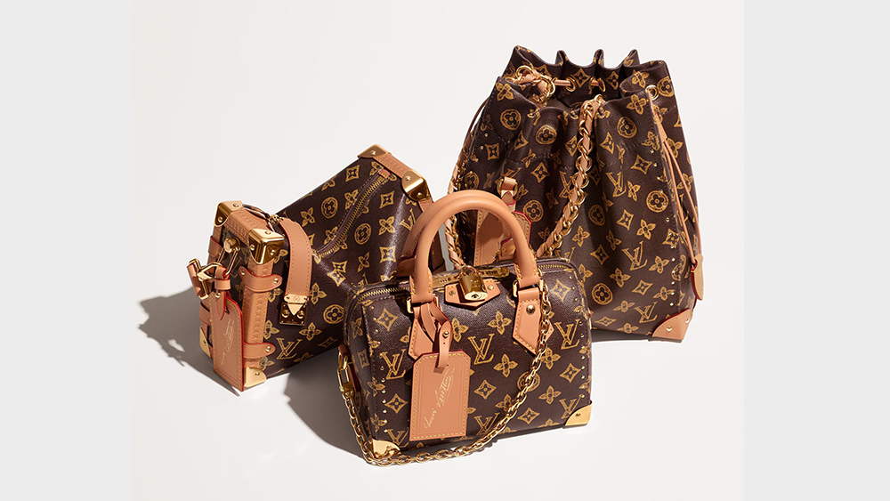
From there, the design's value was augmented by the consistency of use across products. From trunks to handbags, the logo unified diverse product lines, creative a cohesive identity.
And in these times when some brands tweak their logo every couple of years, the monogram's endurance shows that great design lasts. When changes have been made, there was a reason for them. When the calligrapher Claude Mediavilla was brought in to update the floral motifs, it was to meet modern reproduction needs and ensure graphic consistency across products.

Although it was initially intended to be complex enough to avoid easy replication, one of the greatest strengths of the Louis Vuitton logo turned out to be its simplicity. That makes it instantly recognisable but also remarkably elastic, something that's allowed a dialogue with art and culture over the years.
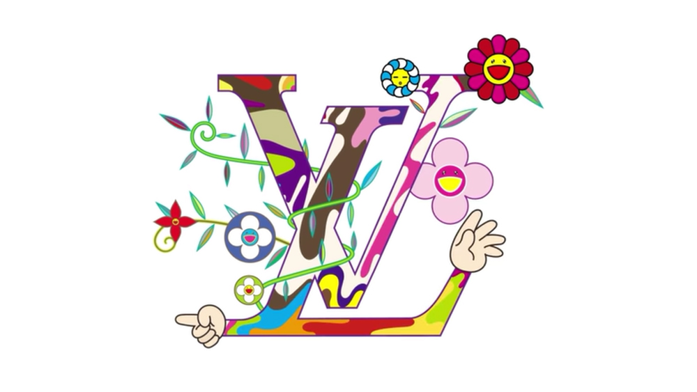
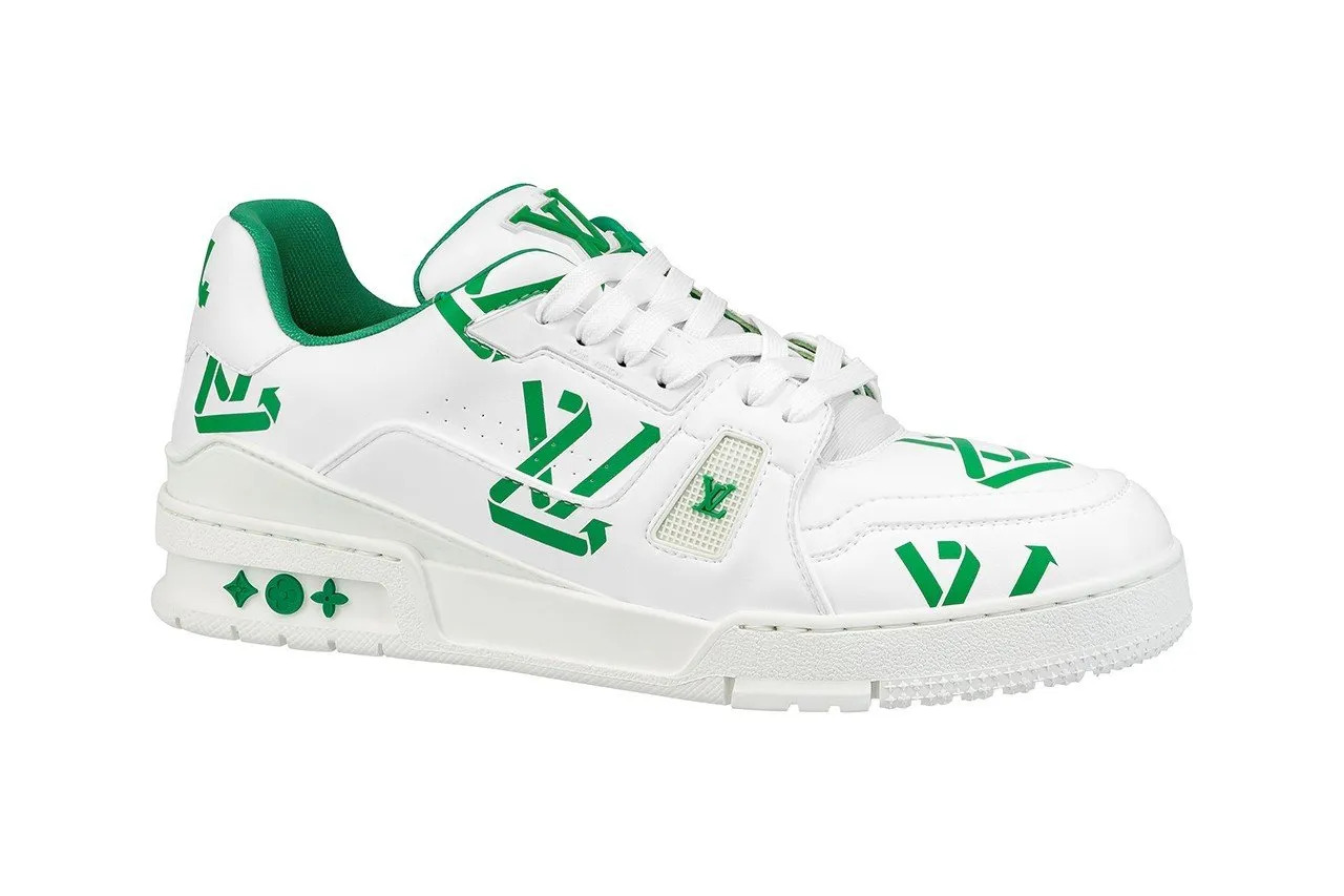
Takashi Murakami gave the design a multicolour makeover in 2003, Yayoi Kusama covered it in polka dots in 2012 and Jeff Koons layered it with da Vinci and Monet reproductions for his 2017 Masters collection. Under the likes of Ghesquière, Pharrell Williams and the late Virgil Abloh, the design has continued to temporarily take on new, complementary identities while remaining instantly identifiable.
That's allowed the design to achieve the difficult balance of timeless classic design that also permits surprising contemporary twists.

Joe is a regular freelance journalist and editor at Creative Bloq. He writes news, features and buying guides and keeps track of the best equipment and software for creatives, from video editing programs to monitors and accessories. A veteran news writer and photographer, he now works as a project manager at the London and Buenos Aires-based design, production and branding agency Hermana Creatives. There he manages a team of designers, photographers and video editors who specialise in producing visual content and design assets for the hospitality sector. He also dances Argentine tango.
You must confirm your public display name before commenting
Please logout and then login again, you will then be prompted to enter your display name.
