Monotype's new logotype collab isn't afraid to break the rules
It celebrates the diversity of the human form.
Sign up to Creative Bloq's daily newsletter, which brings you the latest news and inspiration from the worlds of art, design and technology.
You are now subscribed
Your newsletter sign-up was successful
Want to add more newsletters?
Typography shouldn't be an afterthought – something that Monotype understands better than anyone else. Demonstrating the power of font design, the typographic pioneer has created a custom logotype for Chantelle Pulp, made to disrupt and challenge the limitations of traditional fonts.
While there's no formula for creating iconic typefaces, individuality is key to standing out amongst the crowd. Punchy, bold and dripping with attitude, Chantelle Pulp's variable logotype represents the future of typographical design, where even a simple letterform can speak louder than words alone.
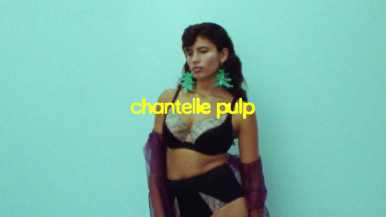
Created for pioneering French lingerie brand Chantelle, the creation of the custom typeface coincides with the launch of its rebellious sub-brand, Chantelle Pulp. Defined by its celebration of all bodies and forms, the shape-shifting custom typeface is a beacon of inclusivity that mimics the diverse styles of the human form.
Article continues below"I first met Natalia Kotkowska, Chantelle’s Head of Design, over coffee. As we talked, it became clear this brand needed more than a static logo. It needed something alive," Damien Collot, Monotype's executive creative director, tells Creative Bloq.
"So, right there in the coffee shop, we started brainstorming ideas and even discussed variable font technology. Understanding a brand’s story and spirit is essential when designing a typographic asset. That’s when the concept shifted: a logotype that could morph and adapt to match Chantelle Pulp’s rebellious, inclusive spirit. So, from day one, the logo was designed to move, to feel dynamic."
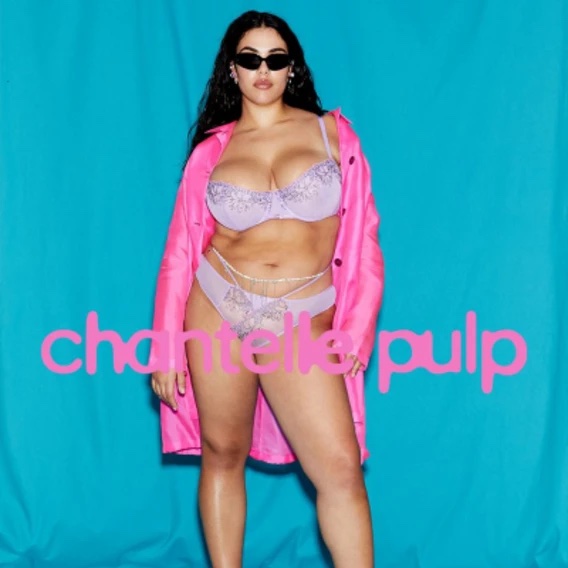
“Great branding always starts with great collaboration," adds Chantelle’s head of design, Natalia Kotkowska. "Monotype brought the missing piece, jumping in to elevate our vision and make it truly remarkable. The energy from our initial workshops confirmed we were on the right path. We wanted a logo that felt inclusive, fluid, and organic; and that’s exactly what we created. This shape-shifting identity reflects how the brand is evolving and has endless potential to be reimagined for many, many, many years.”
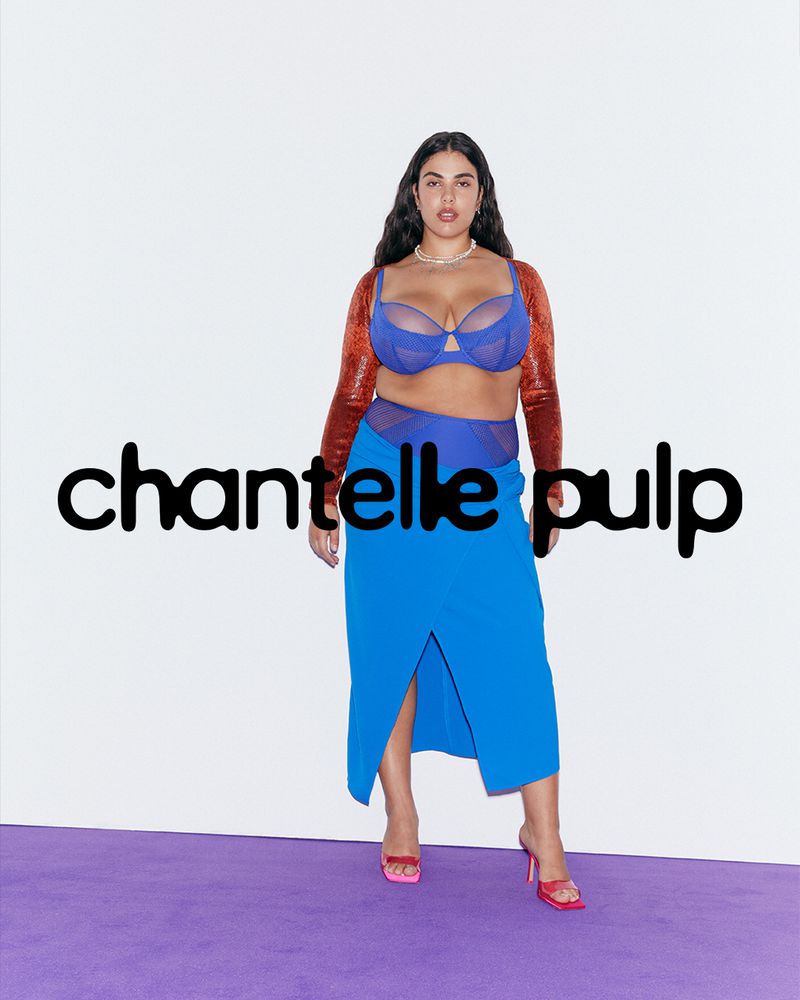
It wasn't a project without challenges, as Damien explains, particular technicalities required careful engineering. "The design runs on two axes with three masters per axis, so every variation had to transition seamlessly. Getting those shifts smooth took some serious fine-tuning," he says.
Sign up to Creative Bloq's daily newsletter, which brings you the latest news and inspiration from the worlds of art, design and technology.
"This whole project felt like a dialogue between two worlds: type on one end of the spectrum and lettering on the other. To create a system that could generate countless variations without looking warped, we had to find that sweet spot where fluidity meets dynamism without compromising brand recognition. The first designs were rooted in a Neo Grotesk structure, classic, clean, and tied to Chantelle’s global font, Helvetica Now. But quickly, we realised that Chantelle Pulp needed its own voice. After several iterations, the look evolved into something more open and expressive, with soft terminals and overall blur effect," Damien adds.
Naturally, the variable nature of Chantelle Pulp is the key to its magic. "The blurred edges and flowing shapes suggest a body in constant motion: free, limitless, always evolving. That’s exactly what the variable approach is about, celebrating adaptability and individuality. Just like real bodies, the logotype isn’t locked into one shape, it shifts, stretches, and reshapes. This flexibility reflects the brand’s commitment to inclusivity and diversity, showing that beauty doesn’t come in a single form," says Damien.
"Variable type gives brands a way to stay dynamic and relevant. Instead of a type that looks the same everywhere, you get a living identity that can adapt to seasons, campaigns, and cultural moments. For Chantelle Pulp, that means endless creative possibilities, mini-identities for each collection, playful transformations for social, and a visual language that never feels stale." Damien explains.
"When a brand identity feels responsive and expressive, it creates a stronger emotional bond with consumers. Variable type can convey mood, tone, and personality in ways that static type cannot, making the brand feel more human and relatable. On a more global note, design trends and consumer expectations evolve quickly. A variable type system gives brands the agility to adapt without a complete redesign, ensuring longevity and relevance in a fast-changing market," he adds.
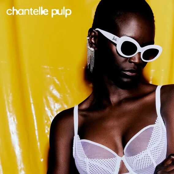
Find out more at Monotype and take a look at why fonts matter more than ever in 2025.

Natalie Fear is Creative Bloq's staff writer. With an eye for trending topics and a passion for internet culture, she brings you the latest in art and design news. Natalie also runs Creative Bloq’s 5 Questions series, spotlighting diverse talent across the creative industries. Outside of work, she loves all things literature and music (although she’s partial to a spot of TikTok brain rot).
You must confirm your public display name before commenting
Please logout and then login again, you will then be prompted to enter your display name.
