"The best logos in the world are typographic": Why fonts matter more than ever in 2025
We talk to type foundry Monotype about its fascinating new typography report.
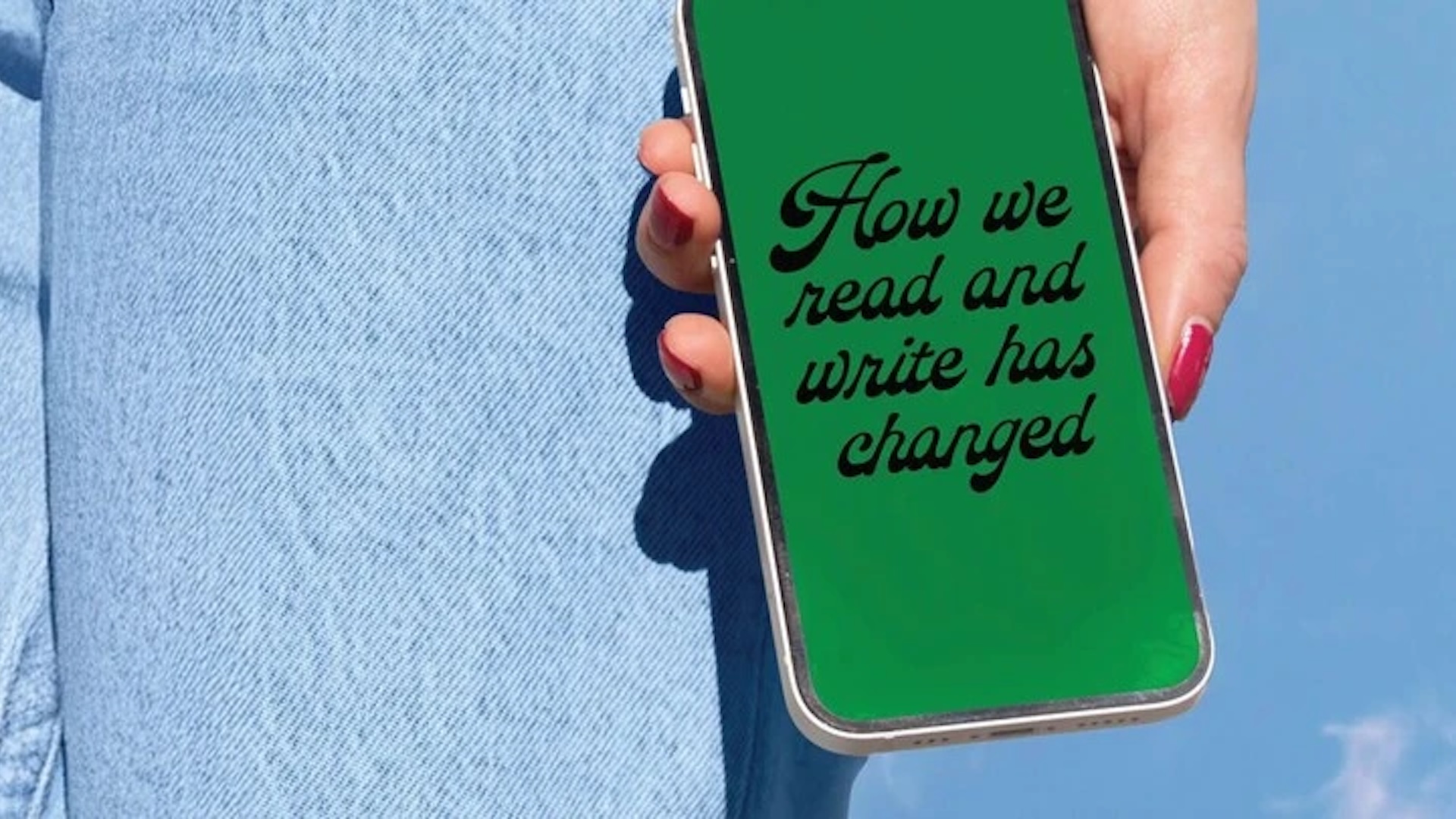
As design journalists, we like to think we understand the power of fonts. Typography is an essential pillar of design, one with the power to elicit strong subconscious responses from the reader. But as a fascinating new study from leading type foundry Monotype reveals, not everybody views type in the same way.
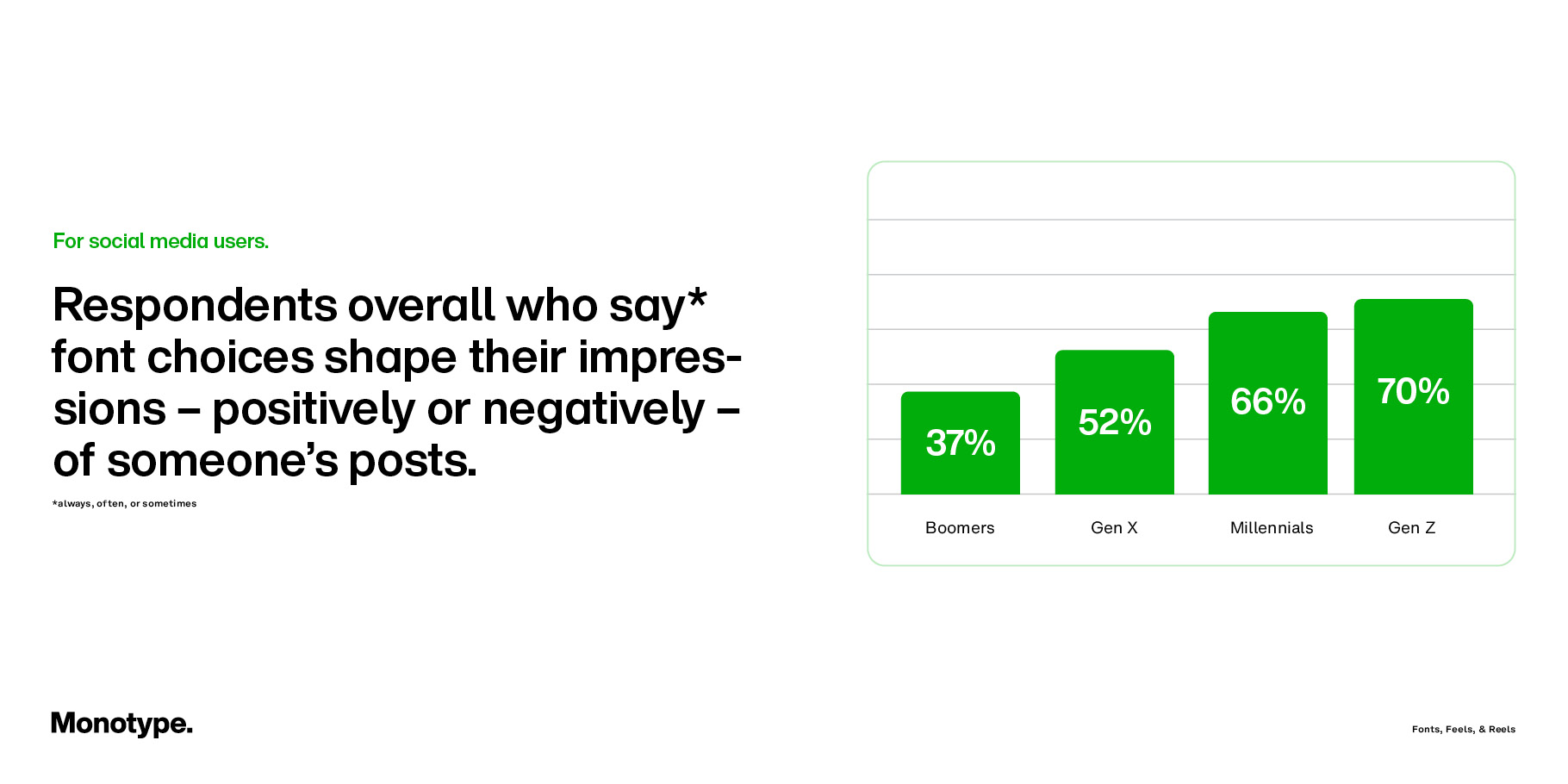
Titled 'Fonts, Feels, & Reels: Generational Attitudes to Type', the multi-country study explores how over 12,000 social media users, from Gen Z to Boomers, use fonts as a form of visual language – and how younger generations in particular are using them to build identity, create emotional connection, and shape how their content is received.
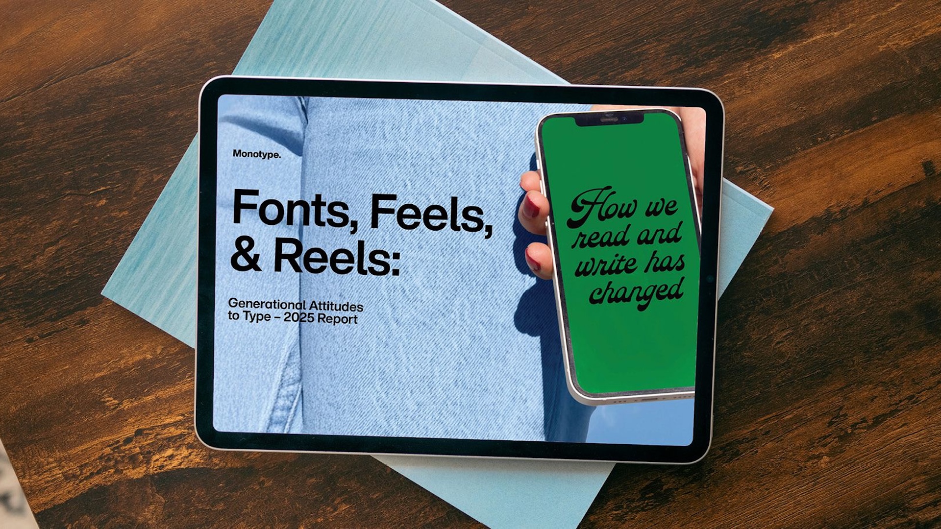
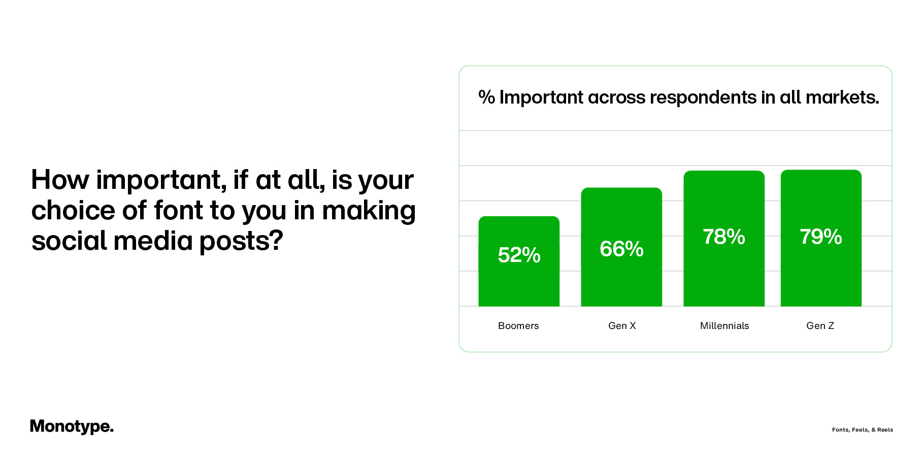
78% of all respondents reported that using distinctive fonts boosts engagement on social posts. Meanwhile, lack of font choice is a frustration, with more than half of Gen Z and Millennials frustrated by the limited font options on social media platforms. This has led creators to go “off-platform” for greater font freedom, with 71% of those who use external design tools for creating social media posts doing it specifically for more font choice and control.
We caught up with Tom Foley, executive creative director at Monotype, to find out more about the learnings from the report, as well as the motivation behind it. If you're looking for more typographical inspiration, take a look at our roundup of the best free fonts.
Why did you decide to study how different generations approach fonts?
Every generation has an awareness of fonts. While we used social media as a focus for this report, the overall aim was to get a perspective on how different generations or people feel about type. Depending on what period you grew up in, what technologies you were exposed to, and what technology you use every day, you’re going to have a different perspective on type – digital type, especially. So it’s unsurprising that Gen Z is far more literate and confident with type as a means of expression.
The background to this piece of research was a broader work, which is our trends report in 2025. The original report was all about the typical things you'd expect in a type report – accessibility, readability, etc. But we realised there was something missing within that topic, something less about academic research or the type designers perspective, and more about the users themselves, and what their preferences are.
What’s striking for us is just how much of an opinion people have on type and how much importance they give it. As a type agency we work with brands and do user testing, but to see it purely from the perspective of users, without the brand and the agency in the middle, you get a different lens on it.
Do you think social media platforms are letting users down in terms of font selection?
One of our finds is that users wish they had more options available. Perhaps because the platforms don’t even realise there’s the demand or expectations. For many, type as a cultural asset of means of communication is overlooked. But it’s so important – it’s a signifier toward a certain taste or style. But it’s under-researched. So I think that's probably part of the reason why social media platforms don't offer more, because they haven't got enough evidence to suggest that it's as important as it really is.
Is type really as important to personal expression as the clothes we wear?
Well, you have to put it in context. In the context of social media or a digital platform where you’re posting lots of kinds of content, typography can be a thread, and it can be a thread that kind of underpins your style or preference or perspective. When done well, typography can be an extremely effective communicator of taste, cultural background, intention, tone of voice and emotion. So it's probably even more pure and direct than the clothes we wear. It's more distilled.
And on a cultural level, what we're seeing over the last ten, fifteen years is a better understanding of the subconscious way type influences us. It has this kind of silent persuader quality to it. Or becoming more aware of it on a kind of a more everyday user level. So we're at an interesting moment with it. It's kind of becoming less specialist knowledge and becoming more mainstream.
How can you make sure your font matches your message?
If your font doesn’t match your message, it’s a real missed opportunity. When we work with brands, designers, and different platforms on typeface selection or custom font design, we often meet people who feel they don’t have any expertise in typography. They come into workshops hesitant to share an opinion, thinking they don’t know what they’re talking about.
The way we structure those creative sessions is to break down that hesitation and get people to respond instinctively to type, without overthinking it. We’ll ask questions like: What does this typeface make you feel in the moment? That emotional response is often the best guide when choosing type, especially for a personal or expressive brand.
It’s really about tone of voice: how does the type make you feel, and does that feeling align with what you want to communicate? Thinking purely in technical terms, whether it’s a serif or sans serif, display or text face, won’t always lead to the right choice. The key is to connect the emotional impact of the type with the message you want your audience to take away.
Why do fonts matter more than ever in 2025?
Since 2020, there’s been a lot of talk about digital transformation. It’s been a buzzword, but it’s also a reality that’s unfolded rapidly. Brands that barely had a digital presence six years ago now have to exist everywhere, across social media, websites, and multiple global platforms.
In that context, typography is the one element in a brand’s toolkit that can consistently connect all those digital touchpoints. More than colour, more than a logo, even more than sound, type can remain uniform across every platform. That makes it one of the most crucial components of a visual identity.
When a brand gets its typography right, whether that’s a company, a platform, or even an individual building a personal brand, it creates an almost instant sense of recognition. A strong typographic identity can achieve that faster than colour or shape alone. The most recognisable logos in the world are typographic for that reason.
Symbols and icons can work, but they rarely achieve the same universal recognition. Characters, like mascots or brand figures, such as the meerkats from Compare the Market, can also create strong associations, but they can’t appear in every post, caption, or video in the same way type can.
That’s why typography is more important than ever. It holds a brand’s communication together across every medium. When it’s wrong, it’s a missed opportunity, but when it’s right, the benefits are unparalleled.
Sign up to Creative Bloq's daily newsletter, which brings you the latest news and inspiration from the worlds of art, design and technology.

Daniel John is Design Editor at Creative Bloq. He reports on the worlds of design, branding and lifestyle tech, and has covered several industry events including Milan Design Week, OFFF Barcelona and Adobe Max in Los Angeles. He has interviewed leaders and designers at brands including Apple, Microsoft and Adobe. Daniel's debut book of short stories and poems was published in 2018, and his comedy newsletter is a Substack Bestseller.
You must confirm your public display name before commenting
Please logout and then login again, you will then be prompted to enter your display name.

