I'm absolutely loving the Affinity rebrand
It's fresh, it's fun, it's cool af.

Affinity made waves last week as it launched its new offering – three apps rolled into one and offered for the princely sum of... nothing.
The reactions from the creative community have been mixed, some people think there must be a catch while others are frantically unsubscribing from the likes of Adobe.
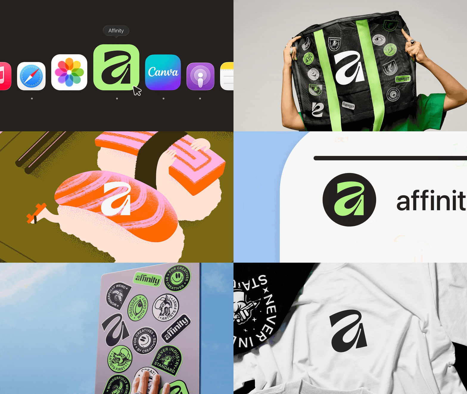
But one piece of news that went a little under the radar is Affinity's new branding, launched at the same time. And I'm here to say that I love it.
Article continues below 
Affinity's motto is "for creatives, by creatives" and the new identity reflects this.
Affinity explains that its process began with tone of voice. "Knowing, liberating and a little out-there. In short, fresh.af". The use of "af" is clever, and shows immediately that this is a brand that's bold and not to be messed with.
The new brand was spearheaded by a team consisting of creatives from Affinity, Canva and design studio Twist. And sticking by that motto, members of the creative community also took part.

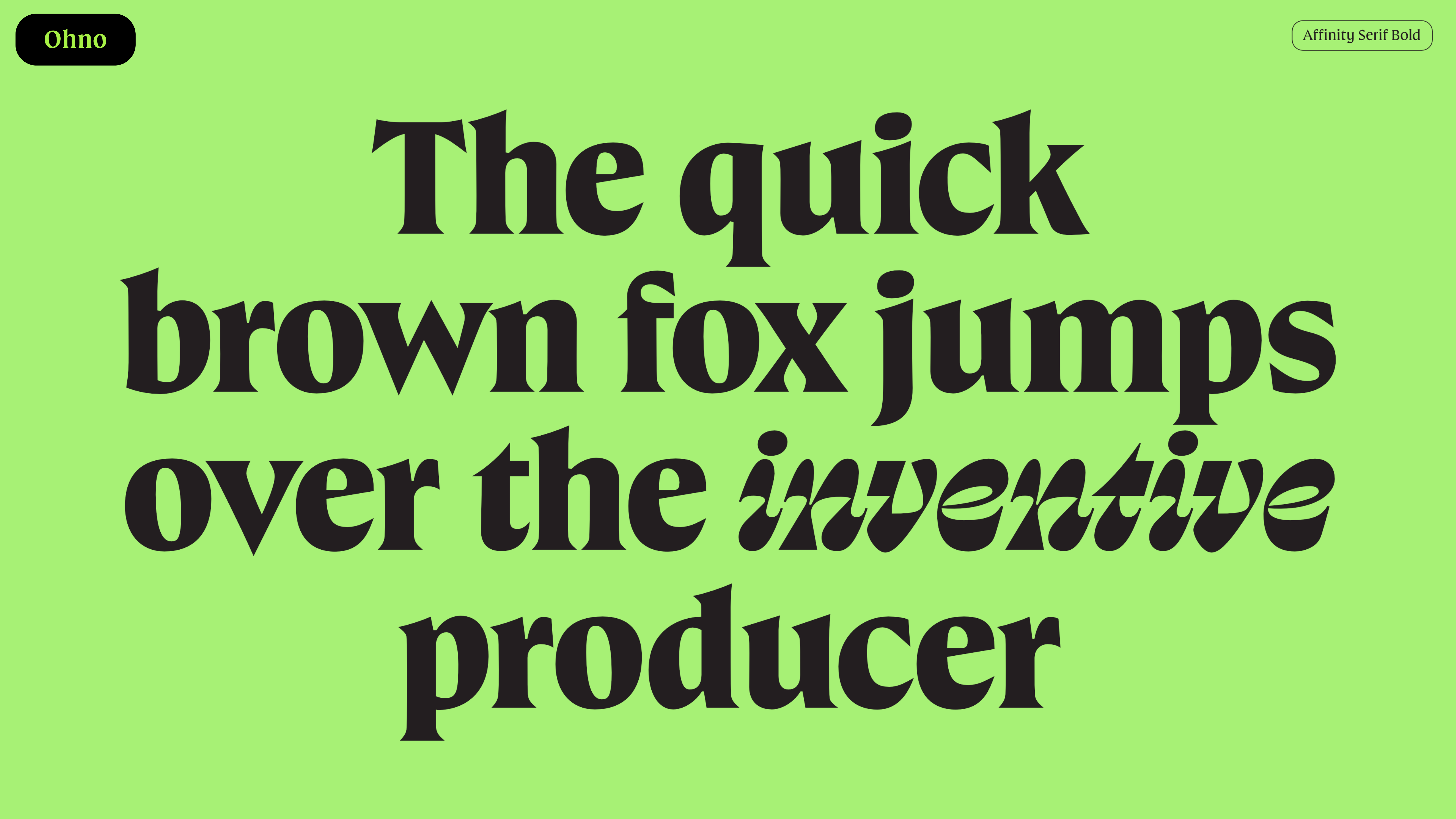
Rob Clarke created the symbol and logotype, with its mix of juicy curves and precise angles, while type foundry Ohno added a custom typeface that demands attention.
Sign up to Creative Bloq's daily newsletter, which brings you the latest news and inspiration from the worlds of art, design and technology.
James Martin (aka Made by James) created a suite of fun graphic assets, and the launch campaign animation was created by Brand Impact Awards 2025 winners ManvsMachine (above).

The goal of the campaign was to ensure that every encounter with the brand screamed creative possibility, and that every touchpoint felt unique to Affinity.
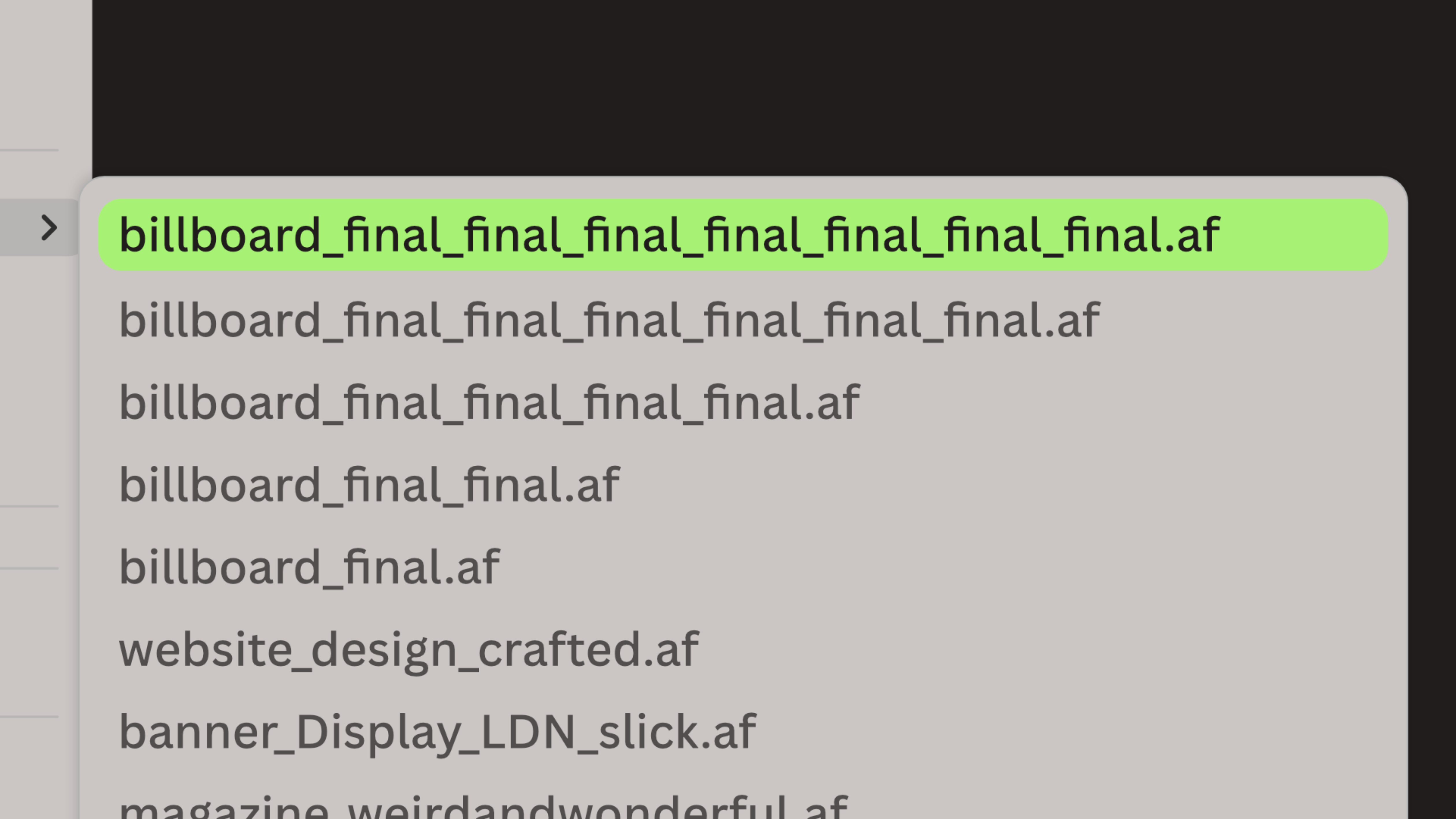
The colour palette is mostly neutral with the lime green adding a touch of punk. Af isn't just a saying either, now files created in Affinity will have the .af file name, ensuring that punk attitude is reflected in even the most boring of tasks – saving a file.

The campaign assets play on version histories too, poking fun at that designer trope of naming things billboard_final_final_final.af, and so on (above).

The identity was crafted in Affinity then scaled in Canva, showing just how these two programs can work together. (Also, it would've been a little bit embarrassing for Affinity to admit it worked in Photoshop.)
Overall the brand feels new, fresh and fitting for a company that's ripping up the rulebook and crafting some new. I certainly think it's cool af.
For more on software, see our best graphic design software piece (which now needs an update to include Affinity's latest offering).

Rosie Hilder is Creative Bloq's Deputy Editor. After beginning her career in journalism in Argentina – where she worked as Deputy Editor of Time Out Buenos Aires – she moved back to the UK and joined Future Plc in 2016. Since then, she's worked as Operations Editor on magazines including Computer Arts, 3D World and Paint & Draw and Mac|Life. In 2018, she joined Creative Bloq, where she now assists with the daily management of the site, including growing the site's reach, getting involved in events, such as judging the Brand Impact Awards, and helping make sure our content serves the reader as best it can.
You must confirm your public display name before commenting
Please logout and then login again, you will then be prompted to enter your display name.
