New York mayor Zohran Mamdani's branding is a graphic design masterclass

Let’s set the politics aside for a second. Whether you're left, right or in the middle, everyone is agreed on one thing. The visual identity of Zohran Mamdani’s recent campaign for New York mayor achieved something political design rarely does any more: it felt genuinely alive.
In a landscape where campaign materials tend to resemble tax forms and corporate letterheads, Mamdani’s team reminded everyone that public life doesn’t just communicate through words. It communicates through colour, shape, texture. And let's be honest; political branding has always been most successful when it stops looking like politics. That's where the best print ads come from.
Obama’s HOPE didn’t succeed because of what it said, but because of how it felt: an image that made optimism look hip. Alexandria Ocasio-Cortez’s first run announced “we are new here” without ever needing to type the sentence. Mamdani’s campaign sits confidently in that lineage, but with a distinctly New York twist. Instead of aspiring upward toward patriotic blues and dignified serif fonts, it looked sideways... at the city itself.
Not playing it safe
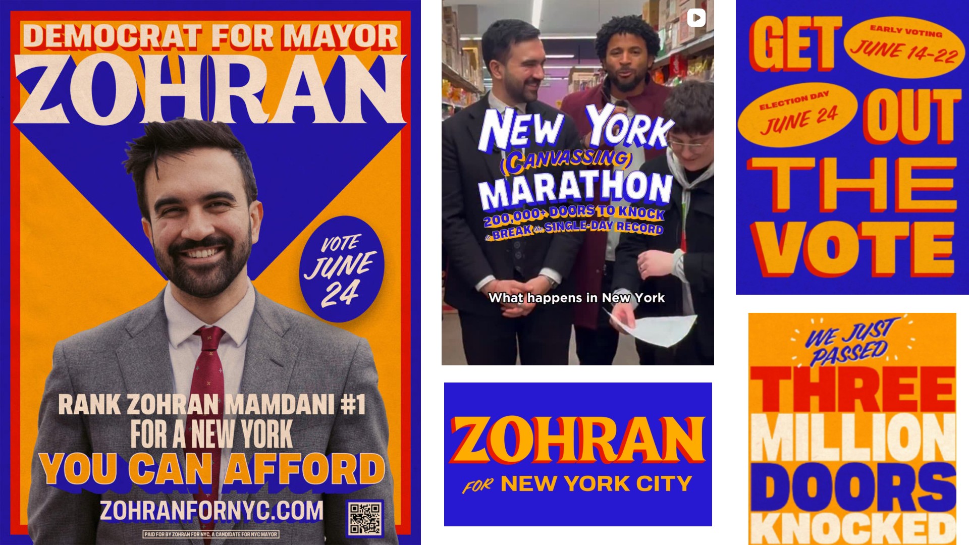
This visual identity was created by Forge Design in partnership with Tyler Evans, who created the posters, the social graphic, and the 'marathon' image shown above. These visuals didn’t use the safe navy-blue of every other American candidate since the invention of CMYK. It stepped away from the visual shorthand of "seriousness". Instead, the campaign leaned into a punchy electric blue that vibrated with energy and daylight.
It paired that with a warm yellow-orange that sits somewhere between MetroCard gold and the side of a well-loved taxi. And it allowed a soft, friendly red to creep into the drop shadows and outlines, for an extra shot of energy. Together, the palette didn’t whisper “politician”. It shouted “street corner”, “corner shop”, “ball game”, “bodega awning”, “café chalkboard”. The New York that people actually live in.
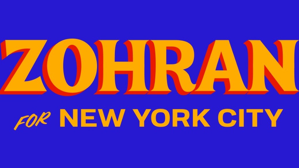
Typography sealed the deal. The name – just 'Zohran' – was treated as an emblem in its own right. Big. Wide. Confident. Shadowed like a storefront sign that’s been refreshed every decade but never replaced.
Again, the lettering didn’t look polished or corporate; it looked like a human hand had been involved at some point. It referenced a visual history long visible on Queens shop shutters, on the vinyl banners outside groceries, on family-run businesses whose names might not be famous, but whose presences shape neighbourhoods. This wasn’t branding made to impress consultants. It was branding made to feel like it had always been there.
Sign up to Creative Bloq's daily newsletter, which brings you the latest news and inspiration from the worlds of art, design and technology.

Despite the apparent simplicity, there's a lot going on here. The design echoes the visual cues of hand-painted signage from the 1930s to the 1950s. It nods to South Asian film posters and sports graphic culture. It touches on memories that belong to immigrant communities, shop owners, families who have lived in New York for decades. People who, let's be frank, are rarely spoken to in the visual language of politics.
Why this matters
Overall, Mamdani’s branding didn’t just represent an idea of who he was. It represented an idea of what the city could feel like again; a place where people’s lives are not hidden behind glass and logos and corporate sheen, but lived in the open; loud and unselfconscious.
This is the lesson for designers. Look around you, not up. Look at the language of the environment you’re designing for. Corporate minimalism does not equal legitimacy. Seriousness does not live in serif fonts. And a message does not become more persuasive because it has been made quieter.
Great design doesn’t simplify identity; it reveals it. The Mamdani campaign didn’t pretend to be the city; it was the city. And that’s why so many responded to it.

Tom May is an award-winning journalist specialising in art, design, photography and technology. He is the author of the books The 50 Greatest Designers (Arcturus) and Great TED Talks: Creativity (Pavilion). Tom was previously editor of Professional Photography magazine, associate editor at Creative Bloq, and deputy editor at net magazine.
You must confirm your public display name before commenting
Please logout and then login again, you will then be prompted to enter your display name.

