The US just declared war on a font
Marco Rubio wants to get with the Times (New Roman).

Sign up to Creative Bloq's daily newsletter, which brings you the latest news and inspiration from the worlds of art, design and technology.
You are now subscribed
Your newsletter sign-up was successful
Want to add more newsletters?
In the world of design news, things tend to slow down in December as brands and studios look towards the holidays – which can lead to some slow news days here at Creative Bloq. So, thank goodness for Marco Rubio, who has just gifted us a late contender for the most ridiculous typography story of the year.
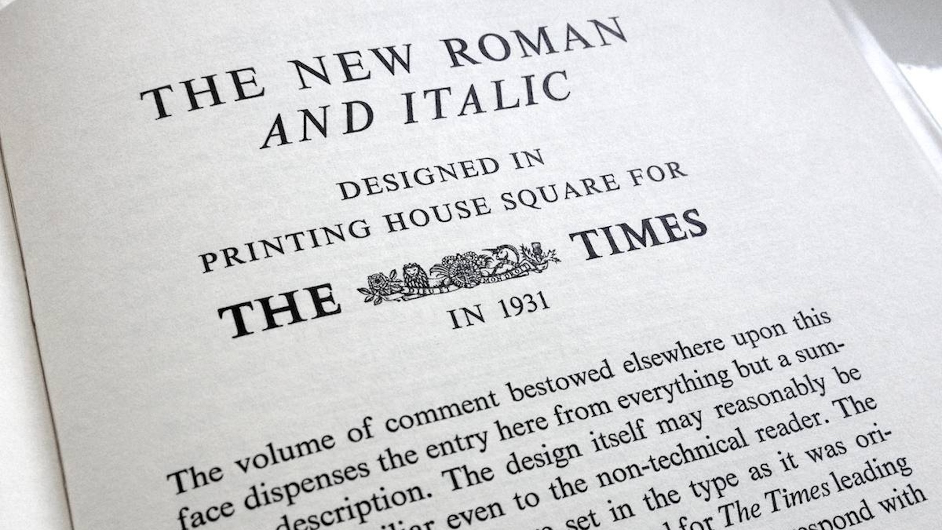
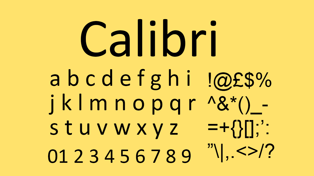
Under Joe Biden in 2023, the US State Department switched from Times New Roman to Calibri for all official documents. But now, in what is apparently an attempt to reverse a DEI decision, Rubio has ordered a return to Times New Roman. And to say designers are bewildered would be an understatement. We've never seen so much drama involving two of the best free fonts.

“To restore decorum and professionalism to the Department’s written work products and abolish yet another wasteful DEIA program, the Department is returning to Times New Roman as its standard typeface,” reads a State Department cable distributed on Tuesday. ““This formatting standard aligns with the President’s One Voice for America’s Foreign Relations directive, underscoring the Department’s responsibility to present a unified, professional voice in all communications,” it added.”
Article continues belowUnsurprisingly, the idea that a typeface could possibly be considered ‘woke’ is raising eyebrows among designers. As is the fact that, as many see it, returning to Times New Roman represents a step backwards. “Even the newspaper that originally commissioned Times New Roman - you might not be surprised to learn it was the Times - has abandoned Times New Roman. The typeface was designed for metal typesetting, specifically for legibility with bad ink and cheap paper,” one Redditor explains. Another adds, echoing the sentiments of many, "Comic Sans would suit them better."

Even the designer of Calibri itself has weighed in. Lucas de Groot, CEO of LucasFonts, shared a statement via the r/Typography subreddit: "The decision to abandon Calibri on the grounds of it being a so-called “wasteful diversity font” is both amusing and regrettable. Calibri was specifically designed to enhance readability on modern computer screens and was selected by Microsoft in 2007 to replace Times New Roman as the default font in the Office suite. There were sound reasons for moving away from Times: Calibri performs exceptionally well at small sizes and on standard office monitors, whereas serif fonts like Times New Roman tend to appear more distorted."
Indeed, I'm having difficulty finding a single positive remark about the change – or indeed Rubio's decision to focus on it as an area of importance. And it's curious that he opts to call Calibri "wasteful". You know what sounds wasteful to me? Changing your default font twice in two years.
Sign up to Creative Bloq's daily newsletter, which brings you the latest news and inspiration from the worlds of art, design and technology.

Daniel John is Design Editor at Creative Bloq. He reports on the worlds of design, branding and lifestyle tech, and has covered several industry events including Milan Design Week, OFFF Barcelona and Adobe Max in Los Angeles. He has interviewed leaders and designers at brands including Apple, Microsoft and Adobe. Daniel's debut book of short stories and poems was published in 2018, and his comedy newsletter is a Substack Bestseller.
You must confirm your public display name before commenting
Please logout and then login again, you will then be prompted to enter your display name.
