
During the flat design boom of the 2010s, blocky sans-serif fonts were everywhere. Crisp, clean text adorned websites and shopfronts, with more decorative serif fonts seen as fussy and passé. But the tide appears to have turned on the serif vs sans serif debate.
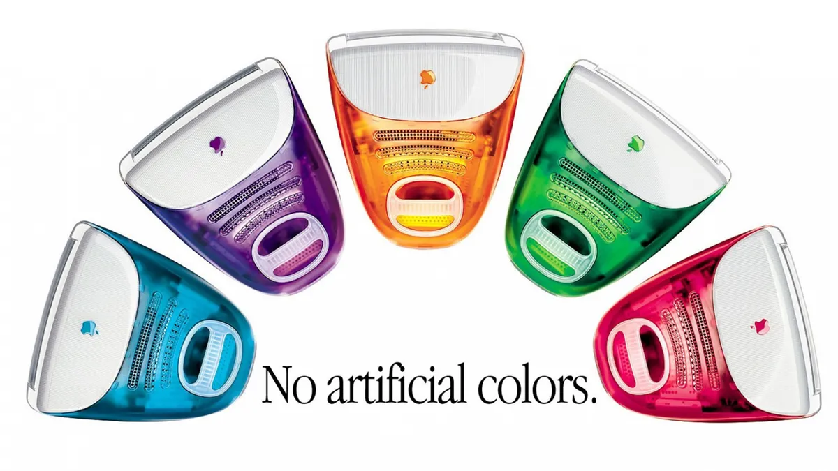
From protein bars to sneaker ads to AI brands, it seems everybody is embracing retro typographical aesthetics. Think the old '90s Apple font – the one that adorned the ads for colourful Macs and the back of the very first iPod. (Looking for design inspiration? Check out the best free fonts.)
I first noticed the trend when the tinyPod, a short-lived gadget that turned the Apple Watch into a handheld device, was announced. With iPod-esque visuals and, yes, that serif font, the product's website was a burst of tech nostalgia.
And it's only becoming more ubiquitous. David, one of the most well-known protein bar brands among Gen Z, features some of the simplest and most retro branding around. Fontsinuse has identified the David typeface as Instrument Serif.
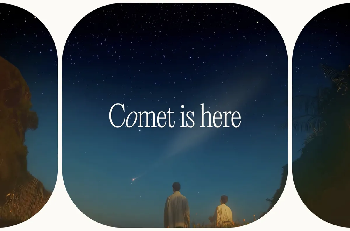
Meanwhile, ads for Comet, the new web browser from AI brand perplexity, feature a similar font titled Editorial New. It's particularly intriguing to see such a retro font design being embraced by the AI community. Could it be something to do with how the nostalgic element brings about a sense of warmth or safety? As we know, the psychology of fonts is a very real thing.

But has the backlash already begun? So ubiquitous have fonts like Instrument Serif become that we're seeing designers complain that it's starting to look lazy. And it perhaps doesn't help that the font has been used to promote the Trump Gold Card visa.
Fraunces and Instrument serif gotta be the hottest fonts for designers at the moment pic.twitter.com/27OvpWp7L2November 5, 2025
Let’s move on from Instrument SerifSeptember 15, 2025
Lot of disturbing things happening in the world but at least serif fonts are making a comeback.November 5, 2025
Still, if serif fonts are bringing back a little warmth and personality to design, I'm all for it. Those '90s Apple ads, for example, are some of the best print ads ever. Whereas the less said about the company's more recent advertising output, the better.

