What trend do you wish would die?
I asked five speakers at Paradigms conference to share their thoughts.

Sign up to Creative Bloq's daily newsletter, which brings you the latest news and inspiration from the worlds of art, design and technology.
You are now subscribed
Your newsletter sign-up was successful
Want to add more newsletters?
Which trend do you wish would die? That’s the question I posed to four speakers at Frontify’s Paradigms conference in Morocco a few weeks ago.
Answers varied wildly, and yes there was a mention of Comic Sans, but not in the way you might imagine…
If you missed Paradigms, you can catch up with my interviews with speakers James Greenfield of Koto, The Black Pepper Studio, Spotify's Bianca Berning, Jonas Hegi of Builders Club and PayPal’s Iskra Velichkova and MUTABOR’s Burkhard Müller.
Article continues below 
James Greenfield, founder of Koto, cited brands “letting social dictate how their brands exist”. He gave the example of UK brand Currys, which had a viral hit recently where its employees were using Gen Z language to talk about products. “It was a cool bit of content, but if you go into a Currys store, it’s an awful experience,” said James. “There’s absolutely no point in spending all that time and effort on social if people turn up at the store and it's crap.”
Why are brands doing this? “People are too worried about what others are doing and copying,” James explained. “Everyone's desperate for data. I get that. But that's not brand building.” Brand building, he went on to say, is “almost impossible to measure”.

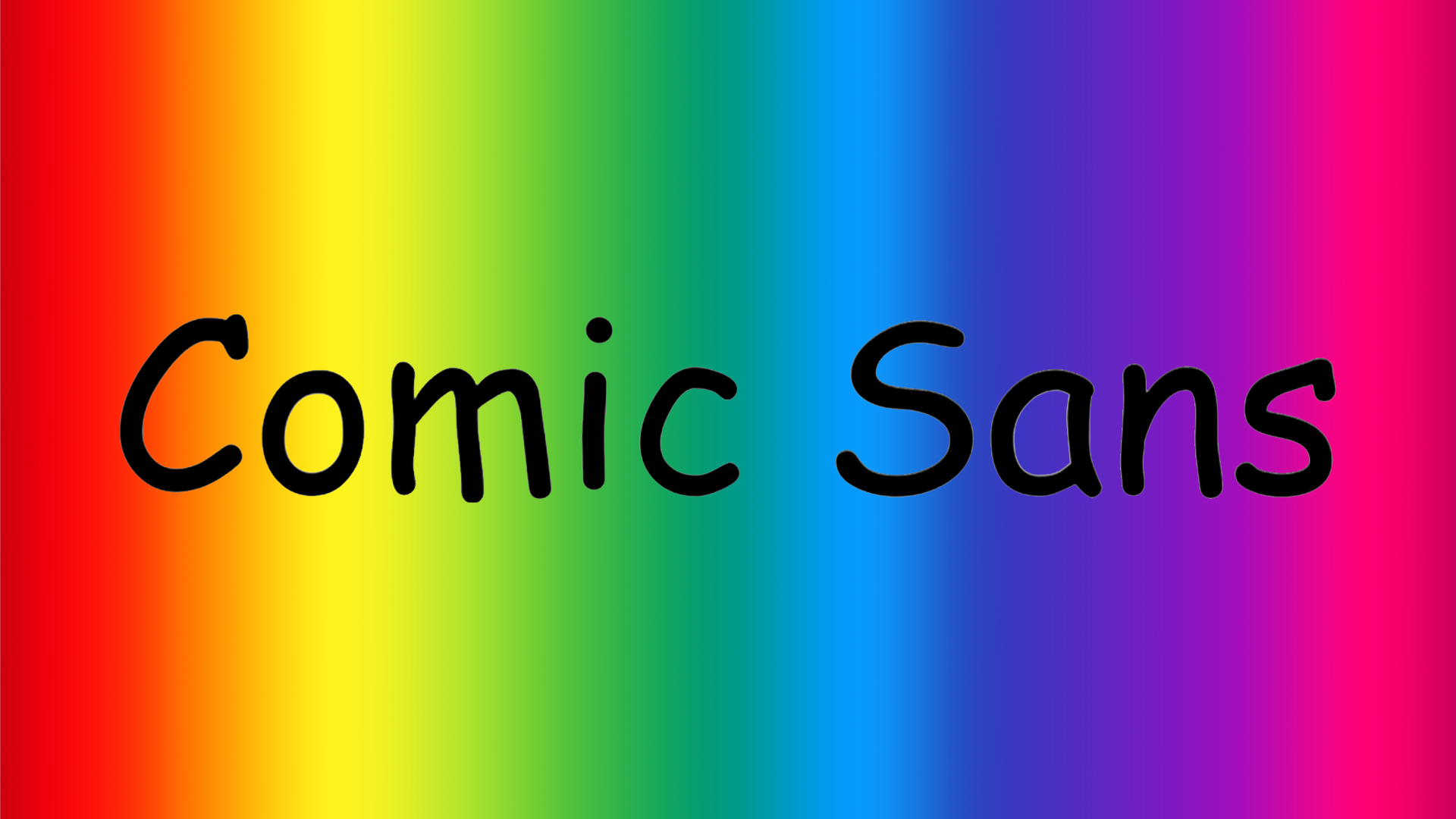
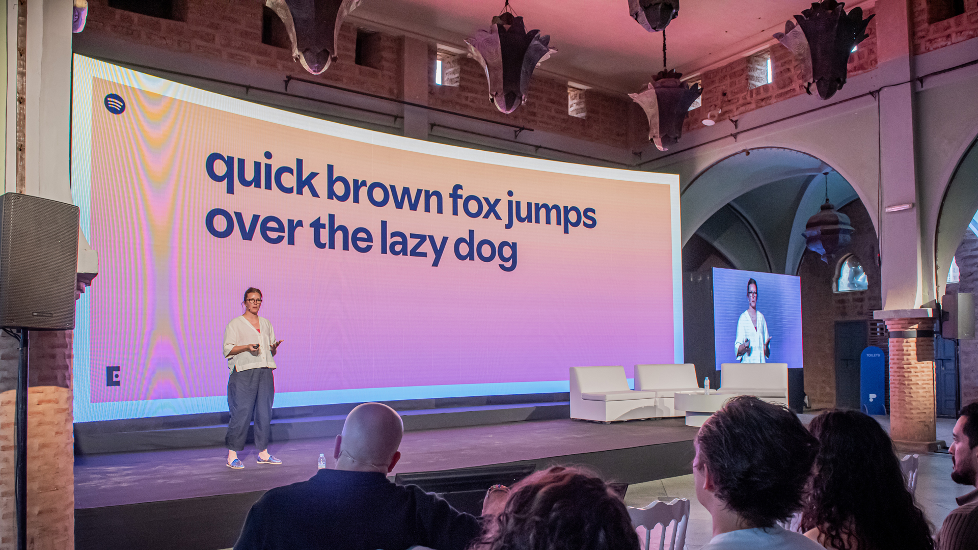
When I asked Spotify’s staff typographer, Bianca Berning, what trend she wished would die, she pointed to a misconception that she’s heard going around at the moment, about one of the most controversial fonts around, Comic Sans.
“A lot of dyslexic people say that they prefer to read things in Comic Sans. And there's a really good logical reason for that, which is that in Comic Sans, because everything's hand-drawn, none of the letters look alike, so they're a lot easier to differentiate from each other. If you have an uppercase letter ‘S’ and a number ‘5’ in Comic Sans, they don't look alike. But if you had them in another font, like a sans serif, they look a lot closer to each other.
Sign up to Creative Bloq's daily newsletter, which brings you the latest news and inspiration from the worlds of art, design and technology.
If you are dyslexic, having differentiation between letters and numbers can be useful, because it stops your reading flow from being interrupted. "I think Comic Sans does that well,” said Bianca. “But because some people said that that works really well for them, there's now a general perception that Comic Sans is the most legible font for dyslexic people, which is not how it works. Dyslexic people – or everyone that I have spoken to – have different preferences.
“You can't make these kind of sweeping generalisations and claims that one thing works best for a whole group of people,” she summed up.

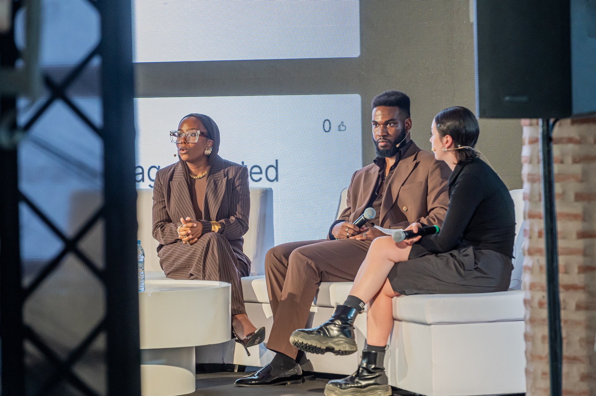
Nkenna Amadi, co-founder and lead web designer and developer of The Blackpepper Studio, also argued that you can’t take one rule and apply it to everything. The trend he wanted to die was “neon greens that pop”. He explained that they can fit in some spaces and work for some brands, but they don’t work for everyone. “There’s also a lot of research that goes into what they’ve chosen,” he said, “and that’s not necessarily translated to your brand. It’s not just a case of copy paste.”
The problem is, he says, when people think a trend works nicely for someone, so they think “let me put this in my work as well. Shiny doesn’t always mean better.”
Nkenna’s co-founder, Asmah Mansur-Williams, brought up “everyone using sans serifs… I think we need more characterful type.” But she caveated that “when it’s done right, it’s good”. It’s just when it’s not done right that’s the problem.

Rather than focusing on one specific trend, Jonas Hegi, co-founder and executive creative director of Builders Club, thinks we should look more closely at the things we don’t like.
“I think as a creator or someone who wants to be creative, it's important to sometimes look further that what you like and get inspired by things you don't like,” he said. And he suggests going one step further. “Try to understand why people like them.”
This is a particularly useful when you don’t like something everyone else loves. “I think understanding why something you don't like is loved by millions is a really interesting exercise,” he said. “Like knowing your enemies… So I'm not genuinely against anything... Out of things I don't like, I get inspiration to do something, maybe the absolute opposite.”
What trend do you wish would die? Let us know in the comments.
Find out more about Paradigms.

Rosie Hilder is Creative Bloq's Deputy Editor. After beginning her career in journalism in Argentina – where she worked as Deputy Editor of Time Out Buenos Aires – she moved back to the UK and joined Future Plc in 2016. Since then, she's worked as Operations Editor on magazines including Computer Arts, 3D World and Paint & Draw and Mac|Life. In 2018, she joined Creative Bloq, where she now assists with the daily management of the site, including growing the site's reach, getting involved in events, such as judging the Brand Impact Awards, and helping make sure our content serves the reader as best it can.
You must confirm your public display name before commenting
Please logout and then login again, you will then be prompted to enter your display name.
