
There was a time when a logo refresh barely registered outside the design community. At most, it sparked a few tweets, and maybe a rant from a typography nerd about the poor kerning of the logotype.
Now, even the smallest brand tweak can trigger a full-blown public reckoning.
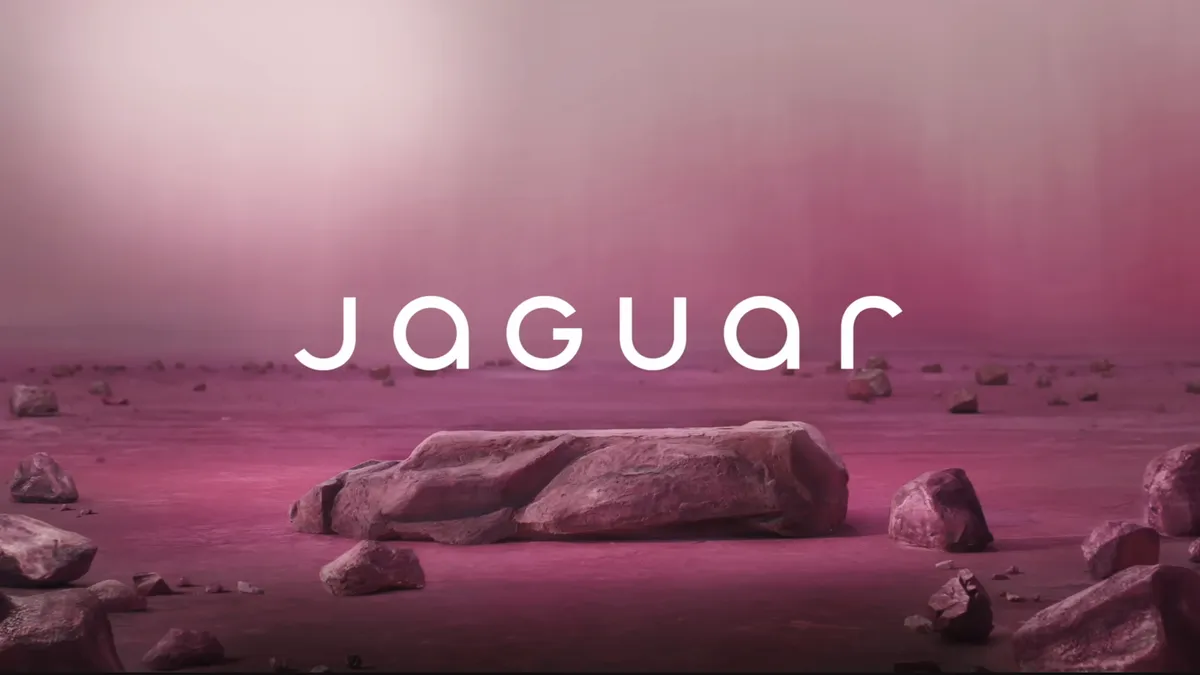
Bud Light, Cracker Barrel, Jaguar, Tropicana, Gap. Big names. Big rebrands. BIG Backlash. Rebrands have become cultural events, often judged in the court of public opinion before the ink on the new guidelines has even dried.
Is this a reflection of where we are as a society? In light of cultural fatigue and rising polarisation, rebrands have become high-risk moments for companies, where design is a proxy for much deeper tensions.
Change fatigue is real, and it’s shaping how we respond to design
Change used to be a staple of progress and forward momentum, but in an age of relentless change: technological, societal, environmental, political. It feels like a constant state of flux. Since the financial crisis of 2008, we seem to be living through one generational crisis after the other.
And people are tired.
In constant crisis mode, even a subtle logo tweak can feel like one disruption too many. When everything else is shifting, we try to cling to the familiar. And few things are more familiar than a brand that’s been with us for decades. A brand that we have grown up with. A brand that we may not have even realised, we held so close to our hearts until it suddenly changed.
That’s why backlash against rebrands often isn’t really about the design itself, but rather what that change represents
That’s why backlash against rebrands often isn’t really about the design itself, but rather what that change represents. A loss of identity. A break with tradition. Another institution “modernising” in a way that feels uninvited and inauthentic.
Designers need to understand this. When rebranding in a change-fatigued world, taking a neutral stance becomes a minefield. You think you have all bases covered, but if you are a big brand, you may carry a lot of cultural baggage. Ignore that baggage, and the backlash could be fierce, potentially changing the very course of your business.
Logos are emotional objects
People don’t love brands because they look good. They love them because they’re familiar, consistent, and emotionally resonant. The same way we return to a childhood game or a worn-in pair of trainers – if we see a brand we recognise, we will feel comfortable, content, even safe.
So when a brand ditches its serif, swaps its colours, or goes full minimalist (not design’s finest moment), it can feel like an act of erasure. And while sometimes that change is necessary, the emotional cost should never be underestimated, especially when the brand in question belongs to an organisation that’s been a part of people’s lives for generations.
Done carelessly, a rebrand can fracture the trust and equity a brand has spent decades building.
Not all rebrands are created equal
Change is often essential. The real issue is how that change is approached.
Spotify can tweak its icons without much fuss because it operates in a context of constant digital evolution. Its audience expects change. But when Jaguar or Cracker Barrel rebrands, they’re playing with a different emotional register. These are brands with heritage, nostalgia, and cultural significance at their core, meaning that a different level of care is required.
Also, too often, rebrands are driven by internal politics: a new CMO wanting to make a mark, a consultancy eager to prove its worth, a boardroom enamoured with the aesthetic of change.
But when design is separated from cultural intelligence, the results are often tone-deaf. You don’t just risk alienating existing customers, you risk becoming a story for all the wrong reasons. Just ask Jaguar, whose attempt to shift its brand away from an older demographic backfired with everyone, even the people they were trying to appeal to. The cost is still being tallied.
Design, fairly or not, is often a proxy for tensions that have little to do with kerning or colour theory
In today’s hyper-polarised climate, even design decisions get dragged into broader debates. A font change becomes a stand-in for corporatisation. A colour shift is read as a political statement. Design, fairly or not, is often a proxy for tensions that have little to do with kerning or colour theory.
This is another reason why it is critical for organisations to embed design in their strategic thinking. That means involving designers in the big conversations early, when key decisions are being made – not at the end of the process. In doing so, you are bringing cultural intelligence into the conversation sooner and, therefore, helping navigate the choppy waters of today’s complex context.
Designing in a change-fatigued world
You would be forgiven in thinking that design is under attack right now.
For designers, maybe that’s a good thing. It means that the work being done is more visible and more consequential than ever.
These 'attacks' also act as a reminder that every design decision is as much an emotional decision as a business critical one. Especially in times of instability, when people are projecting their own meaning and prejudices on even the smallest of changes.
That doesn’t mean we should stand still, though. This is not a reason to freeze in fear of backlash. It means we need to approach change with more cultural intelligence, more empathy, and more humility.
For rebrands that really worked, see the best rebrands of the 2020s (so far).

