
“What’s that?” my teenage daughter asked as I unpacked the groceries.
“Yoghurt,” I said, already anticipating the response.
“But that’s not our yoghurt,” she declared as though I’d just committed a branding felony (such things exist in our household).
“I know, but it’s all they had,” I explained. Suddenly I wondered if I should have gone to another store.
But here’s the thing: When my daughter rejected the brand stunt double, it wasn’t about dairy. It was about continuity. She was defending the design codes she’s grown up with, the signals that make one brand hers and another an imposter.
Because the right brand (and the right logo) apparently matters. For my daughter, it’s sacred. But she’s not alone in that. I feel the same way about Heinz, JIFF, and Lay’s – the original holy trinity of childhood essentials. Like Levi’s, no other brands would even be considered. Families carry these brand loyalties like heirlooms and pass them down from one generation to the next.
Or will they?
Research shows Boomers tend to be loyal to as many as ten or more brands – while Gen Z, on the other hand, keeps their brand circle tight, like an exclusive club with only a few VIPs. Nearly six-in-ten Gen Zers say they feel a connection with people who use the same brands they do, and almost half admit to judging others by their brand choices (yes, they’re watching you).
Millennials? They add a layer of “moral seasoning,” choosing brands that speak to their values, especially sustainability.
For brands, it’s not about pleasing every generation (impossible), but a matter of building a design language that’s like a good family recipe
For brands, it’s not about pleasing every generation (impossible), but a matter of building a design language that’s like a good family recipe – consistent enough to be recognisable but flexible enough to taste fresh at every table.
Because whether it’s yoghurt or music streaming, your brand’s equities and design aren’t just solving today’s problem. They’re shaping brand love that could get passed down, challenged, or coldly rejected by generations to come.
Brands grow with us
Firstly, let’s agree that generational brand allegiance isn’t formed in a single purchase. Kids grow up with brands they didn’t choose but inherited – just like their sports team. By the time they hit their teenage years, they start to negotiate influence in the cart and eventually become independent decision-makers as young adults. And if the brand has navigated these life stages well, these same individuals pass it along to their own households.
That journey isn’t automatic. A single substitution, like my yoghurt error, can expose the fragility – or resilience – of that loyalty. Brands that endure do so by managing both continuity and evolution in a way that feels natural across life stages. If done successfully, the brand you grow up with becomes your first choice when you’re making your own purchase decisions and you want your kids to feel those same warm and fuzzies about the same brands as you did.
Design: The secret to endurance (it’s not magic)

Generational branding often gets reduced to stereotypes – Boomers want X, Millennials want Y, and Gen Z wants Z with extra avocado. But brands that survive and thrive don’t play to tired tropes – they create systems of meaning that flex with culture, without losing their soul.
Campaigns expire faster than the rejected yoghurt brand in my fridge. Copywriting trends age worse than dad jokes. But visual equity – the DNA of logos, colour palettes, typography, and increasingly motion – builds the backbone that carries your brand across decades and generations that will buy your brands today and imprint them on their kids.
The best identities are elastic. They hold steady in the middle, while letting the edges bop to the beat of now
And here’s the trick: It’s not about locking your brand into a glass case. The best identities are elastic. They hold steady in the middle, while letting the edges bop to the beat of now.
Look at Oatly, whose packaging can go from cheeky to downright bizarre without losing their unmistakable vibe, or Kind snacks, whose bold colours and playful fonts shout “healthy snack” while still feeling fresh.
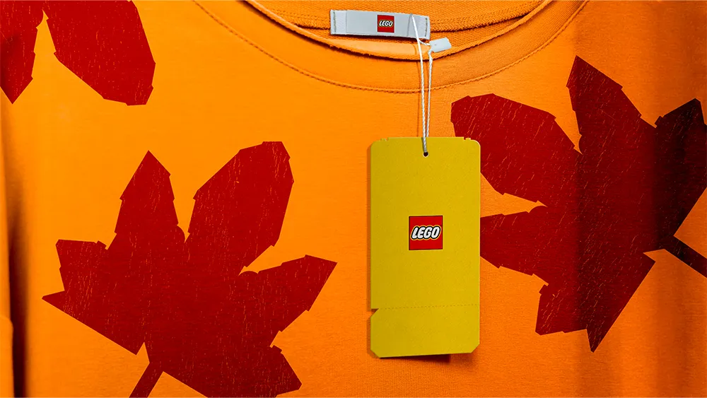
Consider Spotify: Its green is untouchable, but gradients, motion systems and secondary palettes flex constantly. LEGO’s red brick is immutable, yet its graphic language adapts for parents, kids, and adult collectors alike.
This is visual equity as intergenerational memory. Design is not decoration – it is the semiotic glue that allows a brand to remain meaningful as the consumer’s role evolves from passive household member to active decision-maker.
Semiotics: Reading across generations

Visual assets carry cultural meaning, and those meanings shift with each generation.
- Colour signals different things depending on life stage and era: muted earth tones might appeal to Millennials’ sustainability lens, while vibrant neon gradients resonate with Gen Z’s digital-native energy.
- Shapes and forms act as continuity markers: the silhouette of a bottle, the curve of a logo, or an iconic motif can remain instantly recognisable even as style evolves.
- Patterns and typography provide texture and tone: typefaces communicate playfulness or heritage; patterns modernise without abandoning familiarity.
In short, the same assets can be read differently depending on who’s holding the carton, creating a bridge between past, present and future consumers.
Visual Equity: Anchor and edge (think of it like denim)

Here’s the magic formula: Anchor and edge.
- The Anchor: Your brand’s core – think of it as your logo’s favourite pair of jeans. Reliable, classic, and always in style.
- The Edge: Where things get interesting – the fun patterns, ripped knees, or bright patches – that let your brand stay youthful and relevant without losing the denim vibe.
Take Patagonia’s steady, simple logo and classic colour palette as the anchor, while their campaigns adapt fluidly to changing conversations around the environment. Or Chobani, whose wordmark is the anchor but whose packaging evolves with trends and stories.
This balance isn’t just design theory – it’s self defence against the march of time (and the at times disapproving looks of teenagers).
The Next Frontier: AI and immersive worlds (yes, we’re really going there)

The next big challenge for generational branding will come from AI-native and immersive environments, where brand assets can’t just sit pretty – they need to live and breathe dynamically.
Consider how Roblox, which rebranded in 2022 with a simple abstract logo, actually lets its community create an endlessly shifting visual world. For younger generations growing up in immersive spaces, branding isn’t a fixed image; it’s a shared, participatory language.
Trying to fix generational gaps with one viral campaign or the “right” influencer is a momentary point of relevancy. Brand loyalty isn’t owned anymore – it’s borrowed, rented, and occasionally stolen. Your design system, if flexible and smart, buys you time and trust while you renegotiate relevance with each new generation.
Brand Loyalty: Narrower, hotter and more judgmental than ever
Boomers were collectors, but Gen Z? They’re curators with serious judgment skills. They hold fewer favourite brands, but those brands better be good – or else risk social exile. Millennials? They add a values checklist that brands can’t ignore.
The upshot: surviving a generational handoff means your brand has to earn the right to keep flexing its identity. No more safe bets. No more “one-size-fits-all.”
Bringing it back to yoghurt (aka the morale of the story)
So when my daughter rejected the substitute yoghurt brand, she was defending the brand she’d grown up with and the recognition of the signals that make one brand hers and another an imposter. The brand’s visual equities and design have deeper meaning beyond history, and we need to respect that.
Generations of my family have had their brand loyalties. The question is: Will they endure? That depends on whether her yoghurt brand continues to evolve its design language – anchoring to core equities, flexing with cultural codes – enough to remain recognisable not just in our fridge, but in hers one day.
If not, there are plenty of other yoghurts happy to grow up with her.
For more on great branding, see the best rebrands of the 2020s.

