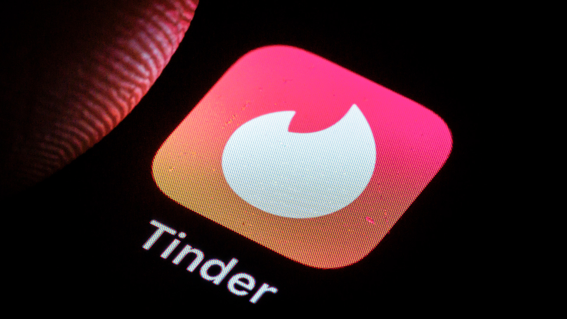
People are getting burned by the Tinder logo curse
Flame logos are threatening to end relationships

Sign up to Creative Bloq's daily newsletter, which brings you the latest news and inspiration from the worlds of art, design and technology.
You are now subscribed
Your newsletter sign-up was successful
Want to add more newsletters?
It's pretty hard to reinvent the wheel when it comes to app icon design. When scalability is a priority, there are only a handful of shapes that really work, but there's one design that you might want to avoid (for the sake of your users, at least).
Those of you who have fought in the trenches of the online dating scene will likely be familiar with the humble Tinder logo – a pink background with that unmistakable white flame. While it might be one of the best logos in terms of recognition, it turns out that other apps opting for the flame are getting their users burned.
Merry Christmas to everyone except the person who designed incidentio logo so my gf thinks I have tinder in my dock pic.twitter.com/caaFOIjK6WDecember 22, 2025
The curse of the flame logo has been raging for years – most recently when an X user aired his frustrations, writing "Merry Christmas to everyone except the person who designed incidentio logo so my gf thinks I have tinder in my dock". While the colour palette is completely different, the flame was enough to raise suspicions, proving just how notorious the Tinder logo has become.
Article continues belowA similar complaint was made about the HotStock app icon, which, unlike Incident.io, shockingly resembles the Tinder logo. "Big thanks to @HotStock_io for almost ending my relationship this weekend. Fancy changing the logo up a bit guys? She almost killed me," one irked X user wrote.
Big thanks to @HotStock_io for almost ending my relationship this weekend. Fancy changing the logo up a bit guys? She almost killed me. pic.twitter.com/x0xtRYwlXOFebruary 15, 2021
It's not just boyfriends getting into hot water – over on TikTok, a female user complained that her period tracking app Flo caused similar relationship tension. I'm sad to reveal there isn't a flame to be found. I guess even the pink and white colour palette is off the table now.
@livviekumar Ok flo stop tryna gaslight me into thinking im cheating
♬ genesis grimes - tchisa !
While there's no solution to the great flame phenomenon (besides a ban on all app icons using flame logos or pink and white palettes), there's a lot to be learned from the controversy. Tinder has proved that a strong, prevailing visual identity is essential for building a brand, allowing it to carry the flame for over a decade.
For more creative inspiration, check out our pro tips for logo design or take a look at why all AI logos look the same.
Sign up to Creative Bloq's daily newsletter, which brings you the latest news and inspiration from the worlds of art, design and technology.

Natalie Fear is Creative Bloq's staff writer. With an eye for trending topics and a passion for internet culture, she brings you the latest in art and design news. Natalie also runs Creative Bloq’s 5 Questions series, spotlighting diverse talent across the creative industries. Outside of work, she loves all things literature and music (although she’s partial to a spot of TikTok brain rot).
You must confirm your public display name before commenting
Please logout and then login again, you will then be prompted to enter your display name.
