Design fans are lusting after this raunchy Netflix poster
It’s straight out of BookTok.

Sign up to Creative Bloq's daily newsletter, which brings you the latest news and inspiration from the worlds of art, design and technology.
You are now subscribed
Your newsletter sign-up was successful
Want to add more newsletters?
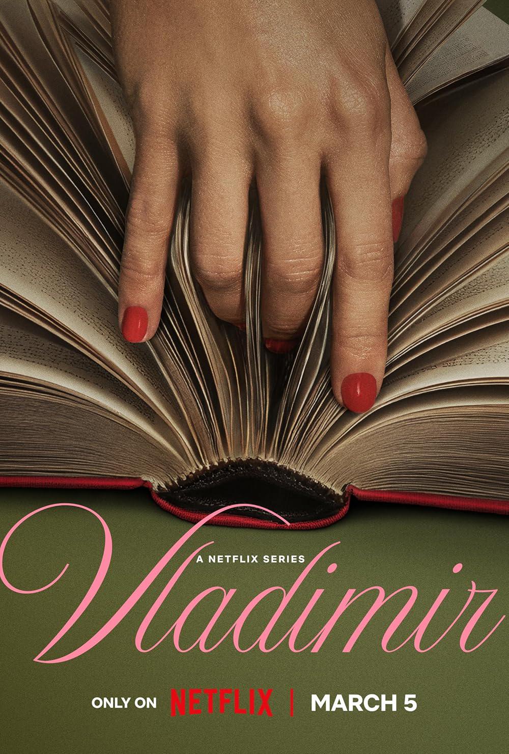
A new poster for Netflix's upcoming series Vladimir has caused a stir for its suggestive design. Dissected by BookTokkers and design fans alike, the provocative poster has sparked debate over its racy imagery, which some believe to be the work of AI.
The best poster designs are designed to be eye-catching, and Vladimir's poster takes that to the next level. Simple yet attention-stealing, the poster demonstrates how striking visuals paired with tasteful typography can elevate an unassuming design concept.

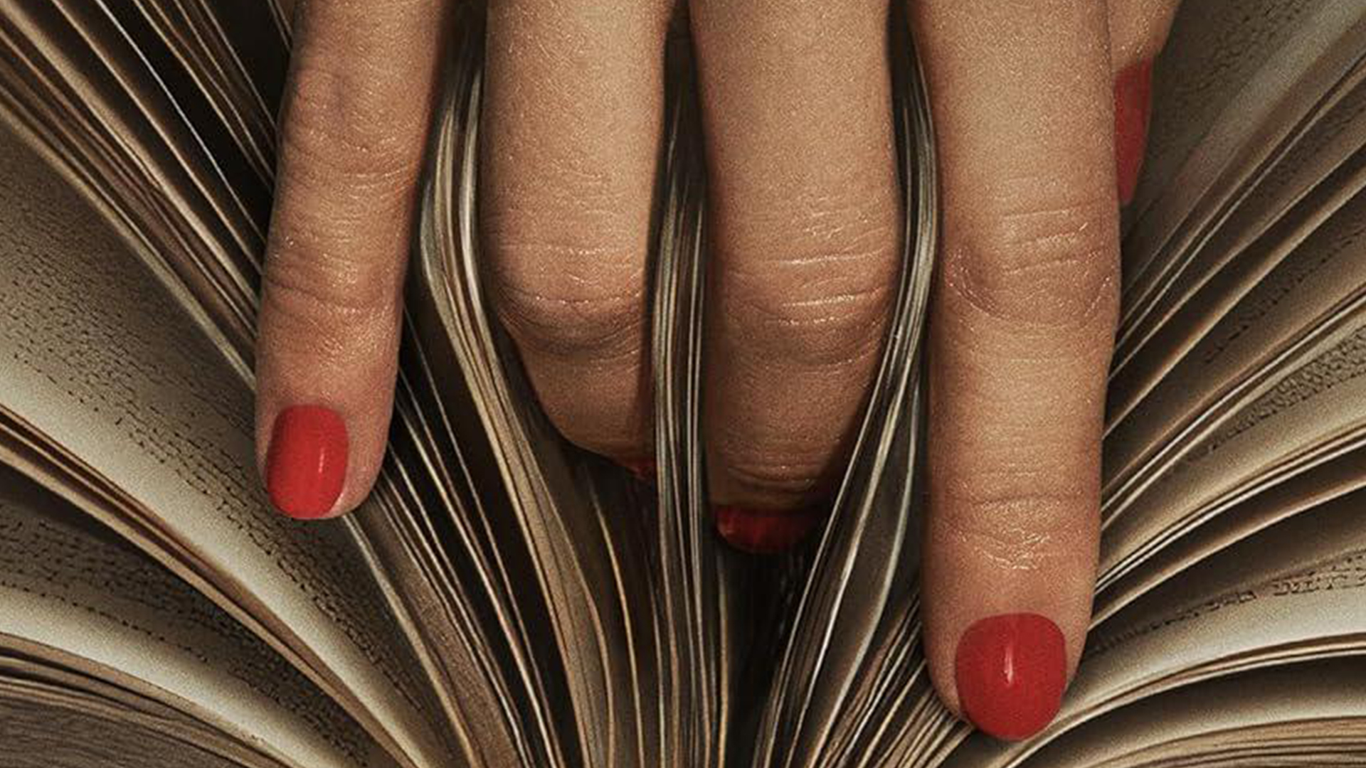
The poster in question features a spread book with a woman's hand suggestively splitting its pages. The colour palette is kept simple with sultry reds and mossy green, which contrast against the delicate baby pink cursive typography. (My only creative gripe is the Netflix logo smacked in the centre, but something tells me this was a non-negotiable addition).
Article continues below"Great metaphor!" one fan wrote in response to the design. "Concept is strong tbh. Hand and book visual is intriguing," another added. Others were clearly surprised by the starkness of the design, with another design fan writing, "Wow I never thought I'd ever see a book/vagina metaphor, but here we are lol. This rules!" Sadly, with so much AI slop circulating online, some were quick to question the design, pointing out the nonsense squiggles on the pages and the way the fingers 'melt' into them. (The validity of these claims was hotly debated, so I can neither confirm nor deny their truth.)
For more controversial design news, check out Jeanette McCurdy's new book cover that's designed to make you squirm or take a look at this raunchy ad that's unexpectedly important.
Sign up to Creative Bloq's daily newsletter, which brings you the latest news and inspiration from the worlds of art, design and technology.

Natalie Fear is Creative Bloq's staff writer. With an eye for trending topics and a passion for internet culture, she brings you the latest in art and design news. Natalie also runs Creative Bloq’s 5 Questions series, spotlighting diverse talent across the creative industries. Outside of work, she loves all things literature and music (although she’s partial to a spot of TikTok brain rot).
You must confirm your public display name before commenting
Please logout and then login again, you will then be prompted to enter your display name.
