The one design trend I want to see more of in 2026

Sign up to Creative Bloq's daily newsletter, which brings you the latest news and inspiration from the worlds of art, design and technology.
You are now subscribed
Your newsletter sign-up was successful
Want to add more newsletters?
When I think back on the year just gone, there are two pieces of creativity that truly stand out for me personally. Not because they were the best or the cleverest or anything. But because when I first encountered them, they filled my internal world with more joy, excitement and wonder than anything other than falling in love or the birth of a child has any right to do.
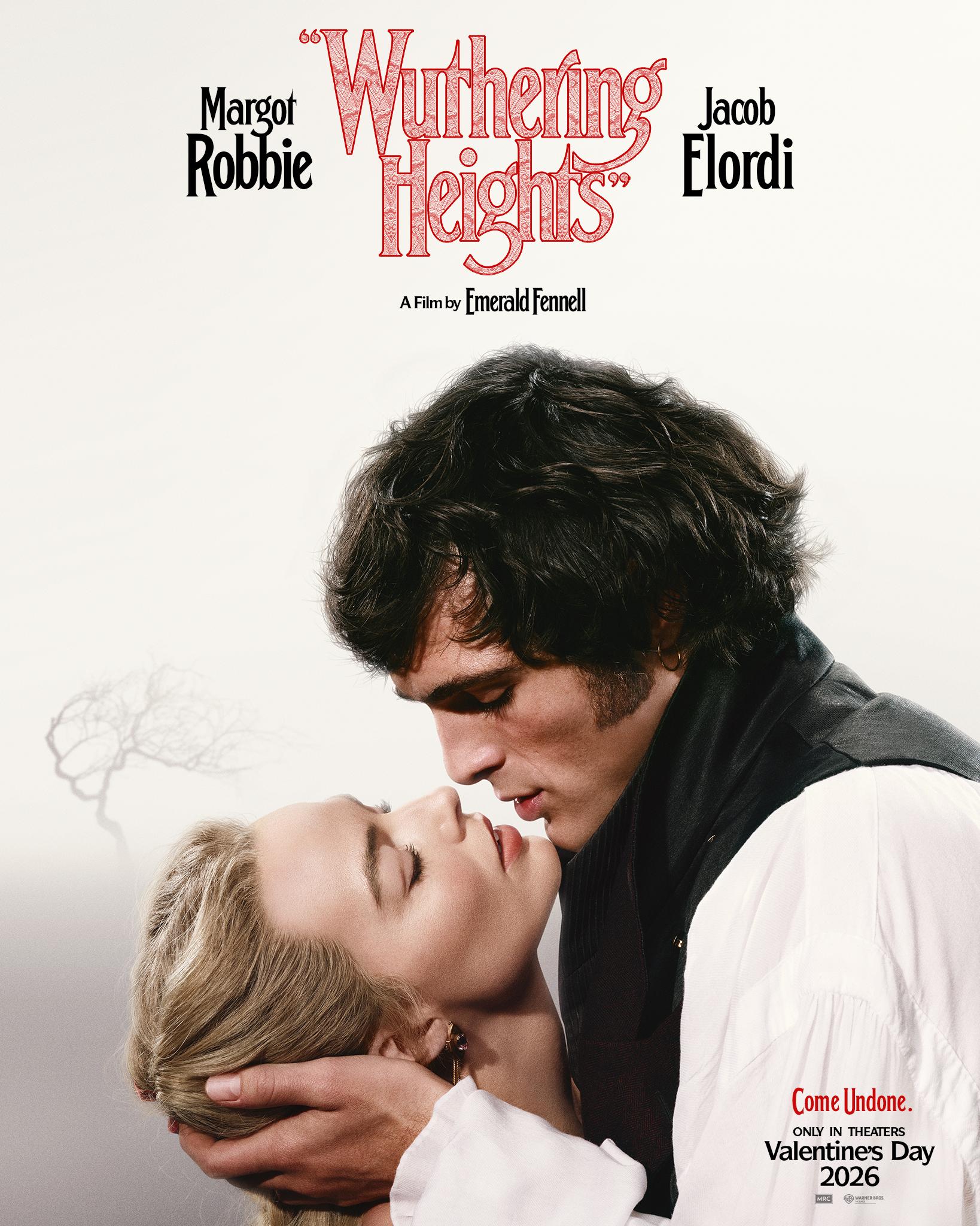
One was watching Taylor Swift's The Fate of Ophelia brought to magical, Busby Berkeley-inspired life on the silver screen, which felt like the future of cinema. The other was unexpectedly seeing the poster for the forthcoming film Wuthering Heights on a bus stop. The moment it entered my eyeline, my heart starting racing and my mind screamed: "I have to see this movie!!!"
Which, on the face of it, is kind of odd. Because I'm honestly not a fan of the Brontë novels. And though my adoration of Sinead O'Connor previously lured me to watch the 1992 film version, I still left feeling 'meh'. So why did this poster make my heart sing? Well, the presence of Margot Robbie always helps. But really, it's the design.
Article continues below 
Look at that hand-drawn title treatment. The way the title sprawls across the top in sketchy, uneven letterforms that feel like they've been carved into the moors themselves. There's something raw and windswept about it, something that captures the untamed passion of the story without needing to scream about it. Elsewhere, the red colouring adds warmth and romance, whilst the slightly rough texture gives everything an authenticity that speaks to the period setting – yet without feeling stuffy or museum-like.
This is typography that understands its job isn't just to tell you what the film is called. It's there to make you feel something about it. To transport you. To seduce you into caring about a story you might otherwise scroll past.
And Wuthering Heights isn't alone. Looking at the slate of 2025/6 releases, there's a clear appetite amongst designers to break free from the tyranny of bland, interchangeable type.
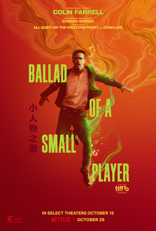
Look at the poster for Ballad of a Small Player, which uses bold yellow-green lettering that practically vibrates against the orange and red gradient background. The typography is confident, unapologetic, stacked at dynamic angles that mirror the energy of Colin Farrell's pose. It's not trying to whisper sophistication at you; it's shouting personality. The addition of Chinese characters adds another layer of visual interest and cultural specificity that grounds the design in its Macau gambling setting.
Sign up to Creative Bloq's daily newsletter, which brings you the latest news and inspiration from the worlds of art, design and technology.

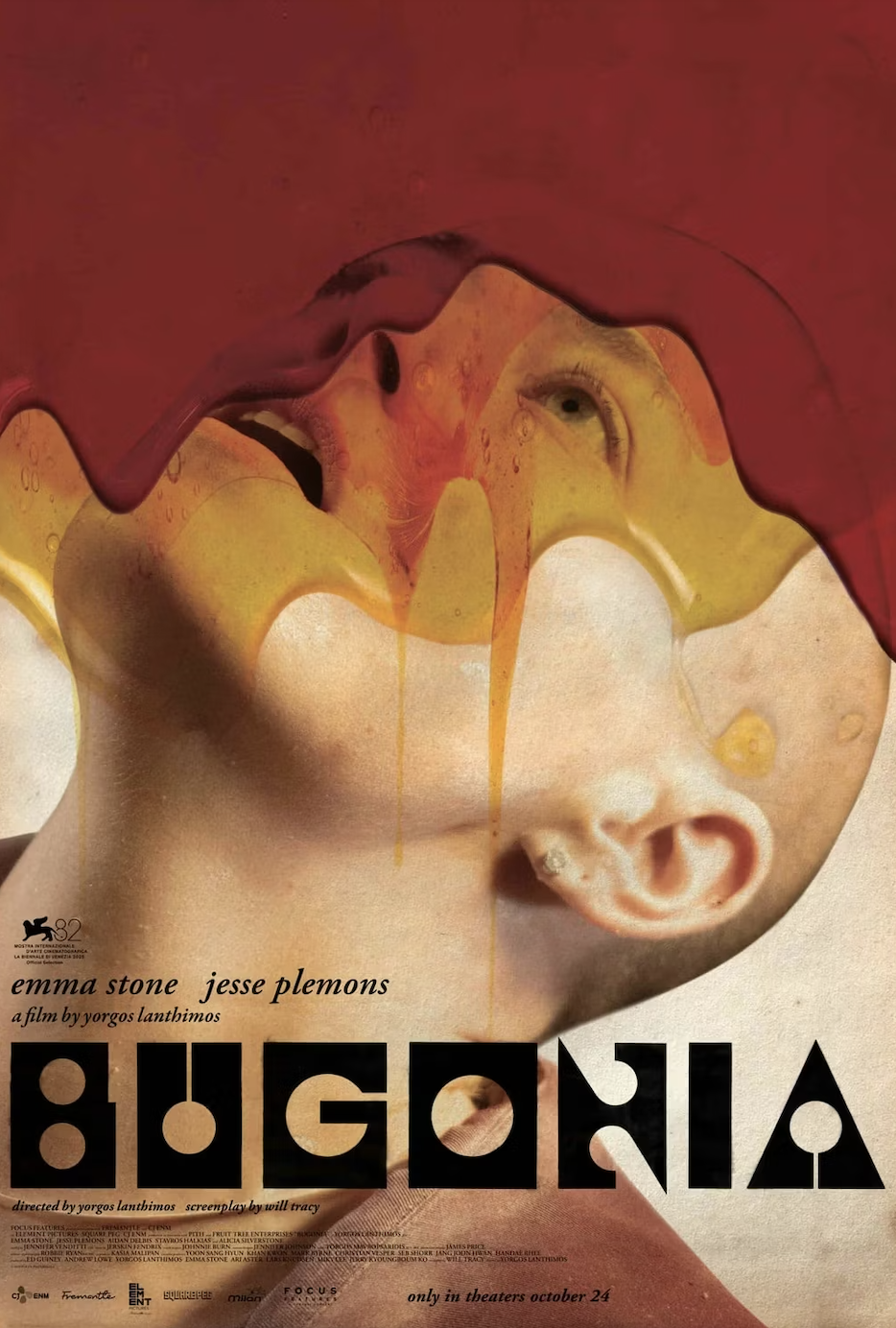
Then there's Bugonia, which takes things in a completely different direction. Here, the typography is geometric and modernist, with circles and bold shapes that feel almost like a visual puzzle. Combined with the surreal imagery of melting, flowing paint across the face, it creates something genuinely arresting. You stop scrolling. You stare. You wonder what on earth this film could possibly be about. Which is exactly what a poster should make you do.

Guillermo del Toro's Frankenstein poster, meanwhile, goes full maximalist, embracing ornate illustrated typography that would make a Victorian book cover designer weep with joy. Surrounded by rich jewel tones, decorative flourishes and symbolic imagery, the type becomes part of an intricate visual tapestry. It's unashamedly elaborate; perfect for del Toro's gothic sensibilities.
Breaking free from the algorithm
What unites all these designs is a willingness to take risks and express individuality. They're not trying to appeal to everyone; they're trying to speak directly to the audience who will actually love these films. In an age where algorithmic thinking has flattened so much design into safe, tested mediocrity, seeing this kind of bold creative expression feels genuinely thrilling to me.
I desperately hope this trend spreads beyond film posters into other areas of design. Imagine if brands, publishers and digital platforms started embracing this same energy. What if our streaming services didn't all look identical? What if book covers started taking risks again? What if the websites we visit daily had actual personality instead of following the same three templates?
Because here's the thing: we're all exhausted. Streaming fatigue is real. Doomscrolling has become our default state. Everything feels a bit beige, a bit samey, a bit depressing. In 2026, we need design that sparks joy, that creates genuine emotional connections, that reminds us why we fell in love with visual creativity in the first place.

Tom May is an award-winning journalist specialising in art, design, photography and technology. His latest book, The 50 Greatest Designers (Arcturus Publishing), was published this June. He's also author of Great TED Talks: Creativity (Pavilion Books). Tom was previously editor of Professional Photography magazine, associate editor at Creative Bloq, and deputy editor at net magazine.
You must confirm your public display name before commenting
Please logout and then login again, you will then be prompted to enter your display name.
