
It's been fruitful week for Apple fans, with the brand announcing new iPhones, iPads and MacBooks across the last three days. Perhaps the most interesting development is the advent of the MacBook Neo, a new, low-cost MacBook that starts at $599 and comes in some uncharacteristically fun colours. But for me, the most creatively exciting aspect of the whole thing has been the accompanying ads.
From audacious typographical treatments to some delightfully playful CGI, the ads for this week's products suggest a company rediscovering its sense of fun. And they haven't arrived a moment too soon; not only has Apple faced accusations of stagnating innovation of late, but it's also put out a string of curiously misjudged ads in recent years. But these look like a return to form.
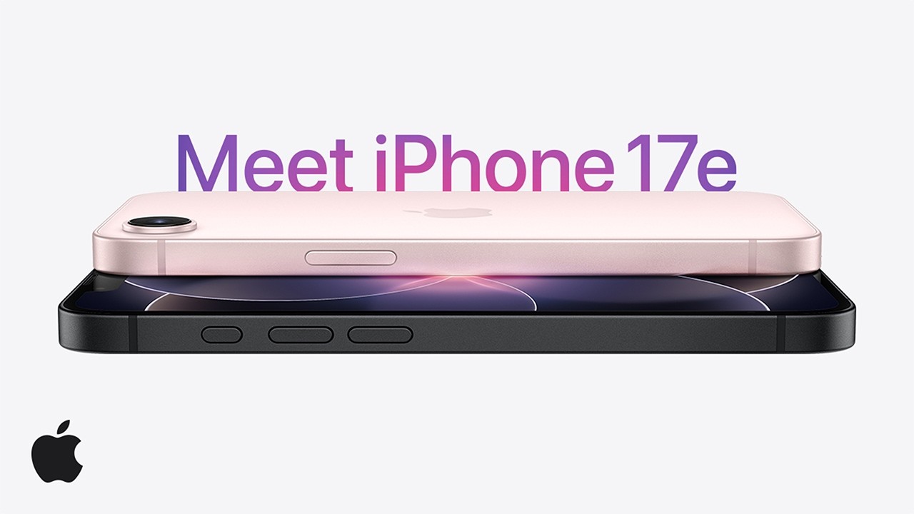
Many have picked up on the ad for the iPhone 17e, which features an array of maximalist graphics that could have been lifted straight out of a comic book. From shopping channel-style badges to VCR-esque blur, the whole thing looks borderline gaudy – an aesthetic one would hardly associate with Apple.
Meet Apple like you’ve never seen it before. pic.twitter.com/VmRaVNLO1zMarch 3, 2026
And yet, it works. Apple seems to be picking up on Gen Z's taste for all things Y2K and frutiger aero, putting out something that actually looks playful and, dare we say it, deliberately unpolished.
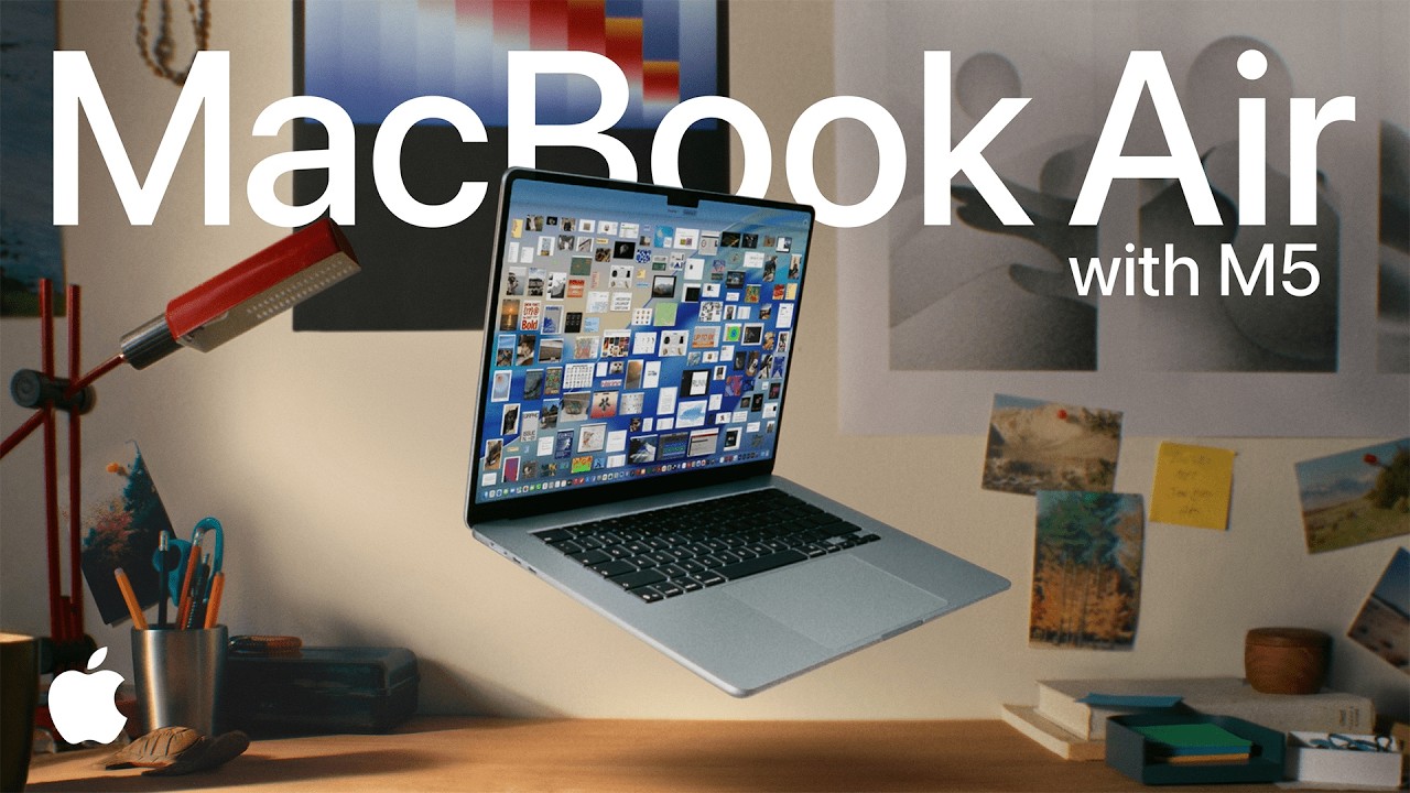
The MacBook Air M5 ad, meanwhile, features its own take on fun typography, with specs and features spelled out via various document and keynote windows on the laptop itself.
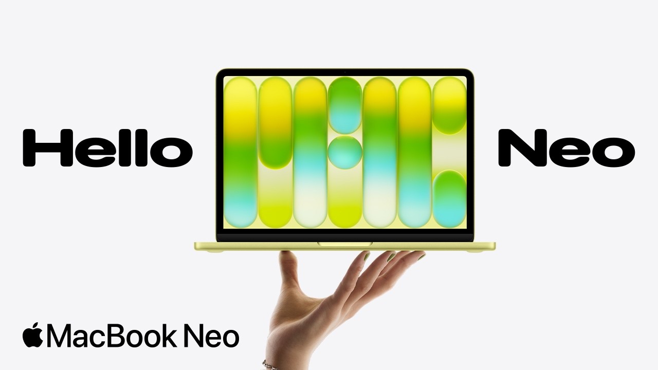
But Apple saved the best for last. The new MacBook Neo ad is not only delightfully playful, but it's also a technical marvel. Featuring a MacBook being, it appears, designed and created with bare hands, it's packed with impressive moments and ideas that make you appreciate tiny design details, such as the colour-matched feet.
Unlike the woefully misjudged 'crusher' iPad Pro ad, or that unfortunate Thailand-based ad (both of which were pulled in 2024), these ads are Apple at its best – simple yet inventive, playful yet impressive.
It's hard to pinpoint exactly when Apple's marketing began to feel stale, but I suspect it was around the time that the Coronavirus forced the brand to move its launch presentations online. Before, when keynotes took place on stage, each product's dedicated minute-long ad was a polished highlight. But when the entire hour or two of launches is conveyed via overly rehearsed and slick, shiny visuals, the sheen starts wearing off.
But here, I'm seeing some of the fun and inventiveness that defined Apple design and branding in the noughties. Roll on the ad for this year's rumoured folding iPhone.

