Why Gen Z is infatuated with the Frutiger Aero design aesthetic
We’re getting nostalgic for 2004.

Sign up to Creative Bloq's daily newsletter, which brings you the latest news and inspiration from the worlds of art, design and technology.
You are now subscribed
Your newsletter sign-up was successful
Want to add more newsletters?
As we look to the new year, it's hard to pinpoint the exact climate of current design trends. In a time where minimalistic design is becoming predictable and stale, younger generations are increasingly looking for inspired, dynamic design and where better to search than the past? For Gen Z, the latest aesthetic infatuation comes in the form of Frutiger Aero.
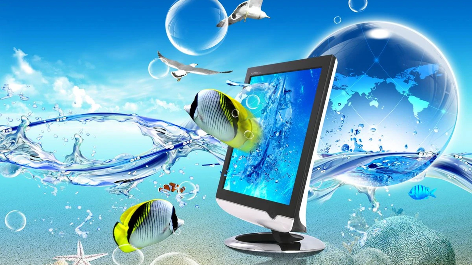
Dominating graphic design trends from 2004 all the way to the early 2010s, the aesthetic is formed of bright, skeuomorphic design, glossy textures and a refreshingly hopeful outlook of the future. With subdued designs such as Corporate Memphis slipping further into obscurity, perhaps it's time for colourful maximalist design to make a resurgence.

It's not entirely clear why Frutiger Aero resonates so strongly with Gen Z, but in part, it appears as a response to the rekindled love of aesthetics and subcultures. From dark academia to Barbiecore, Gen Z has embraced subculture like never before, finding comfort and community in niche aesthetics, but Frutiger Aero also possess a unique appeal in itself – nostalgia.
As a Gen Z, Frutiger Aero marks a simpler time of playful design – uncomplicated, unfussy and creative without self-consciousness. In a time of rapid technological advancement, Frutiger Aero imagines a world that's sleek and modern, softened by natural imagery and fresh colours that set it apart from the greyscape of minimalistic futurism.
Frutiger Aero derives as a subgenre of skeuomorphic design, incorporating 3D realism elements into its aesthetic. In an attempt to capture the past, TikTok users have begun reverting their phone home screens with skeuomorphic app icons and airy Frutiger Aero imagery, creating a jarring yet oddly comforting juxtaposition of modern technology and retro aesthetics.
Escaping the coldness of modern design, TikTok creator uxbyant reimagines modern app icons in Frutiger Aero, with glossy aquatic visuals and friendly colour schemes. With each reimagining incorporating dynamic shading, realistic textures and 3D elements, it marks a sharp contrast to modern design which in comparison, feels somewhat underdesigned.
Whether or not this TikTok trend marks a definitive resurgence of Frutiger Aero aesthetics, it's clear that Gen Z audiences are rejecting modernity in favour of creativity and colour. To resonate with young audiences, new graphic design trends benefit from learning from the past to bring back the element of playfulness that's been lost in recent times.
Sign up to Creative Bloq's daily newsletter, which brings you the latest news and inspiration from the worlds of art, design and technology.
For more design trends, take a look at why I'm glad Corporate Memphis style is dead or take a look at the logo design trends set to dominate 2024.

Natalie Fear is Creative Bloq's staff writer. With an eye for trending topics and a passion for internet culture, she brings you the latest in art and design news. Natalie also runs Creative Bloq’s 5 Questions series, spotlighting diverse talent across the creative industries. Outside of work, she loves all things literature and music (although she’s partial to a spot of TikTok brain rot).
