From moorland to Margot: what 179 years of Wuthering Heights covers can teach designers today
Sign up to Creative Bloq's daily newsletter, which brings you the latest news and inspiration from the worlds of art, design and technology.
You are now subscribed
Your newsletter sign-up was successful
Want to add more newsletters?
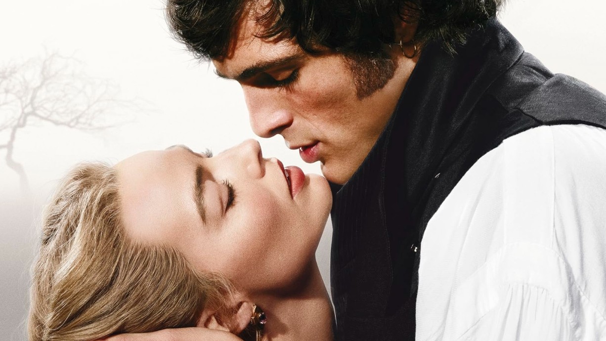
We'll have to wait until 13 February to watch the new Wuthering Heights movie, which stars Margot Robbie and Jacob Elordi, is soundtracked by Charli xcx, and has received a number of rave early reviews.
But in the meantime, at least we can acquaint (or reacquaint) ourselves with the story itself, through a tie-in book released by Penguin Random House today.
Its cover is basically the same design as the movie's poster, showing the two leads in an intense embrace. With its generous use of white space and evocative typography, I'd call it a winner. But it's by no means the first attention-grabbing book cover to grace Emily Brontë's tale of tortured lovers, first published in 1847.
Article continues belowAnd for anyone working in branding, publishing or visual storytelling, the visual journey this novel has been on offers a masterclass in how graphic design can shape our collective imaginations.
19th and 20th centuries
Sophia Schoepfer, fiction editor at Folio Society, sets out the context. "Book covers form a fascinating visual history; a catalogue of our changing tastes," she explains. "Each one is designed with the contemporary audience in mind, and they're continually remade to appeal to readers of the day; something you can clearly see in the many iterations of Wuthering Heights."
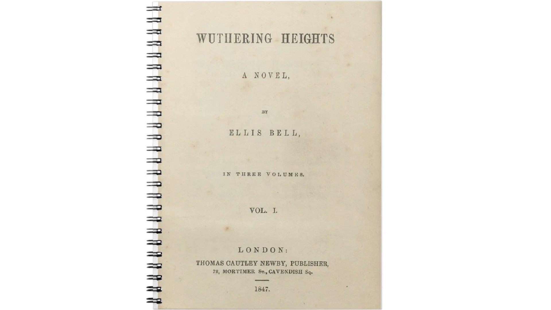
And there have been many such iterations, representing a wide range of approaches. "The 1847 original, with its plain text and simple binding, is a typical example of Victorian publishing norms that favoured function over form," notes Patrick Llewellyn, CEO of 99designs.
By the mid-20th century, though, publishers began experimenting more.
Sign up to Creative Bloq's daily newsletter, which brings you the latest news and inspiration from the worlds of art, design and technology.
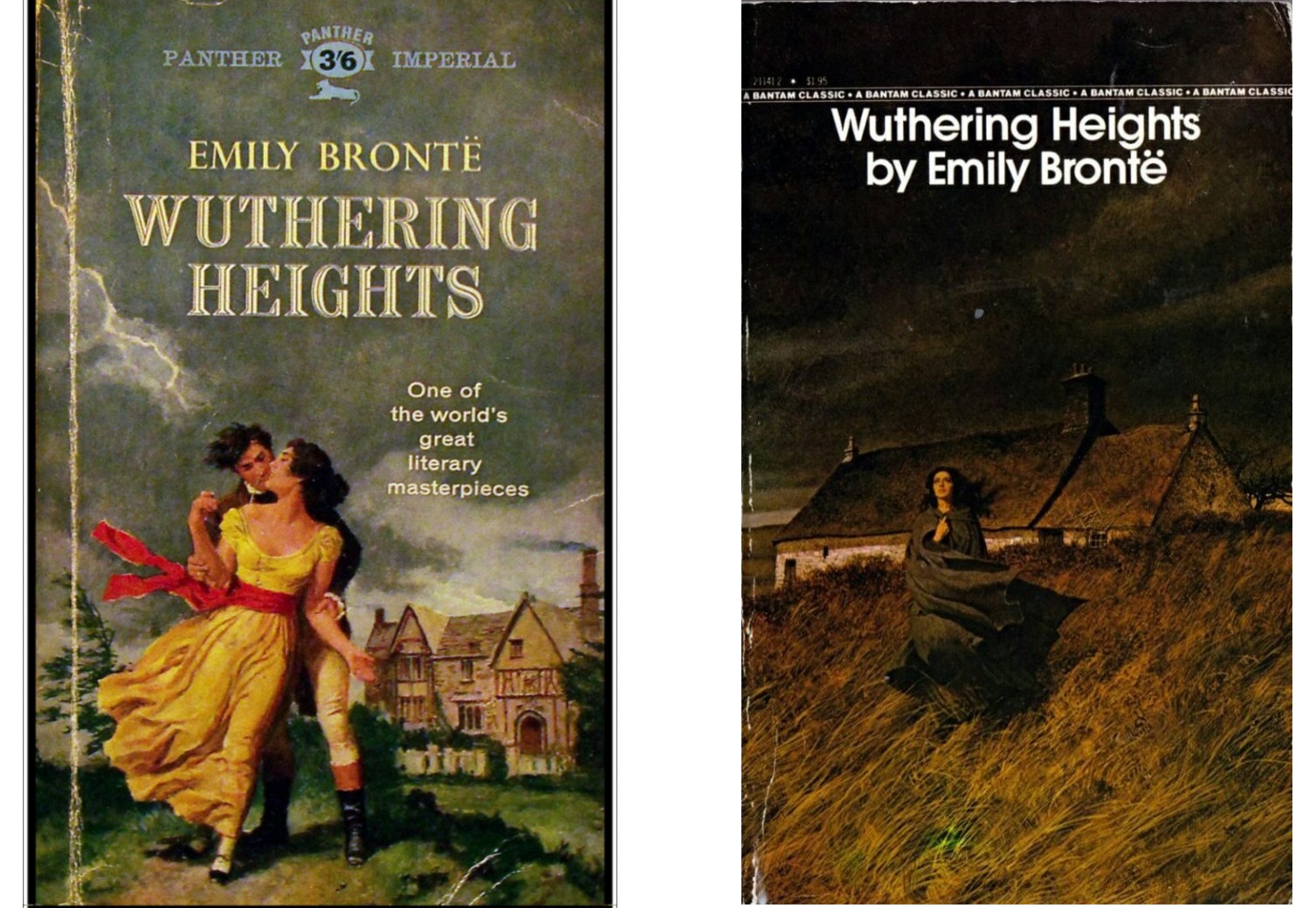
"Cover design shifted toward narrative illustration, reflecting changing interpretations of the novel's themes," says Patrick. "Romantic realism, a popular style for book covers and film posters of the time, framed the story as a sweeping romance, as seen in the 1961 Panther Imperial edition."
By the 1970s, interest leaned more toward the novel's psychological intensity. "Cover designs such as the Bantam 1974 edition, with art by Robert McGinnis, increasingly saw Cathy isolated against the dark, stormy Yorkshire Moors."
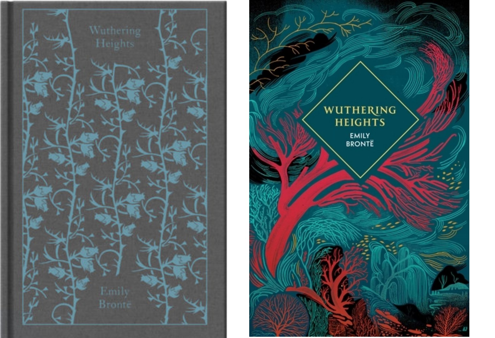
In the 21st century, things have evolved further. "More recently, Penguin’s clothbound versions have used floral or abstract geometric patterns with no narrative cues, while other editions feature highly stylised graphics," says Patrick. "These reflect broader digital-era trends we saw in our analysis of 25 years of New York Times bestsellers, where illustrated romance covers jumped from 50% in 2023 to 100% in 2025, replacing the genre’s longstanding preference for photography."
"This move away from literal scenes toward covers emphasised emotional themes and symbolic imagery," adds Katie Edmundson, senior designer at Studio Noel. "This approach aimed to tap into the YA market, even leaning into Twilight-style aesthetics."
So where does that leave us today? Sophia sees physical book design as becoming more important than ever in the mid- to late 2020s.
"In recent years, there's been a resurgence in the appreciation of books as valuable, tangible possessions," she observes. "It feels like a response to our increasingly digital world. We have a renewed appreciation for the crafted and the physical. Along with that has come a gravitation towards beautiful, enduring design and high-quality hardback editions of these classic novels."
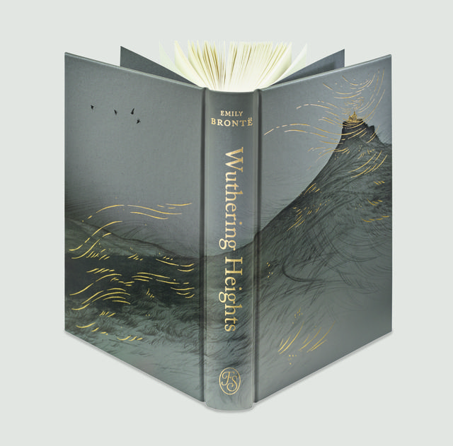
As for Brontë's tale specifically, Duncan Kelly, associate creative director at Siegel+Gale, has an interesting theory. "Wuthering Heights endures because it's a love story that transcends time, place and genre – and that is precisely why its covers so often struggle," he argues. In his view, "designs have repeatedly returned over the years to familiar visual shorthand: a brooding Heathcliff, a doomed embrace, blasted landscapes and rugged moors. These motifs are recognisable and well-intentioned, but they tend to describe the surface, rather than the emotional scale of the novel."
The 2026 movie tie-in
All of which brings us to the Penguin cover released today. Sophia is clear-eyed about its commercial logic.
"Movie tie-in covers are a mainstay of publishing and a common sight in bookshops," she notes. "The main purpose of a tie-in is to catch the attention of people who’ve seen the film and now want to read the source material, or those considering watching it, but who have always meant to read the book first. They’re yet another way of reinventing a book for new audiences."
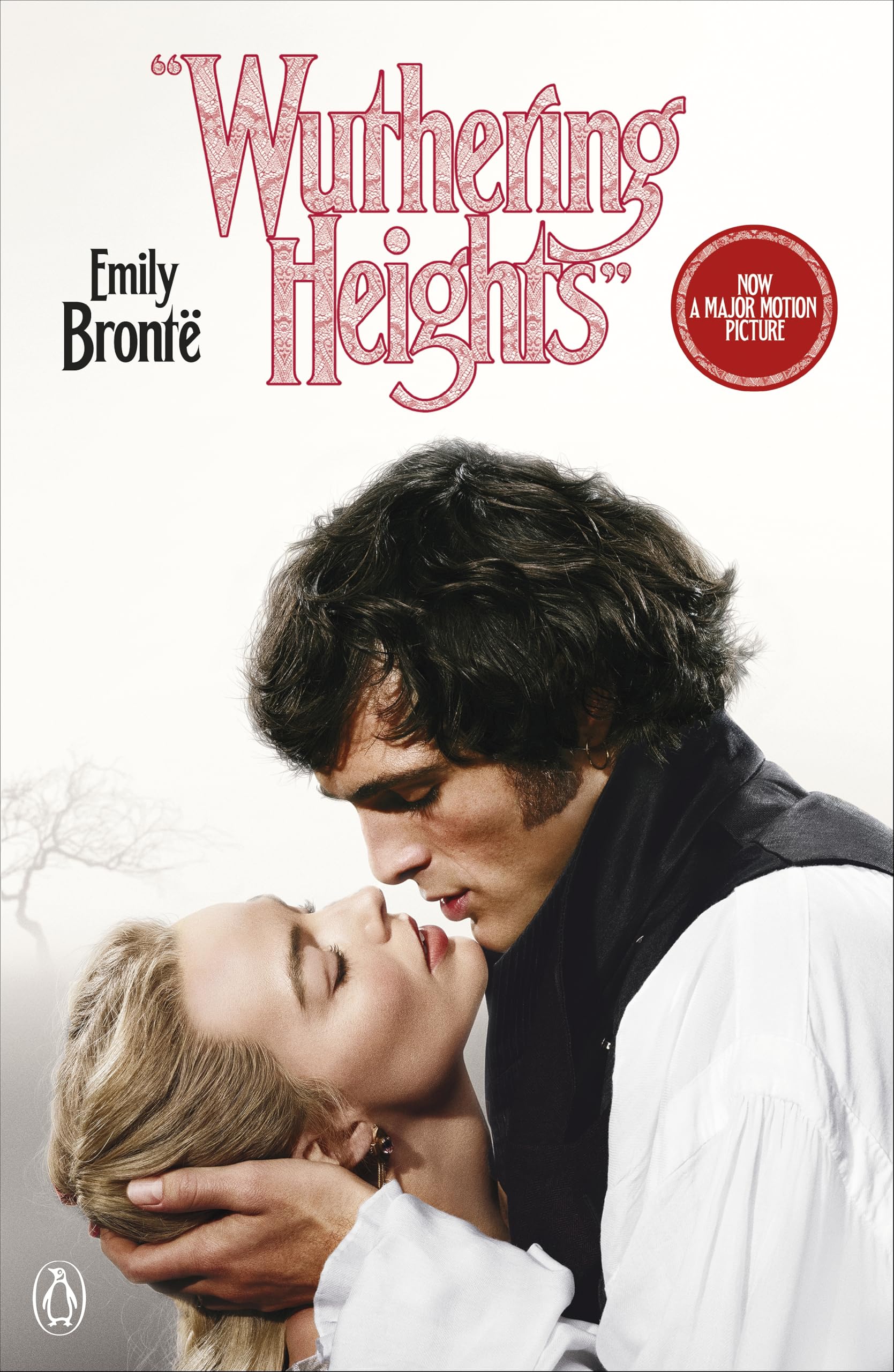
Of course, some readers are put off by this and prefer a more classic look to their literature. "Others value the space to form their own image of the characters, rather than having them shaped by an actor’s portrayal," adds Sophia. "But ultimately, I think there’s room for both approaches."
Interestingly, in this instance, the visual inspiration doesn't just go in one direction. Director Emerald Fennell actually cast Jacob Elordi in the movie because, she says, "he looked exactly like the illustration of Heathcliff on the first book that I read".
To my mind, this admission reveals something profound about the power of visual design. "It shows that covers aren't just packaging; they're often our first visual interpretation of a story," says Patrick. "With Wuthering Heights being such a prolific book, lots of people have strong opinions about it, so this casting choice could be a great way to acknowledge that history."
Sophia agrees. "To me, it speaks to the power of cover design and illustration not only to sell the book but to deepen the experience of the story," she says.
Main takeaways
The main takeaway to all this? I think it's that book cover design is both more complicated and more powerful than many people might think. As Lara Green, creative producer and brand strategist at People People, points out: "The discipline sits at a fascinating intersection. It's shaped by the art – the novel – and the consumer – the culture. Its job is to interpret both.
"For a classic like Wuthering Heights, whose story remains constant amidst an ever evolving society, a look at its many covers over time becomes a study in how design reflects its moment. How each era interprets Gothic romance, how genre expectations shift, and what different audiences want from the books they're buying. Honouring the source material while making something undeniably of the moment; I think that's goal of most book cover designs."
And as Patrick adds: "A teenager discovering Wuthering Heights through a contemporary cover isn't diminishing the novel for someone who treasures their vintage Penguin edition. Different covers coexist and serve different readerships. This variety keeps classics alive in the cultural conversation, as each new design prompts fresh engagement with the text."
For more on Wuthering Heights, see our critique of the trailer.

Tom May is an award-winning journalist specialising in art, design, photography and technology. His latest book, The 50 Greatest Designers (Arcturus Publishing), was published this June. He's also author of Great TED Talks: Creativity (Pavilion Books). Tom was previously editor of Professional Photography magazine, associate editor at Creative Bloq, and deputy editor at net magazine.
You must confirm your public display name before commenting
Please logout and then login again, you will then be prompted to enter your display name.
