The Traitors branding is murderously good. Design experts explain why
Sign up to Creative Bloq's daily newsletter, which brings you the latest news and inspiration from the worlds of art, design and technology.
You are now subscribed
Your newsletter sign-up was successful
Want to add more newsletters?
For a mainstream TV programme, The Traitors has pulled off something rare. It's turned paranoia, backstabbing and psychological manipulation into appointment television for everyone from grandparents to Gen Alpha.
The murder-mystery reality show has become a global phenomenon, with different versions being produced in 35 nations and counting (though we think the UK version is the best). And while much of the attention goes to the scheming and personalities, the show’s branding plays a huge role in why it works so well.
I spoke to designers and strategists in international agencies to explore what The Traitors gets right, and why its branding feels so unusually powerful.
Article continues belowNot one identity, but many
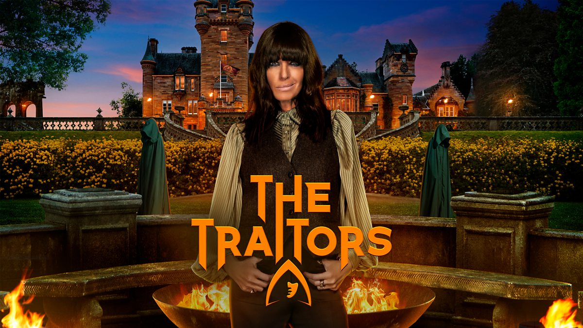
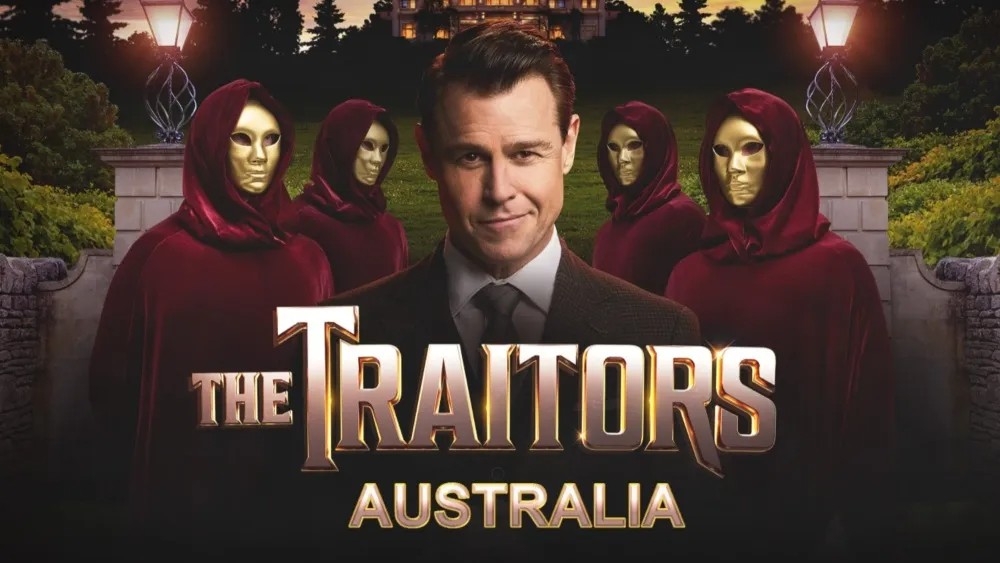
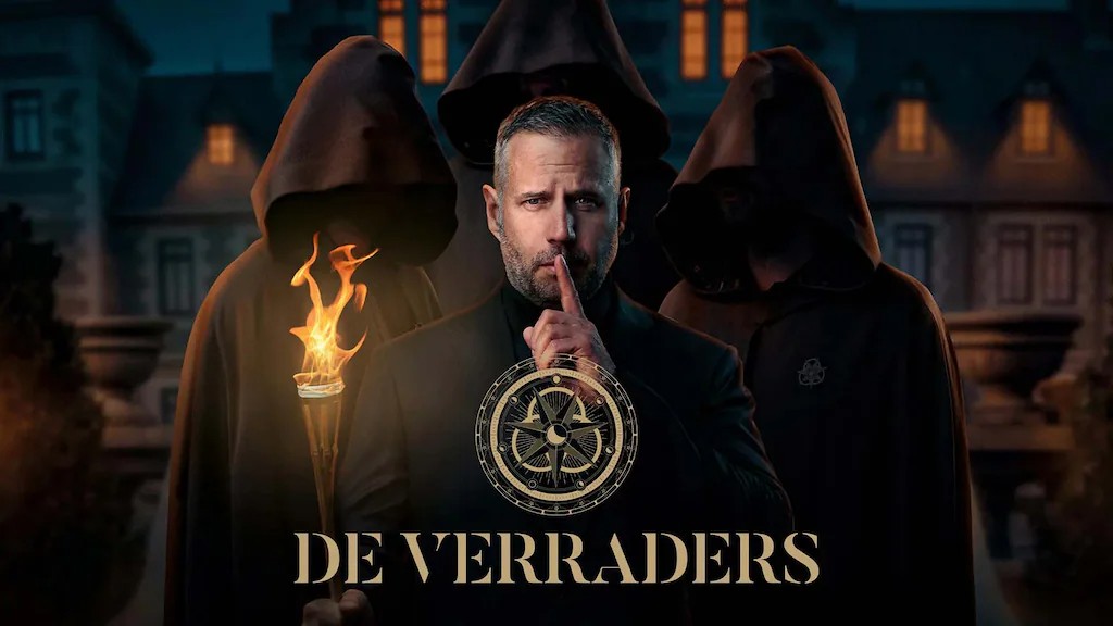
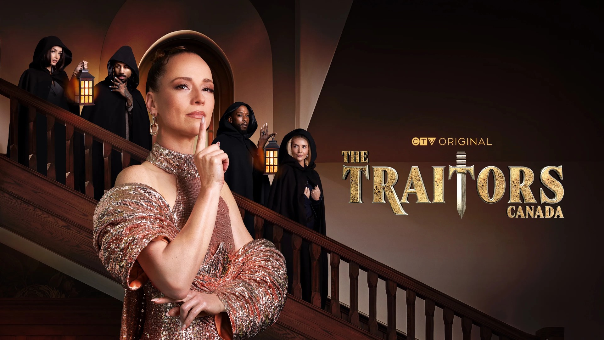
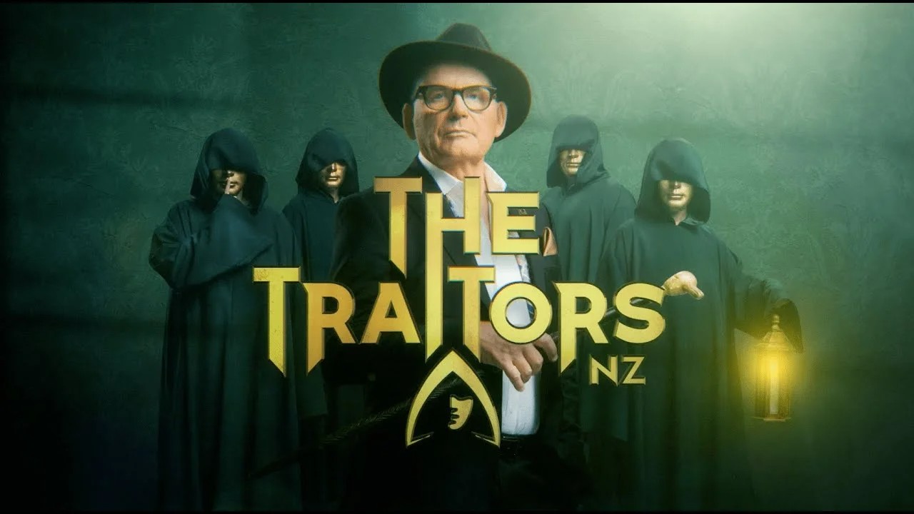
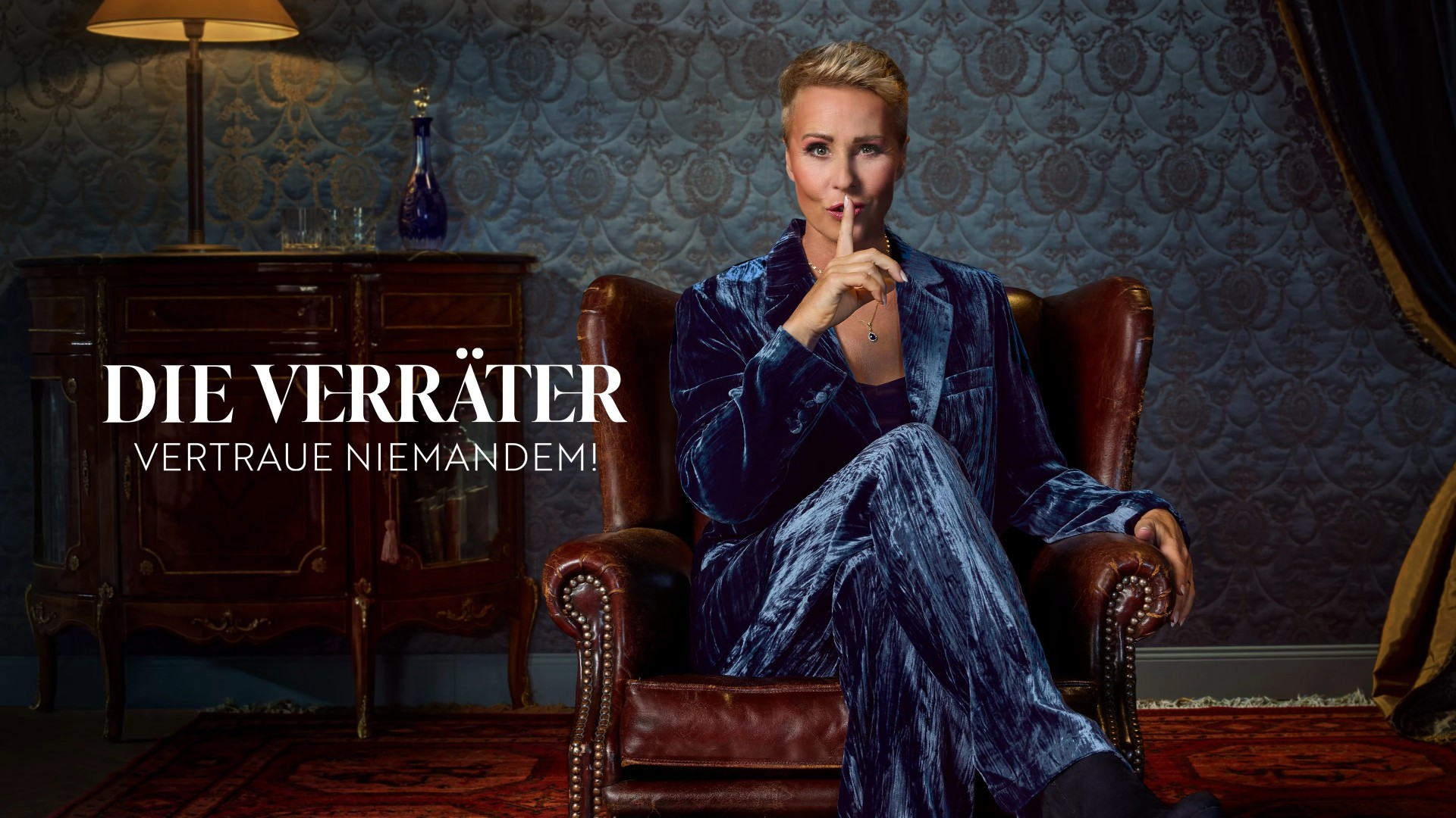
The first thing to note is that The Traitors doesn’t have a single, unified global identity. For example, the UK logo features a hooded figure, the US logo uses a dagger, and the Dutch logo centres on a round table graphic.
At first glance, that might seem counter-intuitive. Same format, same rules, so why not the same logo? But for Abbi Chard, design director at Cummins & Partners (and a self-confessed superfan), this flexibility is precisely the point.
“While the game is consistent, the settings, budgets and cultural tones are wildly different,” she explains. “Forcing one premium identity across every version would actually do a disservice to how local each series feels.”
For Danielle Smith, design director at FutureBrand, the UK’s hooded figure emblem succeeds because it communicates the show’s themes with such economy. “It smartly signals mystery and two-faced treachery while remaining distinctly recognisable,” she explains. “It feels sinister, but not threatening – and it even faintly resembles Claudia Winkleman. Or maybe that’s just me.”
Sign up to Creative Bloq's daily newsletter, which brings you the latest news and inspiration from the worlds of art, design and technology.
“The orange and burgundy palette has become instantly recognisable,” adds Abbi. “Orange brings tension and unpredictability; it’s warm, but not comforting, while burgundy adds power, tradition and secrecy. Together, they feel dramatic without tipping into parody.”
For these reasons, Danielle feels the UK emblem has more emotional pull than some global alternatives. “The cloaked figure is a more distinctive asset than the US dagger,” she argues. “It’s less literal, more psychological. Other versions may be relevant to their formats, but they don’t land with the same sense of unease.”
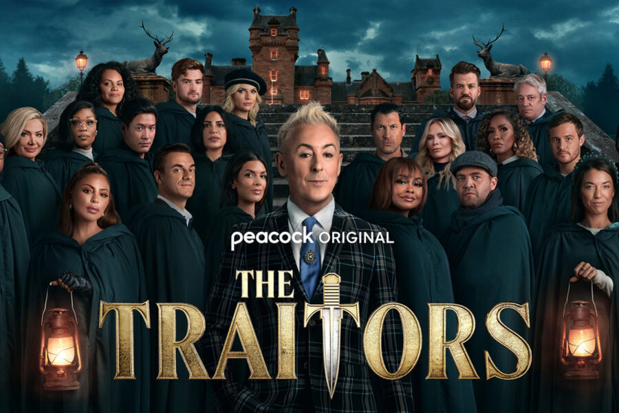
There is love for the US branding elsewhere, though. As Yves Louise, junior strategist at BUCK, enthuses: “The serif font makes the game feel ancient, like it’s been in play for centuries. The dagger in the second ‘T’ weaponises the title, giving a new show instant credibility.”
As a whole, she feels the typography is doing a lot of heavy lifting here. “The Traitors has to sit somewhere between camp and competition," Yves reasons. "The reflective gold lettering adds theatricality, while the sharp angles remind us of the cutting tongues around the table.”
Beyond the logo
Strong branding, of course, goes far beyond a clever mark. As Chris Allen, creative director at Sullivan, puts it, The Traitors benefits from a fully realised brand world. “Cloaks, the castle, the round table; paranoia, ritual, dark humour; language like ‘faithful’, ‘traitor’ and ‘banishment’; the music… these all function like brand assets,” he explains. “They create instant recognition and emotional response without explanation.”
That consistency allows audiences to re-enter the world immediately, series after series. In this light, the introduction of the red cloak in the latest UK series might be seen as "a brand upgrade rather than a format change ... Like a successful product refresh, it's added a new iconic asset and fresh marketing imagery without alienating fans. Because strong brands don’t constantly reinvent themselves; they layer meaning over time.”
Ritual makes rules feel real
Ritual is where The Traitors truly differentiates itself. Yet some of these elements, too, vary internationally. In the Australian version, for instance, contestants wear Venetian-style masks during Traitor selection; something Yves feels is “a missed opportunity” elsewhere.
The UK version, meanwhile, excels at using its environment to heighten tension. “Traitors meet after midnight, walking into the turret cloaked in silk-lined capes,” she explains. “It’s an atmospheric build that communicates the power they hold. Set design and staging are everything."
Even seemingly mundane spaces play a role in this. For example the breakfast room, with its cavernous silence and slow reveals, reinforces the sense that the game consumes everything. “For the players, this is all they’re living and breathing,” Yves notes – and the design ensures viewers feel that too.
Another key asset in this wider branding mix is the presenter themselves. Chris points out that in the UK, Claudia Winkleman doesn't just host but “acts as the show’s brand guardian. Her delivery is ominous but playful, theatrical but self-aware. She signals how seriously each moment should be taken.”
All the presenters subtly shape the tone of their local versions in this way. “Alan Cumming’s high-camp styling in the US adds theatricality," notes Yves, "while Claudia’s look – the bangs, the eyeliner – adds mystery. In Australia and New Zealand, where hosts lean less camp, the entire game feels different as a result.”
John Paolini, partner and CCO at Sullivan, adds that the addition of a celebrity version of The Traitors UK has helped elevate the brand world further. "What makes this series so impactful is that familiar stars are stepping into the world of reality TV to genuinely participate in its community," he explains. "This has helped it break traditional reality-TV boundaries, drawing in a broader, multi-generational audience."
Cultural differences
For Graham Sykes, global executive creative director at Landor, the UK version works because it understands something specific about British culture. “This is a country steeped in treason, trial and quiet condemnation,” he explains. “We’re polite on the surface, judgemental underneath, and the visual identity leans straight into that psychology.”
Every sensory detail reinforces it, too. The breakfast bell isn’t decorative; it’s a stress device. The classical music carries cultural memories of fate and judgement. The rituals feel less competitive than ceremonial. “The show doesn’t decorate betrayal,” Sykes says, "it ritualises it. You’re not watching people get voted out; you’re watching them be condemned.”
The US version, in contrast, "leans more theatrical and Disney-esque, amplifying performance and personality. The Dutch original is sharper and more cerebral. The Australian and Canadian versions soften the ceremony slightly."
Overall, what emerges from these discussions is that The Traitors succeeds around the world not just because of a cool wordmark, but because of rigorous world-building across every touchpoint, tailored to the local audience. As Chris puts it: “The logo is just the badge. The real value lies in the rituals, the symbols and the emotional experience the brand consistently delivers.”
So whether you’re Team Faithful or Team Traitor, one thing’s clear: The Traitors isn’t just well-designed; it’s designed with a deep understanding of culture, psychology and ritual. And that’s why, years in, we’re still completely obsessed.

Tom May is an award-winning journalist specialising in art, design, photography and technology. His latest book, The 50 Greatest Designers (Arcturus Publishing), was published this June. He's also author of Great TED Talks: Creativity (Pavilion Books). Tom was previously editor of Professional Photography magazine, associate editor at Creative Bloq, and deputy editor at net magazine.
You must confirm your public display name before commenting
Please logout and then login again, you will then be prompted to enter your display name.
