Traitors' secrets revealed! How the hit show's atmospheric branding was created
Sign up to Creative Bloq's daily newsletter, which brings you the latest news and inspiration from the worlds of art, design and technology.
You are now subscribed
Your newsletter sign-up was successful
Want to add more newsletters?
Until recently, it felt like the days when we all watched the same thing at the same time were long gone. Our viewing habits had been so fragmented by streaming that the concept of gathering around the water cooler to discuss what we'd seen felt like a relic of the 20th century.
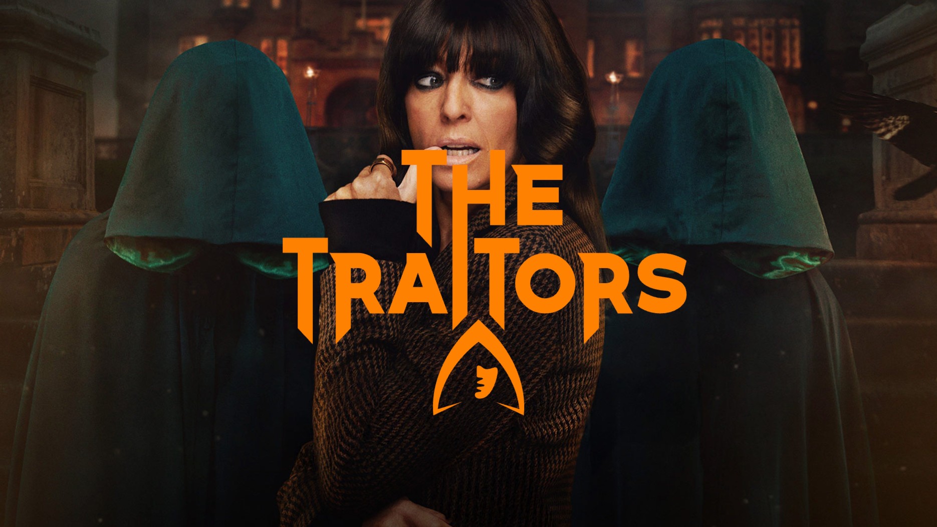
Then suddenly, out of nowhere, The Traitors erupted onto our screens. A psychological reality game show where contestants battle it out at a Scottish castle, with 'Traitors' secretly murdering 'Faithfuls' each night. It quickly became appointment viewing, and a genuine cultural juggernaut.
With 5.4 million average viewers, more than 34 million iPlayer views and a fanbase that fills social media with fevered theories, it's Britain's biggest reality TV success story of the decade. And while we've all been obsessing over who's a Traitor and who's Faithful, The Traitors visual identity has quietly become iconic in its own right.
Article continues belowThat mysterious hooded figure logo? The gothic-meets-modern typography? The rich burgundy and warm gold colour scheme? They're all the work of TQ Branding, a branding agency based in London, Dubai and Jeddah, co-founded by creative director Gareth Mapp. And as it turns out, the story of how this identity came to be is almost as intriguing as the show itself.
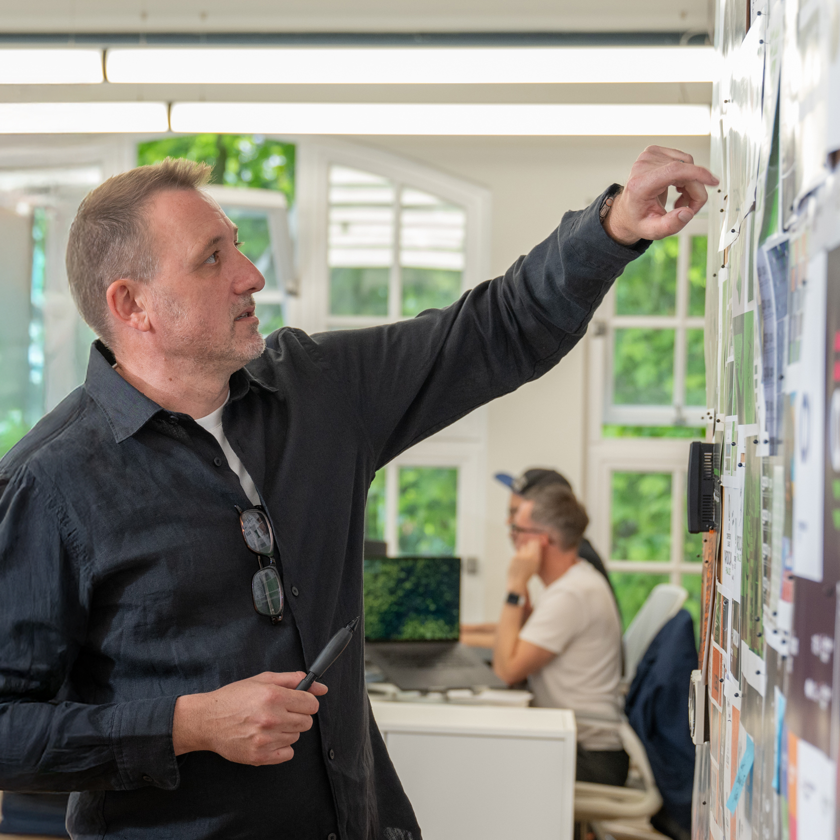
Gareth's background reads like a masterclass in British television design. Before founding TQ Branding in 2003, he cut his teeth at the legendary design agency Lambie Nairn, where he worked on some of British TV's most recognisable branding; think BBC One idents, BBC Two idents, and the BBC corporate brand itself. As he says modestly in his warm Welsh accent, "I've been doing this kind of work for quite a while."
More recently, TQ Branding's relationship with The Traitors' production company, Studio Lambert, began with another high-concept reality show: The Circle. That gig – creating the virtual social media system that contestants used to communicate – was "quite an interesting job, that challenged how people interacted with one another through the use of technology," says Gareth. Then, when Studio Lambert wanted to adapt the original Dutch version of The Traitors (De Verraders) for the BBC, they called TQ Branding again.
"The original brand still exists on the Dutch version," Gareth notes, "but we just wanted something a bit more bold and iconic; something fresher and easier and simpler to use."
Sign up to Creative Bloq's daily newsletter, which brings you the latest news and inspiration from the worlds of art, design and technology.
Lockdown creativity
The brief arrived during Lockdown; that strange, suspended period when creative briefs had a way of landing via Zoom with an almost surreal casualness. "These kind of jobs, they're quite small but they're quite fun," Gareth notes. "You get the brief, grab a cup of coffee, kick back and let your mind wander – just come up with ideas."
The team pitched four concepts to Studio Lambert, but one stood out immediately. "Something I'd been struck by was the show's use of hooded figures," Gareth explains.
The production had already designed the Traitors' dramatic cloaks – those silk-lined beauties we see billowing up the castle turret stairs at midnight – and Gareth saw an opportunity to make them central to the visual identity. "I thought, that's something iconic about the show. Let's see if we can bring an element of that into the identity itself."
Central emblem
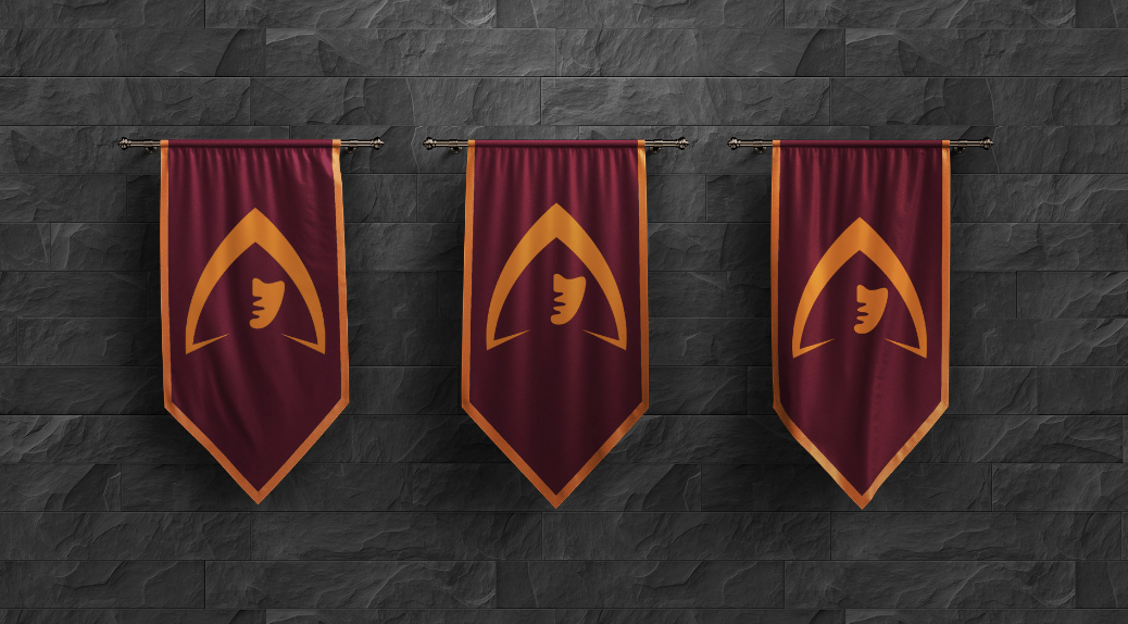
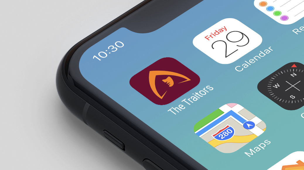
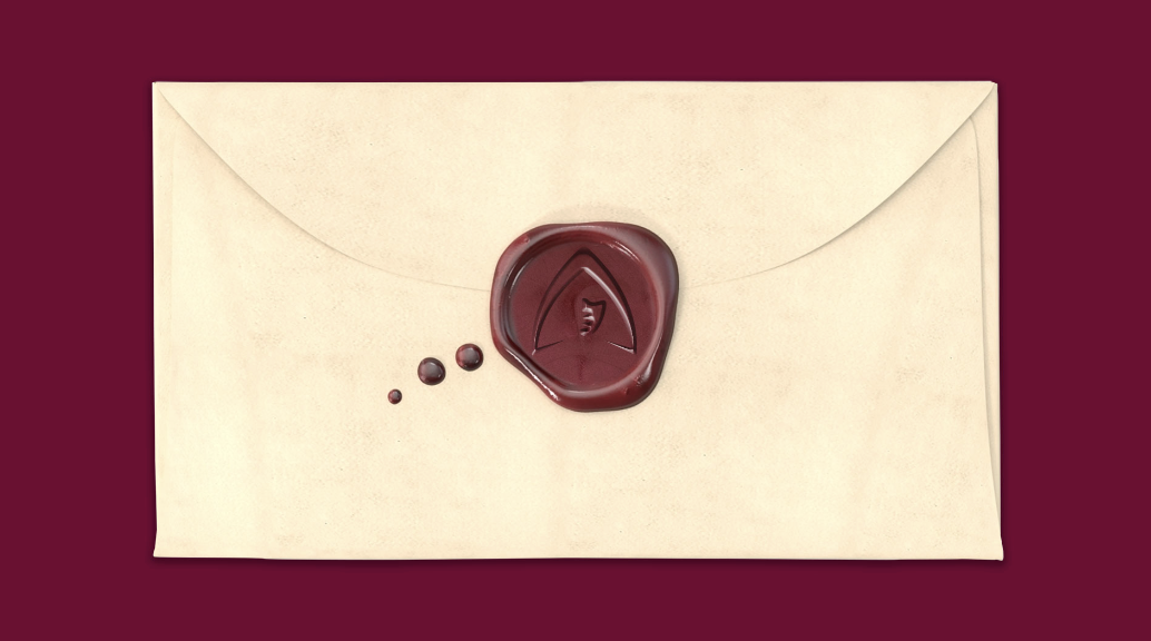
This wasn't just about making a pretty mark: it was about creating a symbol that could work across multiple touchpoints. "We designed things like brand banners with just the symbol on it," Gareth recalls. "There were wooden lanterns, fire pits, the seal on the envelope, that kind of stuff; so it becomes a visual shorthand for the show."
The face on the hooded figure is where things get really interesting from a design perspective. If you stare at it long enough, you realise it's been simplified to an almost abstract degree; yet it's still instantly recognisable as a human face.
"That took a bit of drawing," Gareth admits. "I did a lot of sketching in a physical sketchbook; working out how simple I could go with the drawing of the face. I actually took a photo of my son to start with, then just simplified, simplified, simplified into something abstract and minimal, yet still recognisable."
The result is a partially lit profile – showing only half the face, with the cloak hiding the top – that manages to be both enigmatic and human. "You're distilling down the face to take away; to make it mysterious," Gareth explains. "So you're removing elements; you're only showing a partly-lit, half side of the face."
It's the kind of design decision that seems obvious in retrospect but requires real skill to execute, and the result is quite simply magnificent.
Typography
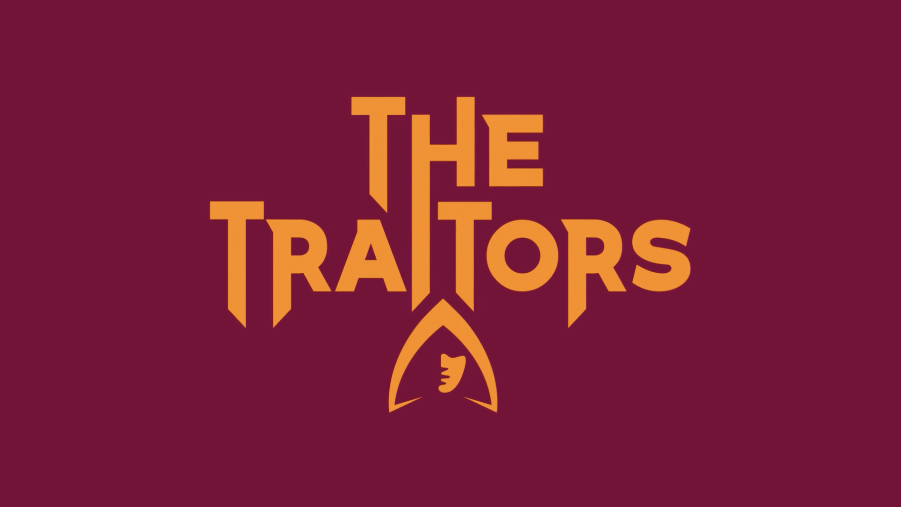
Another challenge was typography. Inspired by timeless British typefaces like Gill Sans, the team's custom typography was specifically designed to inject drama and narrative into proceedings.
"The show is all about suspense, drama and trying to find the Traitors, and there's a lot of backstabbing," reasons Gareth. "So we elongated some of the descenders within the type, to evoke that element... it's almost like the Hammer House of Horror typography you used to get on film posters."
Those elongated stems (the bits of the font that extend below the baseline) work like visual daggers, adding menace without ever tipping into parody. "We wanted to give the type a modern-day production value, so we kept it quite flat, but straightforward," Gareth notes. The result is typography that feels both stately and sinister; perfectly capturing the show's tone.
Colour and animation
The colour palette, meanwhile, was inspired by the castle itself. At the outset, Studio Lambert sent over a toolkit of photographs showing Ardross Castle's interiors. 'We noticed this lovely burgundy hue which we thought could work well in the identity," Gareth recalls. "So we used that as a base and then looked at something that would complement that."
The complementary colour? What Gareth charmingly calls "egg yolk yellow". It's a rich, warm gold that plays beautifully against the deep burgundy, creating a palette that feels both regal and inviting. This colour pairing isn't just decorative: it's doing serious heavy lifting in establishing the show's atmosphere.
The identity also includes animated elements, which Gareth approached with the same cinematic sensibility. "Again, our cues were the old-fashioned Hammer House of Horror-style titles; that Ealing Studio world," he explains. It's a smart reference point; those classic British horror films had a particular brand of theatrical menace that translates perfectly to The Traitors' brand of psychological drama.
TQ Branding developed an on-screen graphics package in conjunction with Studio Lambert. All of this ties back to the core identity, creating a visual system that's wholly cohesive and continually reinforcing.
Clarity of vision
Looking at TQ Branding's work on The Traitors, what's most impressive is the clarity of vision. From that first Lockdown brief to cultural phenomenon, the identity has remained consistent; very much a case of getting it right first time. It's simple enough to be iconic, sophisticated enough to feel premium, and flexible enough to work across everything from fire pits to envelope seals.
"All in all, you know, this was quite a simple job," Gareth says with characteristic modesty. "You never know how these things turn out, and this thing has exploded culturally, which is fantastic." Simple, perhaps. But brilliant? Absolutely.
For more on The Traitors identity, see why Creative Bloq's deputy editor thinks the UK branding is so good.

Tom May is an award-winning journalist specialising in art, design, photography and technology. His latest book, The 50 Greatest Designers (Arcturus Publishing), was published this June. He's also author of Great TED Talks: Creativity (Pavilion Books). Tom was previously editor of Professional Photography magazine, associate editor at Creative Bloq, and deputy editor at net magazine.
You must confirm your public display name before commenting
Please logout and then login again, you will then be prompted to enter your display name.
