'We needed to show our eccentric side’: inside the Radio Times rebrand
Senior designer Nick Wells discusses heritage design, nationhood and ‘Screamer’.

Sign up to Creative Bloq's daily newsletter, which brings you the latest news and inspiration from the worlds of art, design and technology.
You are now subscribed
Your newsletter sign-up was successful
Want to add more newsletters?
Leading UK entertainment brand Radio Times recently unveiled its first major rebrand in over 20 years. Shaped by the brand's 100-year heritage, the new look has a distinctly retro feel inspired by its legendary archival design, cutting through today's sea of soulless minimalist rebrands.
While we might think the best logos are shaped by creative trends, Radio Times proves that heritage design can be just as powerful. Drawing from its roots, Radio Times' rebrand carries a nostalgic feel that cements the refreshed look as a new classic.

"We did a lot of research before we kicked off the creative process to better understand if there’s an audience out there who don’t currently have a relationship with Radio Times but are open to it and interested," says Nick Wells, senior designer at Radio Times. "Luckily for us, there is. They tend to be a bit younger than our loyal magazine readers. They’re culturally astute but time poor and overwhelmed with the sheer quantity of entertainment choices out there. And, unsurprisingly, they’re predominantly on digital platforms.
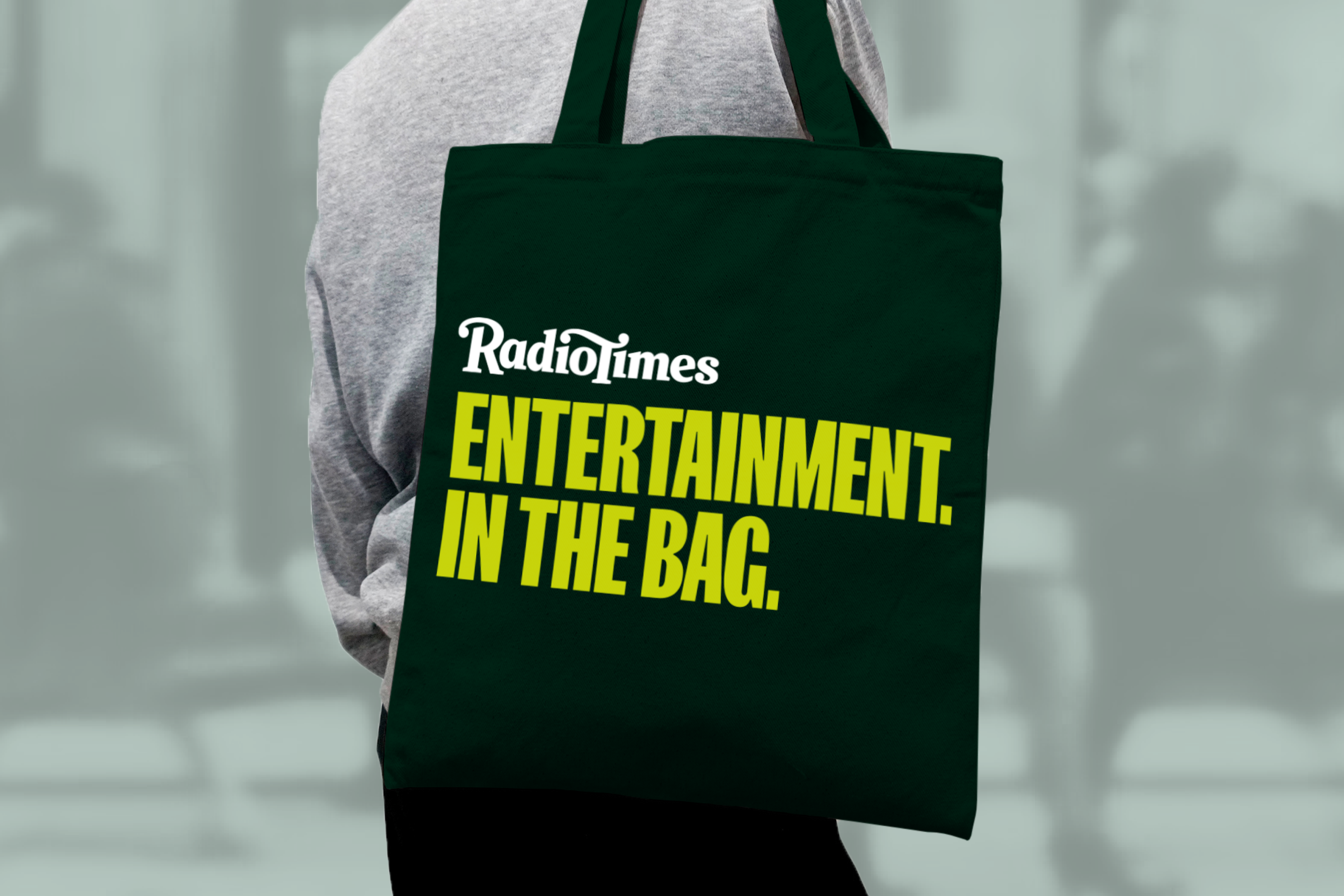
Article continues belowHence, our new approach is much cleaner, simpler and more direct, to help cut through the clutter. We’ve introduced bigger, bolder type (I kind of love the fact that our hero typeface is called Screamer) and pared everything back to its essentials," he explains.
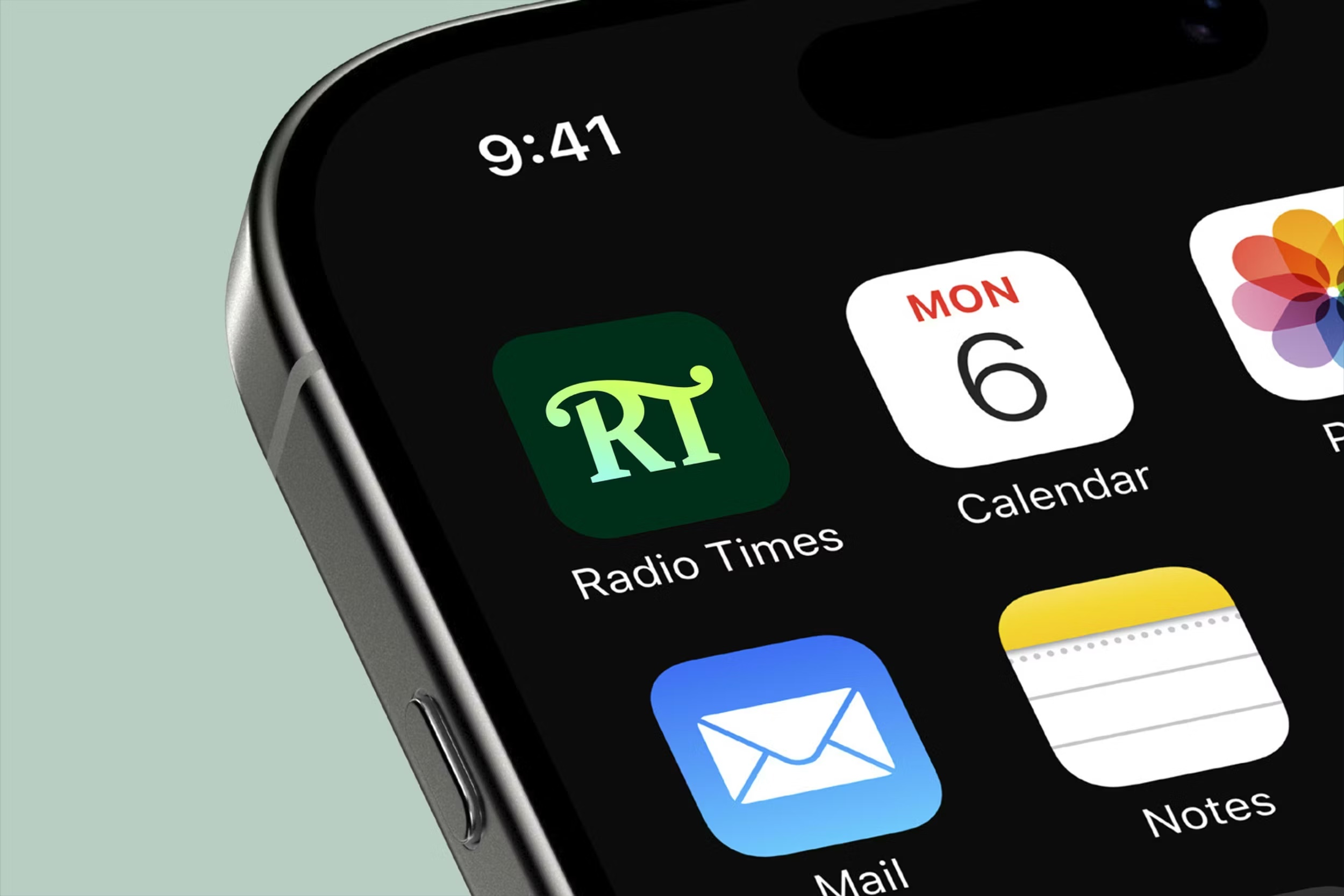
Created in collaboration with Why Projects, the new Radio Times identity unifies the brand's app, website and podcast under one slick and cohesive look. At the centre of the design is a fresh logotype and digital icon created by iconic designer Rob Clarke. Taking inspiration from mastheads of the '80s/'90s, the design is a perfect blend of heritage and contemporary design, making for a bold, future-proof identity.
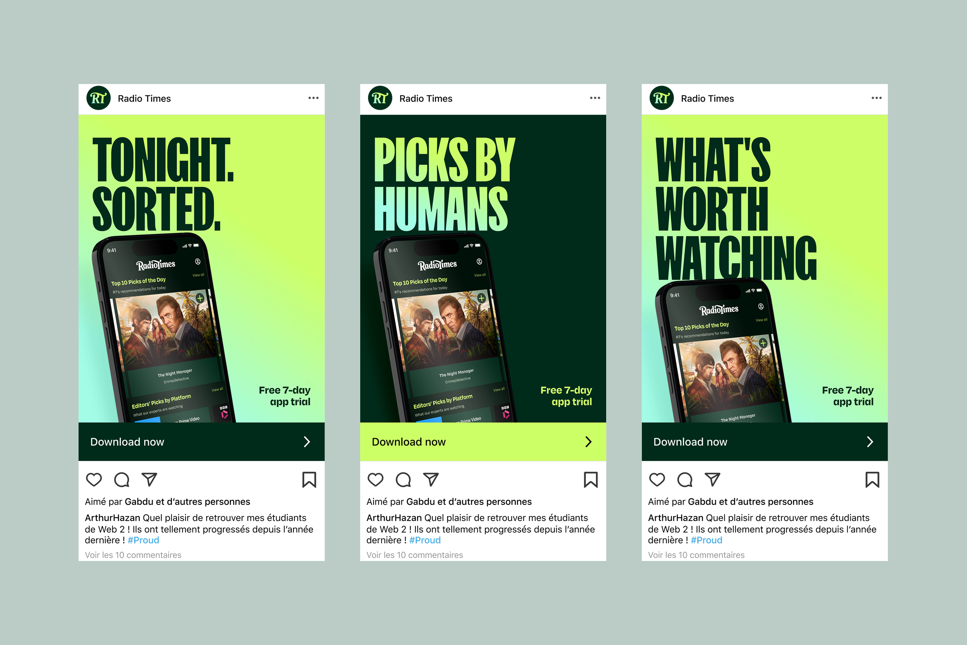
When asked whether heritage or modernisation was prioritised when shaping the design, Nick explains that it took a fine balance of both to achieve the final look. "We want to attract a new audience, but we want to respect those loyal readers who have been with us for a long time," he says.
"Hopefully, you can see that in elements of the new identity, maybe most obviously in the logo and colour palette. The heritage characteristics – the nod to our logos from the 70s/80s, and the deep British Racing Green, are offset by the sharper edges and blockier serifs of the updated mark, and the zingier, screen-oriented bright green. Where we really leant into modernisation was applying the brand to digital platforms – particularly in introducing a new icon, motion, and sound," he adds.
Sign up to Creative Bloq's daily newsletter, which brings you the latest news and inspiration from the worlds of art, design and technology.
The digital 'RT' icon features a new graphic device called "The Beam", which radiates from the design to represent the brand "cutting through the noise to shine a light on the entertainment that truly deserves attention." Alongside it, the rich colour palette takes a digital-first approach, pairing a deep, heritage-feel Dark Green with a vibrant Bright Green.
"We’re looking to put a smile on people’s minds. Radio Times has always prided itself on the quality and accuracy of its journalism, but we recognised that as a brand in the entertainment industry, we needed to show more of our fun, eccentric side, and challenge some of the perceptions that Radio Times is 'just a listings magazine'," Nick explains
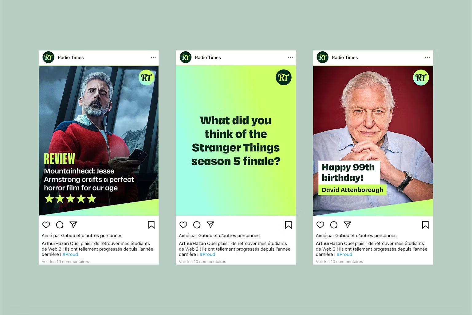
It wasn't a project without challenges, as Nick tells me, "Consensus is hard to achieve, which meant we had to really hone the proposition and our justifications, but ultimately it helped us achieve buy-in from across the business on a new visual identity that future-proofs Radio Times."
Unsurprisingly, it's the logomark that's a great source of pride for Nick, thanks to its "long, storied history." He explains that "with such an iconic British brand, it ties into some people’s sense of identity and nationhood and all that comes with it. You want to do it justice. And I really think we have."
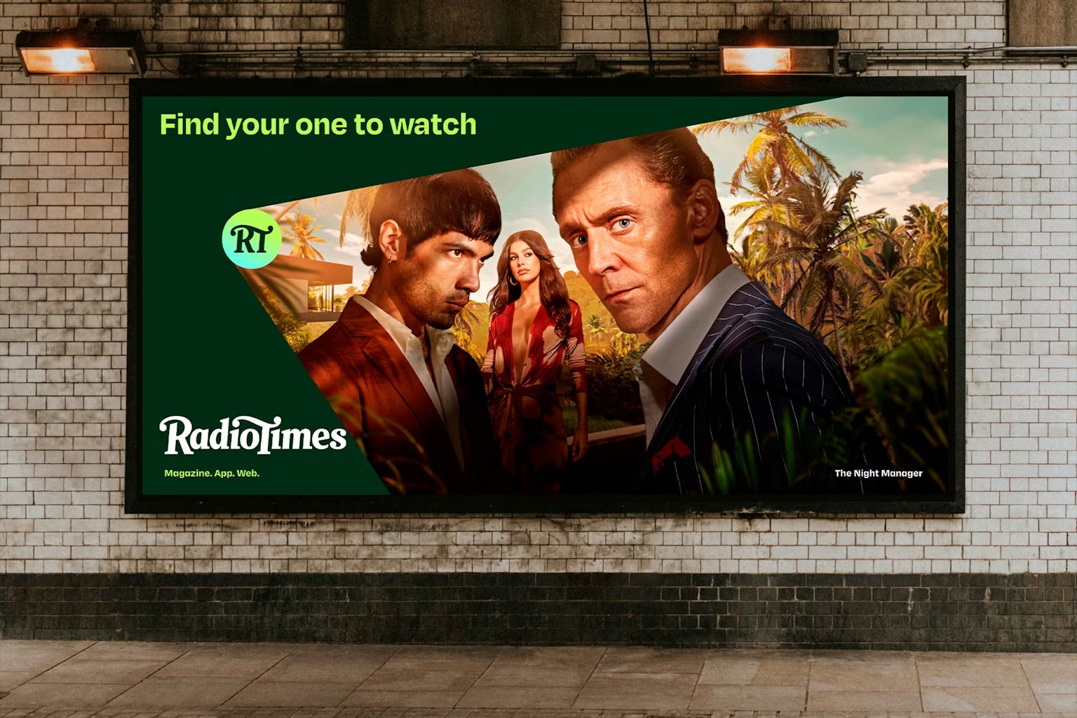
For more creative inspiration, check out why brands should hold fire on launching a whole new identity, or take a look at why today's creative sphere is all about the brand-tweak era.

Natalie Fear is Creative Bloq's staff writer. With an eye for trending topics and a passion for internet culture, she brings you the latest in art and design news. Natalie also runs Creative Bloq’s 5 Questions series, spotlighting diverse talent across the creative industries. Outside of work, she loves all things literature and music (although she’s partial to a spot of TikTok brain rot).
You must confirm your public display name before commenting
Please logout and then login again, you will then be prompted to enter your display name.
