The McMichael rebrand is a work of art
Bruce Mau Design blends Canadian heritage with contemporary style.

Sign up to Creative Bloq's daily newsletter, which brings you the latest news and inspiration from the worlds of art, design and technology.
You are now subscribed
Your newsletter sign-up was successful
Want to add more newsletters?
The McMichael Canadian Art Collection has revealed a stunning evolution, balancing the institution's rich past with its new contemporary flair. Constantly striving to tell the story of Canada's vibrant artistic sphere, the McMichael's fresh rebrand weaves a tapestry of past and present, rooting the institution as a beacon of culture.
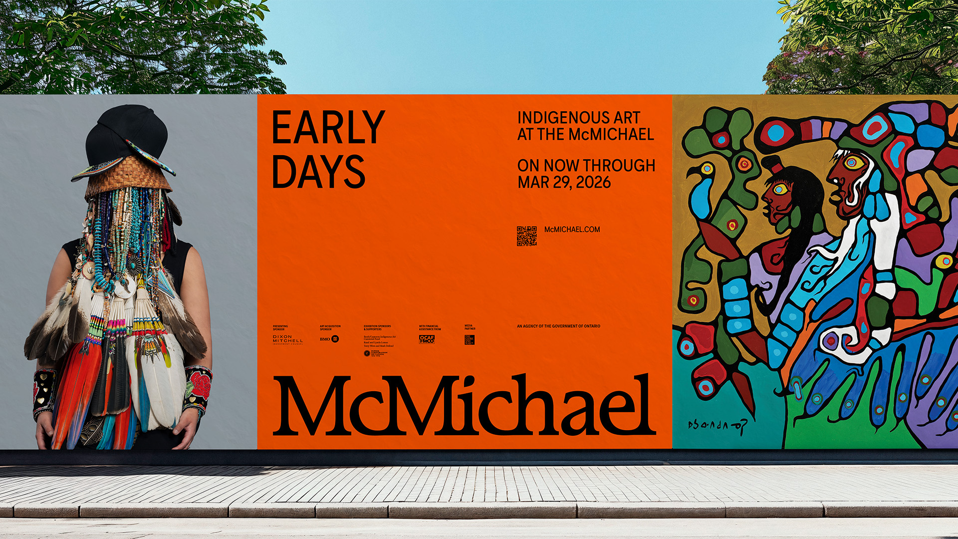
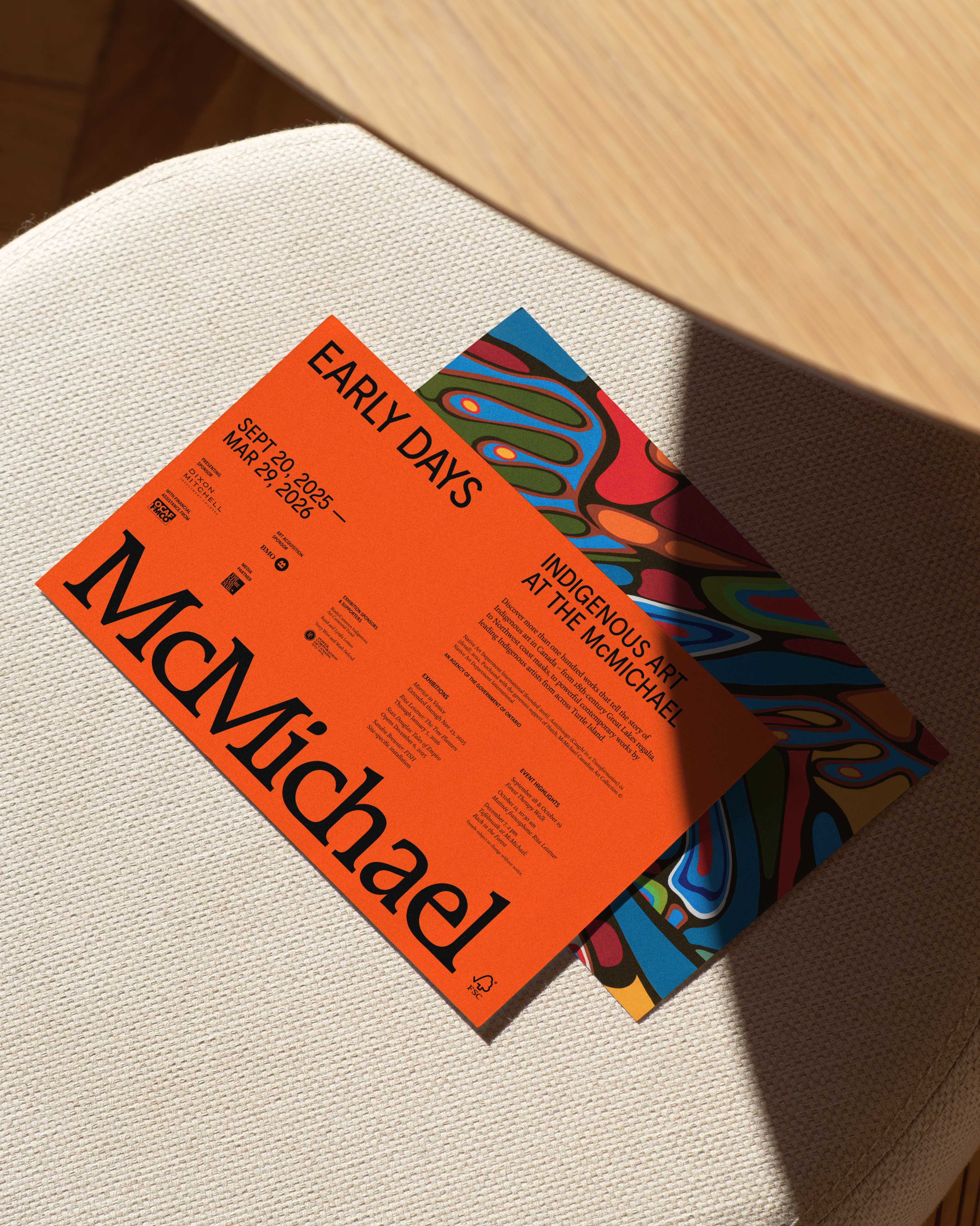
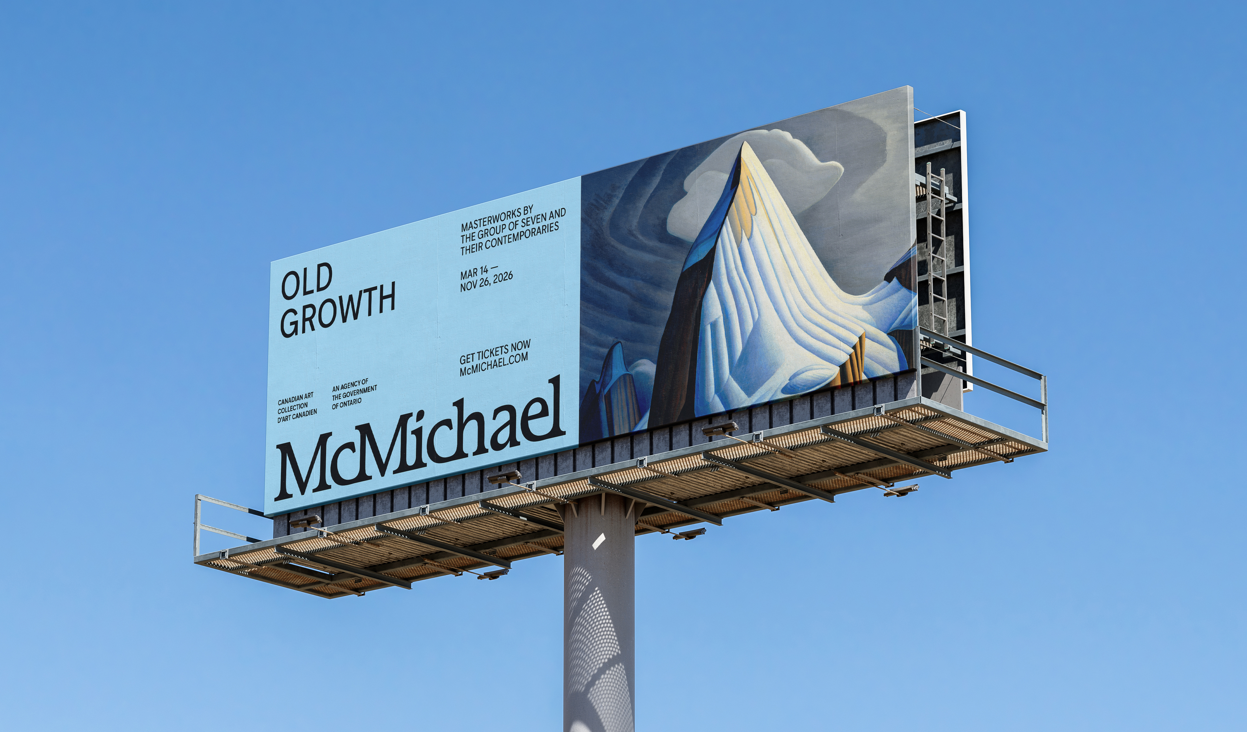
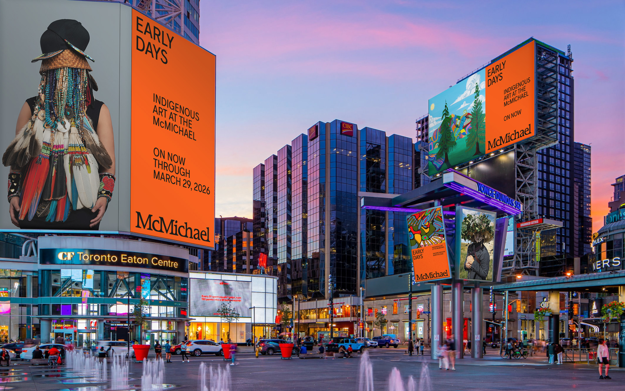
The best rebrands are often a fine balance of heritage and modern innovation, and the McMichael's new identity is no different. With a reworked logo, revitalised colour palette and immersive motion design, the new look bursts with energy without losing the institution's enduring vibrant soul.

Created by multidisciplinary creative studio Bruce Mau Design, the McMicheal's rebrand is shaped by the institution's rich history. Redrawing its heritage logo, the new design has a classic, elevated appeal with its serif typeface. Paired with clean sans-serifs McMichael Sans and November Syllabic, the heritage and modern combine for a timeless yet unmistakably contemporary look.
Article continues below“We helped the McMichael articulate a big brand idea that positions them in a new way while honouring their roots," says Laura Stein, BMD's chief creative officer. "We redrew an older, handcrafted logo to preserve its warmth and paired it with a clean sans serif typeface from Canadian foundries, balanced, approachable, and timeless. The result invites discovery and dialogue across eras and cultures.”

Inspired by the institution's diverse art collections, vibrant colours and grid patterns bring a sense of visual playfulness, reflecting the McMichael's "openness and curiosity." With Indigenous syllabic support, the typography ensures accessibility and inclusivity remain a constant through the brand's evolution.
“Through artist interviews and a pop-up studio with staff, we uncovered what truly makes the McMichael special: its spectacular setting, sense of welcome, and its unique way of sparking dialogue,” adds Kar Yan Cheung, BMD's director of design strategy. “The new identity, built around an ‘invitation to explore,’ embodies that spirit, open, expansive, and engaging.”

For more stunning design, check out this museum’s rebrand, which is pure art therapy, or take a look at the Guggenheim’s new modern masterpiece logo.
Sign up to Creative Bloq's daily newsletter, which brings you the latest news and inspiration from the worlds of art, design and technology.

Natalie Fear is Creative Bloq's staff writer. With an eye for trending topics and a passion for internet culture, she brings you the latest in art and design news. Natalie also runs Creative Bloq’s 5 Questions series, spotlighting diverse talent across the creative industries. Outside of work, she loves all things literature and music (although she’s partial to a spot of TikTok brain rot).
You must confirm your public display name before commenting
Please logout and then login again, you will then be prompted to enter your display name.
