
If you've paid attention to any sort of design over the last 12 months, you'll have noticed something quite profound. Put simply, the logo is evolving. And we wouldn't be surprised if a new contender for our best logos roundup emerges in 2026.
After years of minimal sans-serifs wordmarks and rigid geometric precision, identity design is loosening up, adding dimension and moving about. The traditional static stamp is giving way to marks that adapt, invite interaction, and actually mean something to the people who encounter them.
To explore into this continuing evolution, I spoke to experts in design, branding and marketing across the creative industries. In the article that follows, I'll share 7 hot trends that are likely to continue shaping logo design in 2026.
01. Unfixed identities
Remember when logos were just one design… and that was it? Those days are long gone, says Graham Sykes, global executive creative director at Landor "Logos are no longer static stamps. They're becoming portals; flexible, expressive, and built to behave," he explains. "As brands move deeper into XR, motion, wearables and immersive environments, the logo can’t stay frozen in time. It has to meet the audience where they are. Think mascot energy, not corporate emblem. Think side-kick, not signature."
People often call these "animated logos", but that's to minimise what's going on, he adds. "Rather, these are identity systems that adapt, shapeshift, and invite interaction. Texture-bending, attitude-shifting, context-reactive marks that act as gateways into the wider brand world."
Graham concludes: "As we leave the static era behind, the most modern identities feel alive, gestural, responsive, and ready to flex – emotionally and creatively – in service of the experience. This is the final breath of the fixed logo."
Want examples? "Nike's soup spoon pop-up in Guangzhou turned the Swoosh into a physical, functional object; a ramen spoon handed out at a hyperlocal pop-up for runners," Graham says. "A logo you hold, not just see. Proof that identity can step off the screen and into culture."
There there was Meta × Oakley XR Visual System. "An evolving set of XR lenses, overlays and adaptive glyphs that shift according to environment, movement and user input. The logo becomes spatial, reactive and behaviour-aware — a companion inside an immersive world rather than a flat asset."
Google's I/O event identity, meanwhile, treats the logo as a literal entry point: "A shifting, dimensional portal that opens, bends, rotates and reveals new layers as you interact with it across motion, stage, interface and AR filters."
02. Playful and unexpected

"For every action, there is an equal and opposite reaction" is Newton's famous Third Law of Motion in physics. But in a tongue-in-cheek way, it might also be applied to modern logo design.
As Joe Warburton, senior designer at FutureBrand, puts it: "You can't scroll socials without stumbling on commentary about blandification… but it seems designers have come back swinging. Logos are having fun and are reclaiming their voice: playful, unexpected and breaking the mould a little."
By way of example, he notes paper company GFSmith’s radical rebrand by Templo. "This is a well respected brand, central to the design industry, renewed with feel-good personality. It would’ve been easy to play it safe, but in trying to reach broader audiences, they chose the unexpected. Sure, brand is more than a logo. But a logo can say a lot, especially when it’s brave enough to play."
Joe also cites How&How's fun rebrand of Jupi, an AI-powered decision making OS, and Angelina Pischikova's branding for pet-care company Mud, as examples of the trend. Overall, this shift feels like a direct response to the sea of sans-serif sameness that's dominated the past decade. Designers are remembering that logos can smile.
03. Subtle iteration

Noticed how many of the year's biggest rebrands were relatively quiet and subtle? So has Mary Kate Henry, design director at BUCK.
"Look, I love a full-fledged rebrand," she begins. "And it's not a surprise that we've seen rebrands occur more frequently than ever to keep up with our world's seemingly endless need for newness combined with the number of places brands need to show up rising." But she predicts that in the future we'll increasingly see that level out to what she calls "brand evolutions".
So what will that look like? "Instead of a rebrand from top to bottom, brands will tweak the logo, enhance the visual language with modern layout, new typesetting of existing typefaces, updated illustrations, and secondary colour palettes," she explains. "Less of a big change and more of a seamless update."
Walmart, Amazon and JP Morgan Payments have all taken this approach in 2025, keeping equity whilst feeling current. It's a smarter way to evolve when you've already built recognition.
04. Organic earthmarks

John Smiddy, founder of NutraMarketers, identifies what he calls organic earthmarks as the next wave of natural and eco-inspired logos. "People want brands to feel warmer, calmer and more in touch with the natural world," he explains. "Softer outlines, gentle curves and earth-leaning palettes give a logo an immediate sense of care and groundedness, which resonates in lifestyle, wellness, food and home categories."
After years of very sharp, geometric icons, these quieter shapes feel more human and signal a brand that pays attention to its impact. "The challenge is avoiding a generic leaf or a washed out green that could belong to anyone. The strongest work borrows something specific from the brand's story, such as a contour from a place of origin or a pattern linked to its materials."
Patagonia's mountain wordmark, Beyond Meat's leaf-and-badge system, and Seventh Generation's leaf crest all lean on organic contours, muted palettes and simple geometry to feel grounded and trustworthy. "This direction will gain pace in 2026," predicts John, "because it offers an easy route to warmth and authenticity at a time when audiences are wary of polished, interchangeable branding."
05. Responsive logo systems
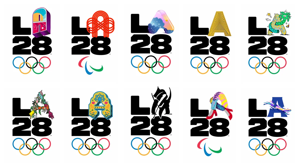
Responsive logo systems have been with us for some years now. But Jack Shaw, founder of Shawfire Media, points out that responsive logo systems are gaining ground because brands need marks that hold up everywhere, not just on a homepage or billboard.
"A logo that reads clearly on an app icon, a watch screen or a social avatar needs a simpler shape than the one used on packaging or campaign films," he explains. So rather than forcing one mark to do every job, teams are creating a small family that shares the same core idea but adjusts in detail and scale. "This makes day to day design much easier. It stops people cropping or improvising logos for tight spaces and keeps branding steady across light and dark themes, small screens and fast moving content."
Spotify's adaptive identity, Airbnb's Bélo system, and LA28's variable emblem highlights how this works in practice. Jack expects more brands to adopt this in 2026 because it supports clarity, consistency and recall without adding extra weight to a project.
06. Tactile 3D logos

Tactile 3D logos are also not a particularly new innovation, but Emma Grant, co-director at Figment Agency, believes their use will continue to grow in 2026. "This approach gives brands a sense of presence and quality that flat marks can't always achieve," she explains. "By using depth, subtle shadows and gentle bevels, logos feel almost touchable, helping them stand out whether they appear on packaging, app icons or digital experiences. The effect is premium without being over the top."
Importantly, unlike the heavy, realistic skeuomorphism of the early 2010s, these designs are clean and refined, adding dimension and warmth without cluttering the visual identity. "The slight sense of movement and layering helps a logo feel more alive and engaging, drawing attention in crowded feeds or on busy shelves," says Emma .
Autodesk's dimensional "A" identity, Netflix's ribbon monogram, and Adobe's Substance 3D suite (where each product uses a 3D cube logo) all demonstrate this approach. Emma expects more brands to use this style to make their marks feel considered and distinctive, creating an immediate impression of quality in both physical and digital spaces.
07. Belief and belonging

For years, logo trends have mostly lived in the aesthetic realm, observes John Paolini, partner and chief creative officer at Sullivan. "So the 'new thing' might be swirls, anthropotheism, gradients, minimalism. But 2026 feels different. What’s emerging now is a deeper systemic and cultural shift born from an epidemic of loneliness, polarisation, AI acceleration and a world that increasingly doesn’t make sense."
As a result, it seems business is finally catching up to the idea that design, and especially identity design, is core. "That at its best, design is fundamentally about relationships, belief, and, most importantly, belonging."
The main reason for this shift? In John's words, "The people have spoken. Cracker Barrel learned this the hard way. The old man in the cane chair wasn't just a logo; it belonged to millions who grew up dining there, a vessel for their memories. Removing it didn't just change the design; it erased the emotional history tied to it."
In contrast, Apple TV's recent logo re-envisioning achieved something rare. "It revived an iconic symbol while drawing a thread from TV's past and celebrating human craft," John explains.
"One of Apple’s earliest logos carried a rainbow; many of us remember its plastic brightness on early Macs. We also grew up with the RGB glow of television bumpers. Apple smartly wove those mythic threads from TV’s golden age into a modern mark, and offered a subtle nod to the Apple rainbow. By inviting us into the making of this logo, in all its not-AI glory, they gave users something meaningful to connect to."
He can see this same hunger for belief and belonging in the new identity for Atlético Dallas, the emerging soccer club in the US. "A brand is a vessel of meaning, and here that vessel holds the grit of Texas oil fields – think James Dean in Giant º and the ancient inhabitants that once fought for survival there—the snake and the wolf. Paired with the heraldry of European football traditions, the result is a brand alive with myth and symbolism, ready to be stamped onto future generations."
His overall takeaway? "As we look toward 2026 and beyond, I’ll offer this: brand and design can help make sense of the world. They help us connect to each other, give us something to believe in, and strengthen our sense of belonging; not just to brands, but to one another."

