The Tango rebrand has a hidden design detail
New look aims squarely at Gen Z.

Sign up to Creative Bloq's daily newsletter, which brings you the latest news and inspiration from the worlds of art, design and technology.
You are now subscribed
Your newsletter sign-up was successful
Want to add more newsletters?
British soft drinks brand Tango is known for thinking out of the box. Anyone who remembers the classic 'You've been Tango'd' ads will agree.
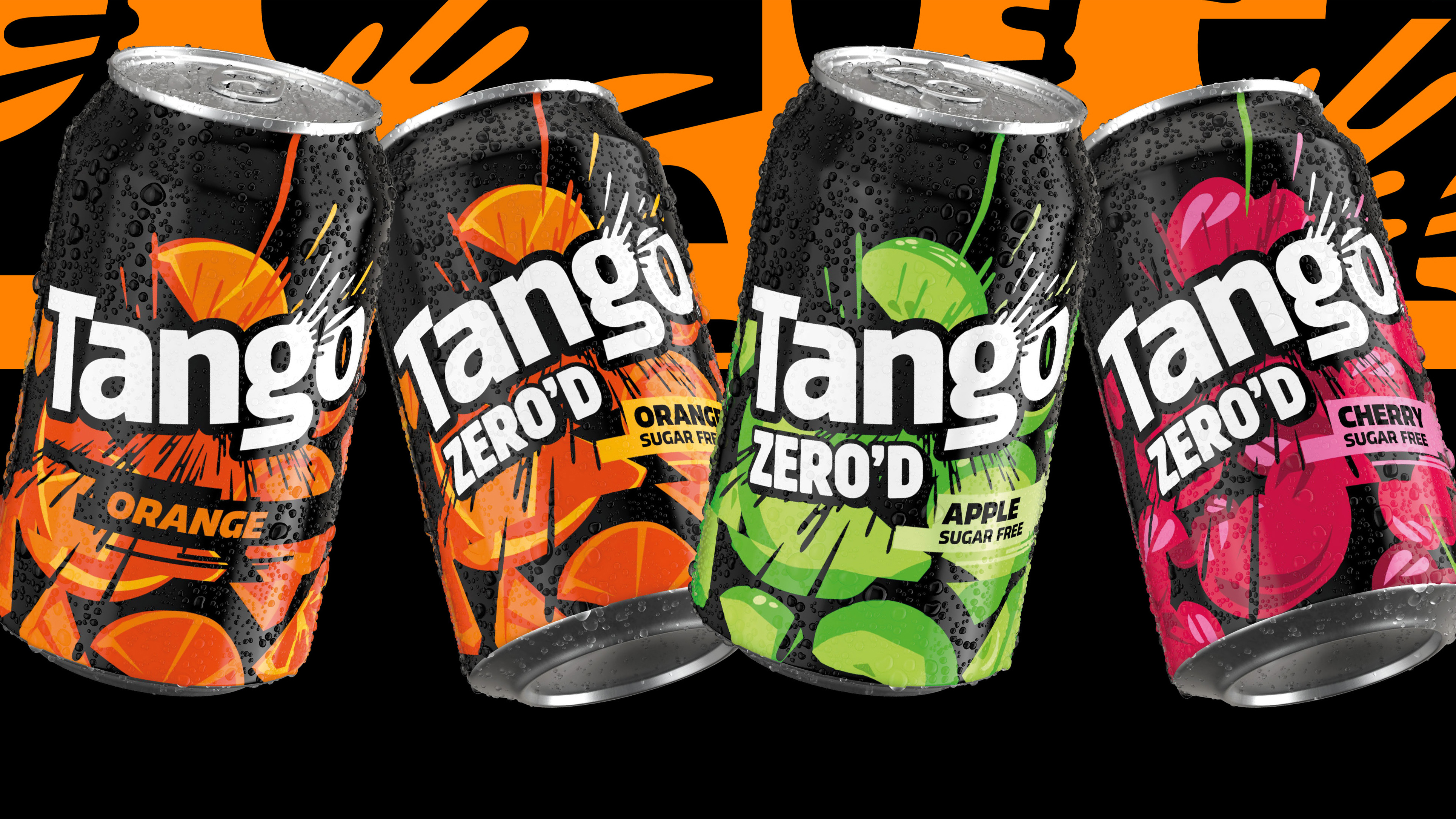
The brand has teased an upcoming redesign with a new look for its sugar-free limited-edition range called Thirst Trap. Aimed squarely at Gen Z and Gen Alpha, the new identity was created by agency Bloom. But has it gone far enough to stand out in today's crowded marketplace? Will it be enough to make it to our best rebrands of the 2020s list?

The new logo creates a hidden pip in the 'a' in a nod to fruity flavours, and is something you might not notice right away. The burst coming out of the 'g' aims to recall the moment when a bottle or can is opened. This is in contrast to the old identity (below), which had fairly straight typography.
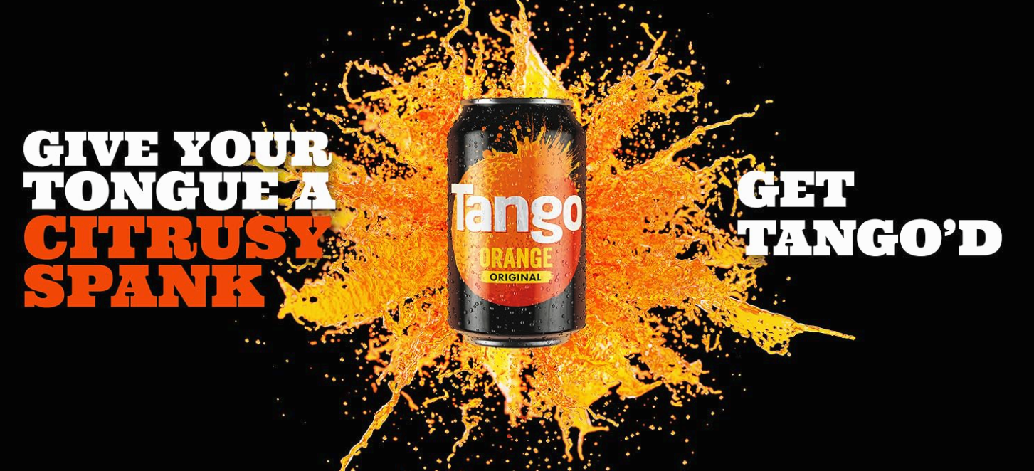
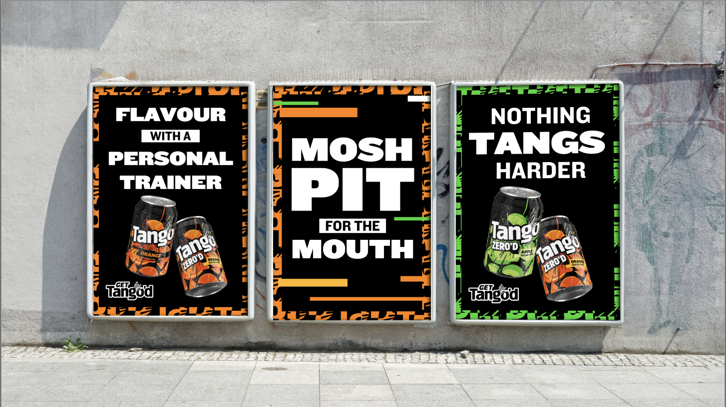
Article continues belowThe new identity combines bright colours, bursting elements and off kilter angles to create a dynamic vibe. Lifestyle photography that invites the viewer in plus fun typography that breaks frames and clashes with colour completes the new feel.

"It’s no secret that carbonated drinks is a very competitive category," says Harriet Dyson, marketing controller at Carlsberg Britvic. “The past few years have seen huge shifts as brands look to reconnect with consumers seeking new flavours, benefits and values.
“Tango has never been a follower of trends. In a category dominated by risk averse global brands, Tango is unexpected and uninhibitedly outrageous. It’s irreverent and cheeky, bringing a smile to the drinker. But as codes of culture grow bolder – what Gen Z and Gen Alpha are eating, drinking, wearing, sharing – we knew Tango needed a flexible new identity that would connect with these drinkers.”

I spoke to Stuart Witter, associate creative director, Bloom, about why this rebrand helps Tango stand out from the crowd.
Sign up to Creative Bloq's daily newsletter, which brings you the latest news and inspiration from the worlds of art, design and technology.
"It stands out by rejecting the category codes of refreshment and fruit. While others are doing standard splashy graphics, we moved to a look that is visually arresting and totally unapologetic," says Stuart.
"The key shift was moving from a brand that felt formulaic to one that is activation ready, it doesn't just sit on the shelf, it feels like it's vibrating. By respecting the defining elements of the brand, boldness, British mischief, and that intense hit of tanginess, but stripping back the over-explaining, we created a flexible language that cuts through. It works because it trusts the design literacy of Gen Z; we don't need to spell the joke. It’s confident, uninhibitedly British, and distinct in a risk-averse category."
What was the thinking behind the bursting element?
"We wanted to visualise the product experience and capture attention by highjacking schadenfreude associated with seeing a digital marketing fails in the wild. These elements represent the kinetic energy of the brand, reflecting the glitches, collisions, and gritty moments that happen in culture," says Stuart.
"Anchored by assets like the 'Tssst' an element that brings refreshment directly to the new word marque, bursts communicate uncontainable tanginess spilling into your digital feed. We used fractured crops and the hack pattern to break the grid, creating a visual clash that signals that intense, invigorating, bold flavour. It’s about making the brand look like it’s breaking out of its frame, amplifying the playful personality central to the redesign."
Making sure the design works across both a phone screen and a supermarket shelf was a challenge, and Bloom had to adopt what Stuart calls a "360 mindset".
The team adopted a strict principle to make it work: "To manage just the right amount of irreverence and electric contrast, we applied a strict 70/30 principle: 70% energy and chaos, anchored by 30% breathing room," he says.
"We aimed to hone the brand to match the audience's own energy; spirited, kinetic, and intense. Getting that tonal frequency right, where the brand feels like a force of nature rather than just a soft drink, was the hardest but most rewarding puzzle to solve."
For more on rebrands that stand the test of time, see our piece on it's time to stop judging rebrands so quickly.

Rosie Hilder is Creative Bloq's Deputy Editor. After beginning her career in journalism in Argentina – where she worked as Deputy Editor of Time Out Buenos Aires – she moved back to the UK and joined Future Plc in 2016. Since then, she's worked as Operations Editor on magazines including Computer Arts, 3D World and Paint & Draw and Mac|Life. In 2018, she joined Creative Bloq, where she now assists with the daily management of the site, including growing the site's reach, getting involved in events, such as judging the Brand Impact Awards, and helping make sure our content serves the reader as best it can.
You must confirm your public display name before commenting
Please logout and then login again, you will then be prompted to enter your display name.
