
Over the last few years we've seen some truly headline-making rebrands. And if you know anything about the attention economy in the twenty-first century, you'll know that headline-making equals controversial. Hate sells, and there's nothing people love to hate more than a beloved brand trying out a bold new look.
Perhaps the most obvious example from recent memory is Jaguar, whose colourful and curvy new look prompted outcry in 2024. And then there's Cracker Barrel, which angered MAGA (and more) by doing away with its 'old timer' mascot' last year. The vitriol directed at these new identities was on another level, with real-world effects for the brands.

One one hand, in today's social media age, perhaps the response to these rebrands wasn't surprising. Seeing figures like Elon Musk call Jaguar woke or Donald Trump Jr ask "WTF is wrong with Cracker Barrel" feel par for the course in the 2020s. By removing iconic assets, those rebrands were doing something bold and, yes, possibly foolish – even on paper, a Jaguar campaign without any cars sounds a bit daft.
But the alarming thing here is that these backlashes so clearly cowed the respective brands. Cracker Barrel was publicly contrite about its redesign, announcing on social media, "You’ve shown us that we could’ve done a better job sharing who we are and who we’ll always be" before wheeling back the rebrand. And this is despite the brand also offering a rationale for the new logo that actually made a lot of sense: to simplify the design for new, digital applications.
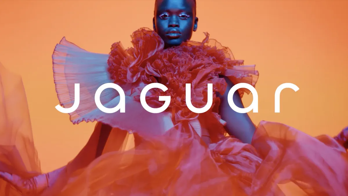
As for Jaguar, to an outsider, the rebrand appears to be going strong – it still adorns the brand's website, along with the new tagline, "Copy nothing. Delete ordinary." But behind the scenes, it sounds like the backlash has led to some profound changes, including the design chief being sacked and the advertising agency being dropped.
Now, rebrand U-turns are nothing new. We've been seeing brands ditch their new designs in response to controversy for decades. GAP's 2010 rebrand lasted all of six days, while Tropicana's 2009 redesign managed a few months. But the difference is that there was nothing political about those backlashes – they were purely about the loss of an iconic design. Both Jaguar and Cracker Barrel, however, were mostly criticised for "going woke". And the noise got so loud so quickly that the brands bottled it.

And what they perhaps forgot is that online noise does, eventually, die down. Some of the most controversial rebrands of the last couple of decades have proven to have remarkable staying power. Back in 2014, the new Airbnb logo faced an avalanche of criticism accusing it of everything from lack of originality to sexual symbolism. Twelve years later, it's still going strong – and hardly anyone remembers the initial controversy.
Similarly, Instagram's switch from its realistic retro camera icon to a minimalist gradient in 2016 was initially wildly unpopular, with the bright gradient called childish and ugly at the time. Turns out Instagram was ahead of the curve – that skeuomorphic camera would look positively dated today, whereas the gradient Instagram logo is now one of the most recognisable in the world.

What these examples show is that while the internet has always been quick to judge rebrands, perhaps the best judge is time. Once all of the noise has died down, longevity serves as pretty categorial proof that a rebrand was sound.
Indeed, some rebrands from the 2020s are now half a decade old, giving us the benefit of hindsight to decide what truly worked and what didn't. Burger King's flat design bonanaza is still sizzling five years later. Conversely, in the wake of the recent news that it's slashing its metaverse department, Facebook's 2021 'Meta' rebrand finally looks like a failure in 2026.
So while the internet will always be a wild west of lightning fast reactions, perhaps we ought to bear in mind that the true marker of a successful rebrand is time. Are people still complaining once the dust has settled five years later? Or is it, like Airbnb, now just a solid and recognizable brand identity? And perhaps the brands feeling threatened by cries of "Woke!" need to remember the same thing too.

