The Instagram logo: a history
The Instagram logo history is a blast of social media nostalgia.
The Instagram logo is one of the most familiar social media icons around, and a mainstay of smartphone homescreens around the world. Unlike other social media logos, the Instagram logo has undergone a couple of pretty significant changes since the app first launched in 2010.
Indeed, the Meta-owned Instagram has rebranded a few times in its 13 year history, most significantly in 2016. The logo introduced that year is close to what we have now – but back in its early days, the Instagram logo was arguably a lot more fun. Check out every logo the app has used over the years, and for more design inspiration, take a look at the best logos of all time.
The first Instagram logo: 2010
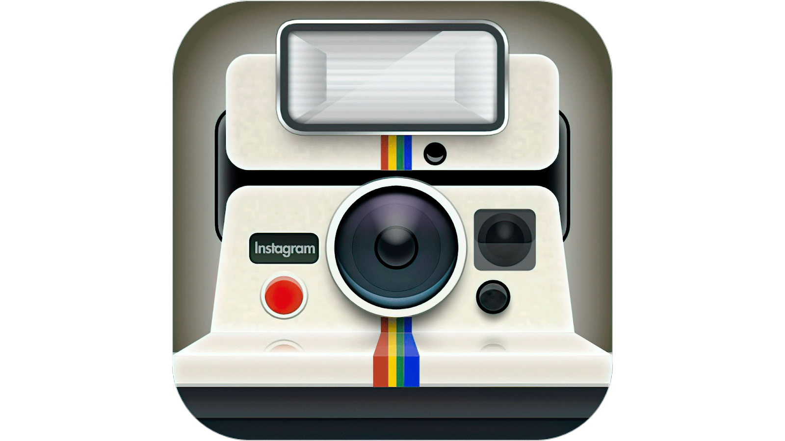
When Instagram launched in 2010, it did so with an app icon that looks pretty busy by today's minimal standards. Very firmly from the world of skeuomorphism, you can almost touch the icon's tacticle, plastic polaroid camera. But this fun design by Instagram founder Kevin Systrom himself wouldn't even last a year.
The Instagram logo: 2010 - 2016
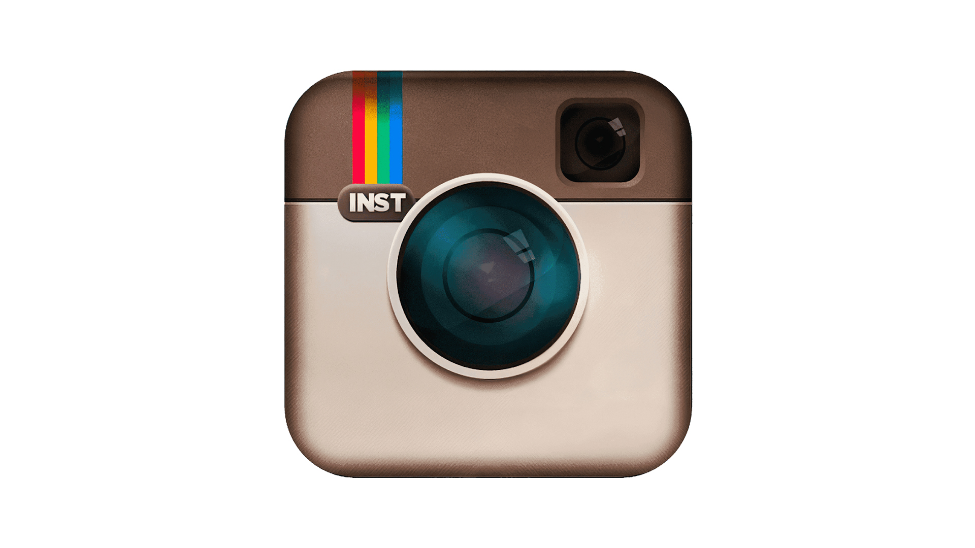
Users of a certain vintage will remember the classic 'viewfinder' camera design. Created by designer Cole Rise, this was based on a 1950s Bell & Howell camera. Back then, Instagram was all about vintage filters that captured the look of old, analogue shooters, with rivals including the likes of Hipstamatic (remember that?) – and this icon reflects exactly that vibe.
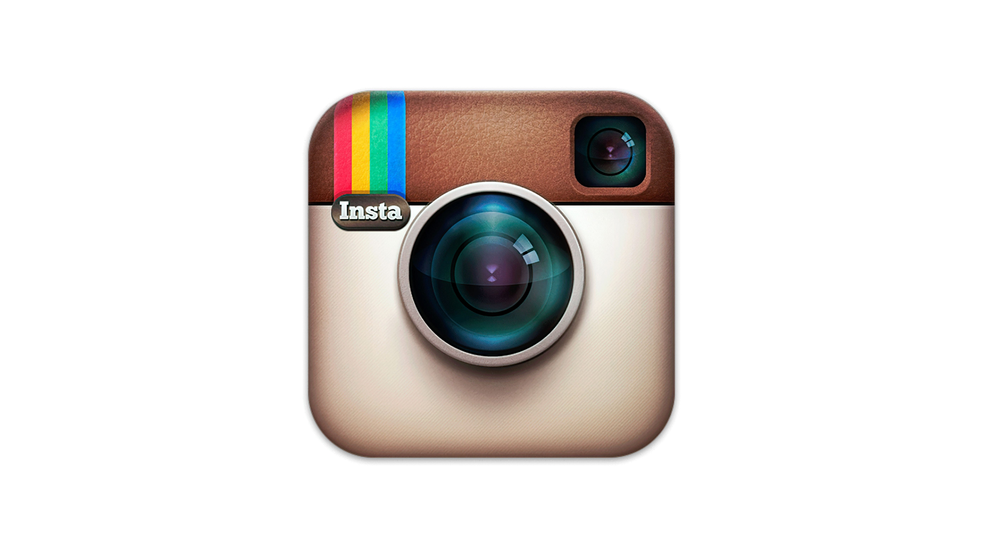
In 2011, the logo was tweaked (above) for added realism, with a more reflective camera lens and leather top for the camera. This would last until 2016, when skeuomorphism went out of the window in favour of minimalism and flat design.
The Instagram logo: 2016
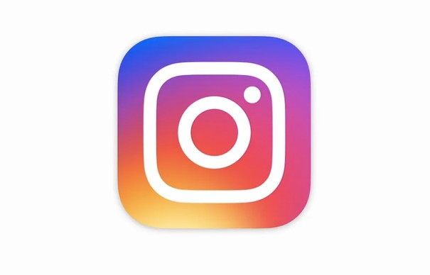
In 2016, Instagram was given its most comprehensive rebrand yet. Using a gradient made of colours from the previous logo's rainbow, the new logo is a much flatter and more minimal take on the previous design. "The simpler design puts more focus on your photos and videos without changing how you navigate the app,” the company said in a blog post at the time. “Our updated look reflects how vibrant and diverse your storytelling has become."
The Instagram logo today
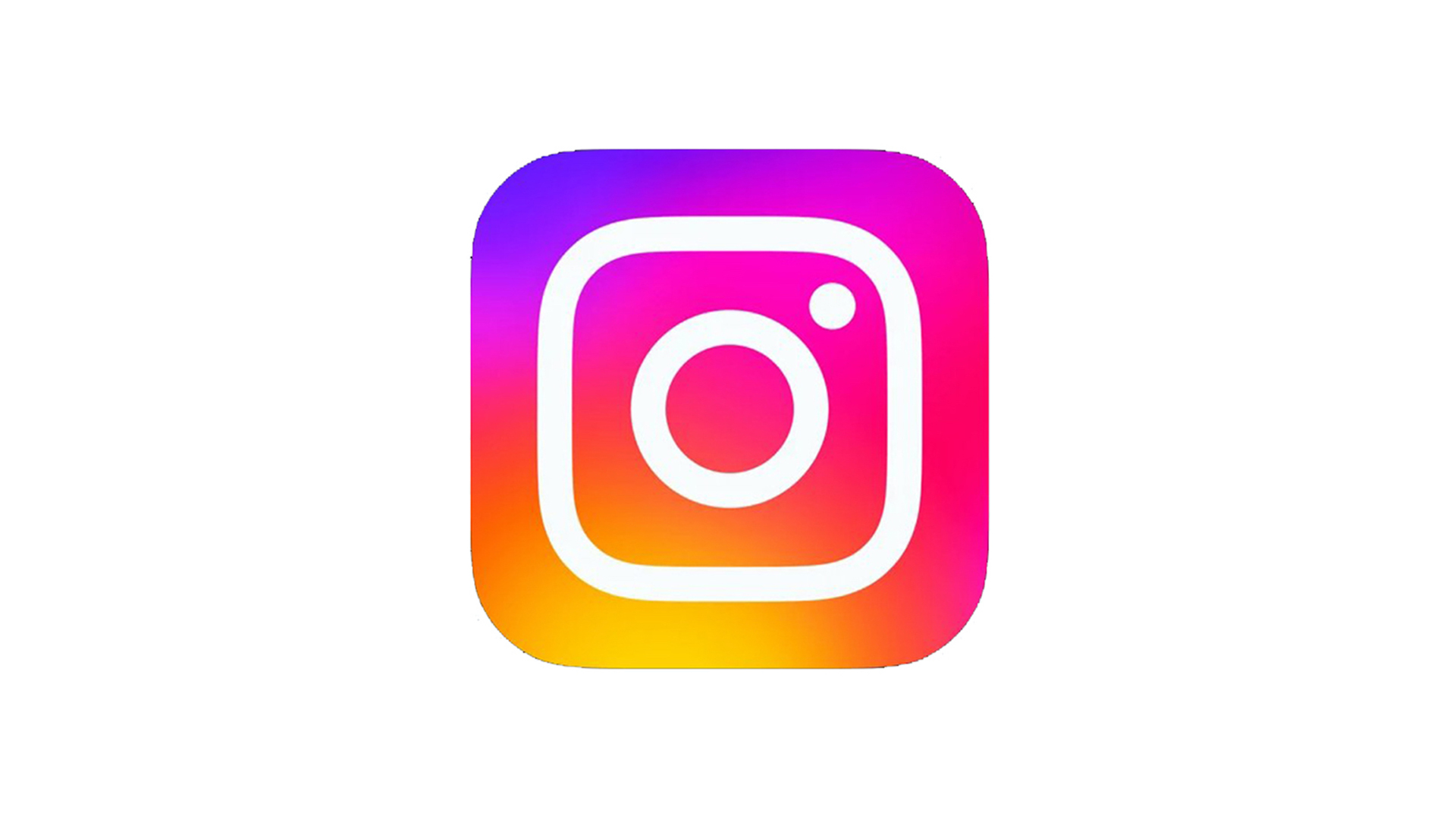
Instagram's most recent brand refresh came in 2022, when the company unveiled a version of its logo with a much brighter gradient, featuring "vibrant colours to make it feel illuminated and alive, and to signal moments of discovery". This new gradient was designed by artist Rose Pilkington.
Sign up to Creative Bloq's daily newsletter, which brings you the latest news and inspiration from the worlds of art, design and technology.
A post shared by Rose Pilkington (@rosepilky)
A photo posted by on
Indeed, while the original iteration of the gradient logo seemed hugely vibrant back in 2016, it looks pretty restrained next to the new version. One can only imagine that the 2028 version will be positively blinding.
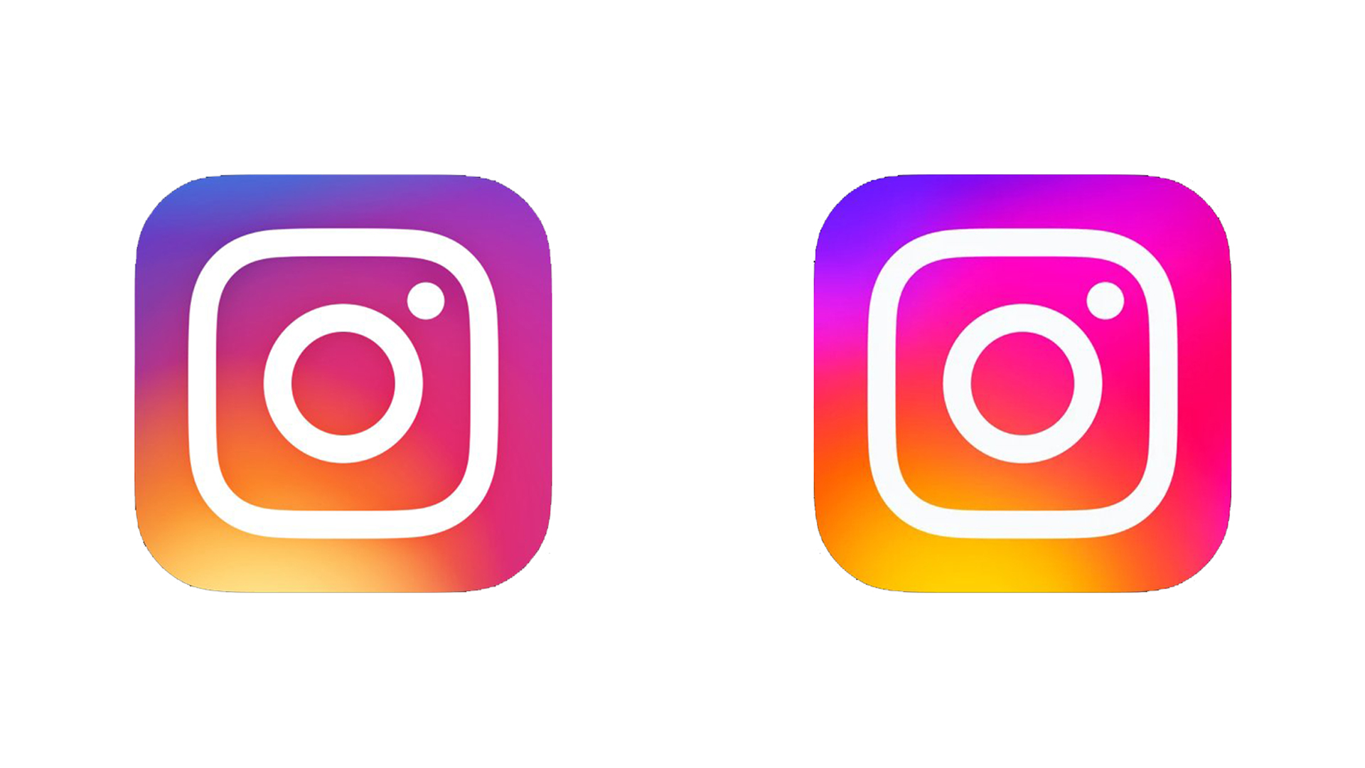
And Instagram is clearly proud of its many logo designs. Back in 2020, to celebrate its 10th birthday, the app allowed users to use any of its old logos as the app icon on their homescreen. If you're looking for more logo history inspiration, check out the history of the YouTube logo.
Read more:

Daniel John is Design Editor at Creative Bloq. He reports on the worlds of design, branding and lifestyle tech, and has covered several industry events including Milan Design Week, OFFF Barcelona and Adobe Max in Los Angeles. He has interviewed leaders and designers at brands including Apple, Microsoft and Adobe. Daniel's debut book of short stories and poems was published in 2018, and his comedy newsletter is a Substack Bestseller.
