"Data can be artful" behind the scenes on JKR's award-winning Centersquare identity
We talk to the people behind the BIAs Best of Show.
Sign up to Creative Bloq's daily newsletter, which brings you the latest news and inspiration from the worlds of art, design and technology.
You are now subscribed
Your newsletter sign-up was successful
Want to add more newsletters?
Centersquare by JKR won the much coveted prize of Best of Show at this year's Brand Impact Awards.
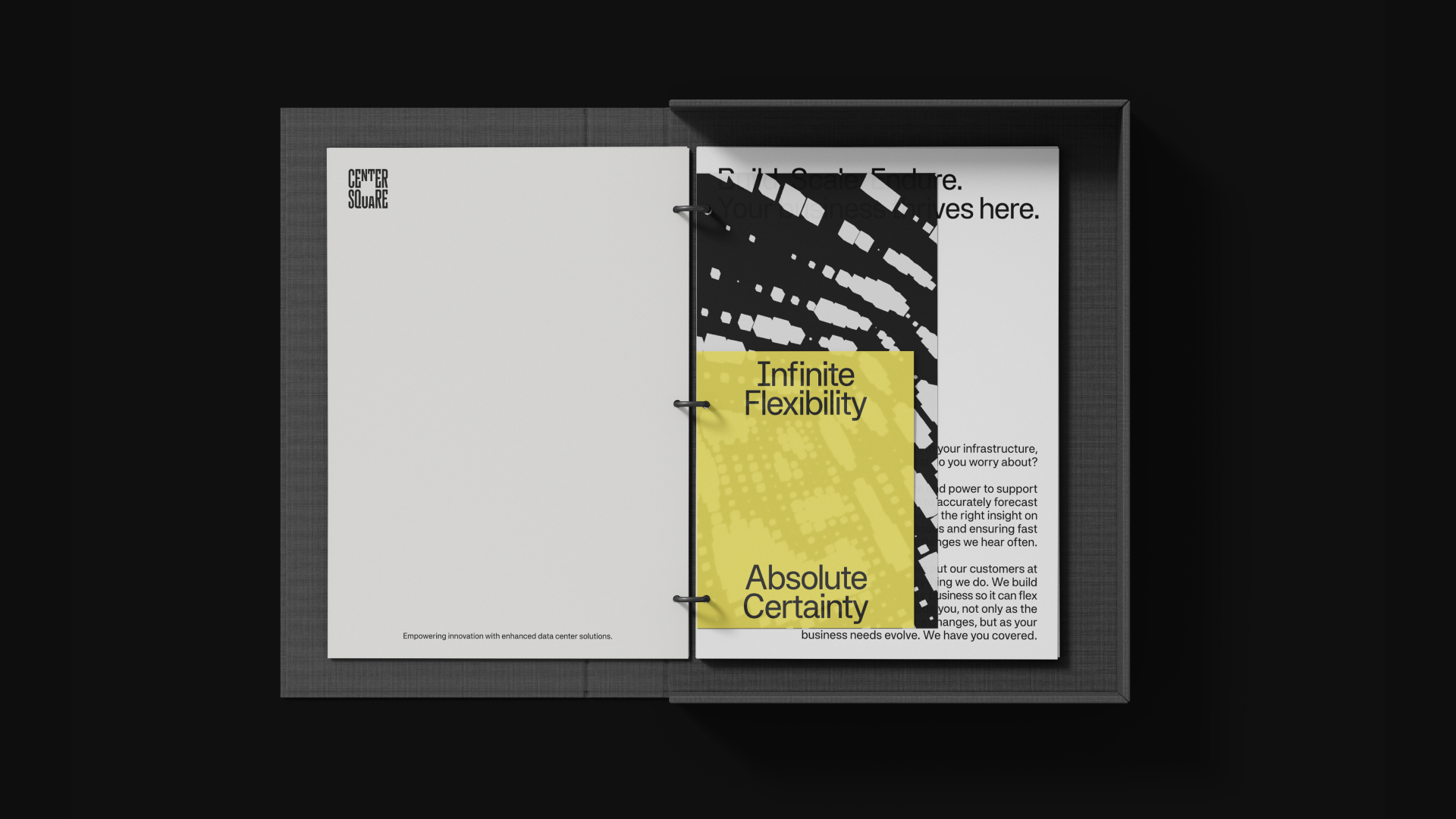
Following the merger of Evoque and Cyxtera, Centersquare rebranded to redefine what a data brand could be. Moving away from cold, corporate visuals, the new identity centres on 'Infinite Flexibility. Absolute Certainty'. A dynamic logo, architectural typography, warm colour palette, and custom iconography transform technical infrastructure into an elegant, artistic system.
This distinctive visual language set Centersquare apart in a conservative industry, earning critical recognition and reshaping engagement. The design not only unified internal teams under a shared vision but also built trust with customers, humanising a traditionally technical field.
Article continues belowI spoke to JKR's Scott Fogel, group creative director; Lee Sherman, head of interface; David Balsamello, creative director; and Tosh Hall, global chief creative officer to discover more about this project.
How did Centersquare’s desire to focus on long-term rather than short-term solutions inform the identity?
Scott Fogel: Data centres are by definition a long-term business. Once you choose a data centre for your company, it becomes a core part of your infrastructure and it’s both costly and burdensome to switch to someone else. It’s why the average deal term is 5-10 years vs. being a yearly thing.
Because of all that, the customer has to really think long-term about whether a certain data centre is the right partner for not just what they need today, but for where their business is going over the next decade. Are they able to support us as we change? As the market changes? As tech requirements in general change? These are the kind of considerations that made us think about the proposition for Centersquare being a long-term philosophy, not a short-term sales pitch.
How did you come up with the idea of ‘infinite flexibility, absolute certainty’?
SF: It’s rooted in what the customer wants. Because on one hand, companies have no idea what their tech requirements and needs will be in 3-5 years, so having a partner that is able to say “no matter where your business goes, we have the capacity and system to support it” is an immensely powerful idea (and one that Centersquare is uniquely able to deliver given their scale and capabilities).
On the other hand, despite how much change and evolution happens, customers still crave a sense of emotional certainty – a reassurance that Centersquare will always be there for you, day and night, to help keep things stable. By combining these two needs, it gave the brand an interesting creative tension: both assuring and safe, yet flexible, innovative, and dynamic.
How has data storage become an art form with this identity?
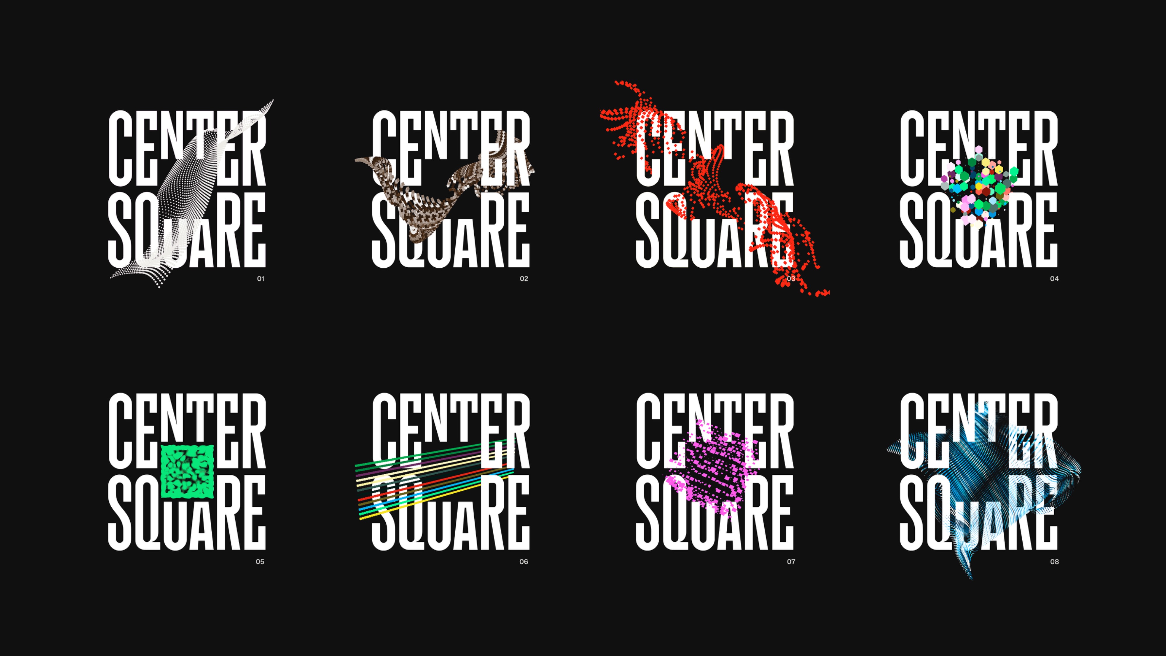
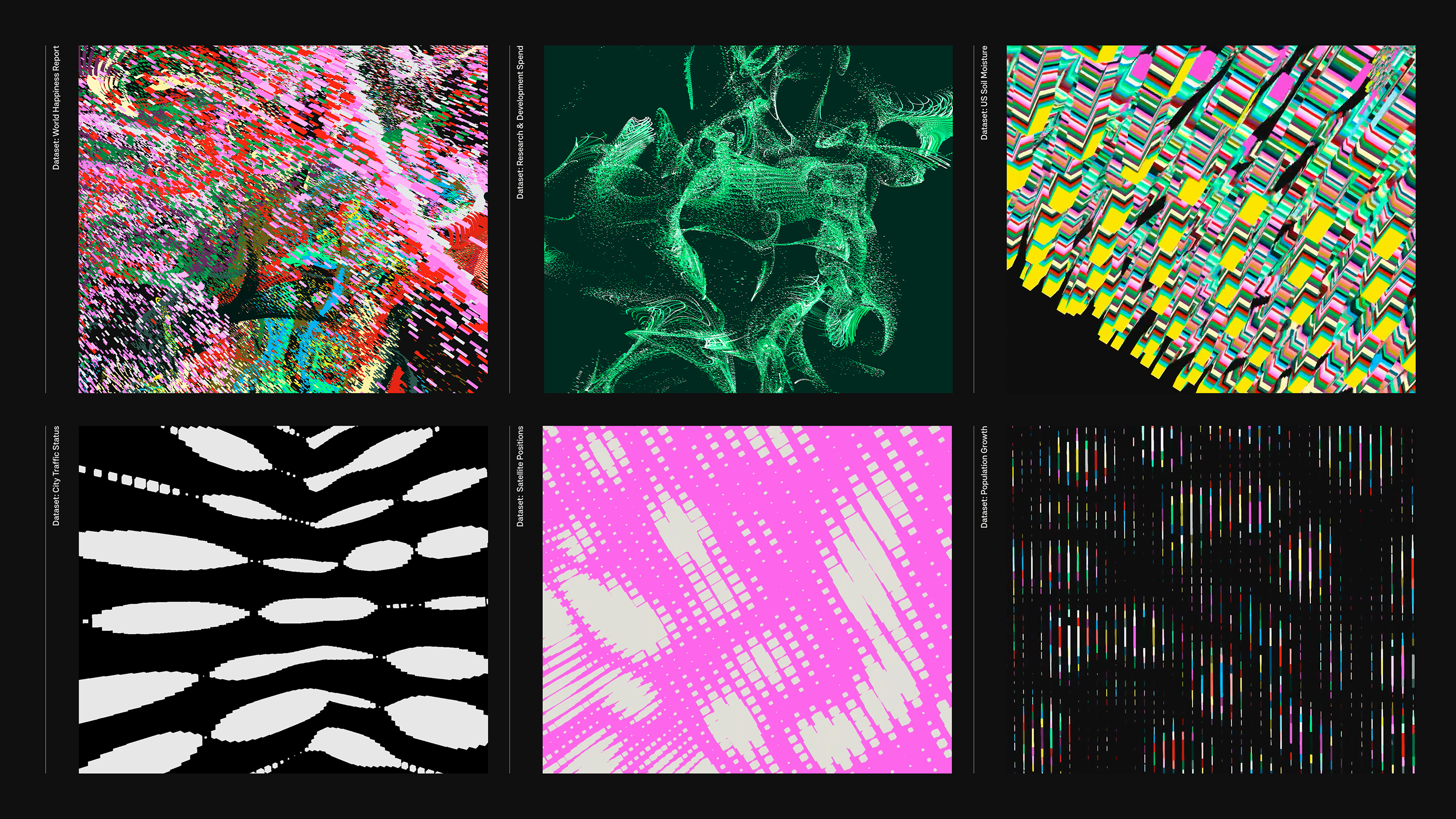
Lee Sherman: To illustrate the secure, scalable and flexible data solutions Centersquare provides, we created a bespoke data driven tool that allows the creation of data filled visuals. We integrated extensive global and open-source datasets into the centre of the logo.
These datasets dynamically drive the animations, with country-specific data controlling cube sizes and transitions over time, enabling each story to unfold in a unique and compelling way. By selecting various parameters, designers can craft personalised data narratives, further enhancing brand communications with distinctive visual storytelling.
How does the typography complement the identity?
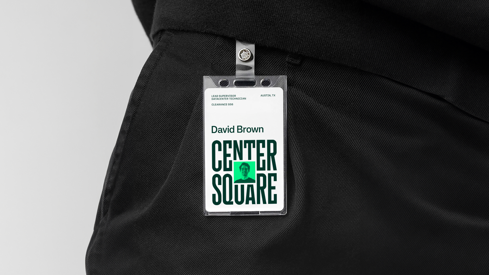
David Balsamello: The typography system uses Systemia by Peregrin Studio. It draws inspiration from digital monospaced type, with square proportions, terminals, and details that echo the geometry of the logo. Designed for clarity and structure at small sizes, it also retains unique details that stand out in larger applications. The result is a modern, versatile typeface that reinforces the identity’s balance of precision, confidence and simplicity.
How did you approach illustration in this project?
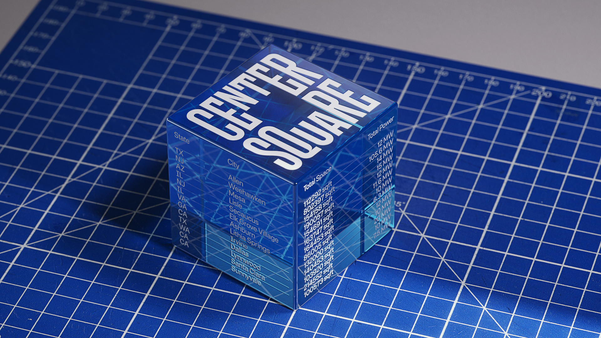
DB: The illustration style is rooted in the language of technical drawings, from data centre maps to precise hardware specification sheets. To connect that world to the rest of the identity, we built an underlying isometric grid derived from the square in the logo, and it quietly sits behind every illustration.
That square-first structure gives the work a sense of technical precision. But because it is so rigorously grounded, we can then use the grid more playfully, creating expressive illustrations and pictograms that begin to communicate more abstract ideas.
Tell me about the colour palette
DB: The colour palette started as a reaction to the category. Most data centre brands live in a world of corporate blues, purples, and soft gradients, which feels a long way from the reality of what's inside the server room.
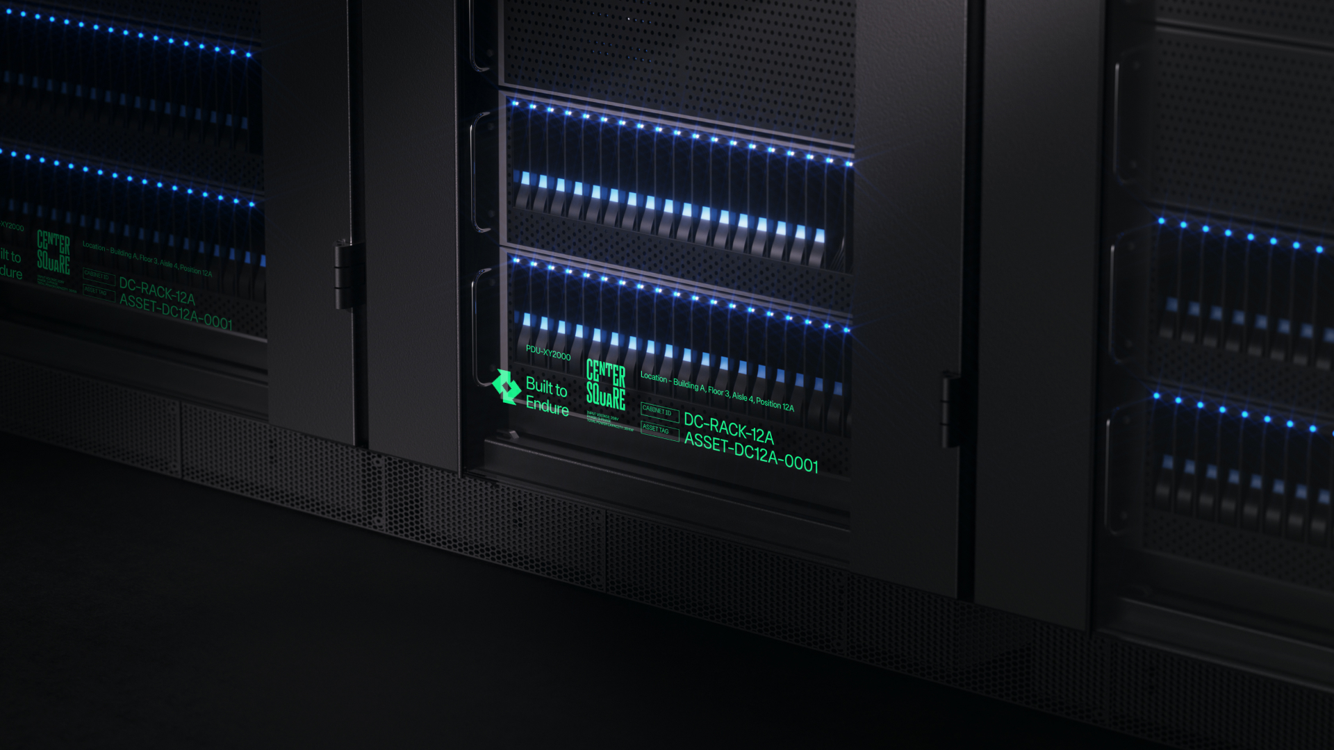
Inside the racks, the wiring is incredibly colourful and meticulously coded, and that discipline became our reference point. By drawing from those cables and labels, we built a palette that feels both systematic and unexpectedly vibrant. It gives us a way to bring the square logo to life with data, using colour to visualise different streams and signals, and to show how precise information can also be genuinely beautiful.
How does the custom iconography complete the final look?
DB: Iconography is where we have to explain the more complex ideas, so it became a place to lean into metaphor and abstraction, and to start to plant the idea that data can be more artful.
We went back to the isometric grid, using it to give each icon a sense of depth, as if the square has become active in three-dimensional space and is processing in real time. Because everything is drawn on a square isometric grid, even at this small scale you still feel the DNA of the logo. The result is a set of icons that can unlock understanding and feeling quickly.
What’s your favourite part of the finished identity?
DB: It has to be the logo mark. Everything begins with that simple square, which became the foundation for every element. It is rare to find such a strong visual link between a name, a symbol, and the service behind it all.
The solution arrived with that mix of inevitability and surprise: the team had been connecting these ideas, and then one day the square simply clicked into place. That moment set the tone for an identity that's iconic and a little unusual, standing apart from the clichés of the B2B space and backed by a client willing to champion something more characterful and built to last.
How does it feel to have won Best of Show at the BIAs for the second-year running?
To win 'Best in Show' two years in a row is incredible, not just for the recognition, but because this award show celebrates what we believe is the most important tool in the creative industry: branding.
Seeing such a wide variety of our work honoured across identity, strategy, and experience, and being recognised alongside some of our most talented peers, is both gratifying and energising. It shows what’s possible when we bring JKR’s mission to life and help brands truly be distinctive everywhere.
Find out more about Centersquare's identity.
Sign up to Creative Bloq's daily newsletter, which brings you the latest news and inspiration from the worlds of art, design and technology.

Rosie Hilder is Creative Bloq's Deputy Editor. After beginning her career in journalism in Argentina – where she worked as Deputy Editor of Time Out Buenos Aires – she moved back to the UK and joined Future Plc in 2016. Since then, she's worked as Operations Editor on magazines including Computer Arts, 3D World and Paint & Draw and Mac|Life. In 2018, she joined Creative Bloq, where she now assists with the daily management of the site, including growing the site's reach, getting involved in events, such as judging the Brand Impact Awards, and helping make sure our content serves the reader as best it can.
You must confirm your public display name before commenting
Please logout and then login again, you will then be prompted to enter your display name.
