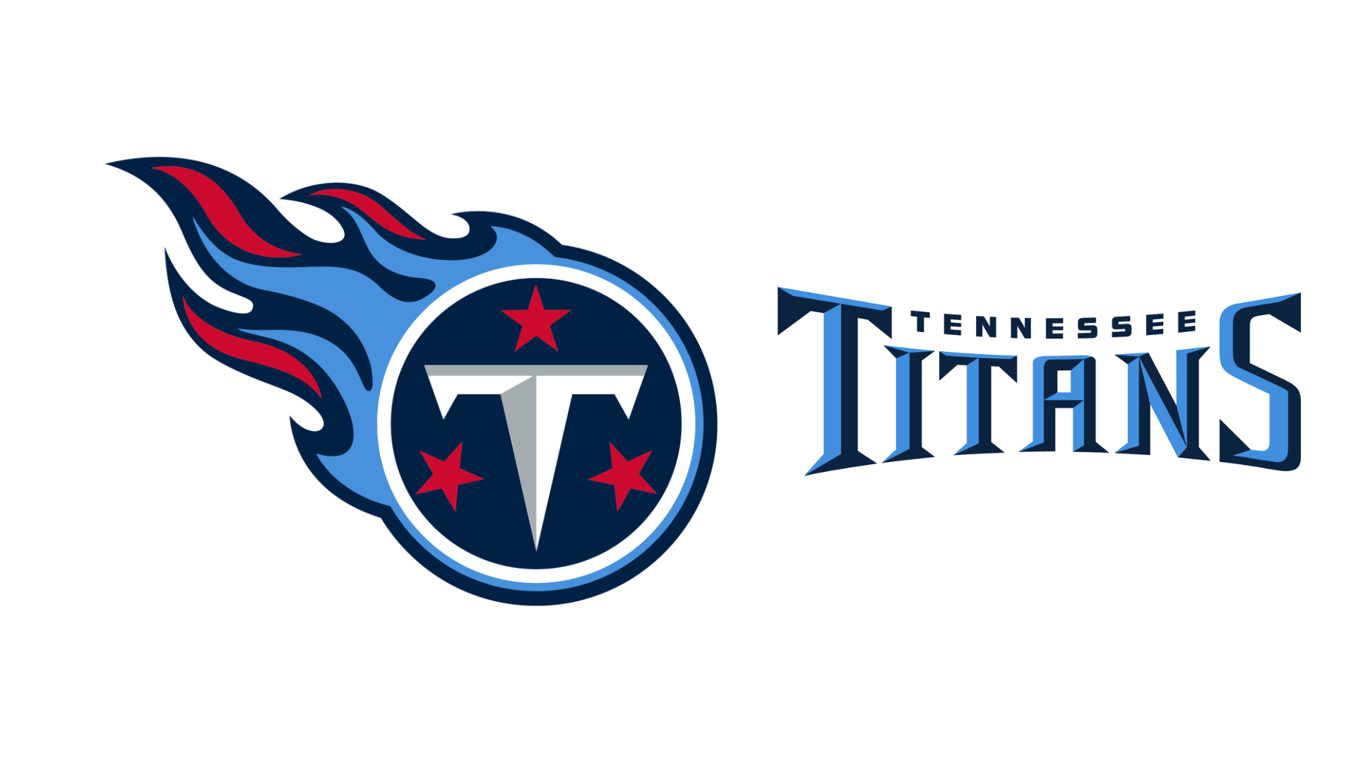
New Titans logo leaks to fierce fan response
"One of the worst in the NFL," one fan complains.

Sign up to Creative Bloq's daily newsletter, which brings you the latest news and inspiration from the worlds of art, design and technology.
You are now subscribed
Your newsletter sign-up was successful
Want to add more newsletters?
New sports logos always cause a stir, but the new Tennessee Titans logo has opened up a whole can of worms with NFL fans. Some fans are aghast at the new 'minimalist' logo, calling it boring and uninspired. Others are into the sleek new design – and the two camps are in fierce debate on the internet.
The new design, which leaked yesterday, replaces navy blue with light blue, and the iconic flames are gone (a staple part of the design since the 1990s , brought in because of the Greek Titan Prometheus – who stole fire from the gods).
BREAKING: The Titans’ new logo has been leaked and confirmed as the rebrand for the 2026 season 🚨The Titans will be releasing the full uniform in the near future, but the helmets have already been unveiled. (via @AustinStanley81 , @AtoZSports ) pic.twitter.com/BqLhlNzsBVFebruary 14, 2026
"If this is truly the new Titans logo, it immediately becomes one of the worst in the NFL," one fan says. "A complete downgrade that continues the absolutely terrible trend of minimalism in sports. Show some uniqueness. Not just another lazy circle logo."
Article continues belowOthers disagree. "I guarantee everyone will eventually like this. This is the exact right ammount of simple. Like Steelers. Will look much better on gear."
Some think it says a lot about the team's brand identity. "Look at their evolution. They started as the Tennessee Oilers, then rebranded to the Tennessee Titans, and now it seems they want to be in a position where they aren't the Oilers but still want to be."
And one fan doesn't even believe it, likening it to the Cracker Barrel controversy. "Nah, no, ain’t no way that’s legit. Ain’t NO way that anyone would make the conscious decision to go from that to that unless this is like the Cracker Barrel deal and they change it back immediately in response to mass public outcry. "
While we haven't seen any official mockups of the logo on uniform beyond on the helmet, some canny fans have overlaid the new logo onto current uniform to envision what it will look like.
Sign up to Creative Bloq's daily newsletter, which brings you the latest news and inspiration from the worlds of art, design and technology.
See the reactions below and decide where you stand on the makeover.
If this is truly the new Titans logo, it immediately becomes one of the worst in the NFL.A complete downgrade that continues the absolutely terrible trend of minimalism in sports.Show some uniqueness. Not just another lazy circle logo pic.twitter.com/3xfr5tYzSTFebruary 14, 2026
it looks incredible on the helmetFebruary 14, 2026
The Tennessee Titans are DEAD… NO SWORD NO FLAMES… TIME TO LOSE THE TITANS NAME. ITS NAME CHAGE TIME. #TitanUp #Titans pic.twitter.com/d9hzkMPnETFebruary 14, 2026
It's probably a bit controversial, but I think they should have just stayed the Tennessee Oilers. The Titans name, logo and uniforms have always seemed amateurish to me. For those who like to argue Tennessee doesn't have oil when I say this, they do. https://t.co/knXTaYoEf6 https://t.co/zhUbtIt9jMJanuary 17, 2026
The creative team has played it super-safe with this logo redesign, and we're more than used to compromising on minimalist aesthetics these days. It does feel as if some of the heritage has been stripped from the brand with the removal of the fire symbol – but it's a clean and sleek design overall.
What do you think of the change? Let us know in the comments
For less controversial logos, see our pick of the best NFL logos. And find out about the history of the NFL logo itself.

Georgia has worked on Creative Bloq since 2018, and has been the site's Editor since 2023. With a specialism in branding and design, Georgia is also Programme Director of CB's award scheme – the Brand Impact Awards. As well as immersing herself with the industry through attending events like Adobe Max and the D&AD Awards and steering the site's content streams, Georgia has an eye on new commercial opportunities and ensuring they reflect the needs and interests of creatives.
You must confirm your public display name before commenting
Please logout and then login again, you will then be prompted to enter your display name.
