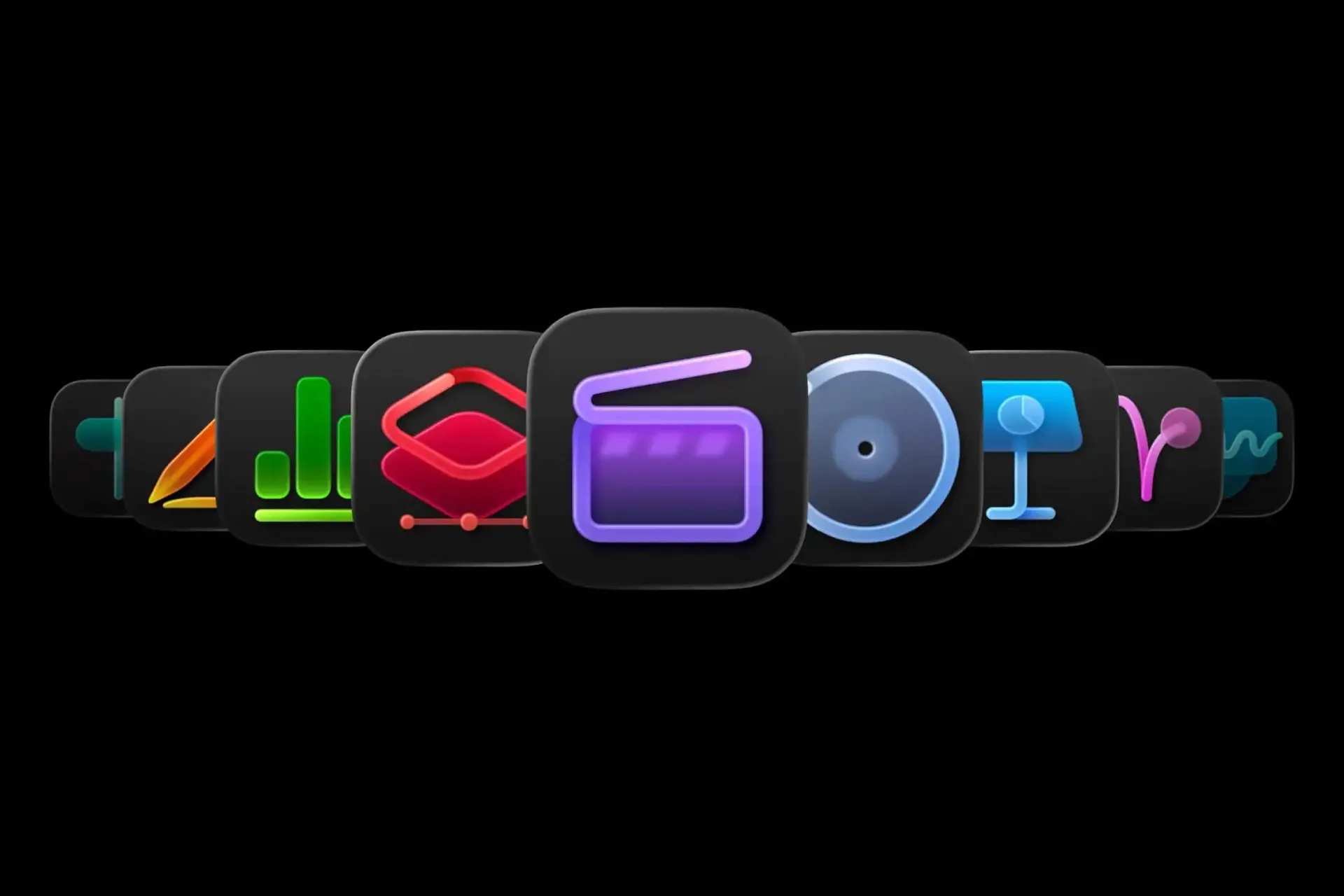
Apple recently released a new version of Creator Studio and, with it, a set of new app icons. So far, so unremarkable. But these icons are so confusing that Apple felt compelled to release a whole user guide to help you navigate them.
The guide exists because the new designs are far from self-explanatory, and because there are now two versions of each app – one via subscription, the other through a one-off payment – each subtly different. Following the style of the macOS Tahoe update, the icons also abandon image-led design, which clearly signals what each app does, in favour of minimalist, concept-led abstractions. The new colour scheme doesn't help either: muted and dull against the vibrancy of the old one.
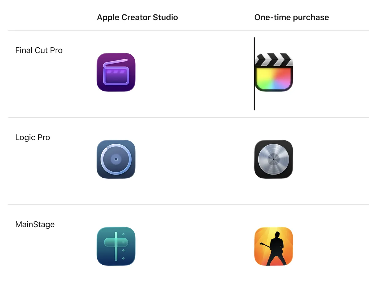
The fundamental principle of an icon is that you can read it at a glance. That's hard enough here, but the bigger problem is that these icons come as a suite, appearing side by side. Their mutual similarity and abstract style compound the confusion in a way a standalone icon might get away with.

Whether or not you prefer the old-style icons (I do), both are here to stay. Apple knew you'd be confused but, rather than design a more intuitive system, it handed you a manual. I'm sure the guide is meant to ease the transition and help differentiate the icons on the desktop – but it would be better still if they were obvious enough not to need one. What do you think?
It's a season for icon frustration: the response to Google's new app icons shows Apple isn't alone. Though we do love these parody Google icons – be sure to check them out!