Some rebrands are criticised as being unnecessary, but the new logo design for Ronald McDonald House Charities was desperately overdue.
The fastfood brand's biggest charity initiative is growing, and it finally has a versatile, warm but more mature identity fit for that purpose – thankfully, without any slightly sinister-looking references to a long-retired mascot.
Ronald McDonald House began life Philadelphia in 1974. It's since grown to more than 250 chapters, which provide accommodation – both out-of-hospital housing and in-hospital family rooms – to ill children and their families in 62 countries. An ambitious expansion plan now aims to double the number of families served by 2030.
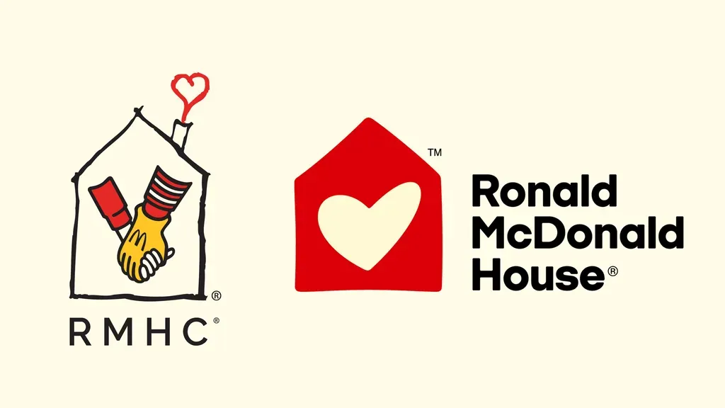
The previous logo design featured a childlike drawing of a house containing the gloved hand of Ronald McDonald clasping that of a child... Well, they were different, more innocent times, I guess. The logo was designed long before the 'clown panic' of 2016 and McDonald's decision to retire its mascot as it shifted to target more adult audiences.
Today, even without the fact that younger audiences might not recognise Ronald, the old RMHC logo looked more like a warning of 'stranger danger' than the identity of a major global charity.
The new logo keeps the 'heart' of the previous identity, both figuratively and metaphorically. It streamlines and simplifies it, making it more versatile, while retaining the warmth that comes with an imperfect hand-drawn motif. The colour maintains an element of association with the McDonald's brand while giving the charity its freedom: McDonald's remains its biggest sponsor, but the charity is independent from the fastfood brand, which only provides around 25 per cent of its funding.
Ronald McDonald House UK noted that research had found people were often unsure about what the charity did. It said the new look “brings greater clarity and consistency to how the organisation presents itself, sharpening messaging and strengthening how its mission is communicated”. The aim to enhance appeal to donors and corporate partners while clearly differentiating the charity in a crowded sector.
Announced late last year, the rebrand is now rolling out to chapters globally, with an aim of full migration by the end of 2027.
For more of the week's branding news, see the controversy around the Bob's Red Mill rebrand.
Creative Bloq is now easier to access than ever before with our on-the-go app, which brings you all the content you know and love from our website, but in a super-streamlined design.
Download the Creative Bloq app for iOS
Download the Creative Bloq app for Android