While it has never quite reached the global ubiquity of McDonald’s Golden Arches, the Burger King logo still deserves its place among the pantheon of the greatest logos of all time – it even won our 'logo of the decade' award during our 10th anniversary celebrations. Having been around since the 1950s, the chain has gone through a few different iterations of logos and typefaces before hitting on a simple and effective slice of mid-century graphic design that has lasted to the present day.
But it was a bit of a journey to get there and back again – so, let’s go back to the beginning and take a closer look as we delve into the history of the Burger King logo. And if you find yourself inspired to get designing, make sure you check out our guide to the best design software to make your ideas come to life.
1953: Insta Burger

When Burger King first opened its doors in Jacksonville, Florida, in 1953, it was under the slightly less catchy name of ‘Insta-Burger King’. Founders Keith G. Cramer and his wife's uncle, Matthew Burns were extremely proud of their new piece of equipment, the Insta-Broiler that could pound its way through up to 400 hamburgers in an hour.
Thus, contemporary photos from the early days show Burger King franchises with this jaunty ‘Insta’ icon in the centre. A proper 1950s-style icon, the ‘Insta’ disc uses a simple and legible font increasing in size from left to right to give a sense of motion and momentum, and it is sometimes (but not always) accentuated by a swoosh that underlines it.
1954-1959: Just Burger King

Despite a promising start, Insta-Burger King swiftly ran into financial difficulties, and was ultimately purchased by franchise licensees James McLamore and David Edgerton, with the sale being finalised in 1959. By this point, most franchises had dropped ‘Insta’ from the name – in part because McLamore and Edgerton discovered some technical issues with the Insta-Broiler, and had consequently switched to a flame griller.
The resulting logo, sans ‘Insta’, was a fairly simple piece of spiky typography. With irregular edges and extremely denuded serifs, this font was certainly unusual, though proved distinctive enough to stay in place until the end of the decade.
1959: Hail to the King
Look at this fancy boy.

The ‘King’ mascot had been introduced in the mid 1950s, but at the end of the decade he finally took pride of place on the logo. The previous ‘Burger King’ wordmark was mostly retained, albeit with a few subtle tweaks to the letterforms, while a painterly burger was added for the King to sit on, and the legend ‘Home of the Whopper’ added below.
The Whopper was invented in 1957 by James McLamore (if lofty words like ‘invented’ can be applied to the concept of ‘make burger big’), and had become the chain’s signature sandwich, and so the logo was redesigned to shout about it. Understandable, though the addition of all these elements undoubtedly makes the logo pretty busy.
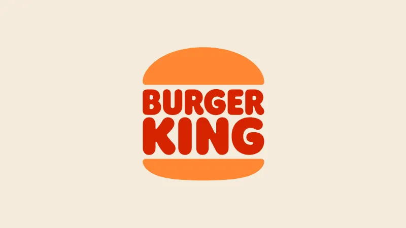
1969-1999: A Logo Sandwich

Here we go. Now here’s some damn design, people – at the end of the 1960s, the Burger King logo was radically reinvented into a form that you will likely find familiar. Taking cues from mid-century modernist design trends, the new logo was pared-back, simple and rather clever with it too.
Gone is our friend the King, gone is the photograph of the burger, gone is any concrete indication that we’re entering the home of the Whopper. We’re in minimalist country now – just the two words ‘Burger King’ in a jaunty bubble font that sands away the sharp corners of the previous wordmark. The words are styled in a meaty red, and in a truly inspired touch, they are encased inside the two halves of a golden bun, drawn as simply as possible in two wedge shapes.
No notes here. This logo is an instant classic – so much so that it was kept virtually identical for the next 30 years, save for a few very minor cosmetic tweaks.
1999-2021: The 3rd Dimension

At the tail end of the 1990s, 3D was very much the new hotness in design. As such, the Burger King logo received a shake-up courtesy of the Sterling Group. The formerly flat logo was set askew, with highlights on the bun wedges giving it a 3D feel.
While the essential concept of the wordmark as a burger patty encased in a bun was retained, the logo was newly encased in a circular blue swoosh – and note the way the ‘K’ cuts slightly over it, just in case you weren’t quite getting that we’re 3D these days.
While this version endured for more than two decades, it’s to my mind not a particular improvement. It makes for an interesting comparison with our history of the Pepsi logo, another mid-century graphic design classic of flat minimalism that flirted with 3D tackiness in the 1990s and 00s, before reverting to the classic version in the 2020s.
(Oh yes, spoilers for the next bit, there.)
2021-present: Return of the King (again)
At the onset of the current decade, the classic form of the Burger King logo returned in a sizzling rebrand that brought back the iconic 1960s logo, updated a little at the edges but conceptually unchanged. With flat design firmly back in, the menus, packaging and merch were all overhauled by agency Jones Knowles Ritchie with a new colour palette and a juicy typeface simply called ‘Flame’.
This has been one of our favourite rebrands of the decade so far, and it was all built around an absolutely sublime logo design from the 1960s. Hail to the King, indeed.
See our history of the Coca-Cola logo for more classic logo goodness. And If you fancy trying your hand at creating an iconic mark for yourself, see our guide to how to design a logo.