Some brands are so strong they don't need a logo at all, or at least not all of their logo all the time. There are also plenty of powerful textless logos that immediately identify a brand without words. But can a brand identify itself without a name when its logo is merely four simple sans serif capitals in a slightly rounded black-and-white box?
That's what the outdoor cooler maker Yeti is aiming for. The brand's logo design is so minimal that there's little more to it other than the Yeti name, but its clever new campaign shows that with precise execution even the simplest logotype can do a lot of lifting.
Yeti's celebrating its 20th anniversary this year. As well as its flagship coolers, it now makes drinkware, kitchen gear, bags and even beds for dogs. The 'FOUR Letters' campaign devised by Wieden+Kennedy Portland sees the Yeti logo replaced with a revolving series of words that you might expect to come up on a presentation of brand associations, including 'Wild' 'Hunt', 'Fish', 'Hike' and 'Snow.
The idea is to highlight the things that Yeti customers like doing with its products, whether its practising sports, exploring the great outdoors or just cooking in the yard. The rotating words replace the brand's name with what it actually means to its customers: the personal passions that it helps them to enjoy.
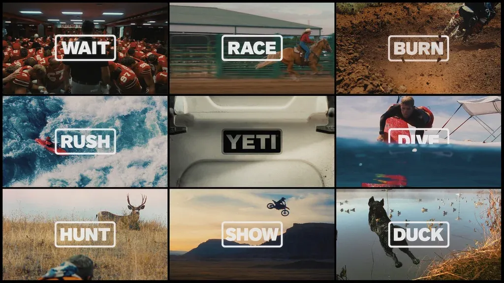
As well as the 'anthem film' above, the brand will be championing specific communities through content with ambassadors David Mangum, Tootsie Tomanetz. and Kimi Werner, reinforcing this idea of the non-Yeti logo as a badge for many passions. In some content, the alternative logos also appear as stickers.
It's not so much a campaign about reaching people who don't know the brand, more for strengthening the relationship with customers who have been with the brand at some point during its 20 years.
The campaign relies heavily on context, which is provided by the photography. The logo design isn't so distinct that customers would immediately think 'Yeti' if they see abstract four-letter words alone, but the rugged outdoorsy images complete the cipher, making the meaning clear and subconsciously reinforcing the connection between the brand and the kinds of places and situations where you might take it (some people on social media are asking where the 'beer' sticker is).
Creative Bloq is now easier to access than ever before with our on-the-go app, which brings you all the content you know and love from our website, but in a super-streamlined design.
Download the Creative Bloq app for iOS
Download the Creative Bloq app for Android