Butter brand Anchor has unveiled a refreshed brand identity that excels in refinement, not reinvention. With a more focused approach to its core brand, the new look shines in its simple elevation, proving that the best rebrands don't always have to be about grand redesigns.
With over 100 years of brand heritage, Anchor's new look is all about honouring its legacy by stripping the brand back to its roots. With a new wordmark, softened illustrations and a simplified brand aesthetic, Anchor's refresh perfectly embodies the brand's spirit of warmth and authenticity.

Partnering with brand design agency Pearlfisher, Anchor's new identity centres around its refined brand system. The once playful yet unfocused packaging of the past has been replaced with a sleek reinvention of the traditional wordmark, subtly softening the design with smoother curves and balanced proportions to reflect the brandʼs breezy aesthetic.
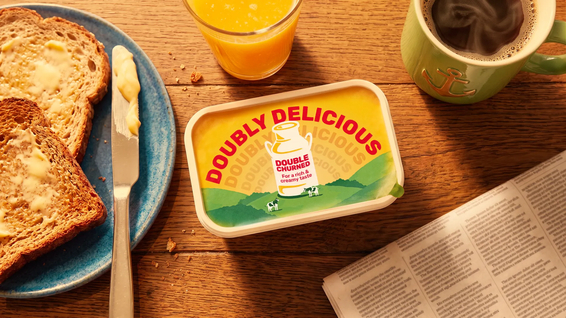
Continuing the spirit of simplicity, the brand's signature positioning takes centre stage, with copy that promotes its “Double churned for a rich & creamy taste,ˮ while the addition of the brand's founding date reaffirms its heritage. “Anchor has always been about unmistakable taste and comfort. By putting ‘Double churned for a rich & creamy tasteʼ at the heart of our packs, weʼre giving shoppers a clear, confident reason to choose Anchor - and doing it with the warmth and joy people expect from the brand," says Catriona Mantle, marketing director for BSM at Arla Foods.
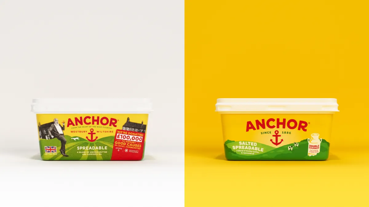
The simplified packaging architecture gives each pack of Anchor a consistent clarity, while the reworked green hill illustrations are redrawn with smoother, more fluid shapes "that subtly nod to the double churning process while reinforcing cues of creaminess and softness." Johnny White, design director at Pearlfisher, explains. “With a brand like Anchor, itʼs about knowing what not to change - and then making a few well-judged adjustments that really lift it.ˮ
For more branding inspiration, check out why brand experience is so important in 2026, or take a look at our interview with Pearlfisher's co-founder, Jonathan Ford.
Creative Bloq is now easier to access than ever before with our on-the-go app, which brings you all the content you know and love from our website, but in a super-streamlined design.
Download the Creative Bloq app for iOS
Download the Creative Bloq app for Android

