Channel 4's in-house agency, 4Creative, has launched a fresh brand identity shaped by the spirit of collaborative culture. Embracing a diverse, ever-evolving look evocative of the agency's work and its creatives, it marks a confidently unconventional new era bursting with soul.
The best rebrands often require a fine balance of heritage and modern innovation, and 4Creative's new look is no different. With a fresh identity, visual language and website, the rebrand captures the legacy of the Channel 4 brand, infusing its archival identity with a contemporary, untameable vibrancy.
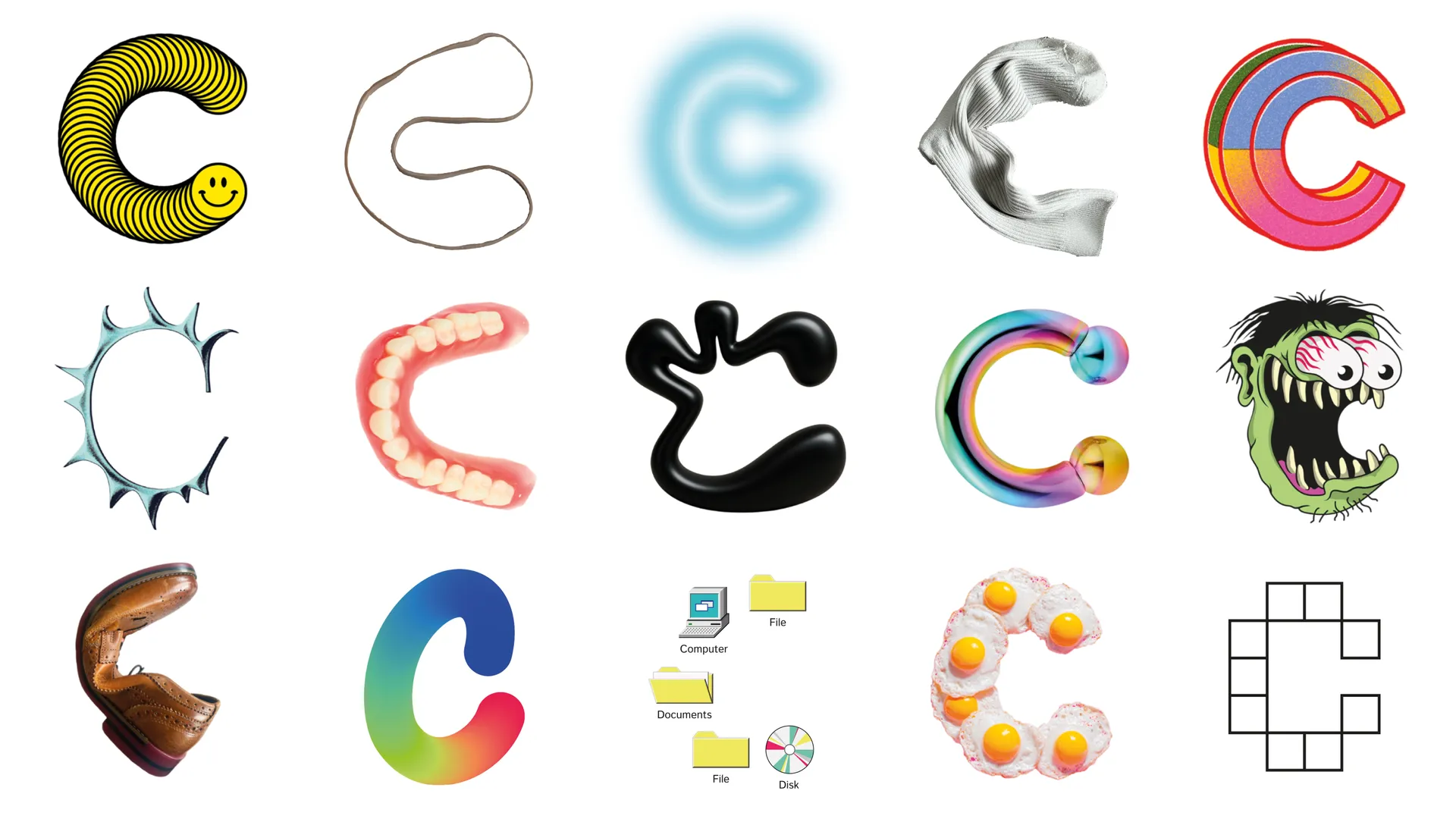
At the centre of 4Creative's rebrand is the ‘4C’ monogram logo – a fluid identity that randomly cycles through unique designs created by the team, from apprentices to the executive creative director. Representing the diversity of the team's perspectives and their collaborative spirit, no single logo dominates the identity, signalling that all voices are valued while interweaving Channel 4’s Altogether Different brand platform.
“The monogram is perpetually unfinished, and I am excited to see how the design continues to evolve with new team members adding their own bespoke ‘4C’ into the mix,” explains producer Jazz Stradling. “4Creative isn’t one thing, and it never has been. It’s rowdy, collaborative, unpredictable and proudly Channel 4. We needed an identity that actually reflects that. Something built from our people and our work, that can keep evolving as we do," adds David Wigglesworth, executive creative director & creative partner.
The wider rebrand captures 4Creative's playfully irreverent energy, pairing bold typography with randomly selected iconography from Channel 4 favourites such as The Great British Bake Off and Peep Show to tie heritage with the rebrand's modern flair. This cut-out motif offsets the functionality of the sans-serif font, showcasing the agency’s "legacy of inventive storytelling, craft, and playful tone."
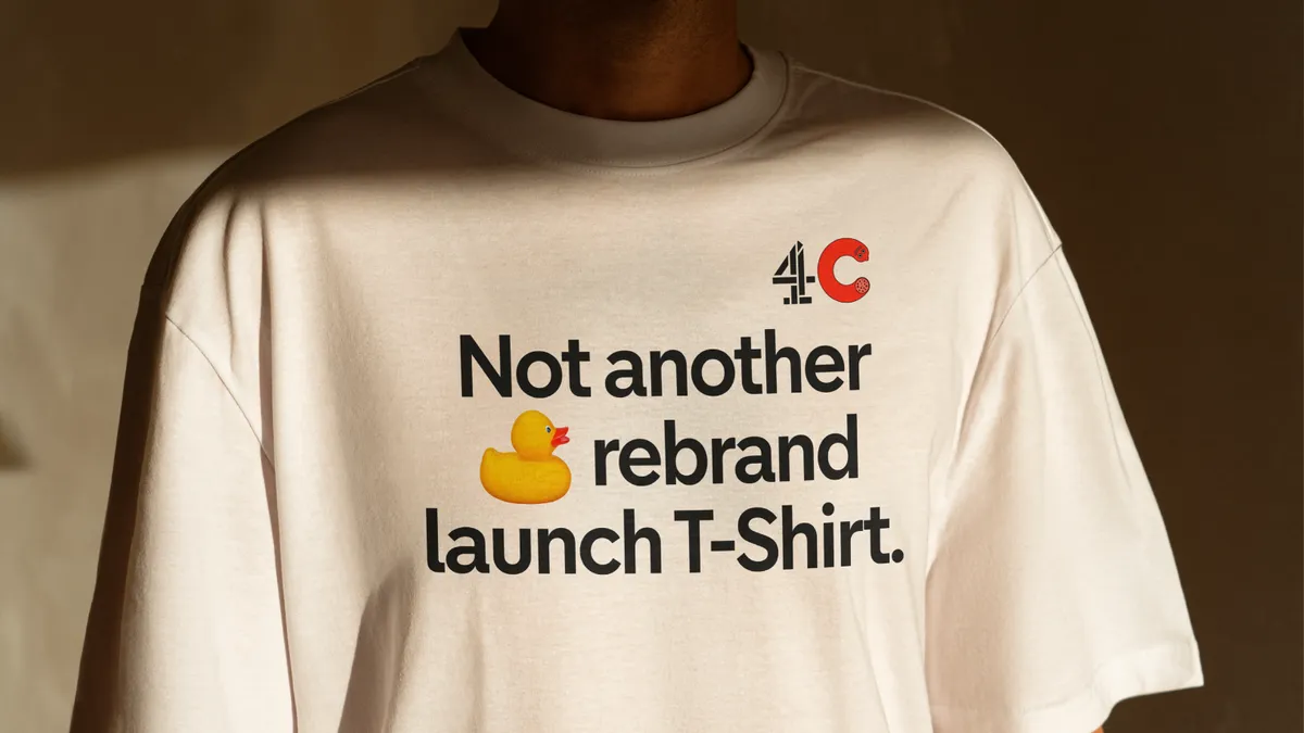
“4Creative truly is a special place, it’s unformulaic and ‘unpindownable’ and we wanted our new brand to embrace that spirit," explains head of design, Rob Boon. "We didn’t set out to be different with our approach; it’s a result of who we are and what we have to say. This refresh goes beyond a monogram, a design system, a website or a t-shirt – it brings us and our work together and it shapes how we’ll show up for some time to come,” he adds.
“At 4Creative, the work is everything, and it’s our people who make the work. This rebrand reflects that: a collective identity built from within. Bringing the Channel 4 logo back into the heart of it, reinforces our role as Channel 4’s creative partner," adds Miketta Lane, director of 4Creative.
For more branding inspiration, check out the logo design trends dominating 2026 or take a look at this beautiful shifting mirror artwork inspired by London landmarks.

