Haven't you heard? Serif fonts are back. While brands have been all about blocky minimalism, flat design and sans serif typography for the last decade, we've started to see a shift back towards more elegant text. The tide is turning on the serif vs sans serif debate, but the shift to a more analogue appearance is bring driven by a somewhat unexpected force: AI.
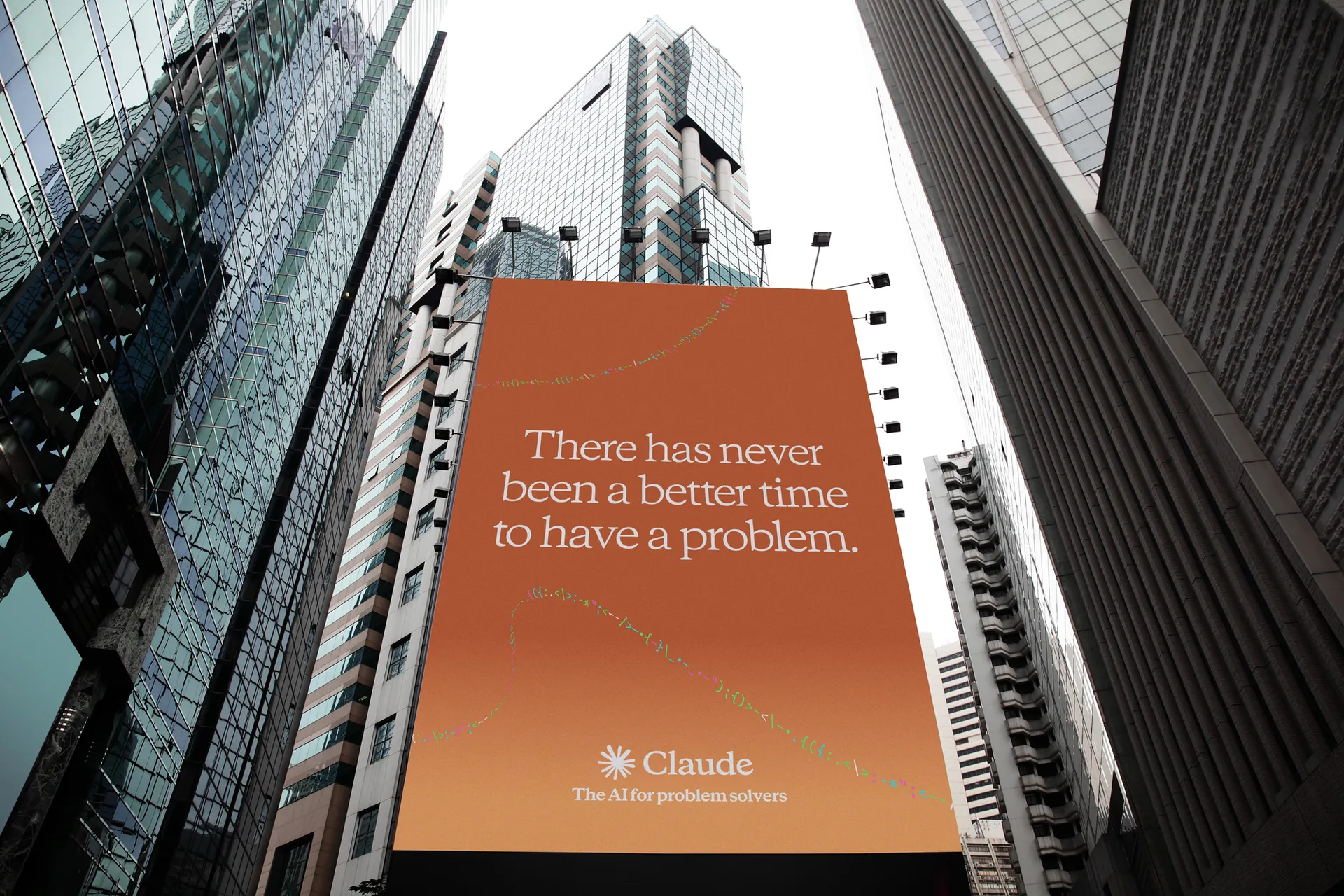
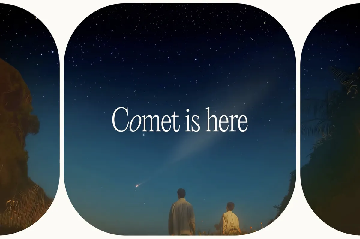
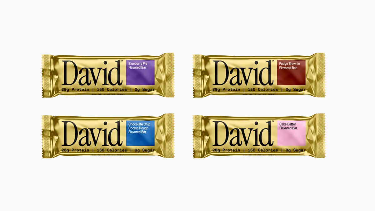
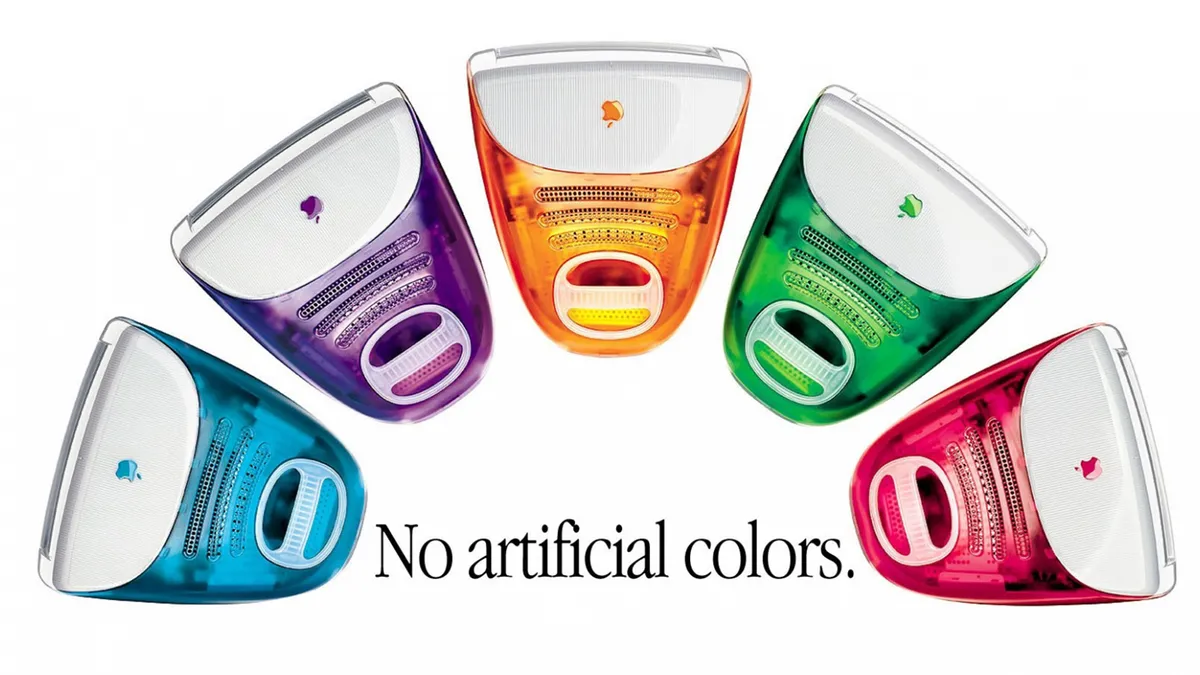
From Perplexity to Claude, AI brands across the board are reaching for the warmth and familiarity of serif fonts. The look is decidedly retro, bringing to mind those Apple ads of the early 2000s. And the trend is making its way into other areas of branding too, even adorning packaging for protein bars.
We caught up with Charles Nix, Senior Executive Creative Director at type foundry Monotype to find out more about what's driving AI's shift towards serif fonts, and why it's all about the pursuit of humanity.
Why are AI brands turning to serif fonts?
In order to seem more human. They’re also turning to serif fonts for differentiation—from other tech companies, from their AI competition, and from the myriad brands of the last quarter century who have used (humanist, geometric, and grotesque) sans serifs.
Serifs are traditional. Serifs are intellectual. They are still the preferred typography for printed books. Using serif fonts in the digital space was seen as anachronistic, but we may have reached “maximum sameness.” The quest for differentiation is causing designers to reconsider serifs—in display for sure, but now in text too.
Why do serif fonts feel more trustworthy?
When was the last time you heard about an 80-year-old cybercriminal? Things that are old (or remind us of age) are generally considered wise or trustworthy.
The origin of the serif pre-dates printing by more than a thousand years—an outgrowth of the brush-written Roman capitals. Typographers have modified the little stroke endings over the centuries, but they persist. They’re old. They’re not as popular as they once were. But they’re a trusted part of typographic history.
What is the 'serif paradox'?
The paradox: AI is the very cutting edge of technological frontier, yet it’s increasingly framed with serif typefaces—typography associated with age, authority and trust. It’s like a child in a three-piece suit.
Can machines grasp the art and craft of the letterforms they're borrowing?
The machines themselves cannot yet grasp the art, craft and local nuances behind the letterforms they’re borrowing. It’s only a matter of training and time. The machines haven’t been trained (or trained themselves) on the highly specific body of typographic knowledge and cultures from the last six centuries. This century has focused unprecedented attention on typographic form—ushered in by desktop publishing and font menus in the last century; abetted by type on the web and social media; and supercharged by readily-available tools and training for making and using fonts. We’ve gone from a scant number of typographers in the world to everyone as a de facto typographer.
What are type and tech experts doing to solve AI's inability to render typography properly?
Type and tech experts are actively teaching AI about the components of the typographic ecosystem: how type is known, studied, categorized, quantified and understood; how type is designed and conceived; how fonts are crafted; how fonts and typefaces are marketed, discovered, and licensed by designers; how fonts become part of brand guidelines and governance systems; how fonts are used in design, layout, and production; how fonts are embedded in digital products like websites and apps; how the effectiveness of brand design and typography is judged and quantified; and the triggers for a re-brand.
In more fundamental terms, typography is the study of type, the making of type, the distribution of type, the use of type, and the effect of type. It’s by addressing these components individually and in concert that type and tech experts are helping AI see typography and render it with greater fidelity and nuance.

