London's St Paul Cathedral is one of the capital's most iconic buildings. Designed by Sir Christopher Wren in the late 17th century, the cathedral was a symbol of resilience during the Blitz and is known today as 'The People's Cathedral'. It is both a magnet for visitors as well as a working, vibrant church.
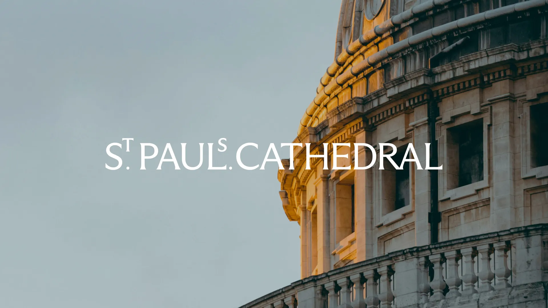
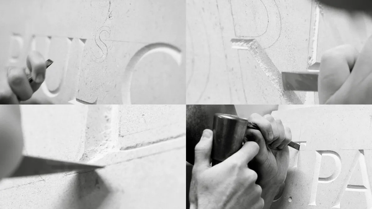
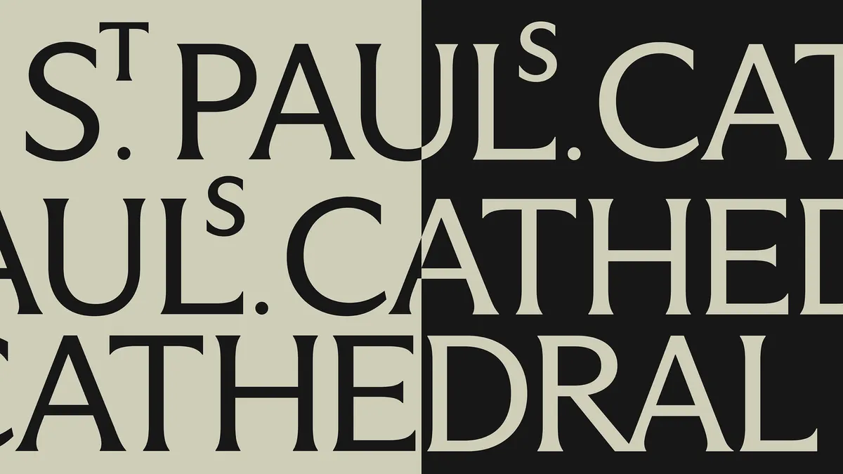
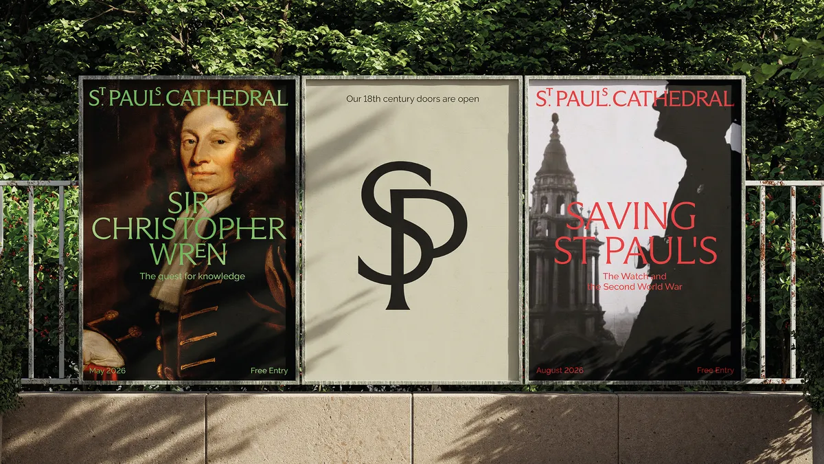
The cathedral now has a new visual identity, courtesy of Pentagram, led by Domenic Lippa. The new look centres around the St Paul's wordmark. This was created thanks to a deep dive into the cathedral's history, drawing on letter engravings and carvings throughout the building and in the Crypt (and is an excellent example of how to build on a brand's heritage).
Working closely with the cathedral's stonemasons, the team explored and experimented with the wordmark to see how it could be made into a modern mark that respected the cathedral's heritage.
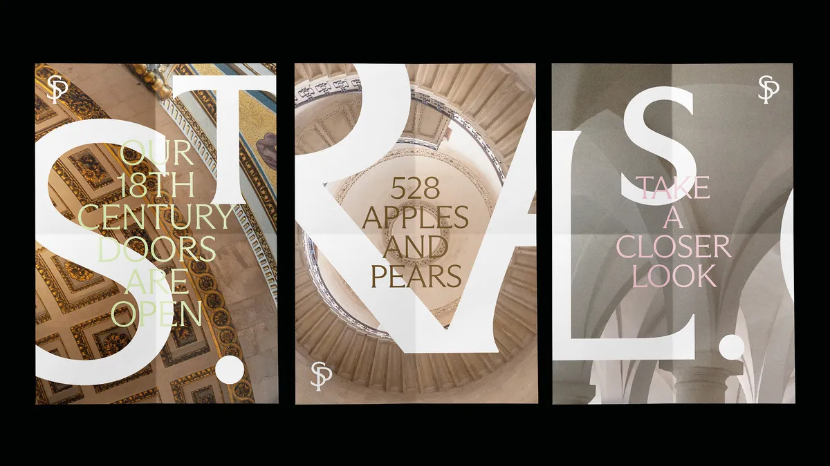
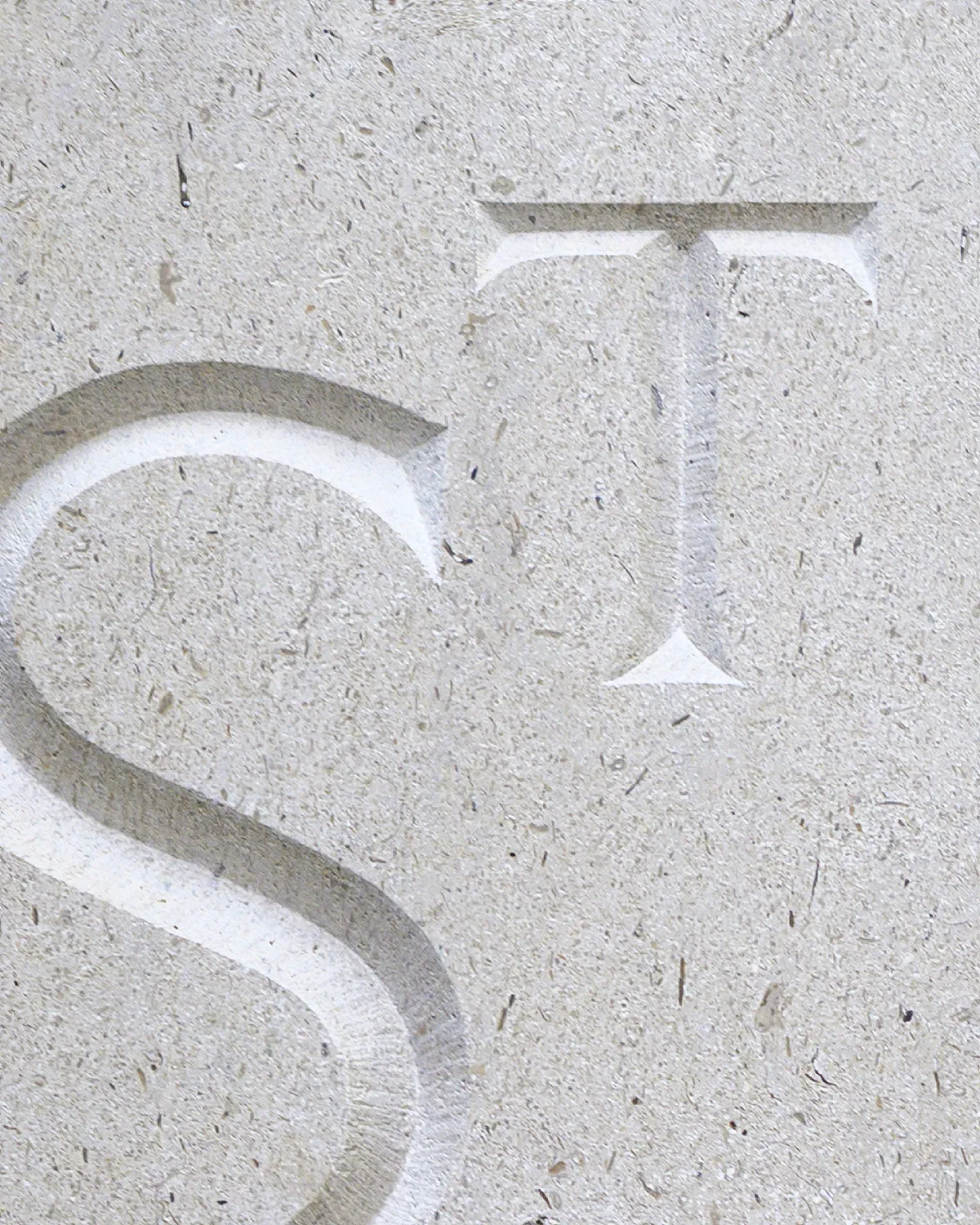
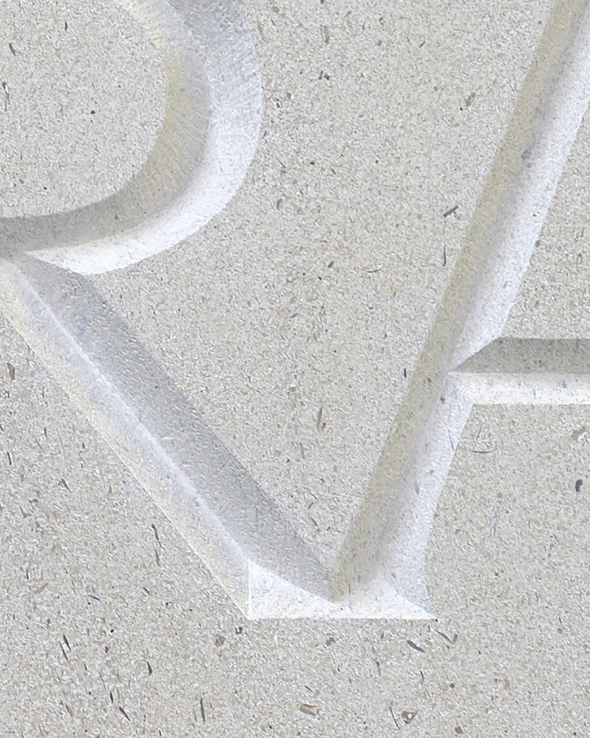
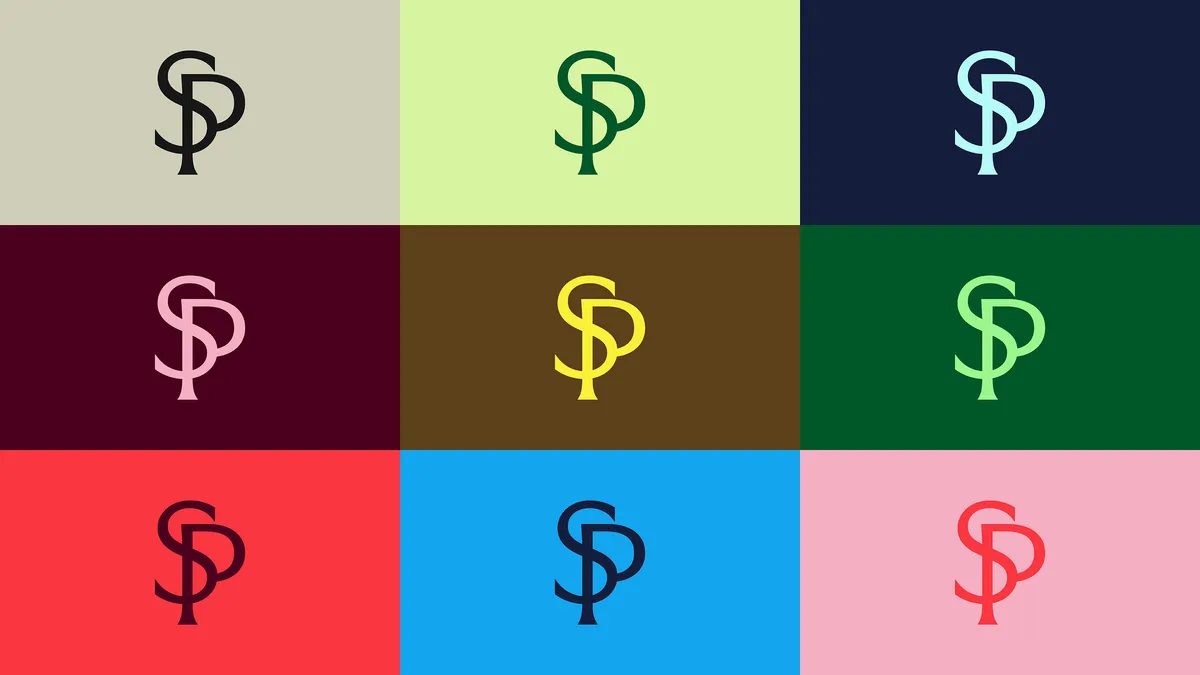
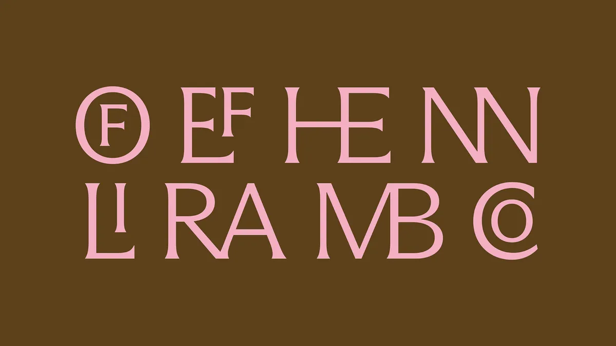
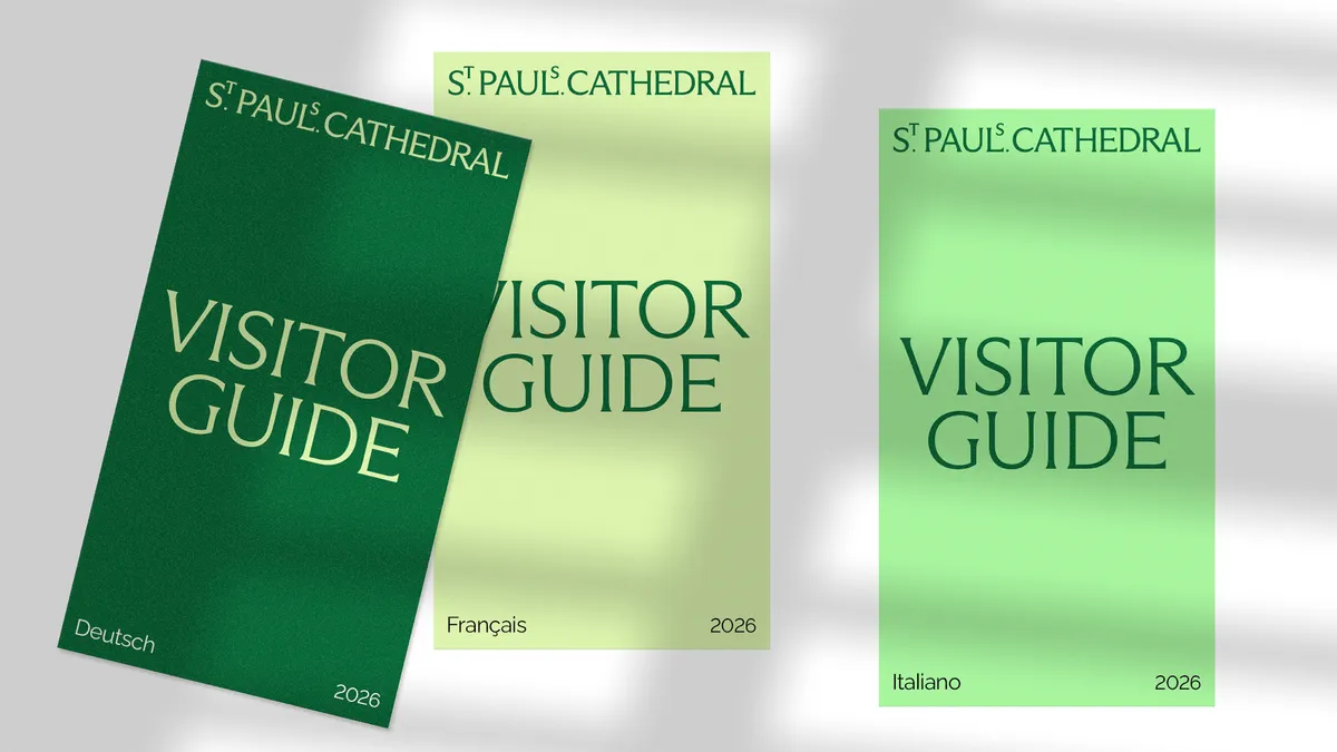
The elevated 'S' and 'T' are a subtle nod to the building's history and are inspired by typographic details found in a book in the cathedral's library. The lack of apostrophe may upset some, as might the full stop after 'Paul', but hopefully most people will be distracted by the form of the letters. Crafted from characters within the wordmark is the accompanying monogram.
In terms of type, Dinamo's Arizona Flare is the primary typeface, with a number of bespoke ligatures also created to complement it. Raleway is the secondary typeface.
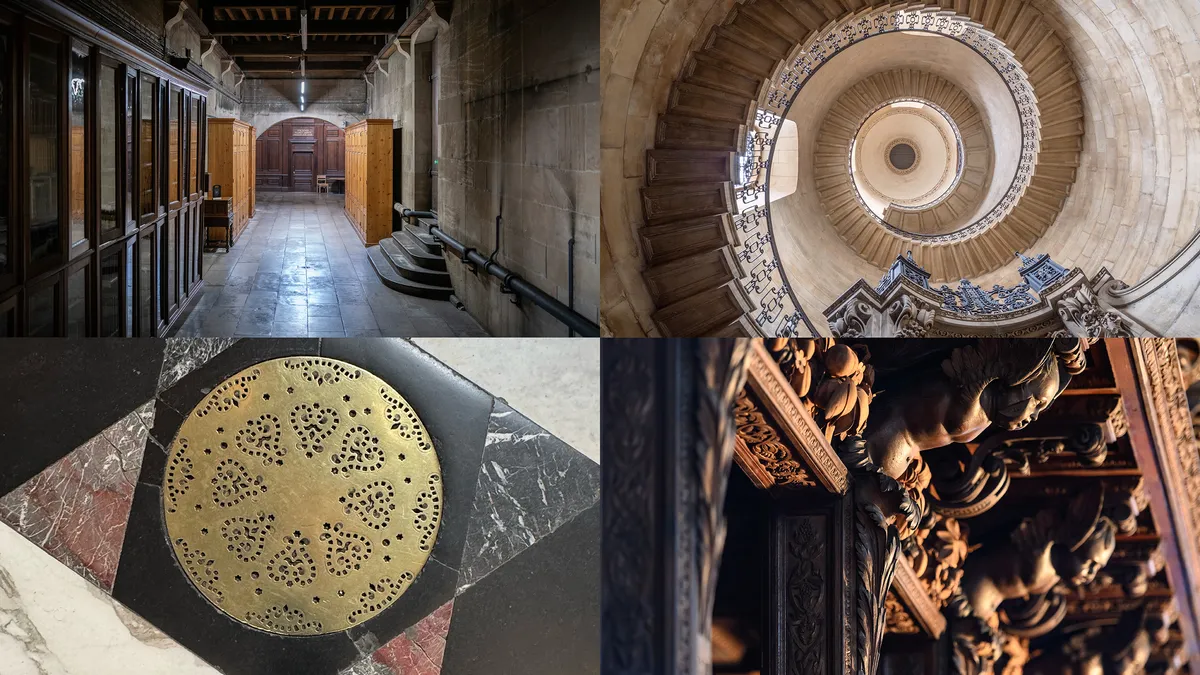
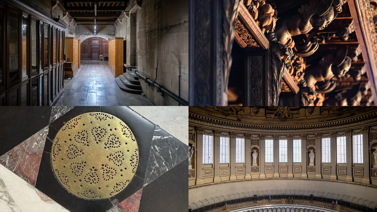
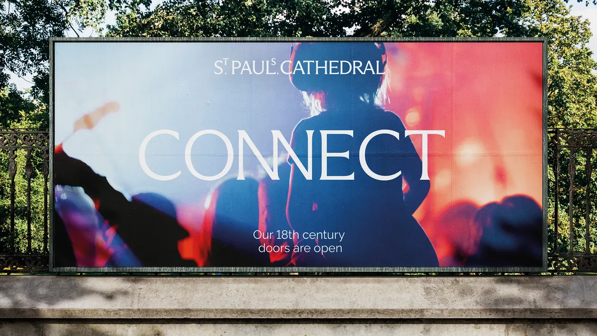
The colour palette is perhaps brighter than one might expect for a place of worship. It draws inspiration from the interior of the cathedral, from the tones of the floor and walls to the vibrant colours of the ceiling mosaics.
Photography captures the grandiose nature of the cathedral, as well as the more intimate, human moments that happen within it.
To create a new strategy and verbal identity, Pentagram partnered with Bert Preece and Adam Kaveney of Simple Revolution. At the heart of this strategy is the idea that St Paul's is for everyone.

“The ambition for us at Pentagram, the strategists and writers as well as the client themselves, was to create an identity that would be authentic, contemporary, flexible and dynamic; to be true for a unique building that exists so proudly in London, but also reflects many of the strengths of our country," says Pentagram partner Domenic Lippa. "I genuinely believe the building has a special personality, and we needed to try to capture this.
"We hope we have created a fluid and flexible identity that will feel appropriate to the cathedral. But like the building itself, we hope it will surprise and delight the staff, volunteers, visitors and most importantly, worshippers."
Creative Bloq is now easier to access than ever before with our on-the-go app, which brings you all the content you know and love from our website, but in a super-streamlined design.

