Sign up to Creative Bloq's daily newsletter, which brings you the latest news and inspiration from the worlds of art, design and technology.
You are now subscribed
Your newsletter sign-up was successful
Want to add more newsletters?
According to reporting by Oregon Public Broadcasting, several athletes at this year's Milan Winter Olympics found their medals falling apart in their hands. US skier Breezy Johnson won gold and promptly warned fellow medallists not to jump for joy wearing theirs. German biathlete Justus Strelow's medal came loose on camera, going viral for all the wrong reasons. Swedish cross-country skier Ebba Andersson' silver medal broke clean in two when it dropped in the snow.
The medals, it turns out, had a clip mechanism designed to snap free if the ribbon was pulled forcefully. Whether that safety feature was the culprit, or whether some medals simply had a manufacturing defect causing clips to sit fractionally too loose in their housings, remains unclear.
What is clear, though, is that the most prized object in the athletics world was falling apart at precisely the moment it was meant to be celebrated. So what can designers learn from this embarrassing moment? (You might also want to read how the Olympic vision for Milano Cortina came about).
Article continues below1. Know your moment of truth
Every design has a moment of truth: a single interaction for which everything is preparation. For a utility bill redesign, it's the moment a confused customer tries to work out why their direct debit has changed. For a hospital wayfinding system, it's the moment a frightened family tries to find the right ward. For an Olympic medal, it is the podium. An athlete lifts it above their head. Cameras fire. The image goes around the world.

The cardinal rule of design is that you work backwards from that moment. You ask, with absolute clarity: what does this object need to do, and when does it need to do it? Everything else (the concept, the symbolism, the material choices) must serve that answer, not compete with it.
2. Concept is no substitute for consequence
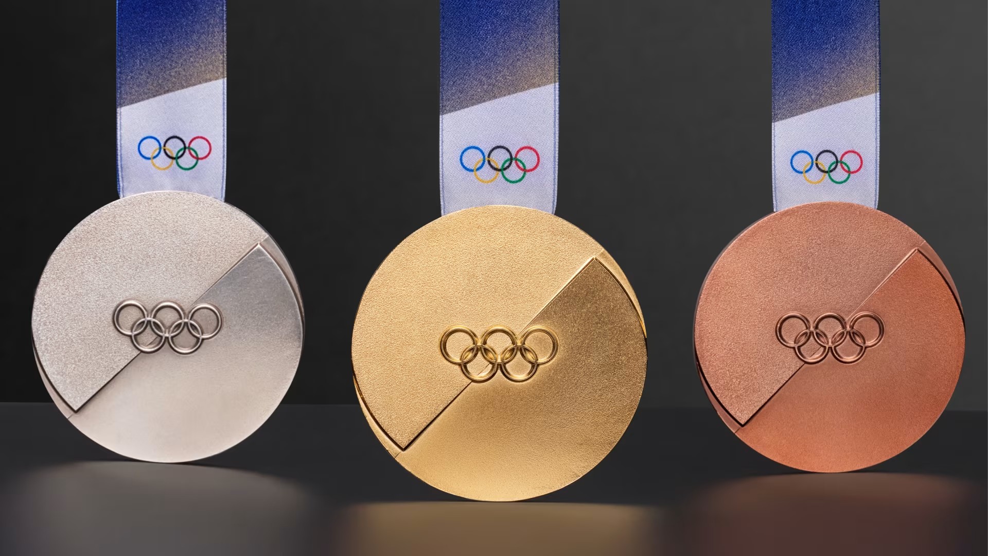
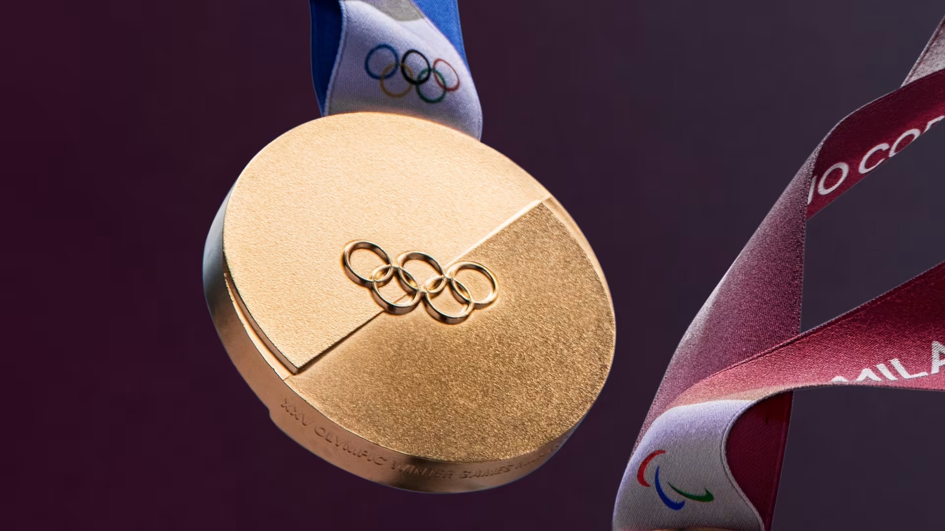
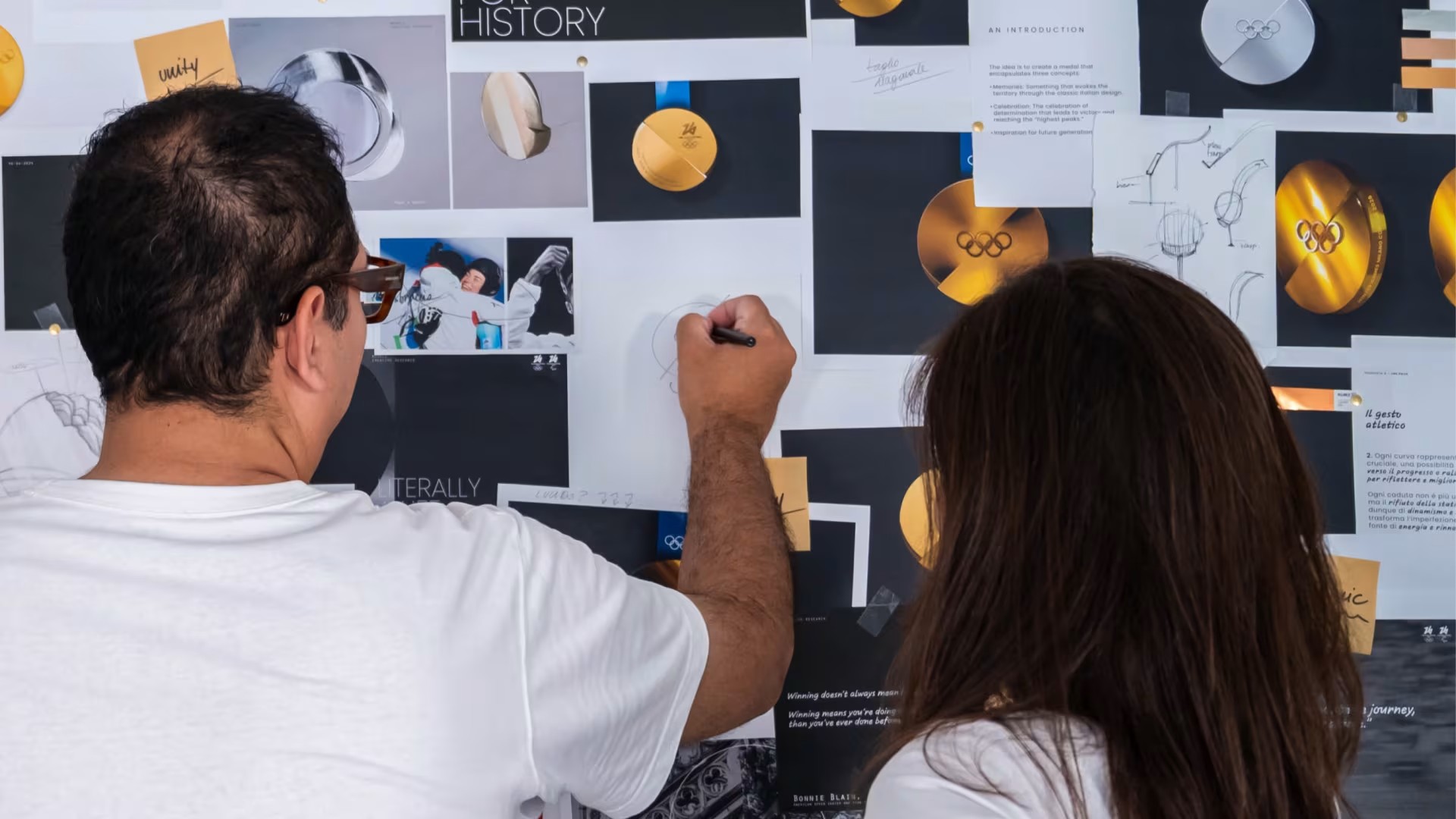
Case in point: the Milan medals are undeniably beautiful objects. The design director has explained how their two-part form symbolises how every victory belongs equally to the athlete and to the team around them: coaches, family, trainers. And that's a genuinely lovely idea. It's the kind of concept that wins pitches and earns applause in briefing rooms.
But a concept that causes your product to break in half when it falls in the snow is not a good concept. It is a liability dressed in good intentions. Sadly, this kind of thing happens in design and branding all the time.
Sign up to Creative Bloq's daily newsletter, which brings you the latest news and inspiration from the worlds of art, design and technology.

The idea is strong, the thinking is coherent, the rationale is compelling. And then the thing goes out into the world and encounters real people, real conditions, real use. Wet hands. Tired eyes. A medal dropped in the snow.
The lesson? The world is not a controlled environment. And the people using what we make are not reading the wordy design rationale while they use it. They're just using it.
3. Brand promises are in the details
There's a deeper branding lesson here too. The Olympics is one of the most powerful brands on earth, built on a very simple promise: that human excellence will be recognised and honoured. The medal is the physical embodiment of that promise. It is, arguably, the brand's most important touchpoint.
When that touchpoint fails – publicly, repeatedly, on camera – it doesn't just create a logistics problem. It actively undermines the brand promise at the moment the brand needs to deliver most.
The sentimental value of a medal is worth far more than the metal it contains. But sentiment requires the object to hold together. So ultimately the lesson here is simple: design well enough that the concept never becomes the excuse.
For more Olympic content that did go right, see our pieces on the Olympic posters and this novelty Olympic pasta.

Tom May is an award-winning journalist specialising in art, design, photography and technology. His latest book, The 50 Greatest Designers (Arcturus Publishing), was published this June. He's also author of Great TED Talks: Creativity (Pavilion Books). Tom was previously editor of Professional Photography magazine, associate editor at Creative Bloq, and deputy editor at net magazine.
You must confirm your public display name before commenting
Please logout and then login again, you will then be prompted to enter your display name.
