New poster for The Mummy looks straight from the ’80s horror archives
Chris Barnes nails the details.

Sign up to Creative Bloq's daily newsletter, which brings you the latest news and inspiration from the worlds of art, design and technology.
You are now subscribed
Your newsletter sign-up was successful
Want to add more newsletters?
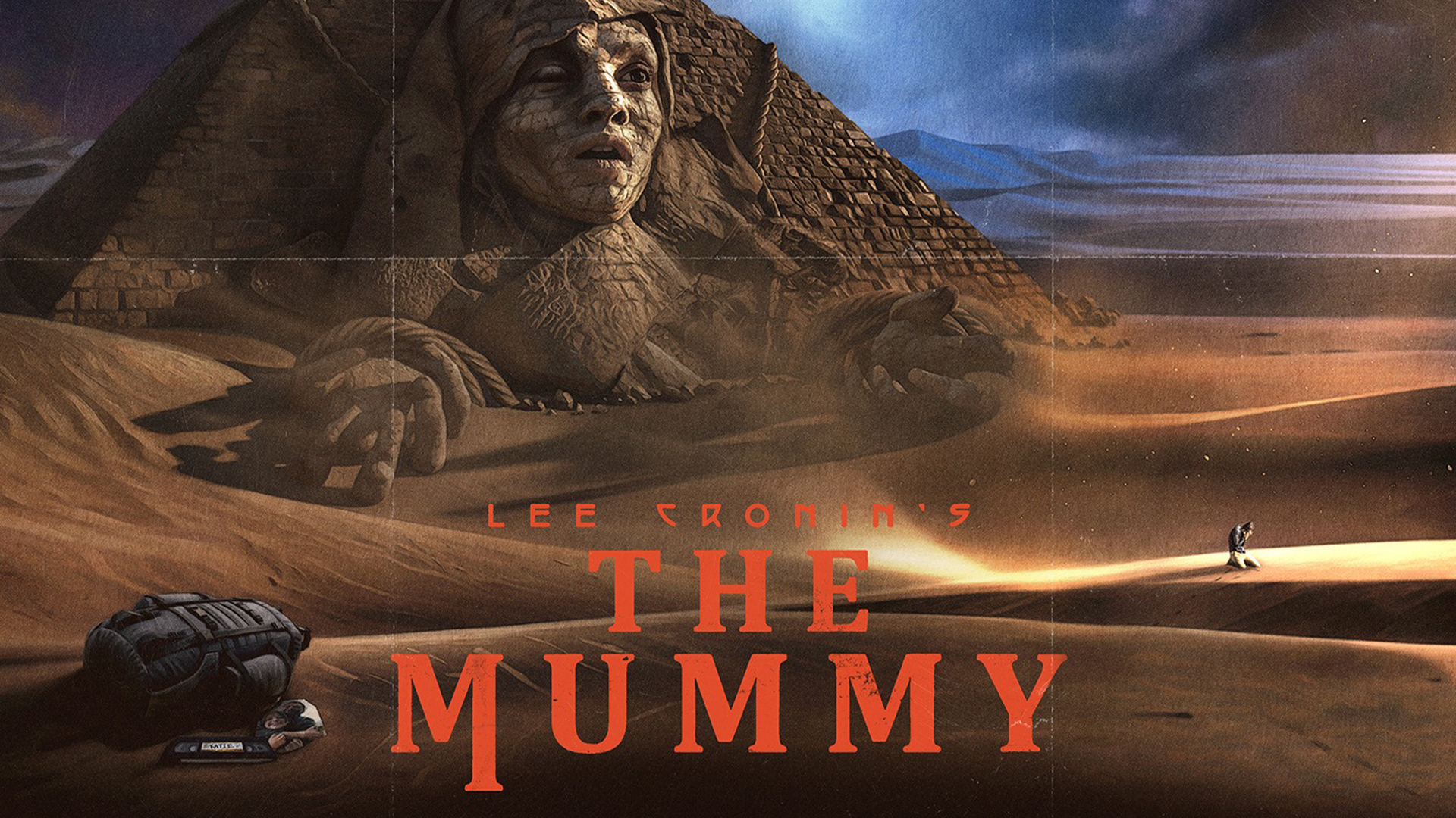
Horror movie posters are in a bit of a design slump, with an endless churn of high-contrast black and red designs bodged together with vaguely foreboding imagery for a little cut-and-paste creep-factor. Thankfully, the curse may have been lifted, all because of the new poster for Lee Cronin’s ‘The Mummy’.
There's no formula for creating the best horror film posters, which is why it's so disappointing to witness the recent sea of formulaic, lacklustre designs. A triumphant return to form, the new Mummy poster is a retro delight that looks like a relic straight from the past, right down to the fine details.
A post shared by CHRIS BARNES (@brutalposters_)
A photo posted by on
Created by Chris Barnes, the design features the eerie sight of a man sobbing in the desert. Behind him lurks a pyramid with a woman's face emerging from the side, frozen in time. The deep colour palette of sand tones and moody blues makes the red film title pop, while the serif font creates a sharp, classic feel.
Article continues belowTalking to Instagram, Chris writes that the design was, "Probably maybe definitely influenced by Dead & Buried and The Keep's classic 80s posters," adding faux weathering to give the poster an aged feel. With subtle grain and lines mimicking fold creases, the poster feels like it's dug straight from a design archive, fully committing to the retro theme.

For more horror poster designs, check out these amazing fan-made posters for The Shining, or take a look at the stunning Frankenstein movie posters that capture the beauty of the novel.
Sign up to Creative Bloq's daily newsletter, which brings you the latest news and inspiration from the worlds of art, design and technology.

Natalie Fear is Creative Bloq's staff writer. With an eye for trending topics and a passion for internet culture, she brings you the latest in art and design news. Natalie also runs Creative Bloq’s 5 Questions series, spotlighting diverse talent across the creative industries. Outside of work, she loves all things literature and music (although she’s partial to a spot of TikTok brain rot).
You must confirm your public display name before commenting
Please logout and then login again, you will then be prompted to enter your display name.
