The best horror film posters of all time

Sign up to Creative Bloq's daily newsletter, which brings you the latest news and inspiration from the worlds of art, design and technology.
You are now subscribed
Your newsletter sign-up was successful
Want to add more newsletters?
The best horror movie posters do a number of things. Firstly, like all the best movie posters, they grab your attention. Secondly, they instantly summon up a sinister and spooky atmosphere. And thirdly, they encapsulate the essence of the story, often becoming iconic symbols of the films in their own right.
None of that, of course, is easy to do because horror cinema is anything but a simple or straightforward genre. A realm where the grotesque meets the profound, where fears are both confronted and sublimated, it can do everything from making us jump to instilling a more profound sense of dread. Bringing all that to bear on a single design is an enormous challenge.
To curate this article, we've spoken to experts across the industry, who explain both why the posters we've chosen work so well, and the design principles behind them. Finally, if you're looking for more poster inspiration, don't miss our roundup of the best movie posters of 2024 so far and our guide to the best and worst movie posters of 2023.
Article continues below01. The Exorcist (1973)
On its release in 1973, The Exorcist was widely regarded as one of the most terrifying and disturbing horror films ever made. Its depiction of demonic possession and the exorcism process was extremely intense and graphic for the time, pushing the boundaries of what was acceptable in mainstream cinema. It attracted widespread critical acclaim, including 10 Academy Award nominations (winning two), which was rare for a horror movie and helped elevate the genre's legitimacy as a serious art form.
Beyond just being a scary movie, The Exorcist also explored deep religious and psychological themes around good versus evil, faith, and the nature of the human soul. This thematic significance gave the film an intellectual and artistic depth that elevated it beyond a typical horror flick.
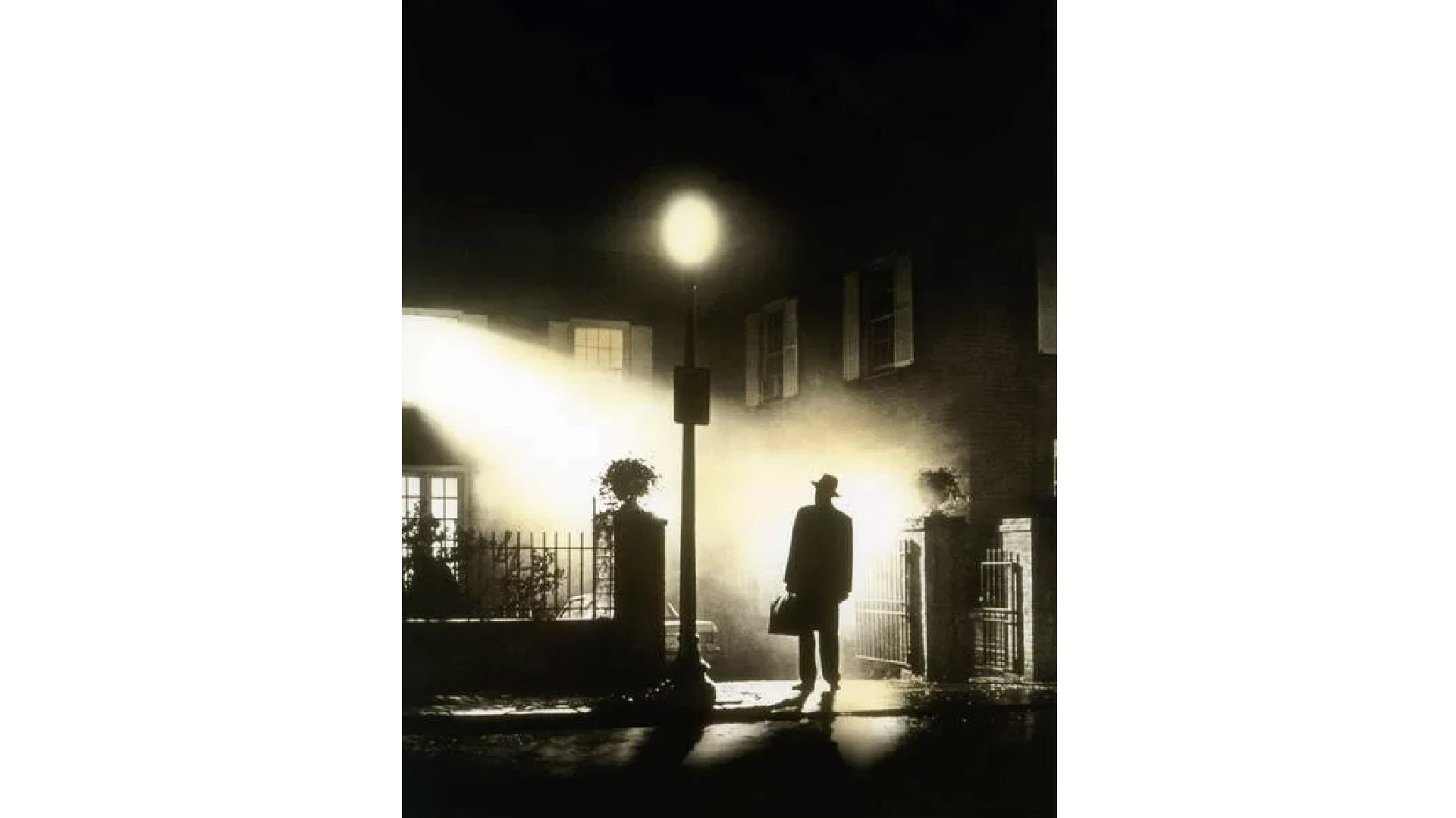
Its poster, meanwhile, is a true classic. "It’s just so ominous and evocative," says Gavin Finney, creative director at Maverick Media. "Plus it's instantly recognisable, even without the title. The use of high contrast, almost pure black and white gives you the sense of something primal and cosmically significant.
"There are stakes here," he continues. "It’s light versus dark, good versus evil. The whole composition of the shot is beautifully elegant; light floods out of a room, while a mysterious figure, an inverted beacon in the fog, stands expectedly; poised. It gives you the sense that something major is hanging in the balance and awaits resolution."
02. The Rocky Horror Picture Show (1975)
The Rocky Horror Picture Show (1975) was a comedy-musical that subverted common tropes of horror and science fiction into a wholly unique cinematic experience. It also celebrated themes of sexual fluidity, gender nonconformity and social outsiders in a way that was deeply radical for the time. Plus it had some darned good tunes.
Sign up to Creative Bloq's daily newsletter, which brings you the latest news and inspiration from the worlds of art, design and technology.
As a result, the film developed a devoted, passionate following that continues to this day. It still gets shown in selected cinemas around the world on a weekly basis, mostly to people who weren't even born when it first came out.
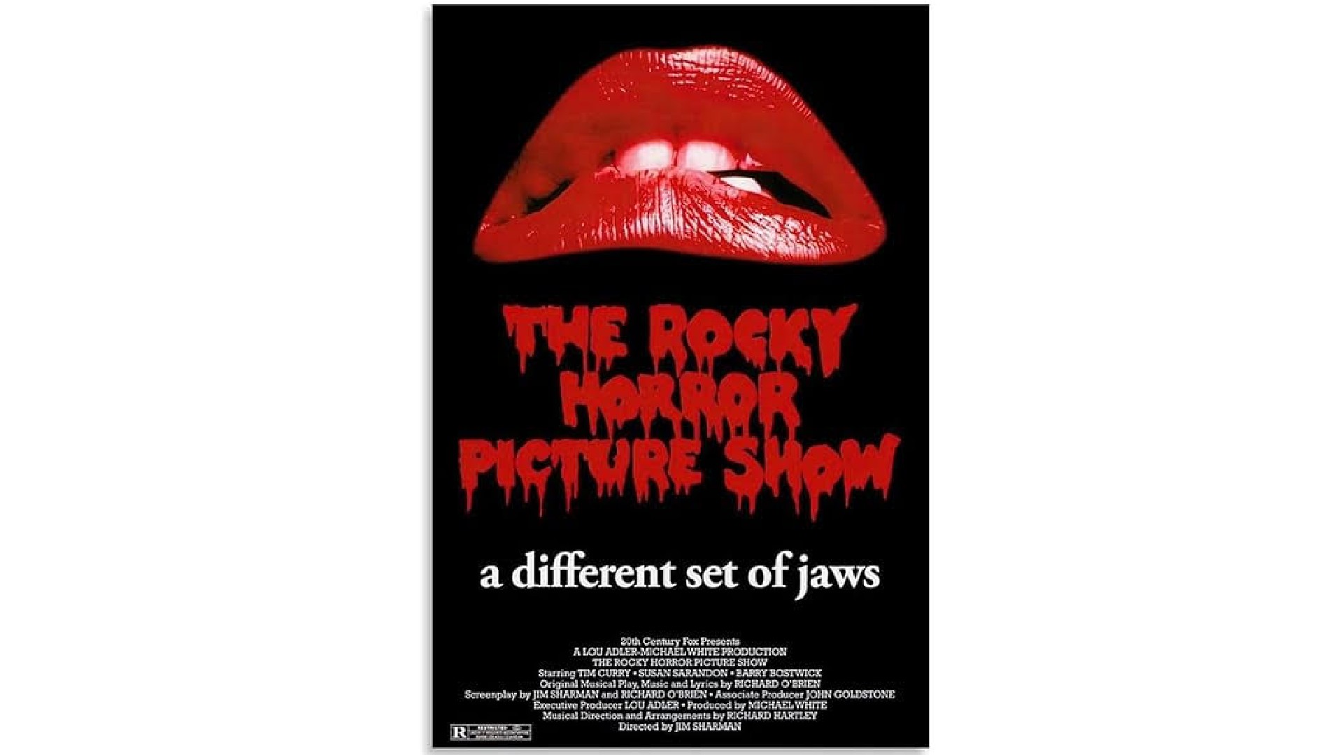
The poster brought this unique combination of sex, cross-dressing and horror together in a brilliantly efficient way. As Ross Taylor, group creative director at Iris, explains: "Sensual, sultry lips disembodied in black space immediately speaks to Frank-N-Furter’s camp, sexually charged character."
The lips echo Salvador Dali’s surrealist sculpture ‘Mae West’s Lips Sofa’, which he'd made a few years earlier in 1972, and Ross believes that's no coincidence. "Mae West was described as the naughtiest woman in Hollywood, sexually liberated, ahead of her time," he explains. “She famously coined the phrase 'Is that a gun in your pocket, or are you just pleased to see me?', and roused backlash and moral indignation throughout her lifetime. So it's no wonder she's been attributed as the muse for Frank-N-Furter’s character."
If that wasn’t enough, the tagline references the biggest blockbuster of 1975, Jaws. "Smartly, the headline immediately positions the movie as ‘alternative’, an outsider, which speaks to the gender themes and identities explored in the film. Iconic, intriguing, contextual and culturally provocative: this poster has it all."
03. Dawn of the Dead (1978)
Directed by George A. Romero, Dawn of the Dead built upon the foundations he had established with his 1968 classic, Night of the Living Dead, but took the zombie apocalypse premise to bold new heights.
One of its most significant aspects was its biting social commentary. Romero used the zombie outbreak as a lens through which to critique the rampant consumerism and mindless conformity of modern American society. The choice to set the film in a sprawling shopping mall was a particularly potent metaphor, as the survivors sought refuge amidst the trappings of a materialistic culture that had ultimately failed them.
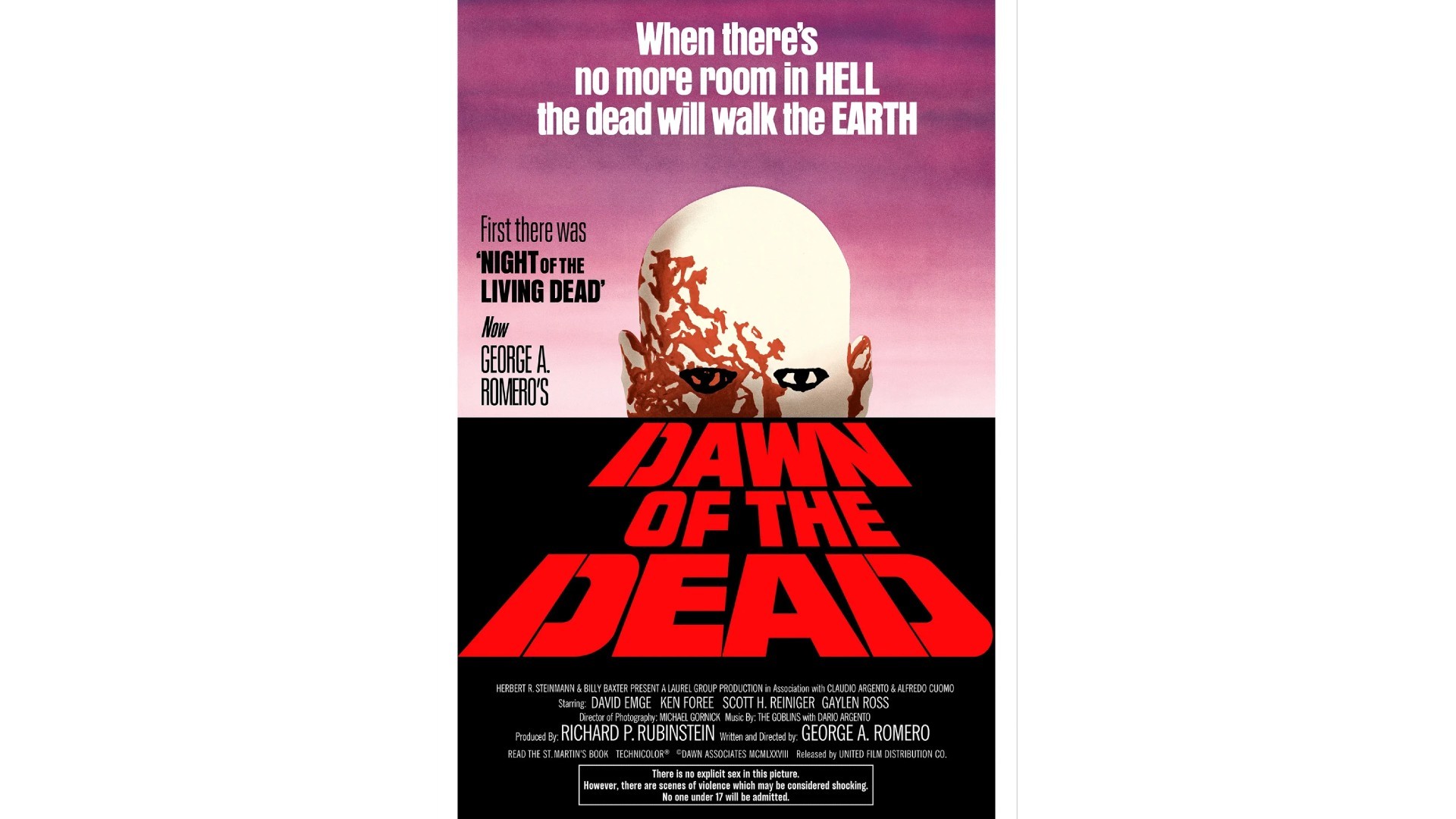
Its poster was pretty groundbreaking too, believes John Cherry, executive creative director at Atomic London . "Bold enough to stand out in a busy cinema foyer, it was quite unlike the general style of movie posters in 1978," he notes.
"There’s no hand-painted collage of the cast, assembled around a central focal point holding a gun, laser, sword or lightsaber. And rightly so, as the film’s main character is not an actor, but the sense that something bad is coming and you can’t escape. Instead you get the unrelenting stare of a blood-soaked head looming over the horizon, just as the 'Night of the Living Dead' looms over George A. Romero’s sequel.
"Finally," John adds, "the stencil block type title, stacked in perspective, has been copied and replicated many times. It’s iconic in itself."
04. Halloween (1978)
Directed by John Carpenter, Halloween (1978) introduced audiences to one of the most enduring cinematic villains in Michael Myers, and pioneered many of the tropes and techniques that would come to define the 'slasher' subgenre.
More broadly, the film's depiction of a seemingly ordinary suburban community descending into chaos in the face of an unstoppable threat tapped into the widespread cultural unease of the 1970s, a period marked by political upheaval, economic uncertainty, and a general sense of social fragmentation.
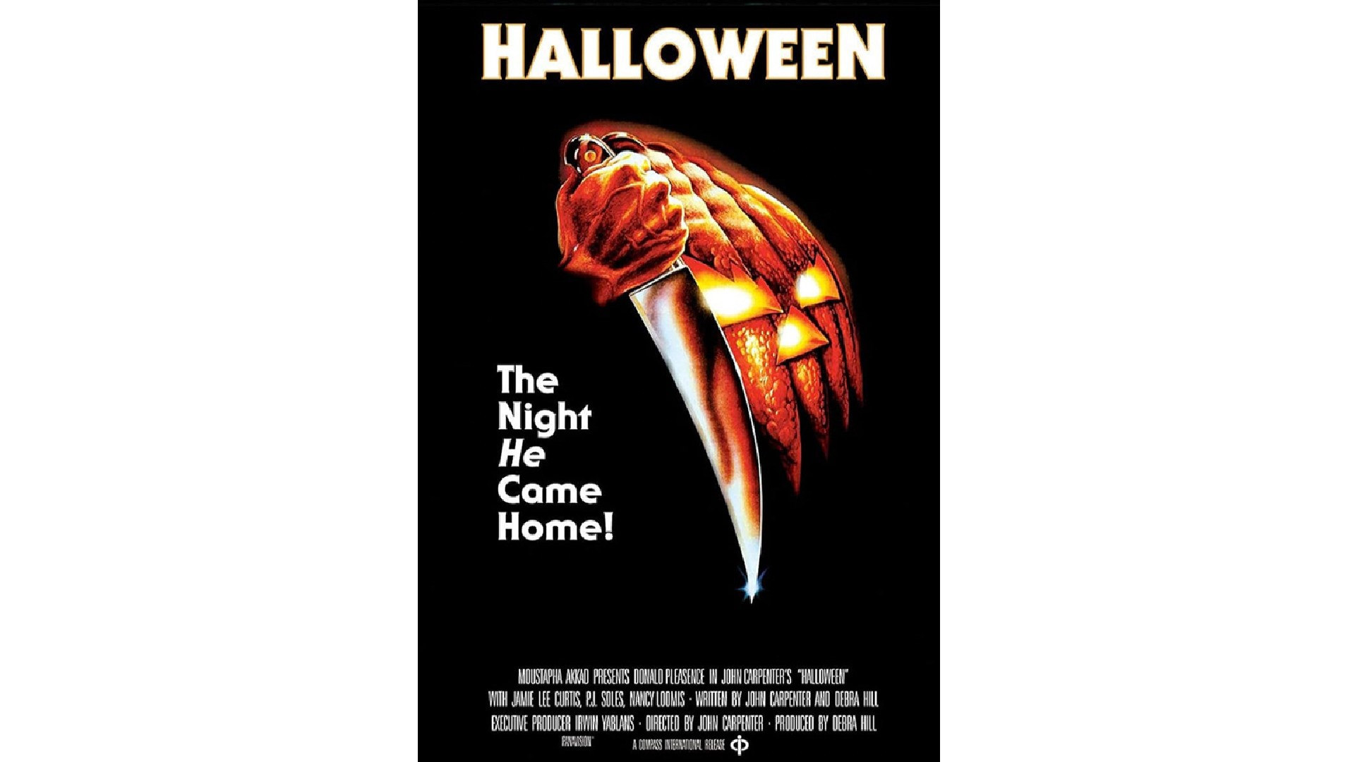
"There are so many classic horror movie posters but the best has got to be Halloween," argues Lauren Richardson, senior account executive at Marketing Signals. "It’s iconic, scary, subtle, and brilliant."
It even has a creepy hidden detail that was done by accident, she adds. "The poster features the hand of Michael Myers holding a huge knife, which melts into a pumpkin, along with a teasing tagline. If you look at the hand carefully, you can just make out a creepy face with what looks like worms coming out too, but despite matching the poster perfectly, it was completely unintentional."
As a result, the poster completely draws you in. "The background being black enables the art to stand out while giving the audience a sense of darkness," adds Lauren. "The tagline puts emphasis on the importance of a mysterious male figure. And all of this comes together to give the audience a sense of what they can expect from the film."
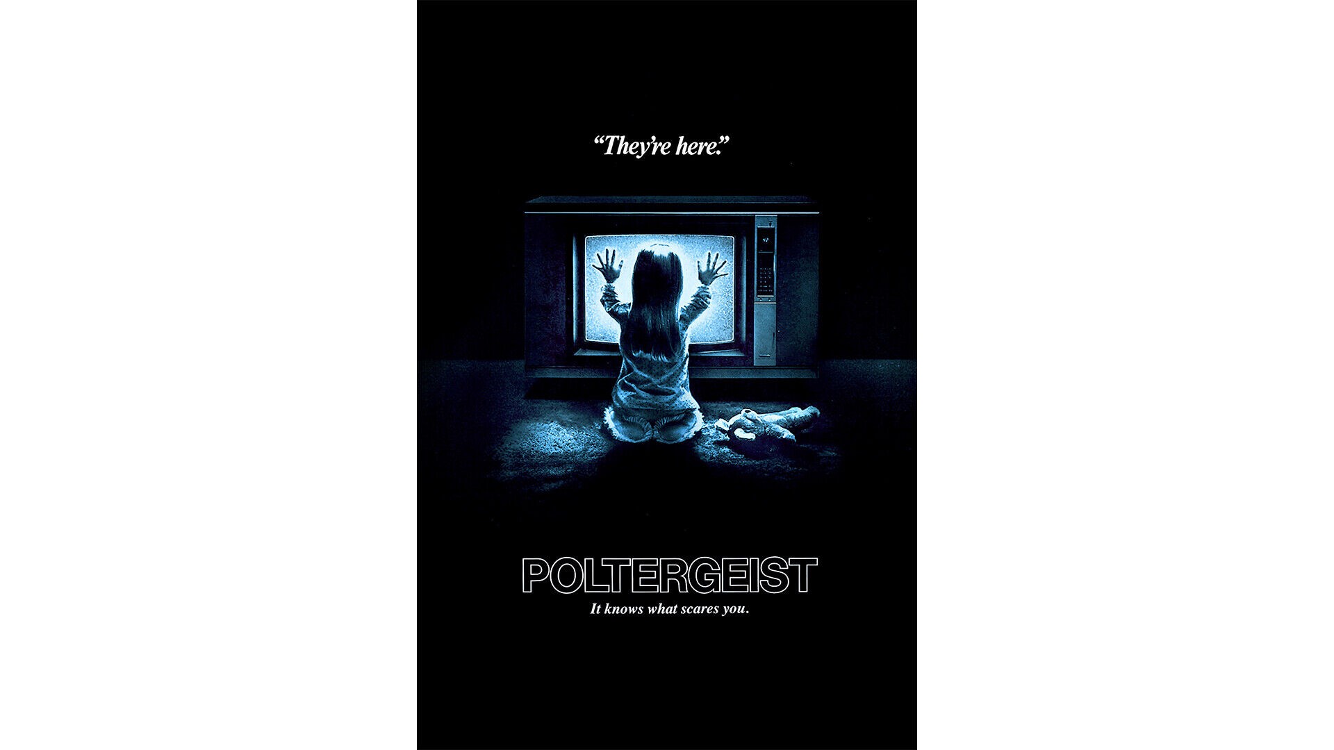
05. Poltergeist (1982)
The innovation of Poltergeist was for the first time to centre a blockbuster horror around the family. The Freelings appear to be living an ordinary suburban life until their home is invaded by a paranormal force. This juxtaposition of the mundane and the terrifying was hugely effective, as it allowed audiences to empathise with the characters and heightened the sense of dread.
Visually, Poltergeist was groundbreaking too, featuring stunning special effects and innovative uses of camera techniques to bring the ghostly phenomena to life. It also tapped into broader societal anxieties surrounding the corrosion of the suburban ideal; helping elevate it above the level of a standard haunted house story.
Karim Salama, director at e-innovate, is a huge fan of its poster: "A prime example of a horror movie poster design that has left a lasting impact on the genre," as he puts it.
"The image of the little girl in front of a glowing TV screen is instantly chilling, perfectly showcasing the supernatural terror of the film," he continues. "Its simplicity and haunting imagery have made it an iconic piece of horror movie marketing that continues to be recognisable with audiences over 40 years on."
06. A Nightmare on Elm Street (1984)
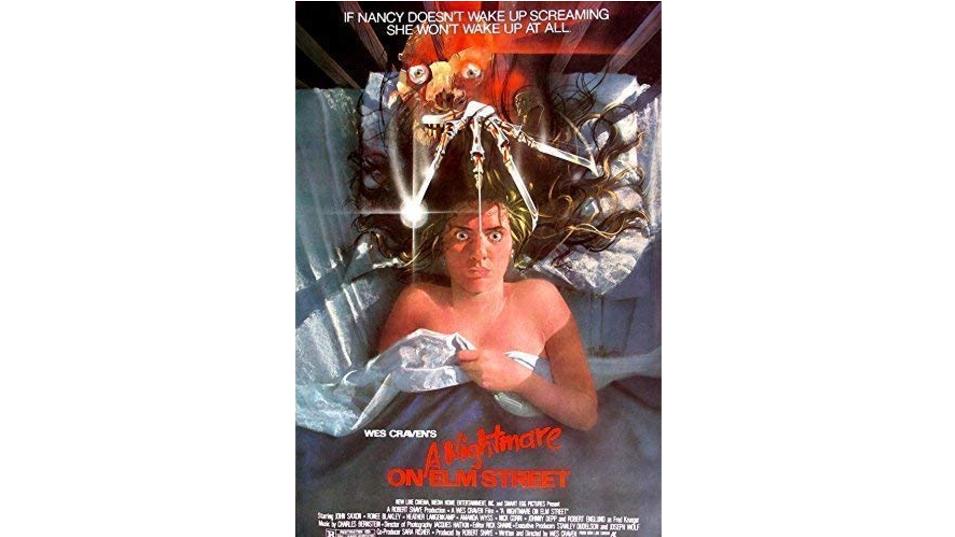
A Nightmare on Elm Street was another landmark horror with an innovative premise. Directed by Wes Craven, the story centred around a uniquely unsettling and psychologically complex narrative: namely, a supernatural killer who stalks and terrorises his victims within the realm of their dreams.
Visually, too, it was groundbreaking. The main character's disfigured visage, razor-sharp glove and dark sense of sardonic humour made him an unforgettably chilling and compelling presence. Additionally the film's surreal, dreamlike sequences, marked by distorted environments and striking visual effects, further enhanced the sense of nightmarish dread.
All this is beautifully conveyed in this classic poster design. "The striking image of Freddy Krueger's clawed hand emerging from a bed beautifully sets the tone for the film's theme of terror invading dreams, giving the audience an idea of what may happen in the film," explains Joanne Pawlett, director at Tailor Made Signs & Embroidery. "It's effective because it immediately grabs attention and hints at the sinister nature of the story, leaving a lasting impression."
The design elements are strategically and cleverly used to create unease and intrigue, she continues. "The contrast between the dark, shadowy background and the sharp metallic fingers creates a sense of danger and suspense. The placement of the hand breaking through the bed adds a dynamic element, drawing the eye to the focal point. And the use of a familiar, comforting setting like a bed is juxtaposed with the grotesque hand, hinting at the blurring of boundaries between reality and nightmares. When merged together, these perfectly mirror the psychological horror elements of the film."
07. Fright Night (1985)
One of the key ways in which Fright Night stood out was its clever subversion of traditional vampire tropes. Rather than relying on the stoic, aristocratic archetype of Bram Stoker's Dracula, the film instead focused on a teenager who discovers his charming new neighbour is, in fact, from the ranks of the undead.
This fresh, youth-oriented perspective on the vampire myth allowed the film to explore the complexities of adolescence within the framework of the horror genre; a clear forerunner of everything from Buffy to the Twilight movies.
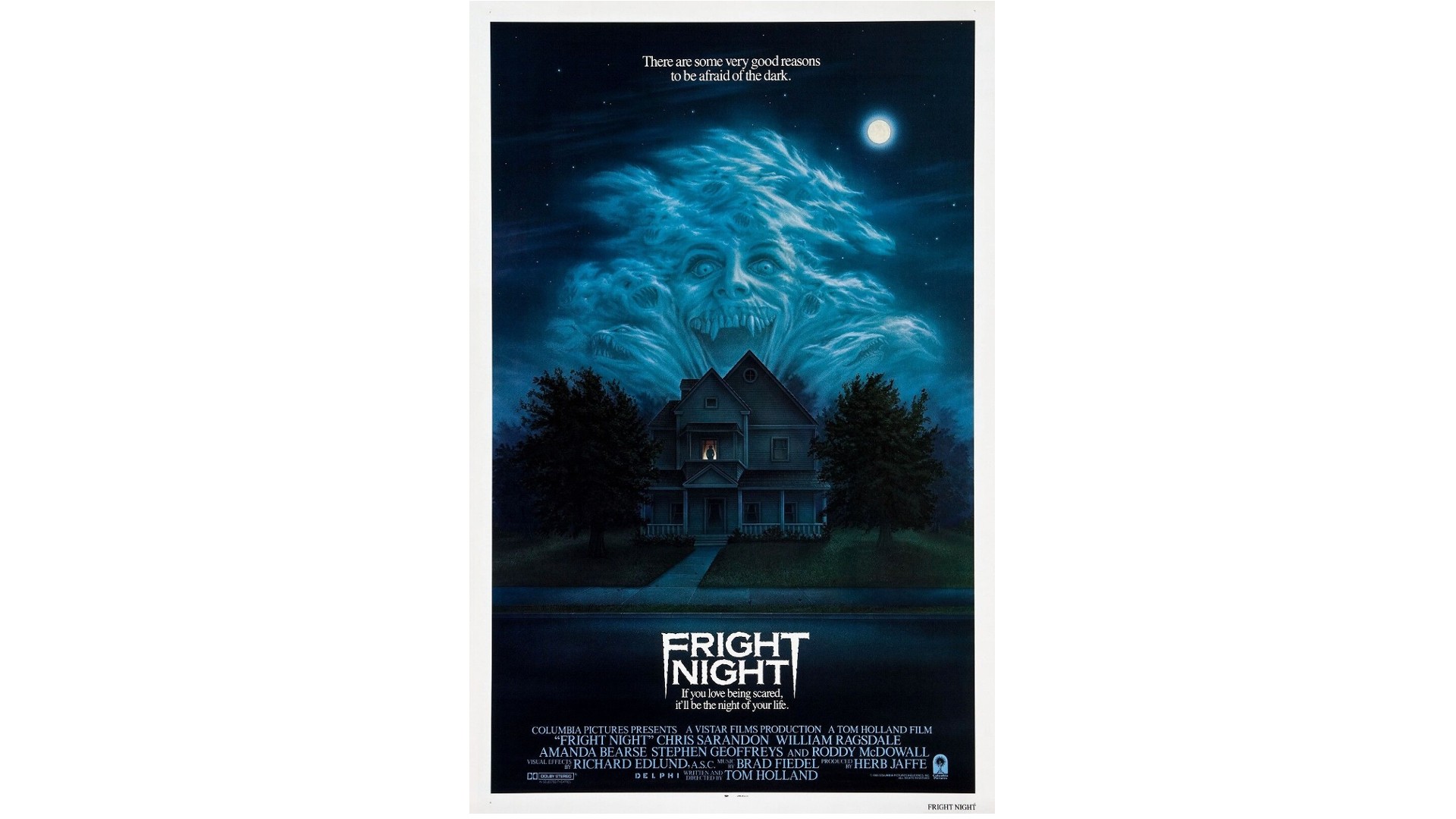
"As a kid in the 80s, I was stone-cold scared of anything horror until I was around 15 – I mean TERRIFIED – and I remember seeing this poster before I really got into the genre," recalls Moog Gravett, creative director at Big Farmer. "We're back in the days of early home video, and I have a memory of seeing this poster in a magazine and flipping it over as fast as possible."
So why has this design stuck with him so? "It's just brilliantly painted," he responds. "It features a very striking, almost monochrome palette, with really well-crafted use of negative space. I love the way the house is dwarfed by the horrific spray of cloud monsters. The first thing to grab you is the wild-eyed vampire like thing, the eyes lock onto you, making it feel like it's about to leap out and rip you apart. But on closer inspection, the clouds are filled with swirling demons: teeth and beady eyes everywhere.
"Then we get just that little pop of yellow pointing out a silhouetted character in the window, delivering a perfect second point of interest for the eye. The triangular composition, echoing the rooftops, is really well planned. Lastly, the iconic logo. Starting with a copperplate bold font, it has the edges chipped away, suggesting something ancient and crumbling, and those deadly, pointed outer letters echo the vampire teeth."
08. Silence of the Lambs (1991)
The first (and to date, only) horror film to win the Oscar for Best Picture, Silence of the Lambs was a masterpiece of psychological tension and suspense. With an exceptional performance by Anthony Hopkins as the murderous Hannibal Lecter, the film delved into the nature of evil, the human psyche, and the often blurred lines between heroes and villains.
The film also broke new ground in its depiction of a strong, capable female protagonist. Clarice Starling, as played by Jodie Foster, exhibited a determination, intelligence and emotional depth that challenged traditional norms in the genre, helping pave the way for a more nuanced representation of women on screen.
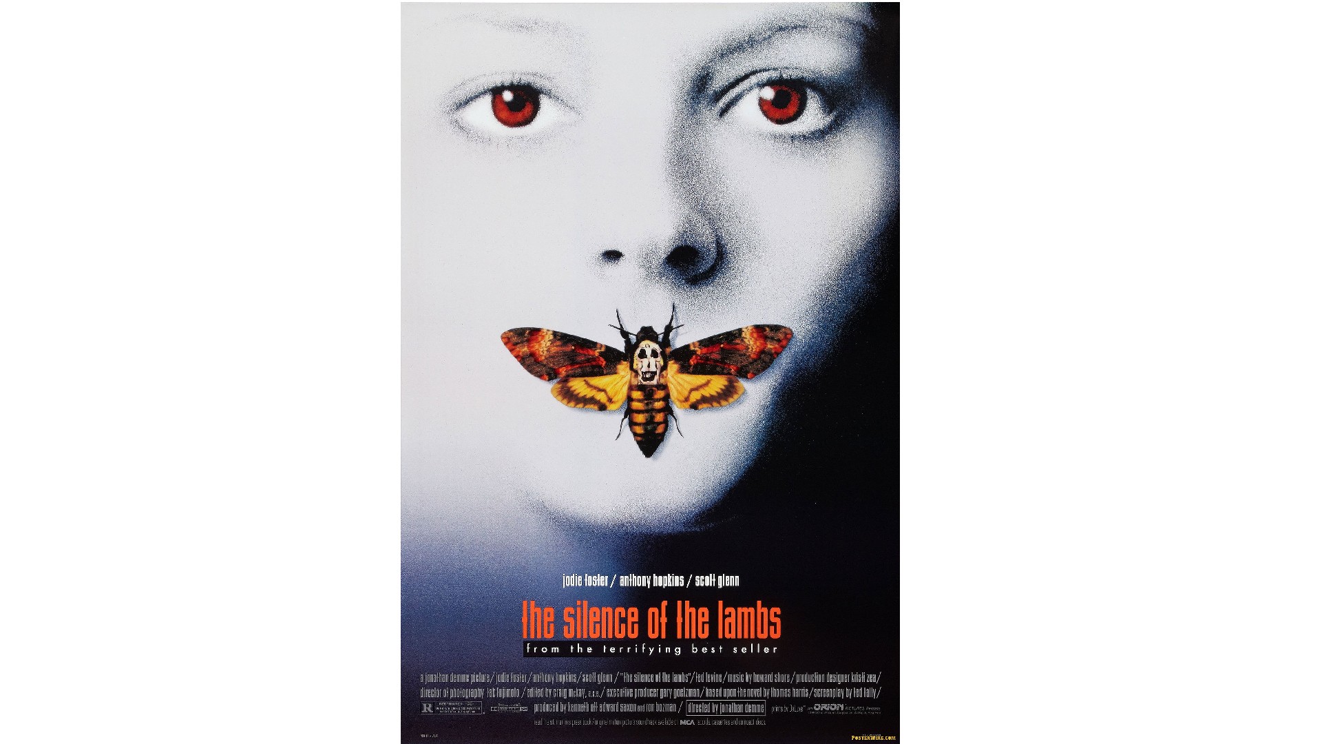
“The Silence of the Lambs poster serves as a masterclass in understated communication," enthuses Zofia Mackiewicz, creative director at UNIT9. "At first glance, the poster presents a striking image: the pale face of a young woman, her eyes piercing red, and a moth delicately covering her lips: the juxtaposition of the innocent and the macabre leaving a lingering impression. But it's the symbolism woven into the poster's design that truly elevates it.
"The moth’s body, initially resembling a skull, in fact reveals itself to be a cluster of naked human bodies," she continues. "This alludes to the deeper themes of the film: mortality, vulnerability and the intertwining of life and death. The design doesn't provide easy answers or emotions; instead, it invites viewers to explore their own interpretations, to delve into the enigmatic world of the film. This poster doesn’t scream, it whispers. That’s what makes it so fascinating.”
09. The Blair Witch Project (1999)
The Blair Witch Project was groundbreaking in its use of the found footage format. By presenting the horror as a compilation of raw, unedited footage shot by the characters themselves, the directors created a sense of immediacy and authenticity that was deeply unsettling.
Its innovative marketing campaign, which presented the found footage as authentic documentation of a real-life disappearance, also played a crucial role in its success and cultural impact. This savvy approach to promoting the film as a seemingly real event created a heightened sense of anticipation and curiosity among audiences.
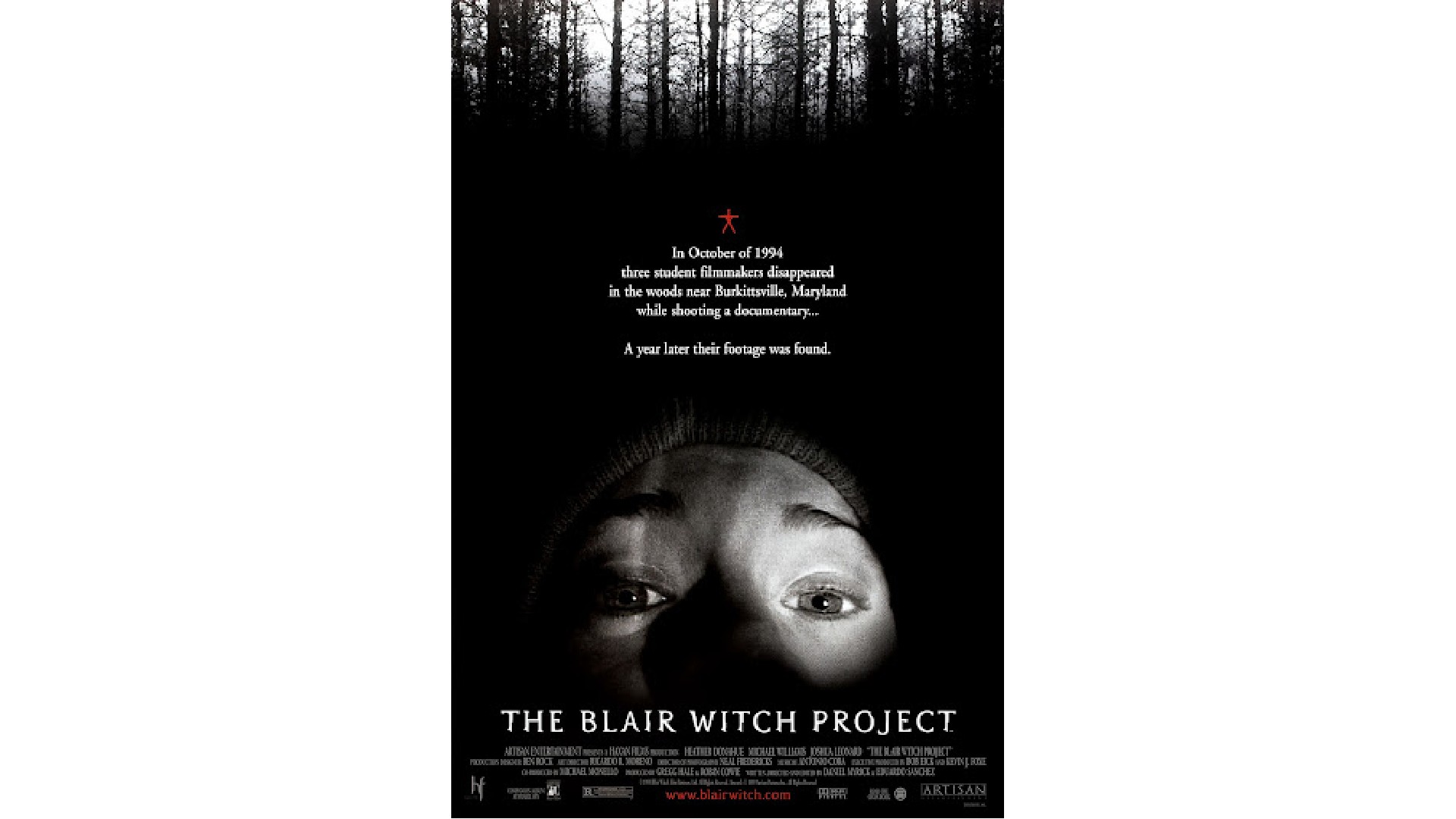
"The Blair Witch Project poster nails the essence of the film's found-footage style by tapping into our primal fear of the unknown," says Sammi Price, creative lead at Trinity Create. "The image of a red stick figure and a person's face lit by a torch in the middle of the woods immediately transports you into the heart of the story. It's not just about seeing a character lost in the woods; it's about feeling like you're right there with them, stumbling through the darkness, with every rustle of the trees and snap of a twig sending shivers down your spine."
In other words, the brilliance of the poster lies in its simplicity. "It's not trying to show you everything," says Sammi. "It's inviting you to imagine yourself in that terrifying scenario. It's like a direct line to your deepest fears, making it one of the most effective and evocative horror movie posters of all time."
10. Get Out (2017)
Throughout the 21st century, horror films have felt like cover versions of the old hits. There have been some great movies, no doubt, but few that felt truly innovative or original. Until, that is, Get Out.
In this modern classic, director Jordan Peele's screenplay deftly used the framework of a horror narrative to explore pressing issues of racial injustice, systemic racism, and the insidious nature of liberal racism. This integration of thought-provoking themes with a compelling, suspenseful plot resonated deeply with audiences and critics alike, elevating the film beyond the confines of a standard horror movie.
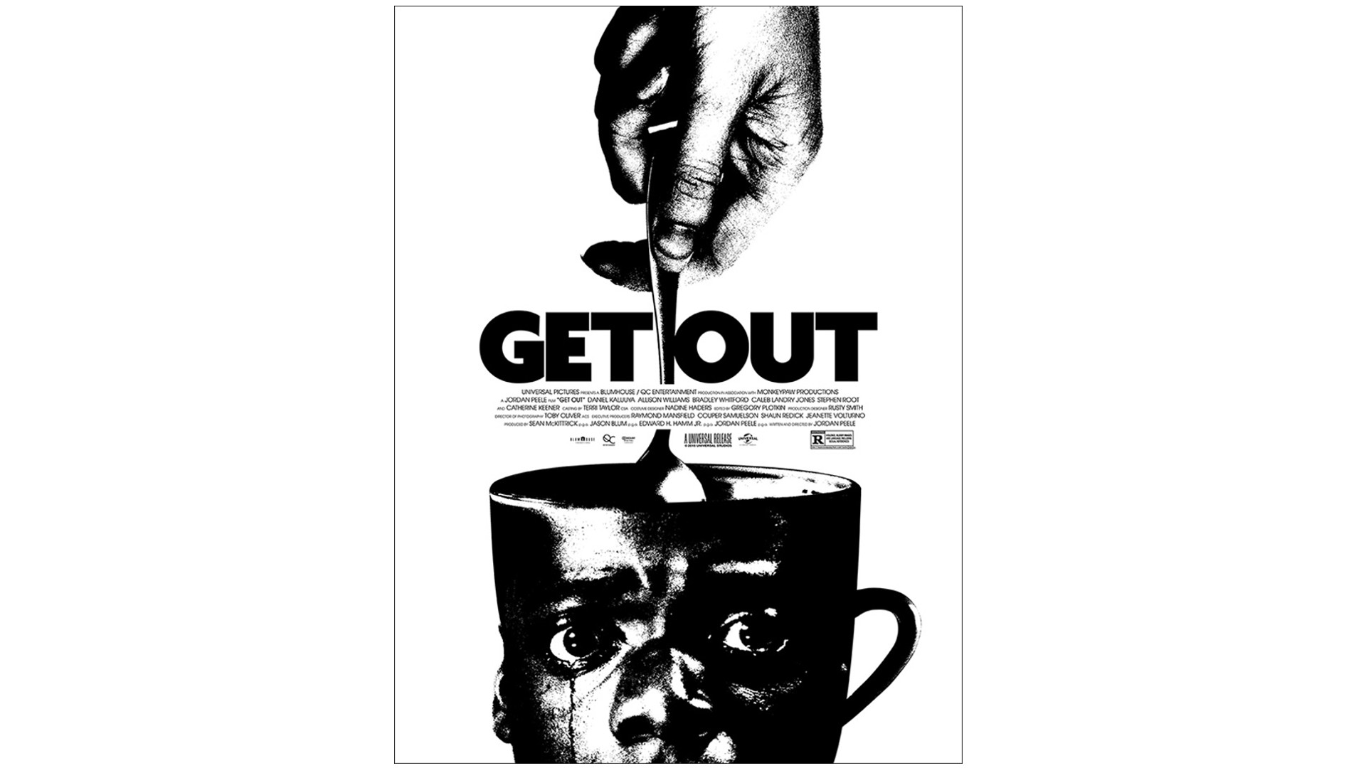
Aaron Taylor, associate creative director at Amplify, brought this unofficial poster for Get Out, designed by Jay Shaw for movie poster outfit Mondo, to our attention, and we have to say we love it too. "Its simple composition tells you so much about the plot of the film without giving anything away," he explains. "The high contrast use of black and white not only focuses the eye but alludes to one of the movie's central themes: race.
"Daniel Kaluuya’s horrified face perfectly aligns with the face of the teacup: squint and its handle could easily be mistaken for his ear. And the spoon! A seemingly random touch that wonderfully reflects its role in the film where it scrambles his brain, sending him into a frenzy."
11. The Killing of a Sacred Deer (2017)
So far, all the movies we've included on this list have been mainstream fare. But the arthouse circuit has also had an important role to play in the history of horror, and one of the biggest critical hits of recent years has been The Killing of a Sacred Deer.
Released in 2017 and directed by Yorgos Lanthimos, this was a profoundly unsettling and philosophically rich film that made a significant impact on the cinematic landscape. Its stylistic approach, combined with the film's slow-burning, enigmatic plot, challenged traditional audience expectations and immersed viewers in a deeply unsettling, almost dreamlike experience.
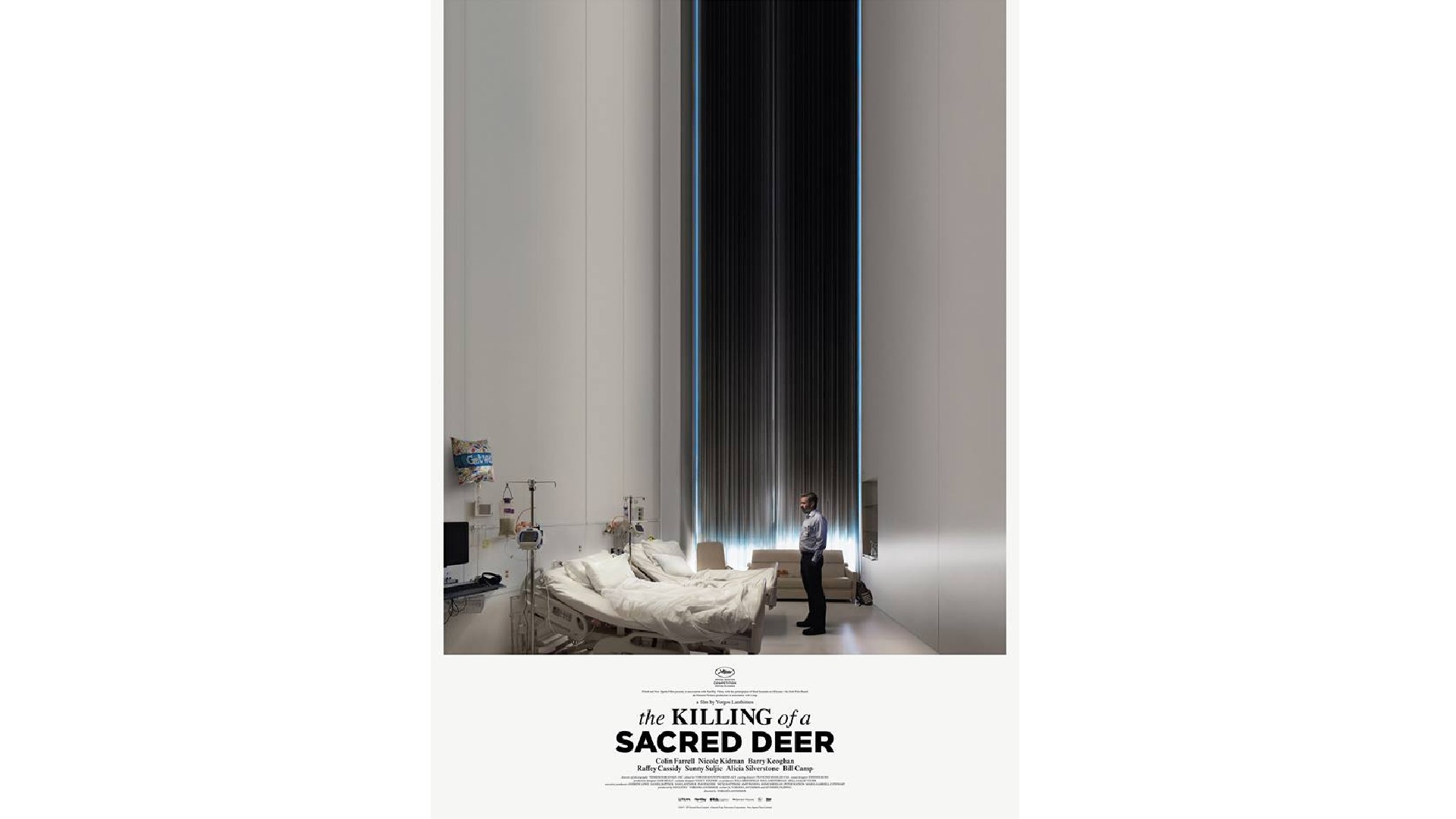
"Absurdist horror's blend of confusion, intrigue and tension is difficult to convey in a still image," notes Alice Pukhova, creative researcher at WMH&I. "Yet the poster here achieves this and more. A hospital room distorts into infinity, evoking claustrophobia amidst normalcy, with Colin Farrell's character appearing tiny and at the mercy of larger forces. Light barely breaches the dense blackness of curtains, hinting at enlightenment just out of reach."
In short, it builds suspense before the movie even starts. "Why is the character staring at empty hospital beds? Were they occupied by the sacred deer that he killed? Rarely is a horror movie poster so gracefully eerie."
12. Us (2019)
Another modern classic directed by Jordan Peele, Us was notable for its innovative and multi-layered narrative structure. The film's central conceit, which revolves around the existence of doppelgängers known as the Tethered, served as a potent allegory for themes of societal division, the duality of human nature, and the unseen forces that shape our lives.
Beyond the film's thematic depth, Us also showcased Peele's exceptional command of cinematic language. The director's use of unsettling imagery, disorienting camera angles and a haunting musical score combined to create a deeply unsettling and immersive viewing experience.
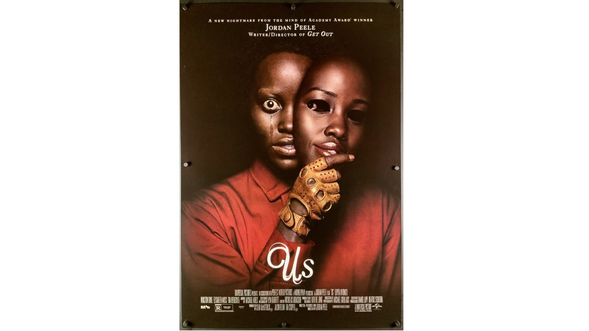
And if Peele was trying to broaden the range of people interested in horror, it succeeded with this poster, at least where Sam Cook, senior account manager at Cheil UK, was concerned. "As someone who's not particularly drawn to the horror genre, I've often found myself disheartened by the predictability of both the films and their accompanying posters," he explains. "The usual dark backgrounds, with a central protagonist, and a squad destined for doom, have become all too familiar."
In contrast, though, this poster defied expectations and provoked people's imaginations. "Gone are the eye-catching slasher motifs, the corny one-liners, and the obvious hints at the film's plot," says Sam. "Instead, the poster shrouds itself in mystery, leaving viewers intrigued and unsettled. There's a substantial absence of clarity regarding the narrative direction or the morality of the characters depicted. This departure from convention is a breath of fresh air in an otherwise stagnant creative landscape.
"In essence, the Us poster not only captures the essence of the film's mysterious narrative but also serves as a testament to the power of subtlety in not only the horror genre, but marketing in general," he concludes. "It's a welcome shift from the norm and a standout among the best horror posters of all time."
Want more great films? See our list of upcoming VFX movies.

Tom May is an award-winning journalist specialising in art, design, photography and technology. His latest book, The 50 Greatest Designers (Arcturus Publishing), was published this June. He's also author of Great TED Talks: Creativity (Pavilion Books). Tom was previously editor of Professional Photography magazine, associate editor at Creative Bloq, and deputy editor at net magazine.
