How to create an atmospheric, painterly environment in Unreal Engine
Lighting artist Philémon Caron shares his Luminism-inspired techniques.
Sign up to Creative Bloq's daily newsletter, which brings you the latest news and inspiration from the worlds of art, design and technology.
You are now subscribed
Your newsletter sign-up was successful
Want to add more newsletters?
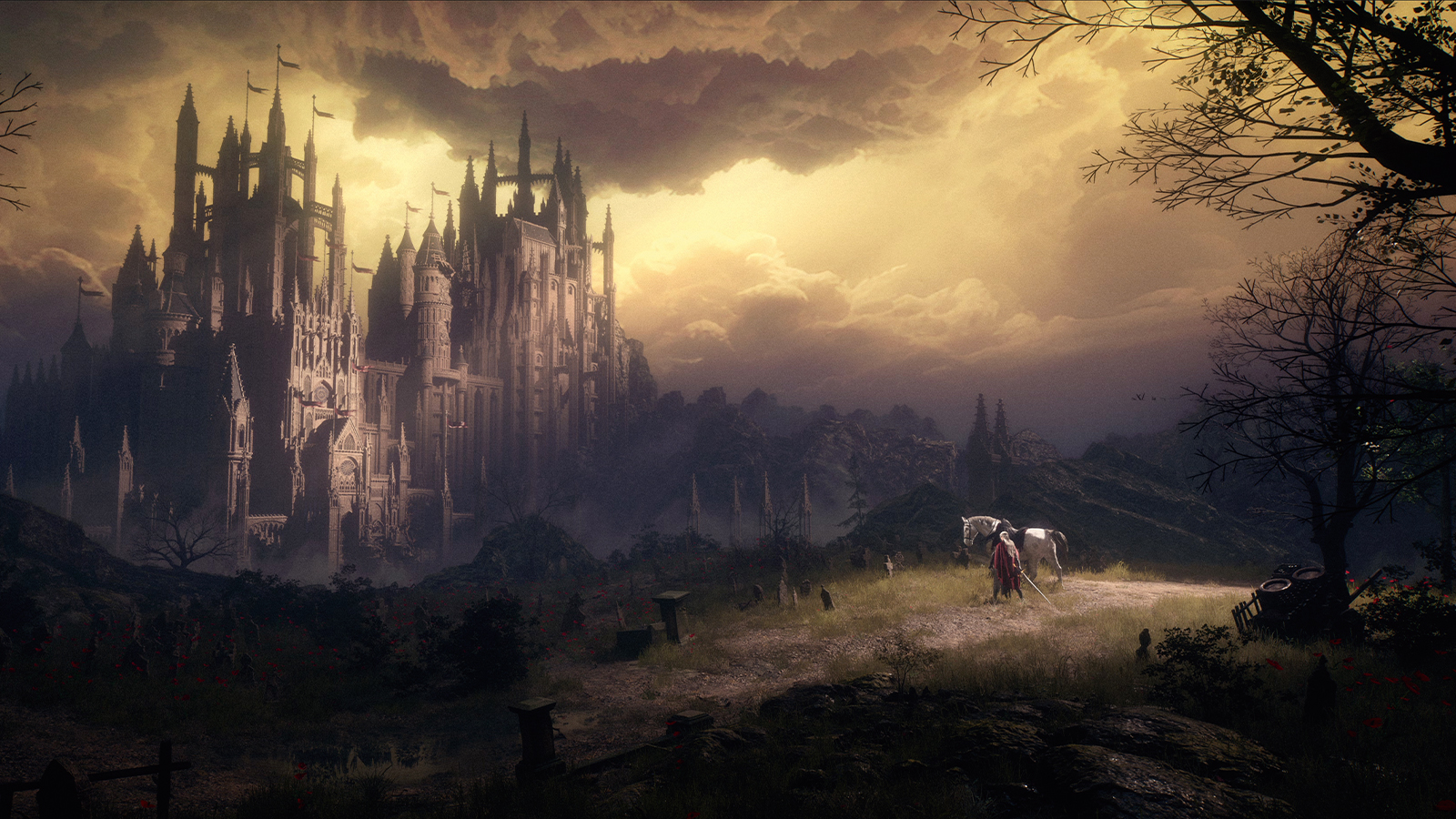
In this workshop, we’ll explore the process of relighting a 3D environment in Unreal Engine, taking inspiration from Luminism and the Hudson River School. Rather than aiming for strict realism, this project focuses on translating some painterly qualities of light into a digital space, with attention to atmosphere, emotion and storytelling. (Read our collection of Unreal Engine tutorials for more advice.)
Luminism, a 19th-century art movement, is known for its serene landscapes, clear and tranquil light, and contemplative mood. Painters of the Hudson River School, such as Frederic Church and Albert Bierstadt, conveyed vastness and depth while maintaining calm and harmony. Here, we’ll consider how some of those visual approaches – soft transitions, balanced compositions, and subtle interplay of light and atmosphere – can inform the lighting of a real-time environment.
We’ll go through the main steps of preparing a scene, shaping light sources, balancing colour and contrast, and introducing atmospheric effects to unify the composition. Along the way, we’ll discuss the artistic considerations behind each choice, offering suggestions and observations that you can adapt in your own work.
The goal is not to replicate a historic style perfectly, but to explore how lighting can extend beyond visibility and realism, serving as a tool to convey mood and engage the viewer in a thoughtful, immersive way.
01. Setting up an Unreal Engine project

Before diving into lighting, it’s important to properly set up your Unreal Engine project. In the Project Settings, enable Hardware Ray Tracing and tweak Lumen for higher quality results. Next, head to the Plugins menu to activate a few key tools that will be useful later on: Screen Space Fog Scattering, HDRI Backdrop and Movie Render Queue for final rendering.
02. Check your materials
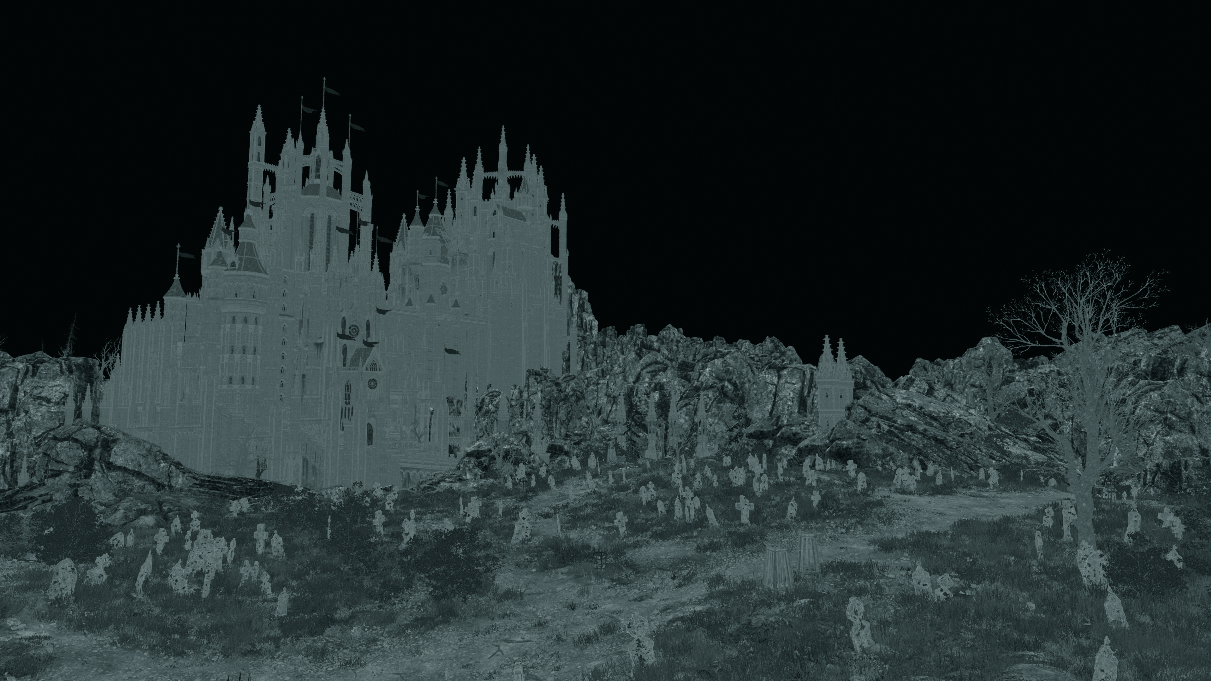
Once the project is ready and the scene is open, I check that materials react properly to light. I start by verifying albedo values, avoiding textures that are too dark or too bright, especially when placed side by side, because they can become under- or over-exposed once lit. I also inspect roughness, metallic and normal maps for consistency. To do this, I select Lit>Buffer Visualization in the viewport.
03. Building a narrative foundation
A strong lighting setup often begins with a story. Who will enter this place? What will they do here? Which elements should attract attention? These questions can help guide your lighting decisions. In my case, I want to portray a knight about to enter a castle. Thinking narratively early on helps visualise light direction and emotional intent.
04. Gathering references
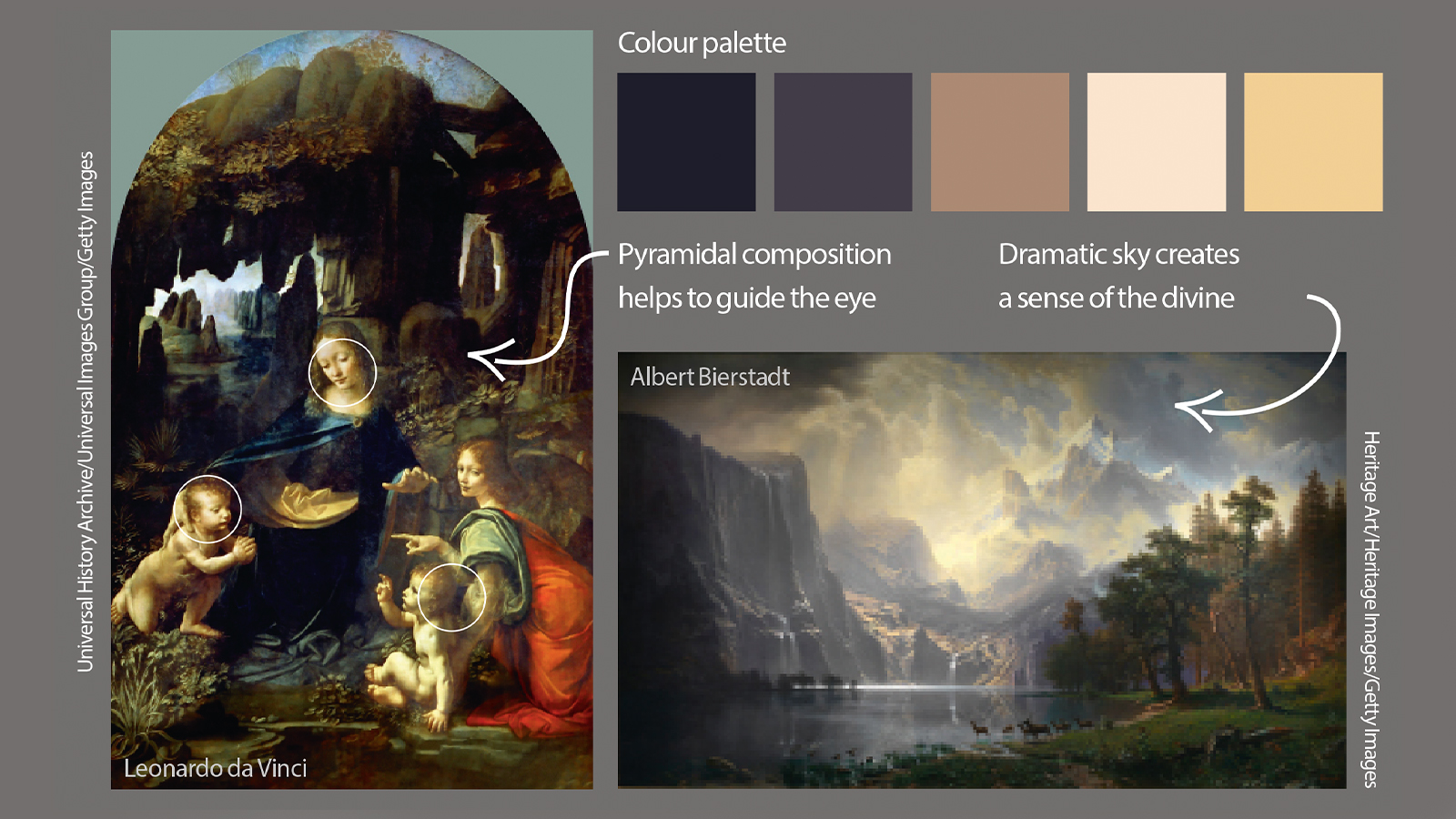
References are a valuable foundation for any lighting study. For this project, I gather paintings from the Hudson River School to study how Luminist artists captured depth, softness and atmosphere. Good references can help define tone, storytelling and emotional intent. Tools like PureRef or Miro are great for building organised moodboards and keeping your visual direction consistent.
05. Applying counterchange
A key concept I keep in mind for better readability is counterchange, which involves creating contrast by placing dark shapes against bright ones, and vice versa. This principle enhances depth, clarifies the composition and naturally guides the viewer’s eye toward the focal point. In this project, I use it to make the castle stand out by keeping its top in shadow against the bright sky.
06. Establishing the camera
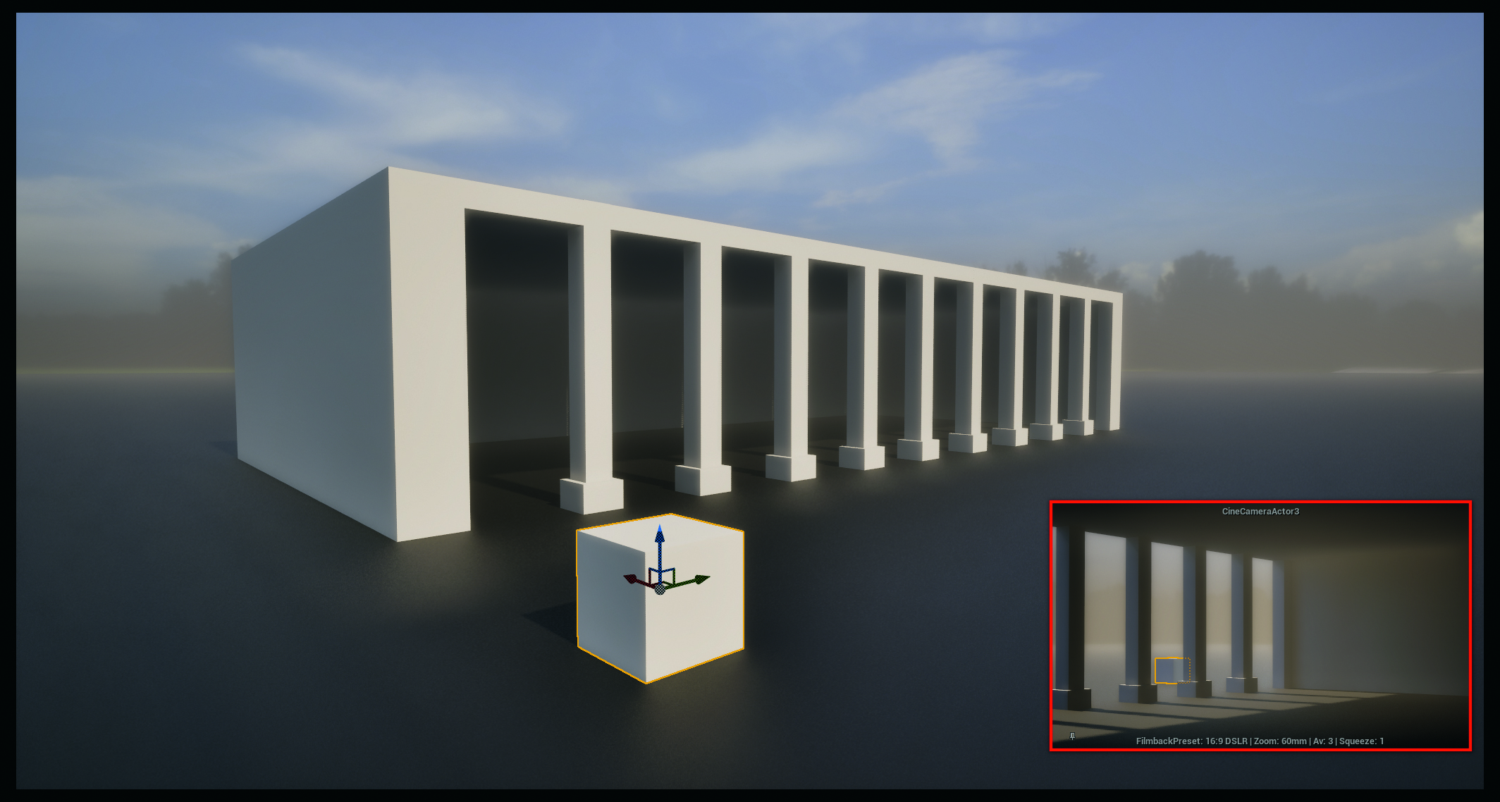
Whether you’re lighting a game environment or crafting a standalone visual piece, establishing a main camera is usually very helpful. It serves as a consistent reference point to evaluate progress and visual balance.
I regularly take screenshots from this camera to compare iterations and track improvements. Using a Cine Camera Actor is particularly useful, because it simulates real-world lenses, depth of field and focal lengths, helping me to achieve a more photographic result.
07. Apply the BMS principle
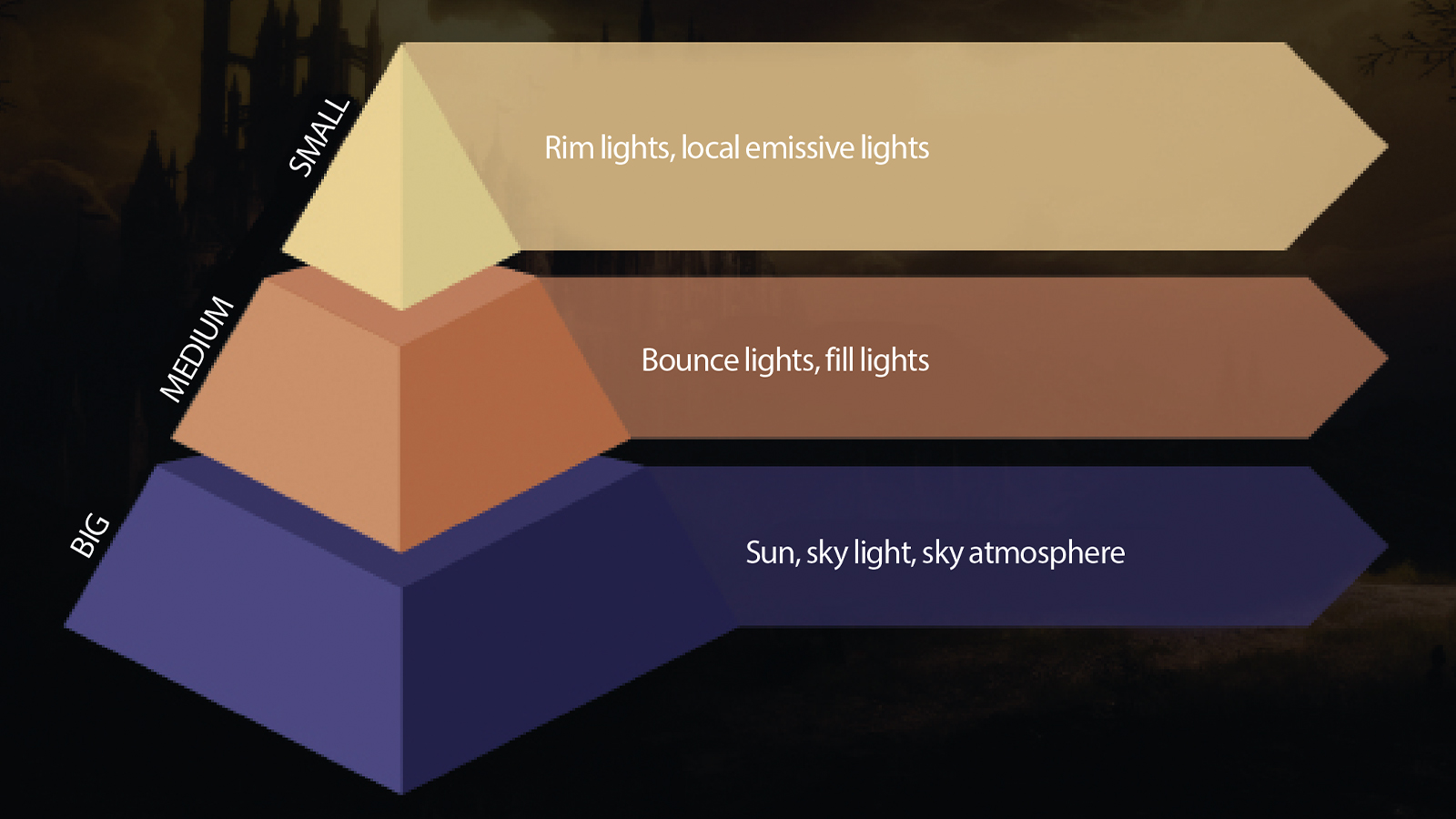
When tackling lighting, I like to follow the Big, Medium, Small method. It consists of starting with the most dominant light source, then progressively refining secondary and tertiary ones. This approach works like a funnel, helping you notice early on when something feels off. In outdoor scenes like this one, I usually begin with the sky light, as it defines the global illumination balance and ambient direction.
08. Sky light essentials

Placing the sky's light establishes shadow direction and ambient tone. For this project, I use a dramatic sky texture made by Velarion. Although the sky itself is predominantly yellow, I apply a subtle bluish tint to the sky light. The contrast in colour between the warm highlights and cool shadows reinforces both depth and harmony. The idea here is to emphasise the divine and epic feeling often found in Albert Bierstadt’s paintings, for instance, in Among the Sierra Nevada, California.
09. Key light setup
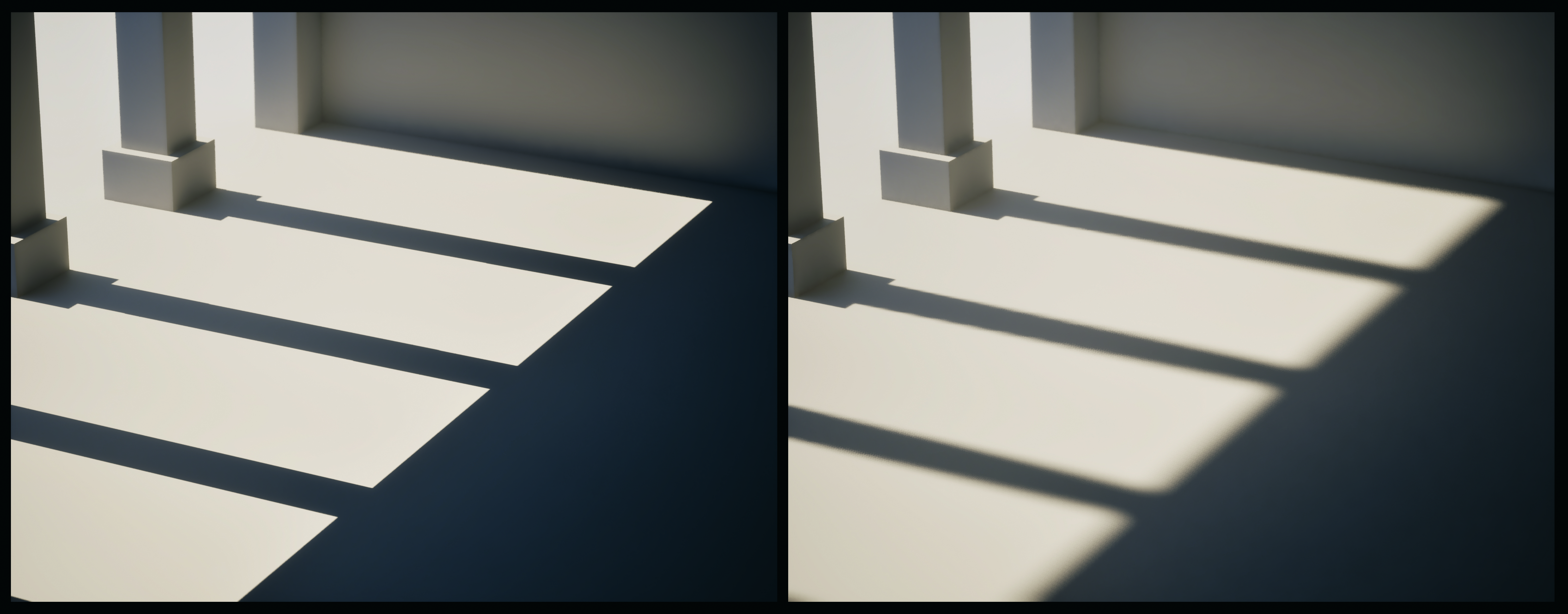
Next comes the directional key light. I use a warm, low-side-angle sun to simulate late-afternoon light, enhancing architecture and shaping volumes with softness. For this still image, I enable Raytraced Shadows to refine definition and realism. Adding a Cookie Texture as a mask on my light introduces natural irregularities in illumination, evoking the soft, uneven lighting you might see when clouds drift across the sun. If your shadows are too sharp, increase your light’s Source Angle to soften them.
10. Introduce Fog Scattering

Atmospheric fog is key to visual depth. I use an Exponential Height Fog volume set to Volumetric mode, with a soft bluish tint and slight start offset to preserve foreground clarity. The Screen Space Fog Scattering plug-in (made by Dmitry Karpukhin) enhances how light diffuses through mist. It simulates a subtle haze effect that adds cohesion and a painterly softness across the different layers of the environment.
11. Place Fog Cards to create depth
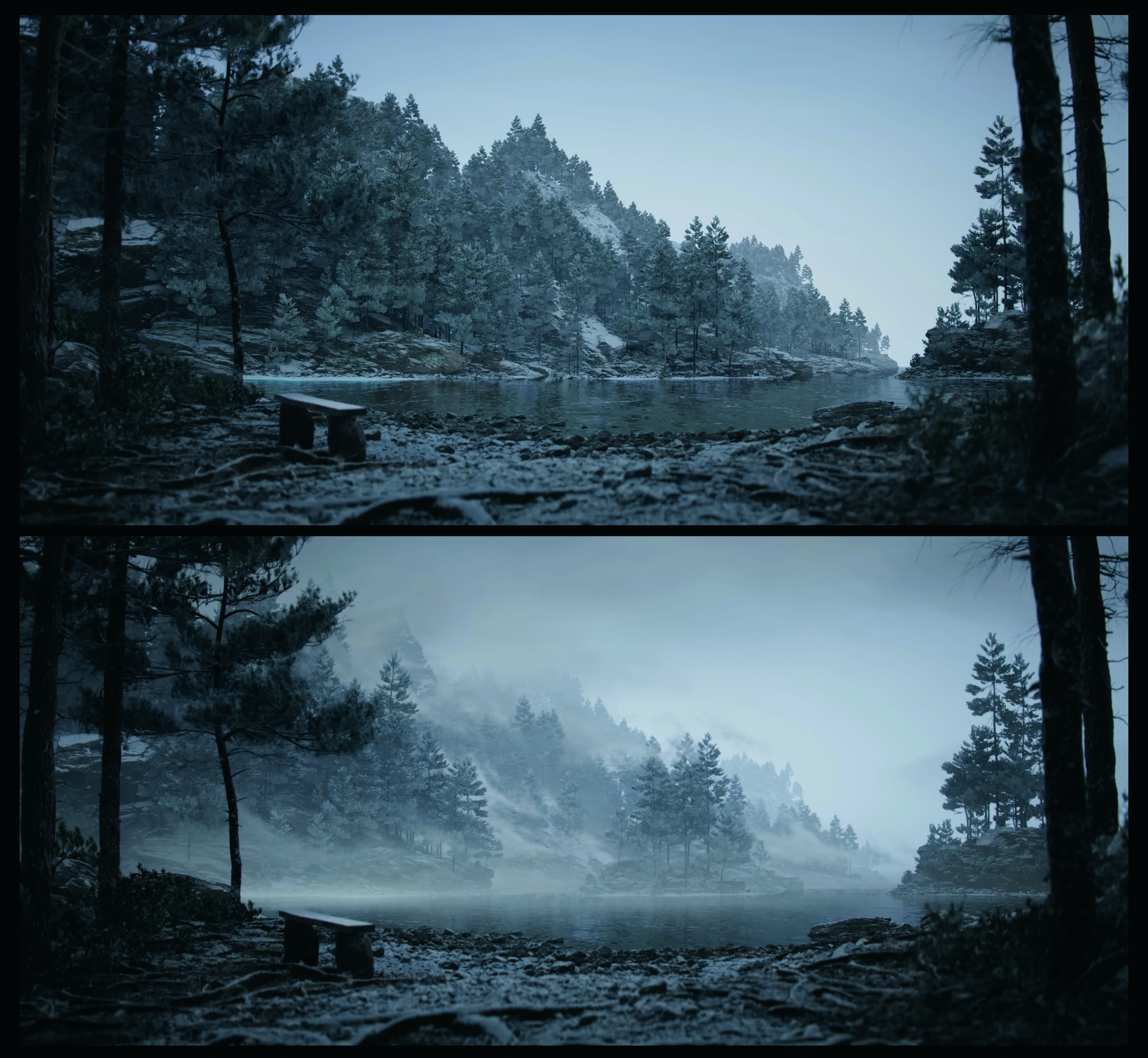
To strengthen the sense of separation between foreground and background, I place semi-transparent fog cards at various depths, recreating a valley-like layering effect. This method is inspired by the atmospheric perspective seen in luminist paintings. For this scene, I used EasyFog by William Faucher, which blends naturally with volumetric fog. Be cautious, though: too much opacity can easily reduce credibility.
12. Colour grading and Post Process Volume adjustments

Inside the Post Process Volume, I begin by refining local exposure to preserve detail across the full tonal range, avoiding crushed blacks and blown-out highlights. I then move on to colour grading: cooling the shadows with subtle blue tones, and lifting midtones and highlights to strengthen contrast and focus hierarchy. This helps reinforce a pyramidal composition, giving the overall lighting a coherent and narrative balance.
13. Using Convolution Bloom
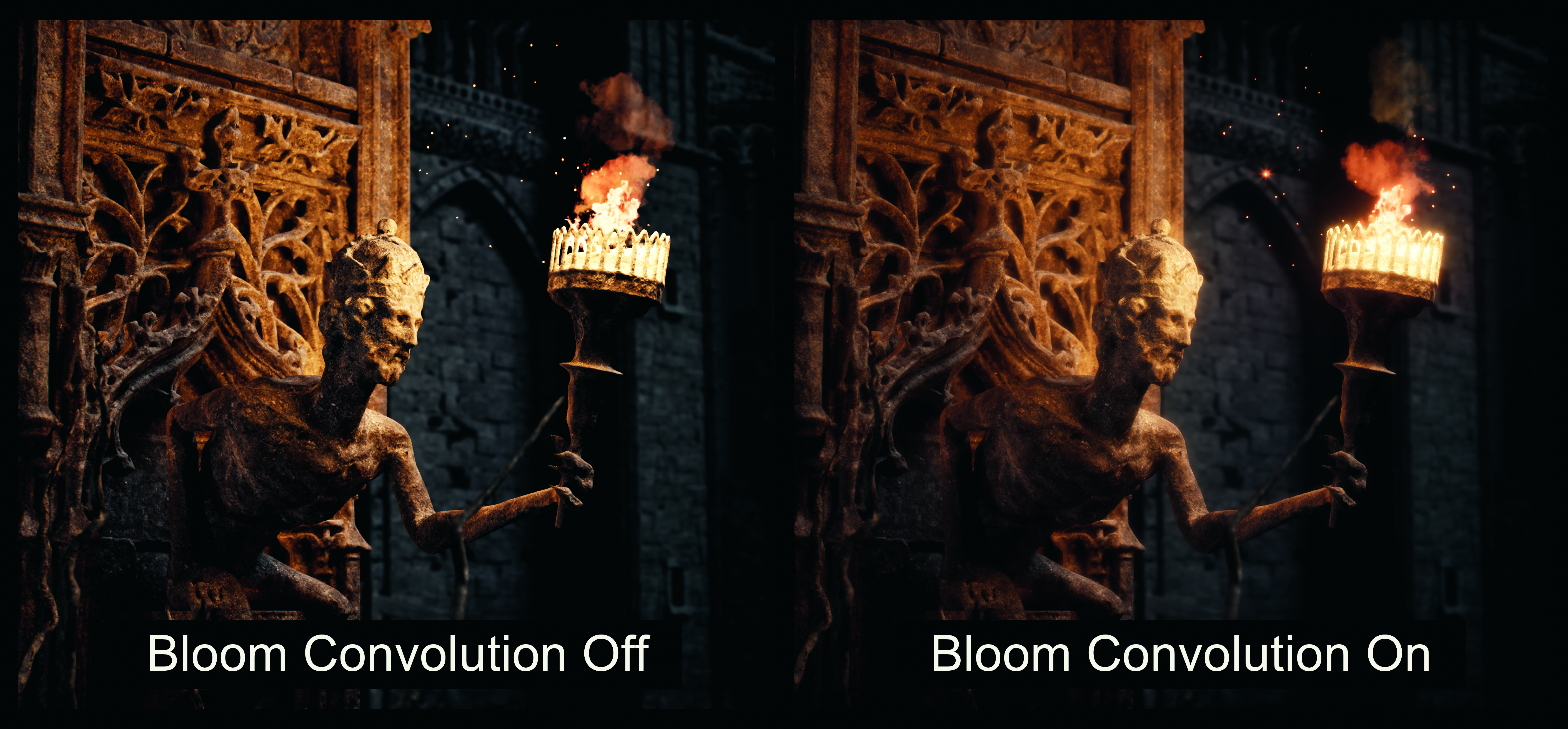
Bloom plays an important role in this piece, reinforcing its soft, dreamy character. I carefully increase convolution bloom intensity to create smooth light diffusion across bright areas, inspired by how luminist painters rendered radiant skies. The key is restraint: too much bloom flattens contrast and reduces depth. Subtle adjustments preserve readability while giving the scene its luminous, almost ethereal glow.
14. Final adjustments in DaVinci Resolve
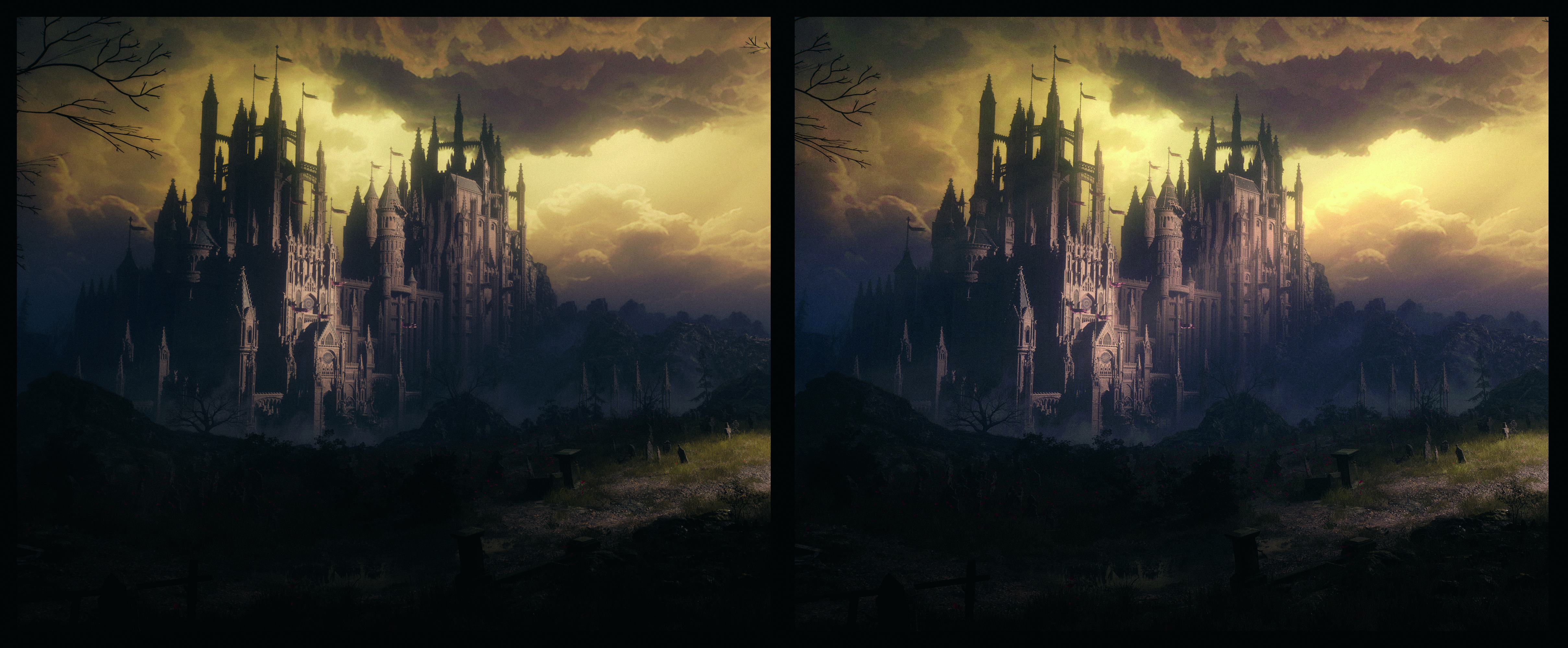
At this stage, the image is about 95 per cent complete, but I like to polish the details in DaVinci Resolve. I add a touch of film grain, a faint glow and light rays to accentuate the ‘divine’ aspect. These effects aren’t necessary, but they can help bridge the gap between a digital render and the softness of a luminist painting.
Sign up to Creative Bloq's daily newsletter, which brings you the latest news and inspiration from the worlds of art, design and technology.

Philémon is part of the team at video game developer Arkane Studios. He also teaches lighting in art school and has a strong interest in medieval dark fantasy, storytelling and atmospheric worlds.
You must confirm your public display name before commenting
Please logout and then login again, you will then be prompted to enter your display name.
