How to create stunning KPop Demon Hunters art in Photoshop

Sign up to Creative Bloq's daily newsletter, which brings you the latest news and inspiration from the worlds of art, design and technology.
You are now subscribed
Your newsletter sign-up was successful
Want to add more newsletters?
KPop Demon Hunters was the animated movie phenomenon of the past year. It became the most-streamed content ever on Netflix, cleaned up at the Concept Art Awards, and there's now a KPop Demon Hunters art book.
Unsurprisingly, Maggie Kang and Chris Appelhan's movie has sparked an explosion in fan art dedicated to the HUNTR/X trio of Rumi, Mira and Zoey. And if you're wondering where to get started yourself, have no fear. The Taiwanese digital artist Jiunn Kuo has provided us with a step-by-step tutorial showing how he creates KPop Demon Hunters fan art in Photoshop.
Jiunn has worked on the likes of League of Legends and Legends of Runeterra. Here he shows us how he makes a character illustration of Zoey, putting his own take on the main rapper and lyricist and youngest member of KPop trio HUNTR/X. He'll use Photoshop but you could also use other tools among the best digital art software.
Lighting is of the essence here. Jiunn sees expressive lighting in character illustrations as more than a finishing touch for highlights. It shapes the emotion of a scene, guides the viewer’s eye and gives the character a strong sense of presence.
The workshop begins with a clean line drawing and a simple value pass to establish the essential forms before any colour is added. From there, Jiunn organises the character, background and effects into distinct layer groups so that he can adjust them easily at any stage, keeping the artwork flexible throughout the process.
Jiunn will also explain how he builds glow effects, places soft and sharp accents and maintain a stable value structure even when using bright and stylised lighting. By dividing the artwork into manageable steps, these methods can be applied to a range of styles, whether you prefer subtle, atmospheric lighting or bold, luminous highlights.
How to create KPop Demon Hunters fan art in Photoshop
To get the brushes used for this artwork, See how to download the resources from ImagineFX issue 261.
Sign up to Creative Bloq's daily newsletter, which brings you the latest news and inspiration from the worlds of art, design and technology.
01. Set your composition with a sketch
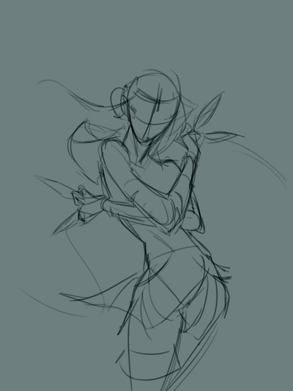
I use loose, simple lines to capture the character’s pose and movement, relying on reference images when required.
I focus on the proportions and the overall balance without adding details. The goal is to place the character quickly within the composition.
02. Improve your line art
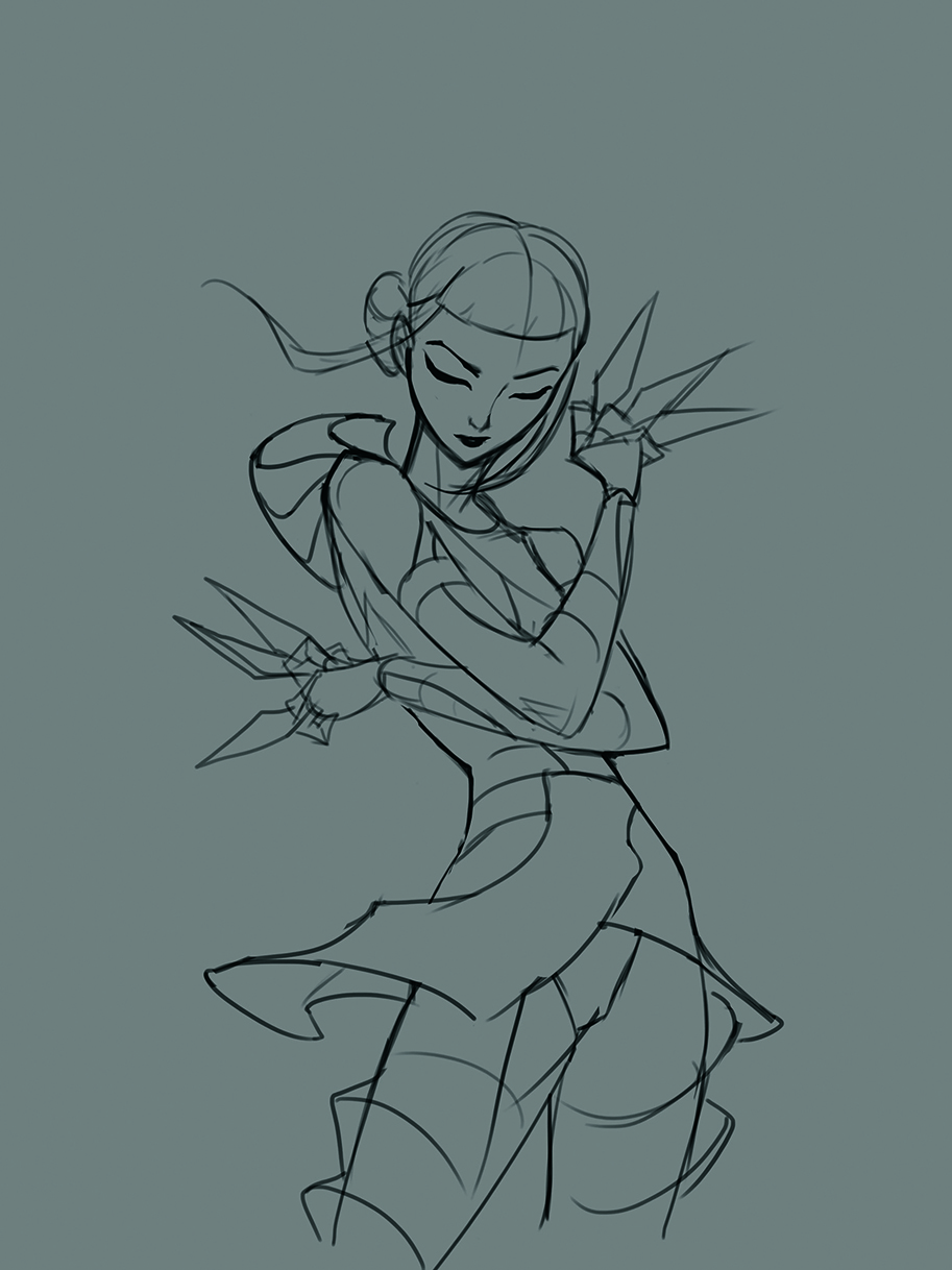
Refine the initial draft by clarifying shapes, strengthening the silhouette, correcting proportions and establishing the main forms while keeping the lines clean and readable.
This step also involves organising the muscle structure, clothing design and overall line flow. Clear line art makes the upcoming colour-blocking stage smoother and more efficient.
03. Apply base colours
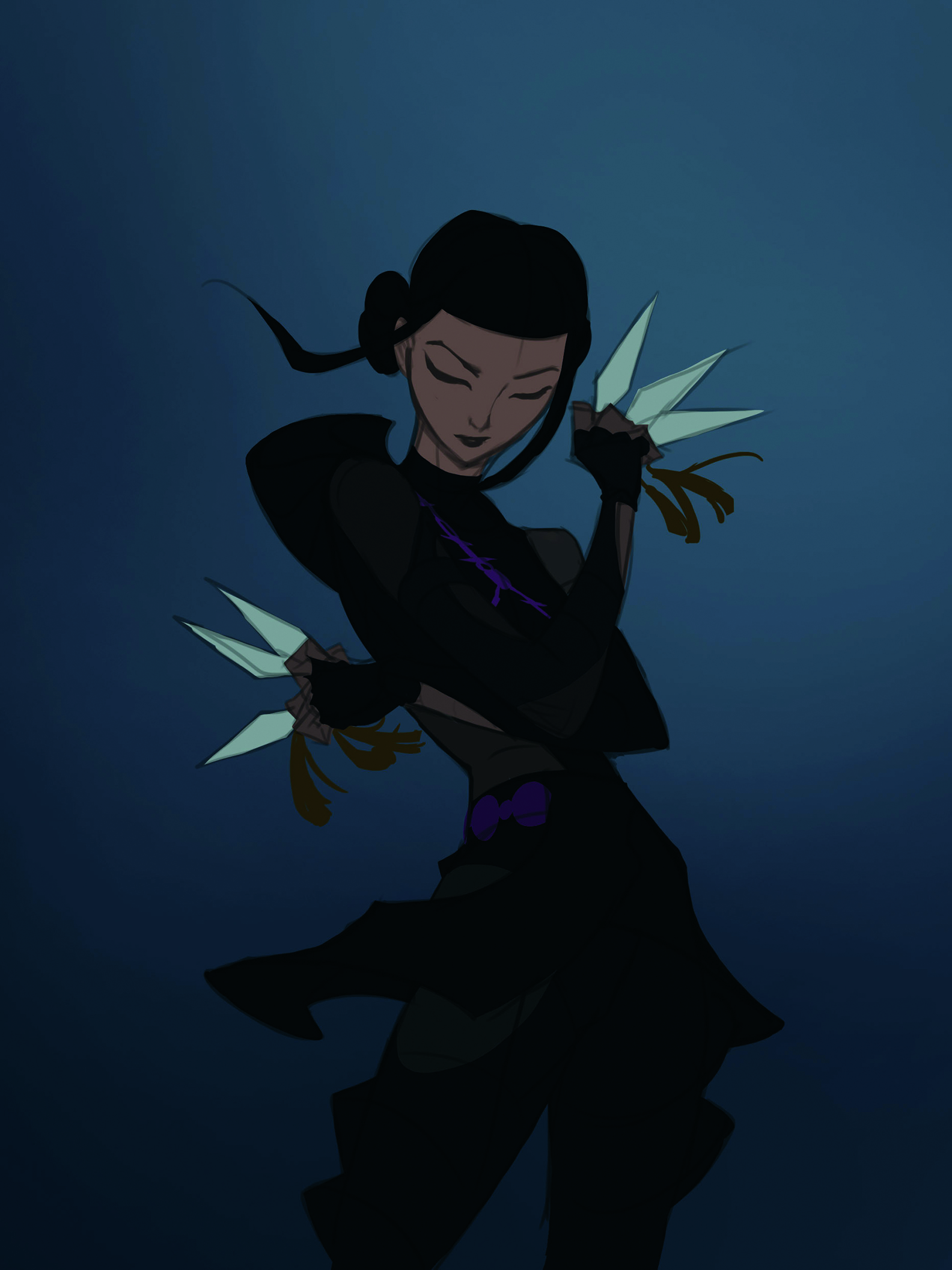
I begin by laying down flat base colours to set the character’s overall palette, keeping the tones simple and consistent to maintain clear shapes. I then block in key areas such as skin, hair and clothing, but don’t add shading yet.
Clean and solid base colours create a stable foundation, making lighting and rendering easier to control.
04. Lighting the character
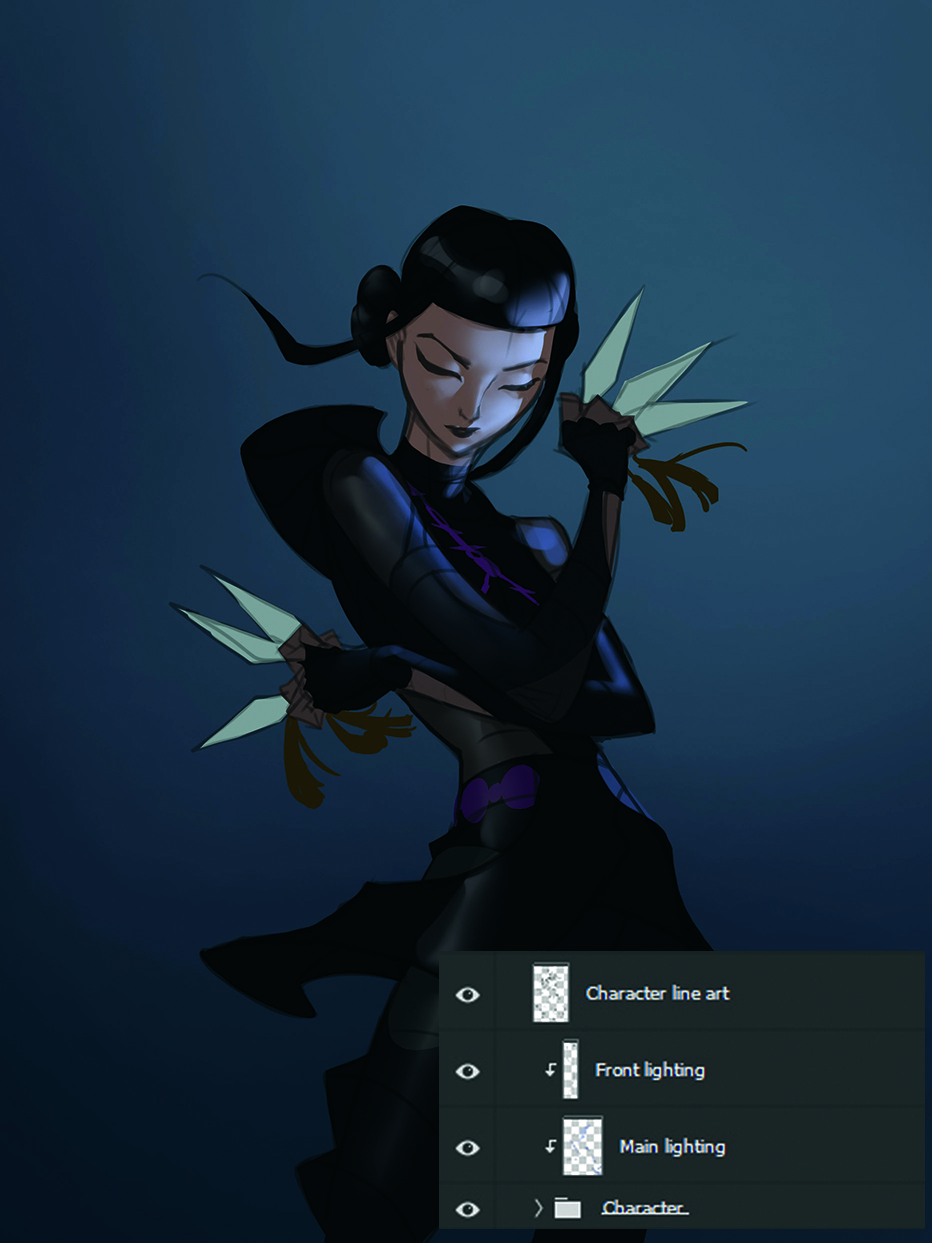
I use a Lighten layer to softly build the primary light source, enabling the illumination to blend naturally without disrupting the base colours. I establish the direction and intensity first: I usually have one light from the weapon and another main light on the character.
I block in broad light areas, and then refine them gradually. Setting the light and shadow structure early on helps define the strength, direction and contrast of the illumination, enabling the rest of the painting to develop more confidently.
05. Prepare your render by creating separate layers
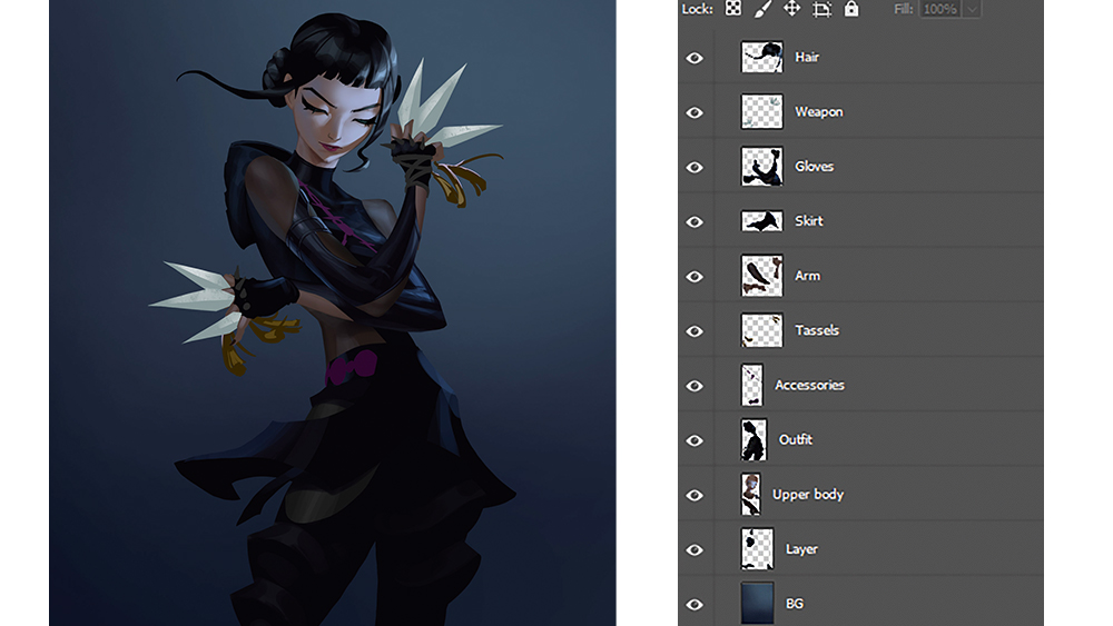
After merging the lighting and base colours, I separate the character into layers such as hair, skin and clothing to make later refinements easier.
I adjust the forms on each layer, strengthen the edges and improve the structure. The main goal is to make the important shapes clearer
06. Use different brushes for different materials
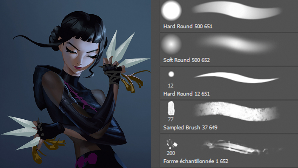
Different brushes create varied textures and edge qualities. Most of the time I rely on basic brushes, and occasionally I add texture brushes to introduce detail or roughness.
Switching brushes helps control depth and clarity in the painting and gives each area a more expressive finish.
07. Keep working into the render
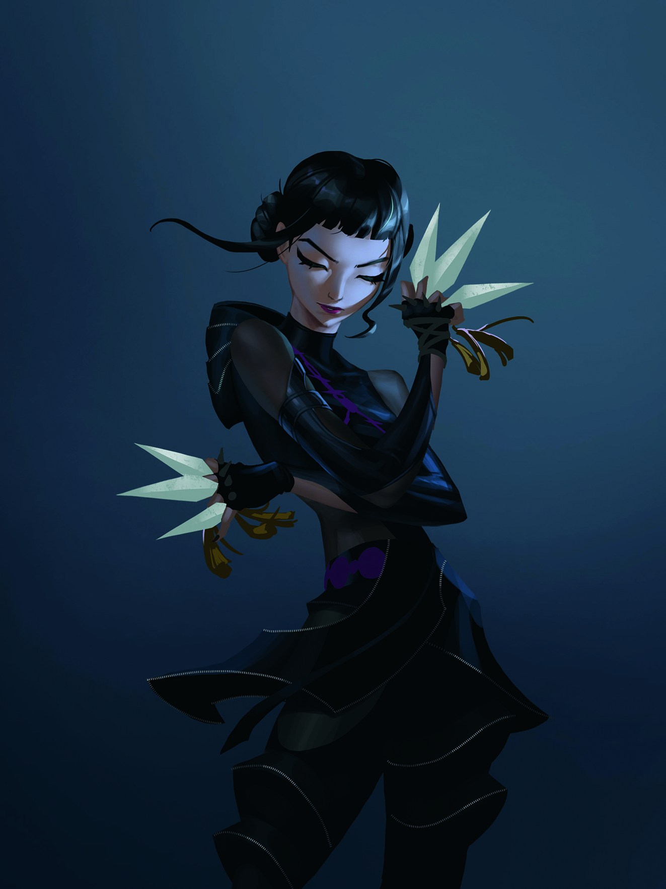
I add elements such as hair strands and chains only in areas that need emphasis. These details enhance the surface richness without disrupting the main forms.
Applying them selectively keeps the design clear and controlled, and the right amount of small accents makes the overall artwork feel more polished and refined.
08. Depict the weapon effects
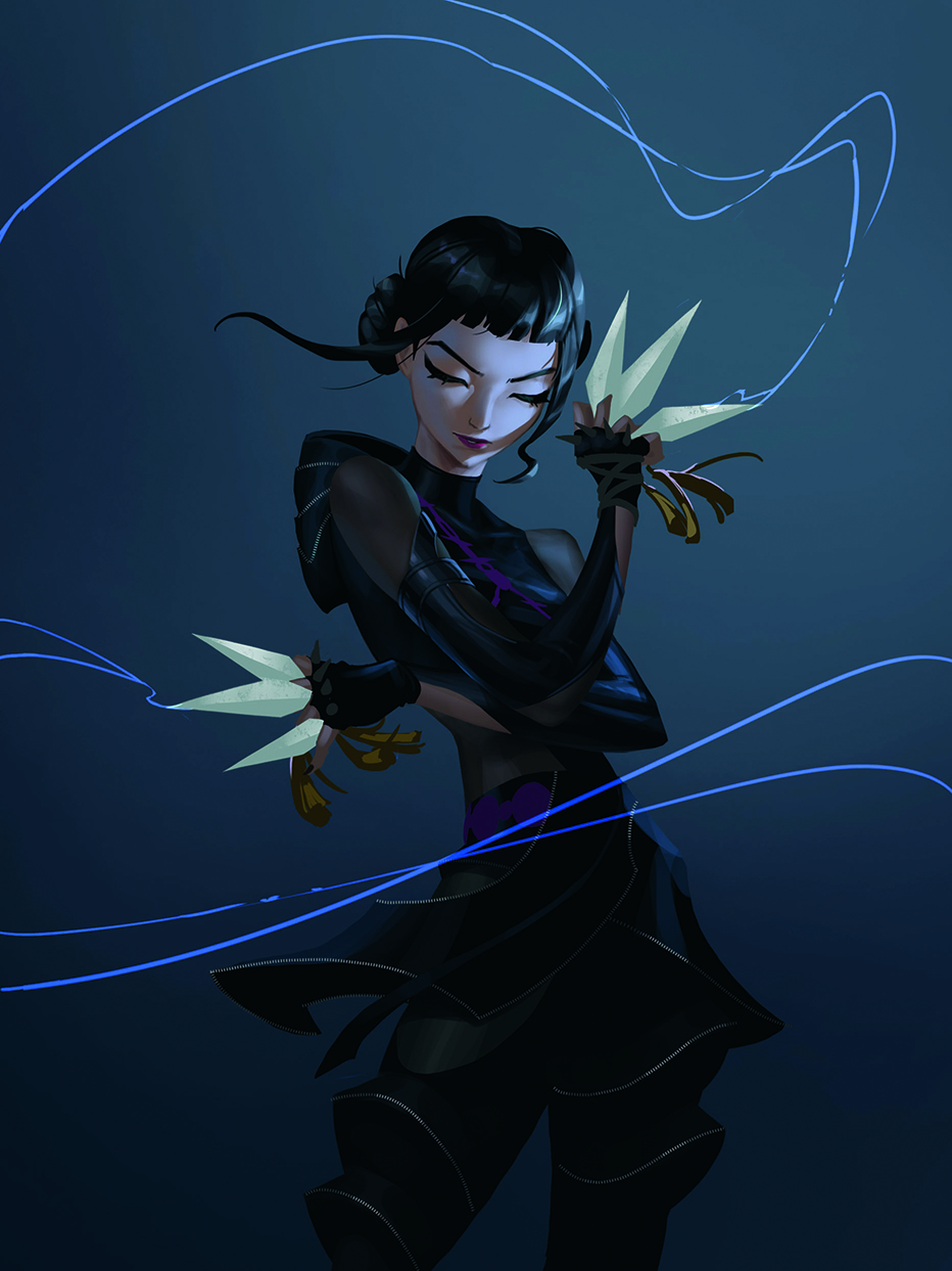
I like adding streamlined motion effects to the weapon, using Linear Dodge (Add) to emphasise direction and a sense of force. Clean and flowing shapes suggest speed and energy without pulling attention away from the character.
These lines help guide the viewer’s eye and give the weapon a stronger sense of rhythm.
09. Make it glow and check the values
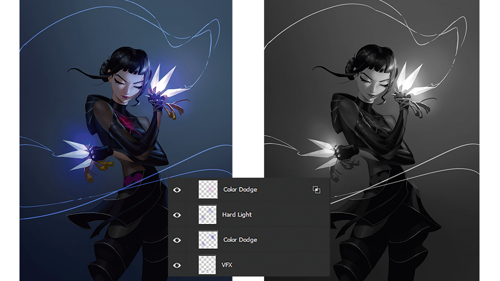
I use the Hard Light or Color Dodge blending modes to gradually build up the highlights on the weapon. I’m careful to increase the brightness slowly to keep it controlled, and frequently switch to black and white to check the overall value structure.
I keep the brightest point on the weapon so it becomes the visual focus. Strong lighting enhances contrast and energy
10. Improve surface interest
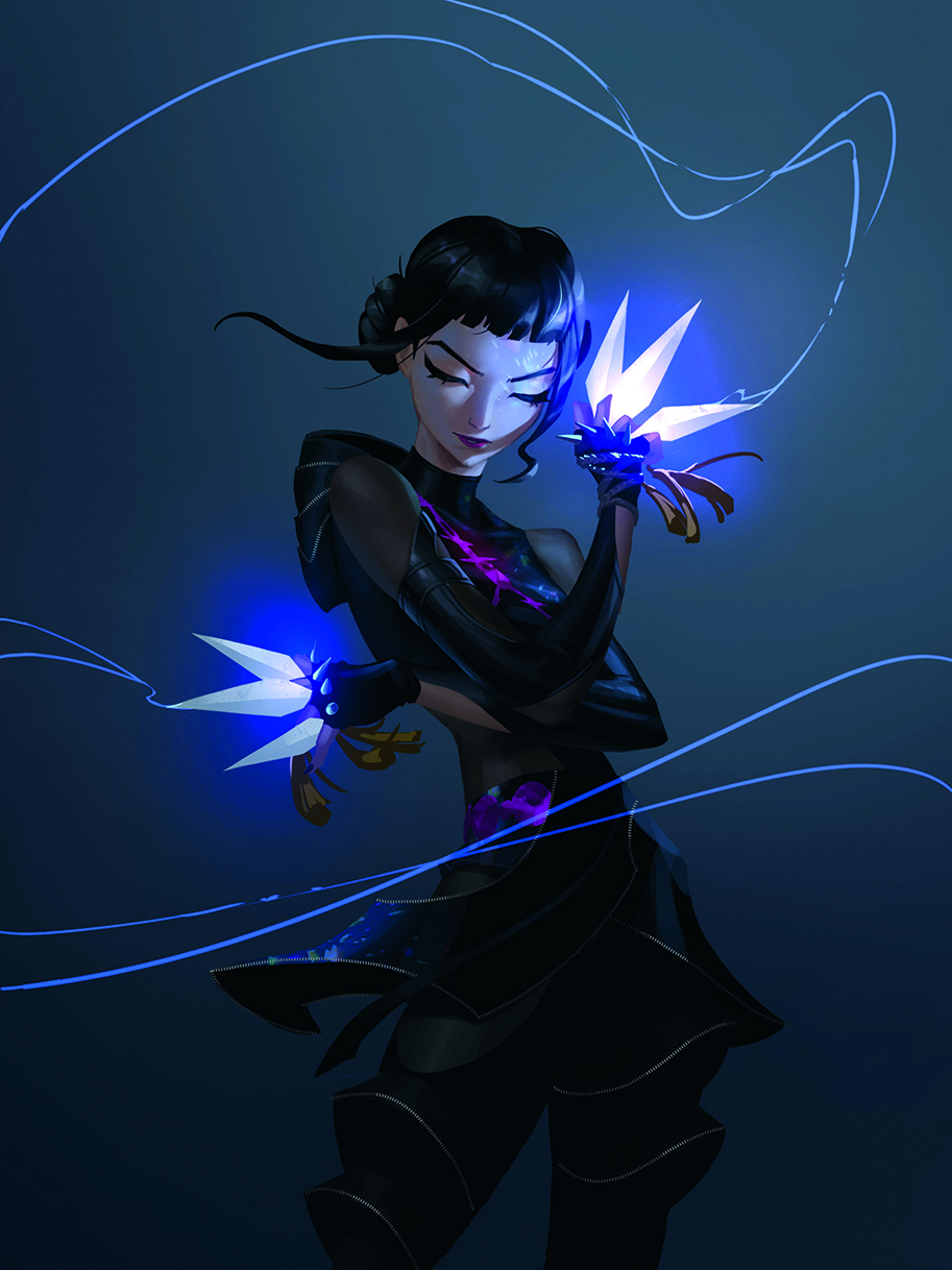
I add texture to the character to give the surfaces more depth and make each area feel more engaging. You can use fabric patterns, light noise or textured brushes to enrich the design.
The aim is to introduce details that support the overall look without making the image feel too busy
11. Enhance facial detail
I use an Overlay layer to add soft warm tones and natural blush to the face. Light touches of color around the eyes or nose can enhance the expression.
I add small highlights to clarify the volume. These subtle adjustments help refine the facial features and make the character feel more lively
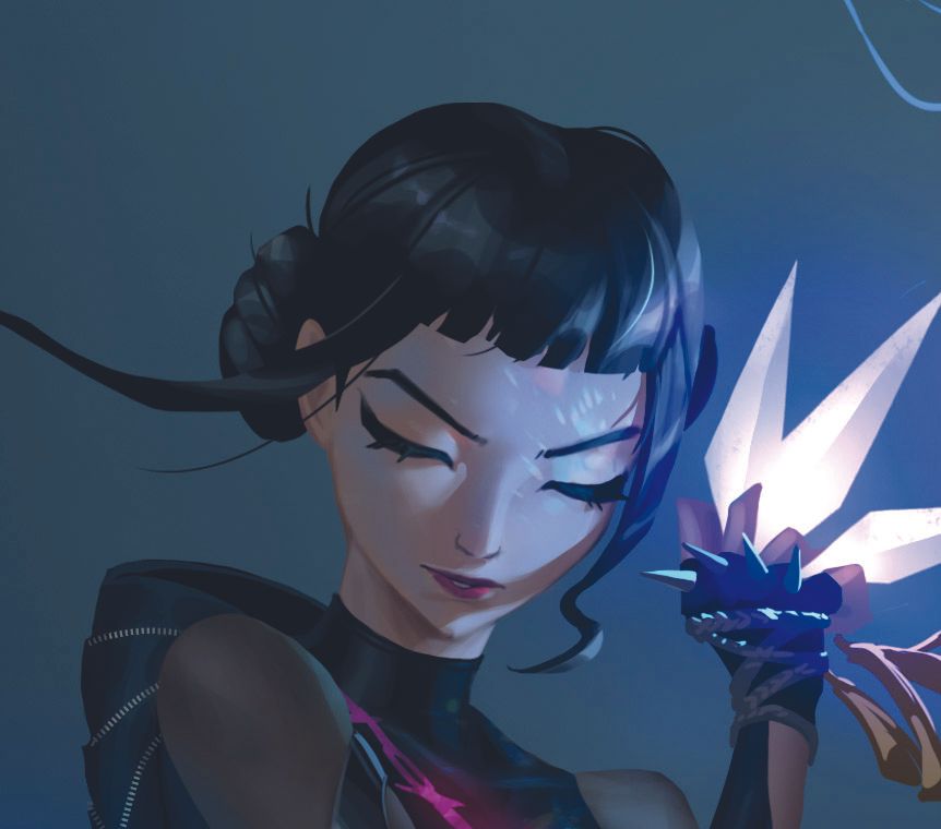
Image credit: Jiunn Kuo
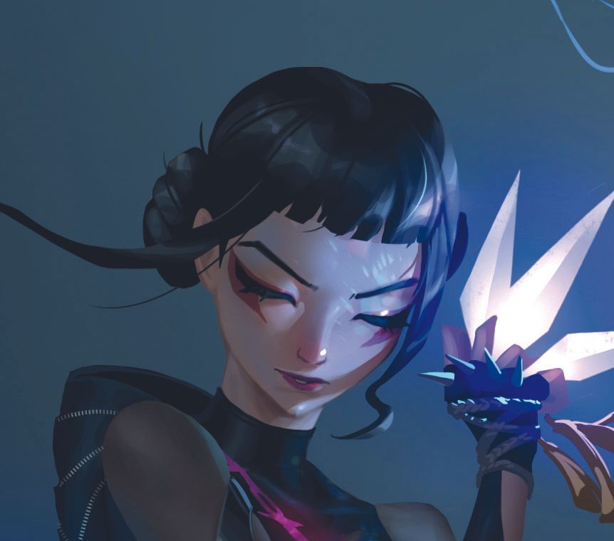
Image credit: Jiunn Kuo
12. Enhance the background atmosphere
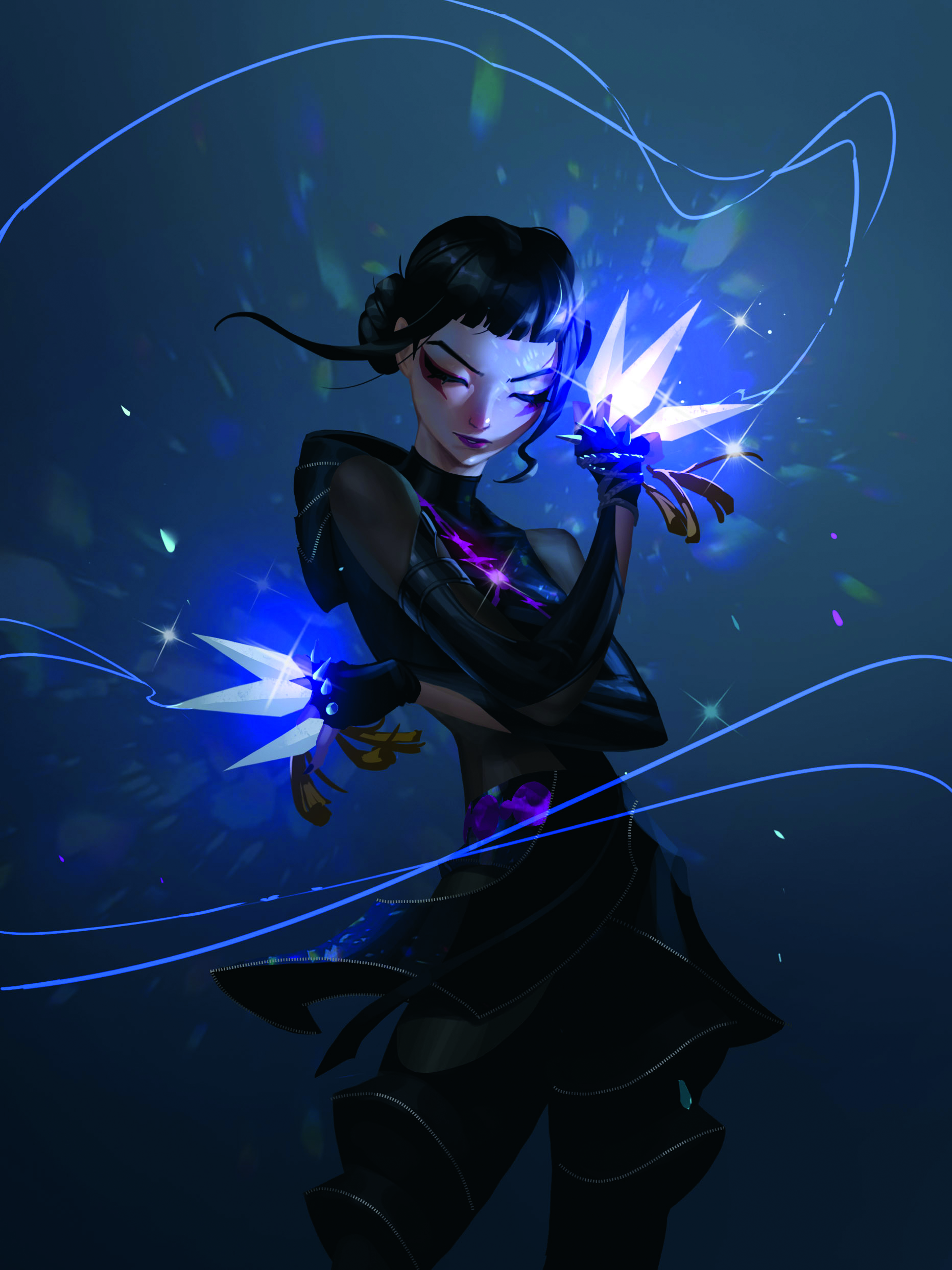
I add soft light sources and particles to enhance the background and atmosphere. I keep the lighting gentle so it doesn’t overpower the character. Light beams guide the viewer’s eye and strengthen the sense of space. These touches add depth while keeping the environment supportive.
13. Use filters to enhance depth
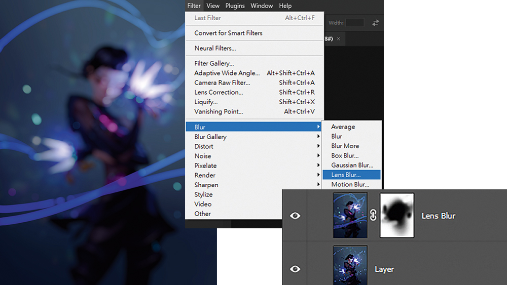
I use the Lens Blur filter to enhance depth of field. A layer mask enables me to keep the main subject sharp while blurring only the secondary areas.
Strengthening the depth of field improves visual readability and helps direct the viewer’s focus toward the most important parts of the illustration.
14. Final touches
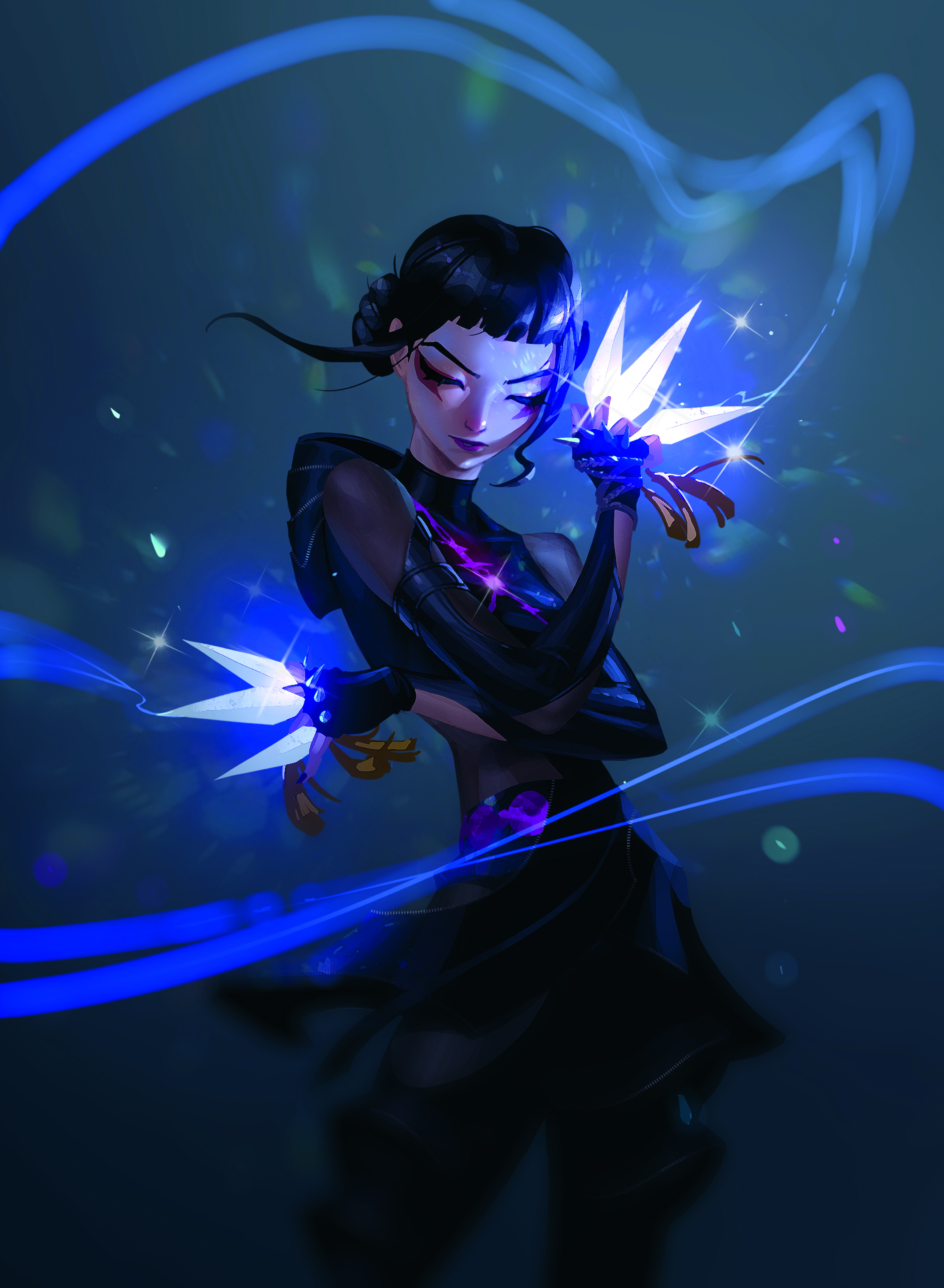
I make precise adjustments to the colours, contrast and details in the final stage. I refine any shapes that need more clarity and ensure the lighting remains consistent across the illustration.
These final touches help the artwork feel more polished, clean and cohesive.
You can see more of Jiunn's work on his ArtStation profile
Want the brushes he used for this artwork? See how to download the resources from ImagineFX issue 261.
Need the gear?
If you don't have a device to draw on, you may want to invest in one of the best drawing tablets or one of the best laptops for drawing. Below, you can see some of the best current deals on tablets we've reviewed.
This article originally appeared in ImagineFX. Subscribe to ImagineFX to never miss an issue. Print and digital subscriptions are available.

Joe is a regular freelance journalist and editor at Creative Bloq. He writes news, features and buying guides and keeps track of the best equipment and software for creatives, from video editing programs to monitors and accessories. A veteran news writer and photographer, he now works as a project manager at the London and Buenos Aires-based design, production and branding agency Hermana Creatives. There he manages a team of designers, photographers and video editors who specialise in producing visual content and design assets for the hospitality sector. He also dances Argentine tango.
You must confirm your public display name before commenting
Please logout and then login again, you will then be prompted to enter your display name.
