How to use bold colours to boost your art in Photoshop
Sign up to Creative Bloq's daily newsletter, which brings you the latest news and inspiration from the worlds of art, design and technology.
You are now subscribed
Your newsletter sign-up was successful
Want to add more newsletters?
I have often designed suits of fantasy armour using animals as motifs. For this personal project, however, I wanted to use an animal that rarely appears in my work.
The koi, a type of carp, is an ornamental fish raised in Korea, Japan and China. This series actually started with a plate armour design. Although the armour had a Western form, I used Asian-style strings to connect the armour plates and swords.
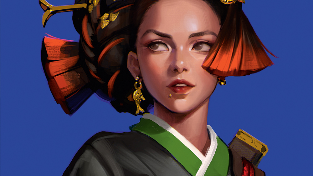
This time, I took the concept further by including traditional Korean elements, drawing a female character wearing a hanbok (traditional Korean dress). I wanted the overall silhouette, to evoke the shape of a fish, not just the decorative details.
Article continues belowAs part of a series from the previous artwork, I maintained a strong contrast in light and shadow and used rich primary colours, adding various textures to prevent the image from looking flat. In this workshop, I’ll show you my process and explain how to create and apply your own texture patterns from a photo.
For more art tutorials, see our feature on how to design fantasy architecture in Photoshop and our broader collection of Photoshop tutorials.
01. Taking elements from the koi armour
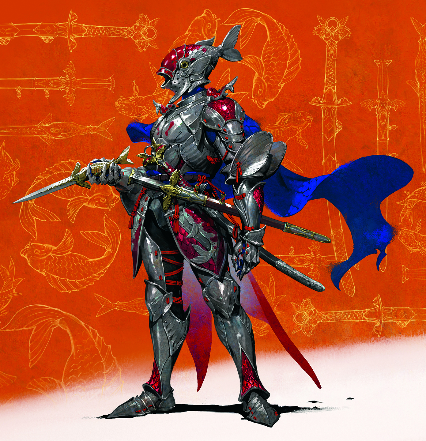
I decide to incorporate graphic elements from the previous work: strong contrast, high saturation, rich colours and primary colour usage. I also decide to use the flat fish line drawing from the piece. Although I change the armour to a dress, I keep the three swords and the Asian-style armour ties
02. Colour palette
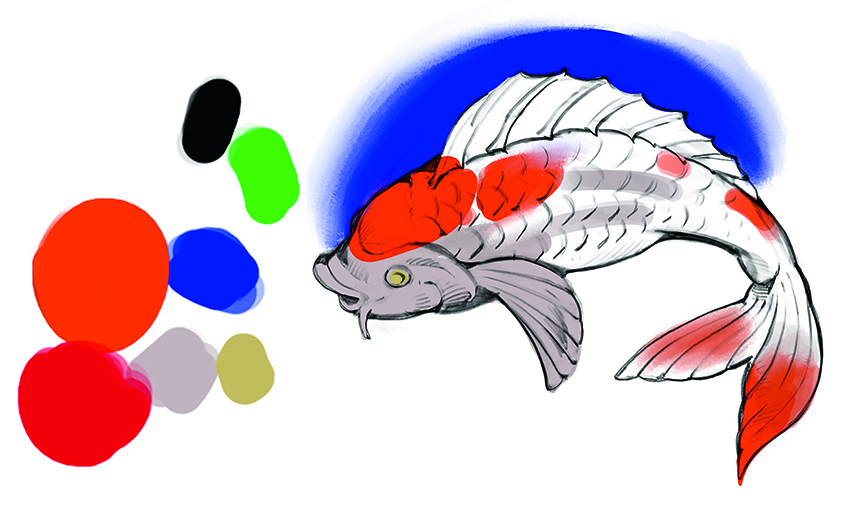
I prepare a high-saturation colour palette, knowing that I’ll need to control the amounts used to create visual emphasis and an eye-catching image. For this illustration, I’ll mainly use orange and red, with ultramarine – the complementary colour – for the background.
03. Sketching with a silhouette in mind
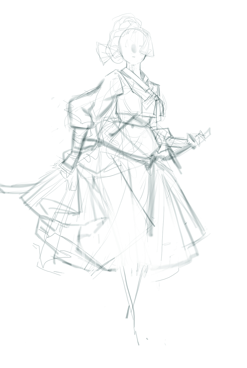
I designed a fish-shaped helmet for my previous armour artwork. This time, I want a more indirect fish like silhouette. I transform the traditional Korean hairstyle (gachae – a large wig) into a fish silhouette. I also tie up the skirt to resemble a fish’s fin.
04. Establishing dark shadows in the sketch phase
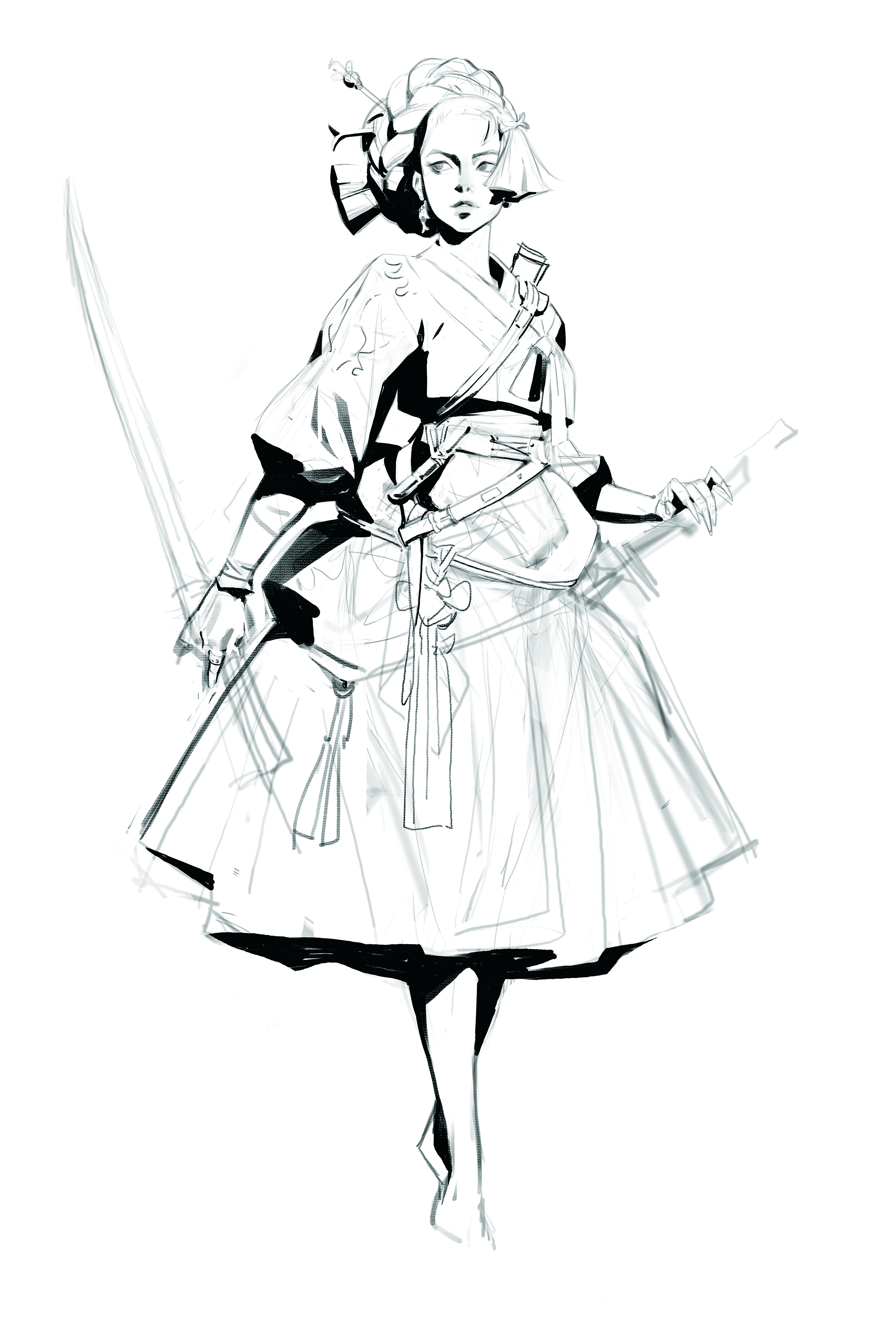
I apply the black values for contrast during the early sketching stage. I decide to make this character look stronger, so I give her a sword to hold in her right hand – previously the figure’s skirt was being held by this hand.
05. Understanding the tonal value by laying down flat colours
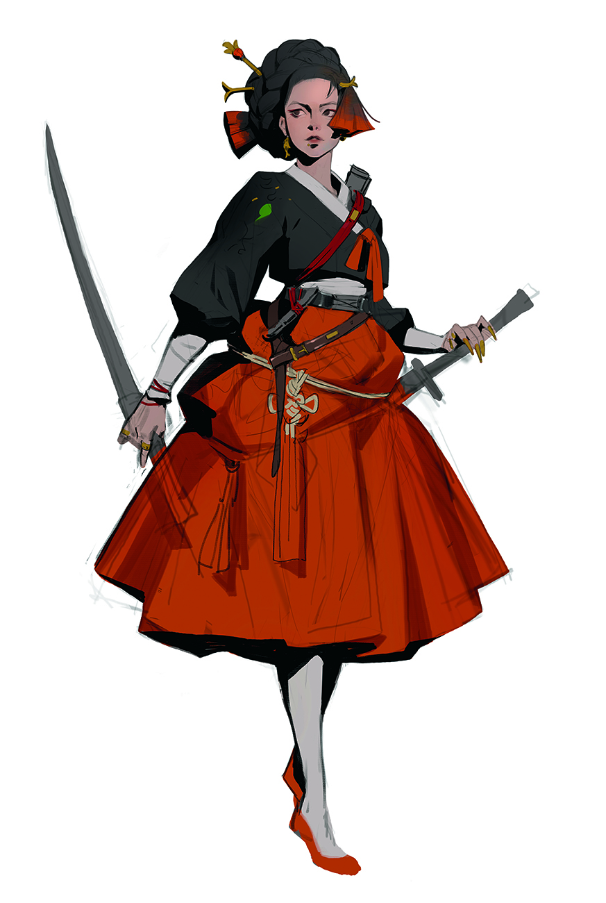
I block in the colours, focusing on the orange/red hues of the koi. This step helps me understand the overall colour scheme. I recommend exploring various colours during this step, creating many options before deciding.
I now decide on the primary colour, and I plan to add richer primary colours later on, such as blue, gold and green.
06. Refining the colour scheme
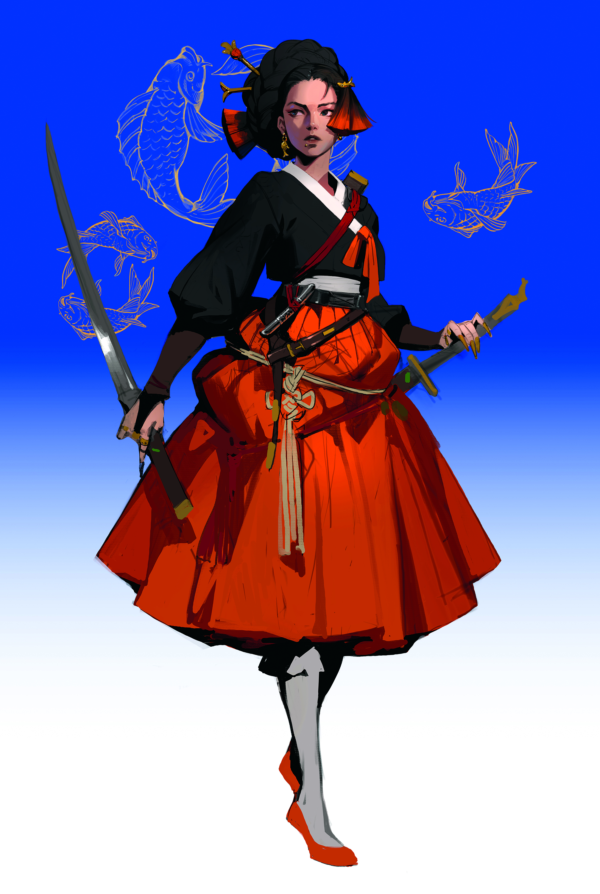
I want to add a bold colour to the background, and because the main motif is a fish, blue seems like a good choice. I keep the background on a separate layer and merge the sketch and colour layers to prepare for rendering.
The contrast between blue and orange is a key technique for drawing the viewer’s gaze towards the character’s face. However, the background’s darker value simultaneously makes the figure and the background appear poorly separated.
To fix this, I emphasise the contrast by further brightening the light areas on the face and skirt
07. Temporarily apply patterns to the clothing
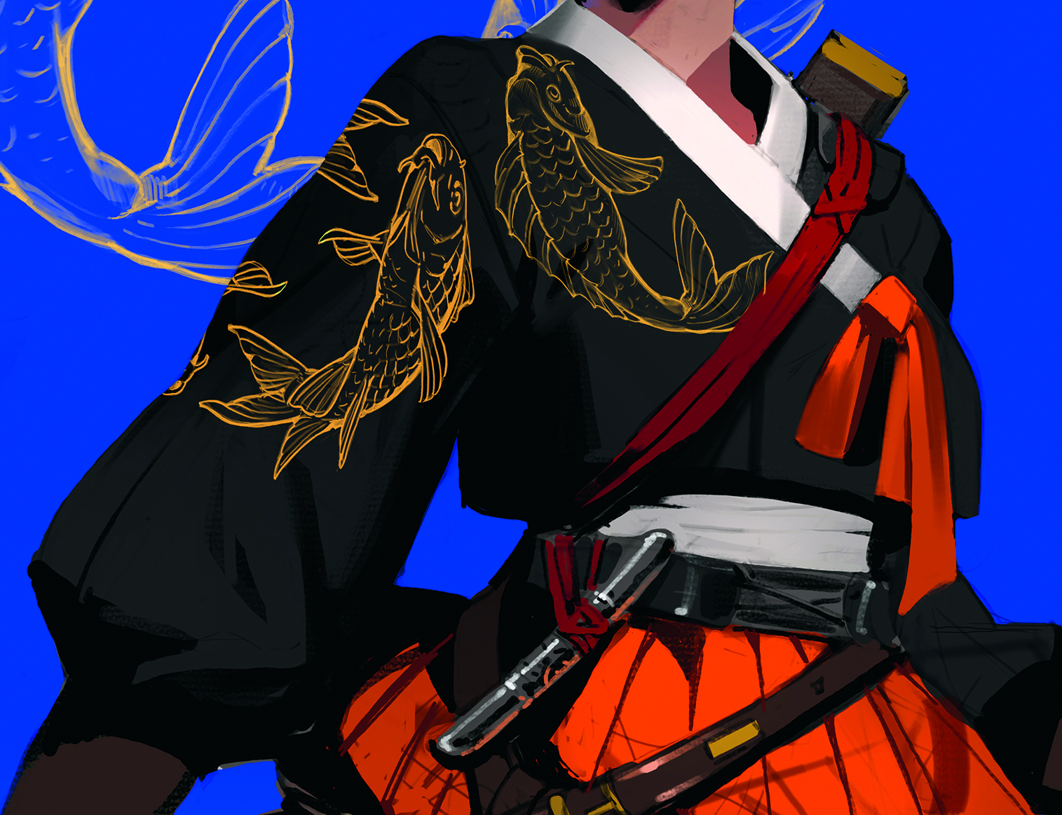
The overall look is missing a sense of luxury, so I add gold trim to the top. I also arrange the line drawing of the fish design I made in the previous artwork. I keep the pattern on a separate layer and work with a Clipping mask to avoid mixing it with the clothing’s wrinkles.
08. Detailed rendering
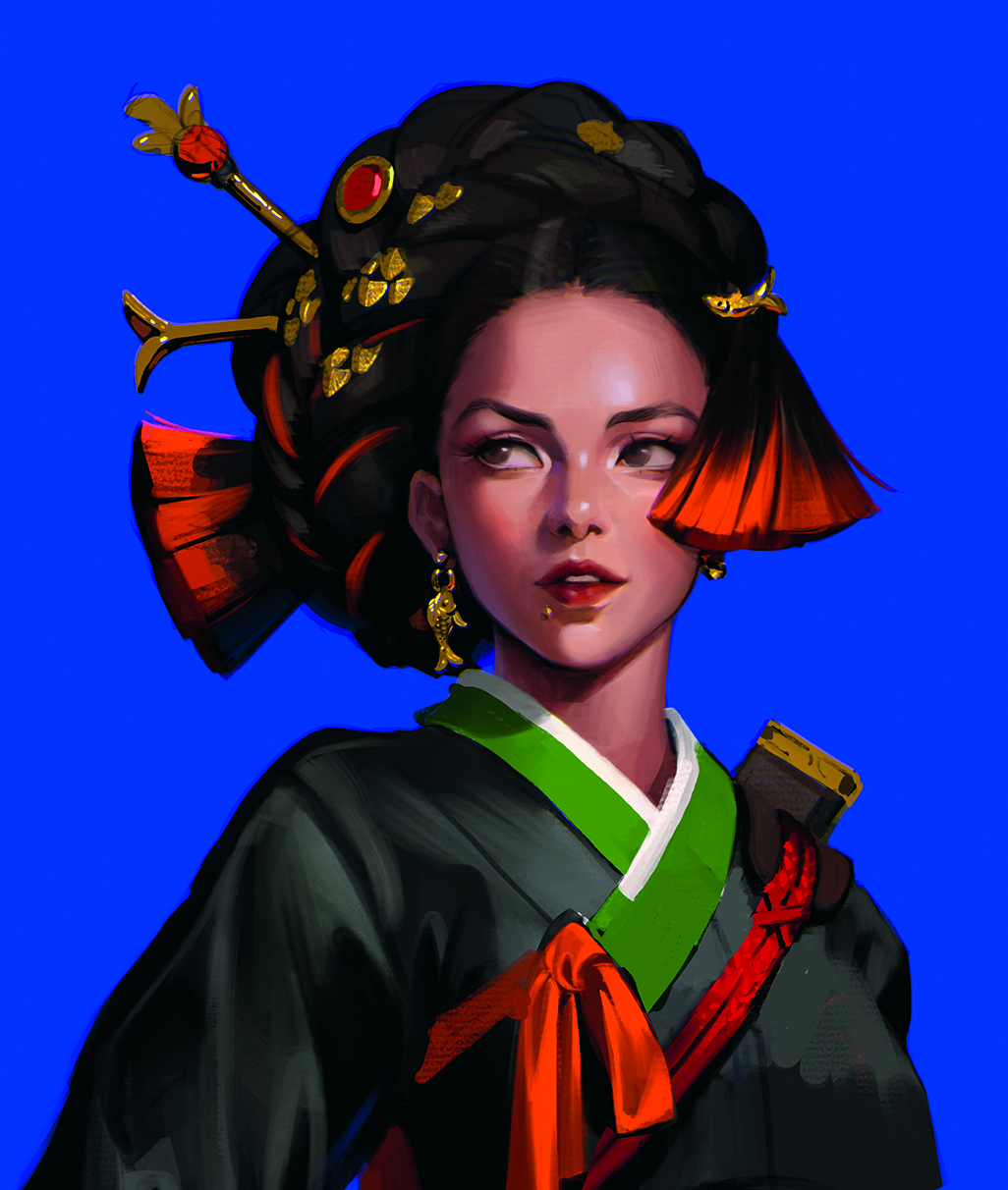
I paint reflections from the background’s blue light onto the character. I also add green to the collar for a richer colour palette.
If you establish the colour palette in advance, you can easily apply it. I experiment with various brushes, making sure not to break the main forms.
09. Boldly changing the design

I add more decorations and render them in detail. I also paint a white petticoat under the skirt to create the appearance of a rich, flowing fin. This change also obscures the shoes, making the character look even more like a fish!
10. Drawing the clothing pattern
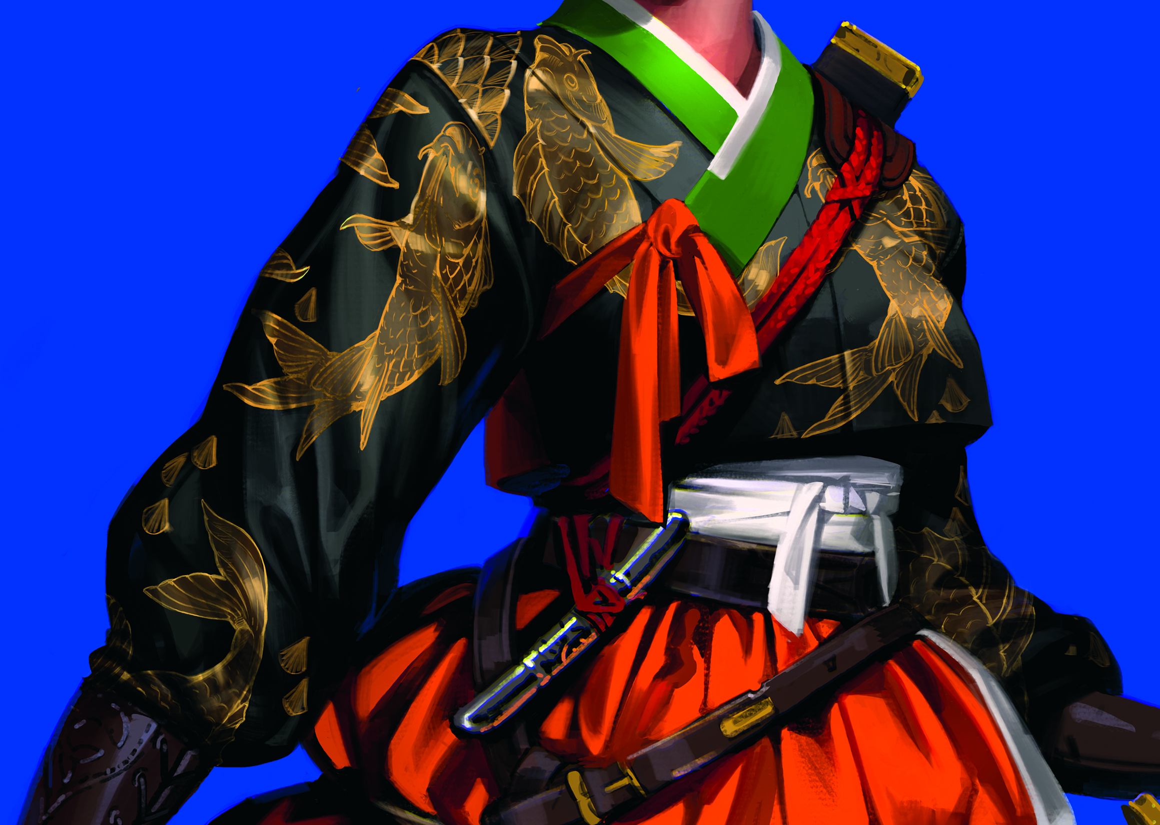
After finishing the rendering of the wrinkles, I refine the fish pattern. Working with a separate layer and a Clipping mask makes this step easier.
Compared to the black or green fabric texture, the gold embroidery is described with a wider range of values, ensuring it stands out.
11. Finalising the character details
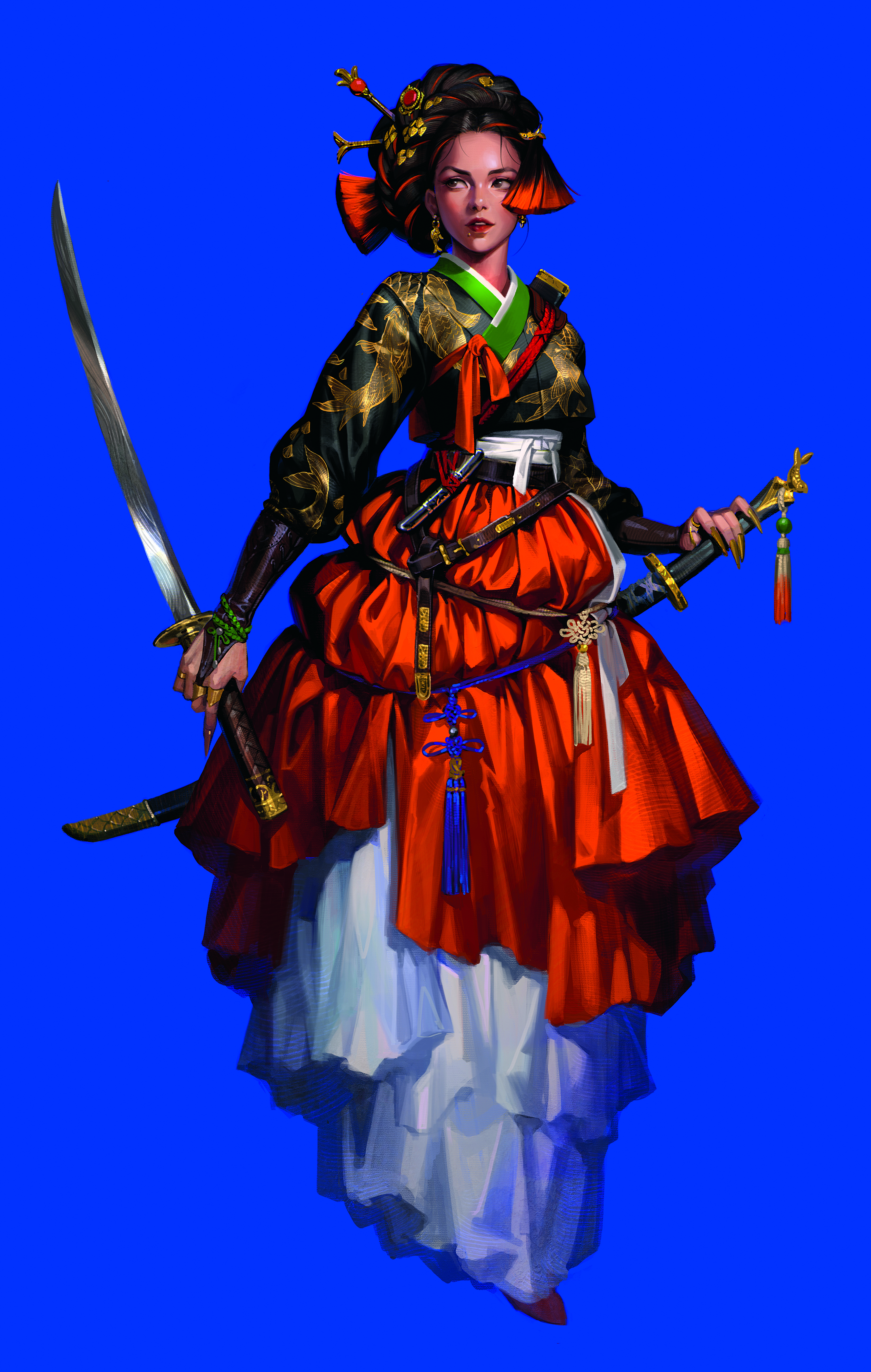
I render the accessories further and pay attention to the folds to complete the skirt. I make the outer orange skirt look like a silk texture. I use the blue, green and orange colours used on the accessories to let the rich colours spread throughout the composition. I also add strands to hair to the figure’s head, which is the focal point
12. Photographing an oil paint texture
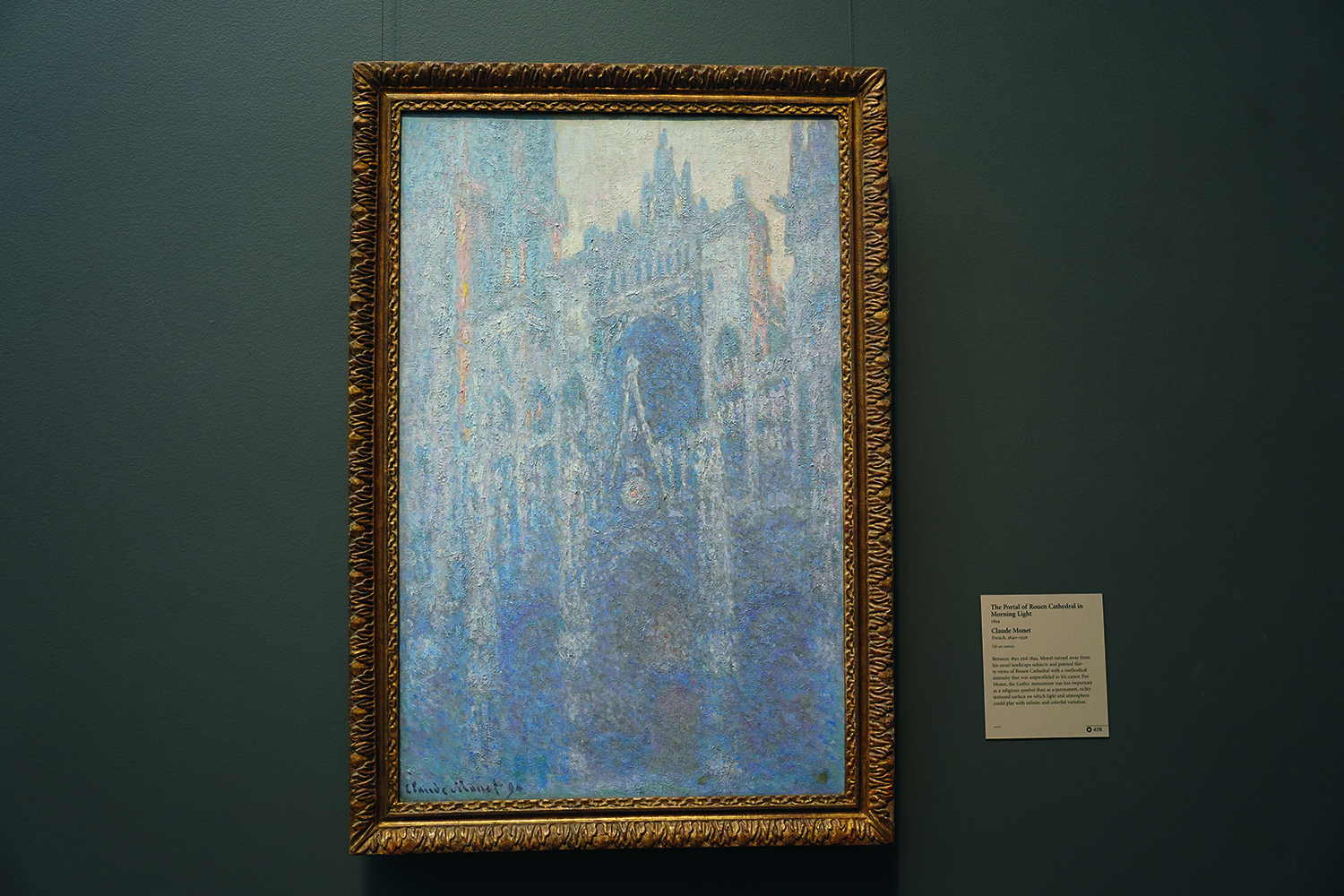
I want a straightforward way to introduce a painted feel to my artwork without compromising either the contrast that I’ve created or my choice of highly saturated colours. I decide that the solution is to take a texture from an old art piece and apply it to my brush.
I crop a section from a photo that I took at the Getty Center in Los Angeles of a painting by Claude Monet, entitled The Portal of Rouen Cathedral in Morning Light. I used a photograph, but if you’re skilled with oil paint then you could also paint the texture yourself.
13. Adjusting the photo
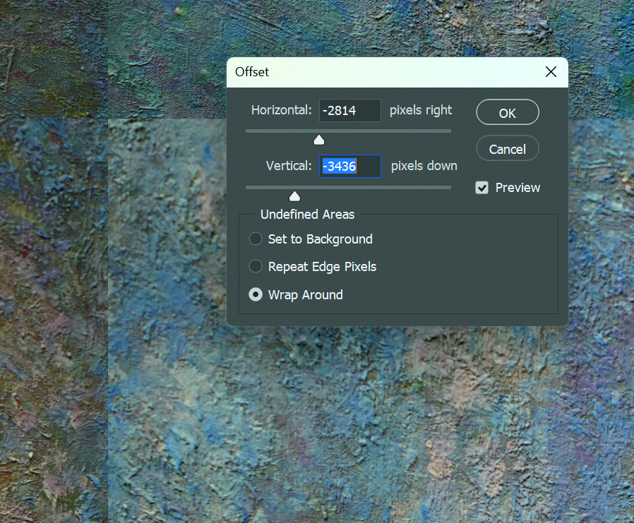
In Photoshop, I use Filter>Other>Offset to shift the image vertically and horizontally. Next, I use the Clone Stamp Tool to blend the edges, creating a seamless image.
It’s also a good idea to adjust the lightness to a mid-range value. Adjust the saturation and colour to your preference. I prefer to make it highly saturated
14. Registering and using the pattern
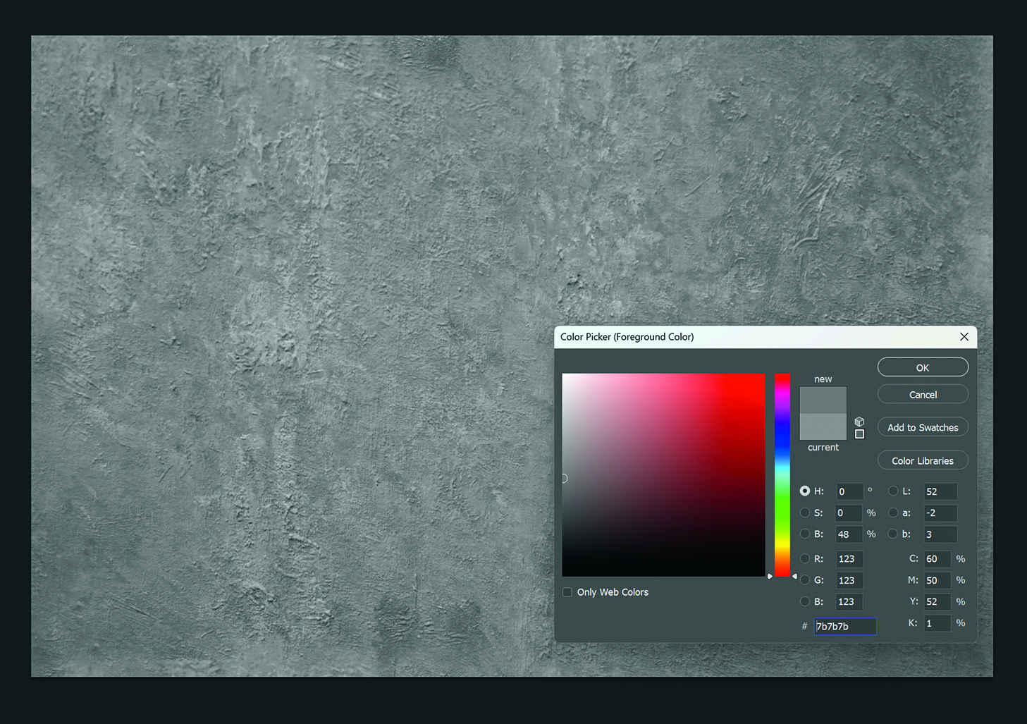
I register the finished seamless image as a pattern by selecting Edit>Define Pattern. Next, I return to the Tools menu, find the Pattern Stamp Tool and select the pattern that I’ve just registered.
I apply this pattern in Soft Light blending mode with 50 per cent Opacity, which gives the illustration a textured feel.
15. Give the artwork a final polish
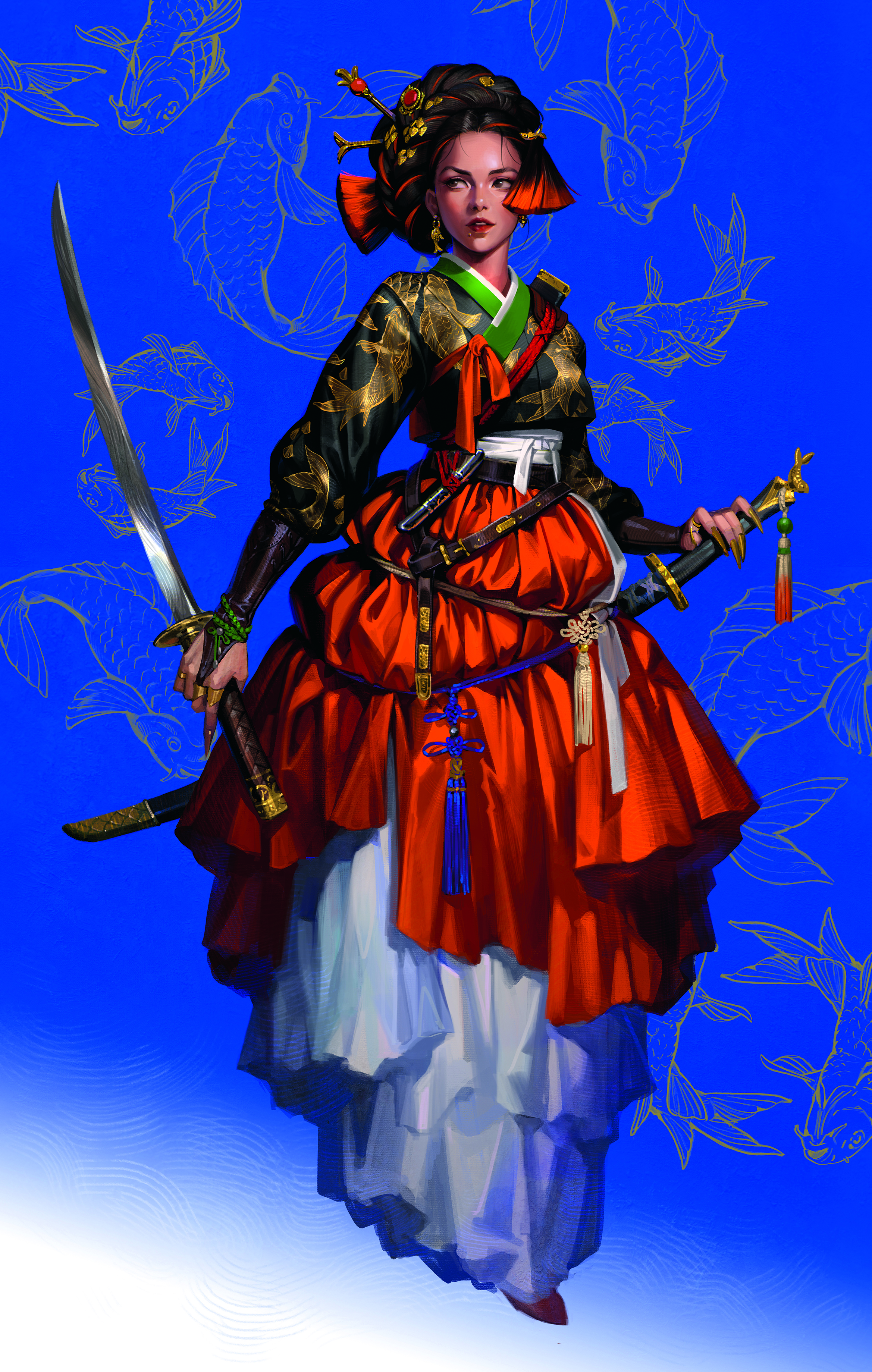
I lightly apply the pattern to the character and check the overall balance before finishing. During the final finishing stage I apply Sharpen, Chromatic Aberration and Noise filters to achieve a result that’s both sharp and raw/gritty.
Before calling the artwork complete, I make sure that the high saturation, strong contrast and rich colours I planned at the beginning are all clearly expressed on the canvas.
Need the kit to get started?
If you need to the tools to take your own art digital, here are the latest holiday deals on drawing tablets that we've reviewed on Creative Bloq (see our guide to the best drawing tablets for more options). You might also want to see our comparison of the best digital art software.
This article originally appeared in ImagineFX. Subscribe to ImagineFX to never miss an issue. Print and digital subscriptions are available.
Sign up to Creative Bloq's daily newsletter, which brings you the latest news and inspiration from the worlds of art, design and technology.
Based in South Korea, Sora has been a concept artist and illustrator since 2014, working on many fantasy games while developing a versatile range of styles.
You must confirm your public display name before commenting
Please logout and then login again, you will then be prompted to enter your display name.
