How to design fantasy architecture using Photoshop and Blender
Grady Frederick shares his process for concepting environments and architecture for video game art.
This image was part of a community concept art challenge I created for my members on Patreon. Here you’ll see a method I use regularly in my professional work to quickly iterate and refine ideas, which can be helpful in a production setting.
I’ll show my design process that involves developing a standalone architectural concept, which is useful for the creation of video game assets. I’ll then produce a final mood illustration to show the design in the context of its environment.
This helps with the story, the atmosphere and tone of the location, and – in a studio setting – hopefully inspires the rest of the team by showing them a clear vision we can all work toward.
Article continues belowFor this workflow, I'll mainly use Photoshop, but I'll also use Blender to create a 3D perspective guide for the scene (see our guides to the best digital art software and the best 3D modelling software for more on these and other options. You might also want one of the best drawing tablets).
01. Visualise the idea
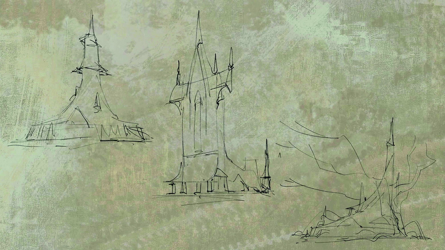
I sit down and open Photoshop with nothing more than the idea for a tavern in a fantasy setting. I begin with rough scribbles as I attempt to generate an idea as a starting point. I don’t have references yet – I’m just trying to create some interesting shapes that might help when looking for suitable reference material.
02. Sketching fantasy details
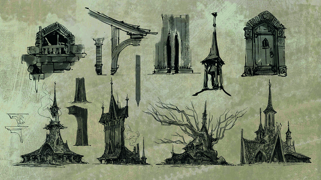
know I want to design a tavern, but I want to push the fantasy aspect to make it slightly “unbelievable”. I start adding more extreme shapes and elements such as a tree growing right through the middle.
As I work, I do little drawings in the margins to clarify some details and make sense of things: how the windows are made, what the wooden supports look like, any ornamentation on the structure and so on. This enables me to gather some online references for inspiring architecture
03. Work up the details and create a clear concept
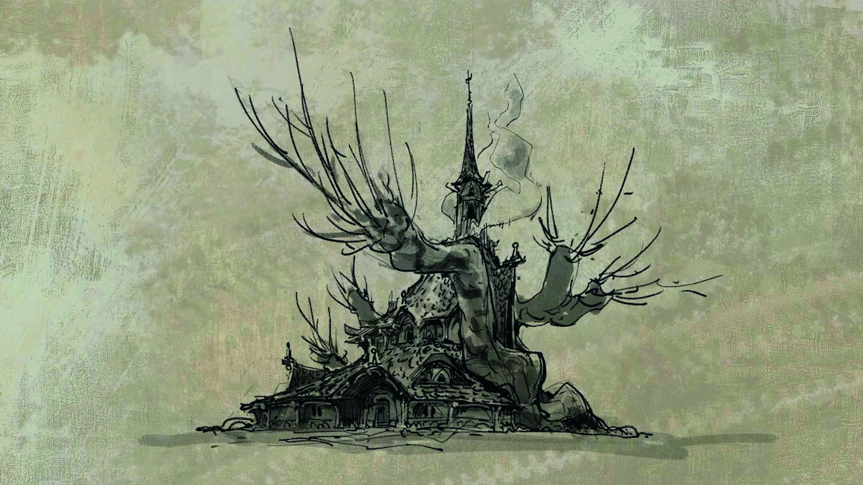
Once I’ve chosen one of my sketches I start refining the design, combining some of the other ideas that I like. Whereas the first sketches are really about rough and gestural ideas, here I’m beginning to be more clear about the details.
This is an example of the type of process I use at work as a concept artist. It’s important to be quick, but also create a clear-enough concept for the 3D artists to refer to when they make assets. I like doing all the problem-solving here, so when I’m painting the final illustration I don’t have to resolve the design of the building.
04. Common shape language
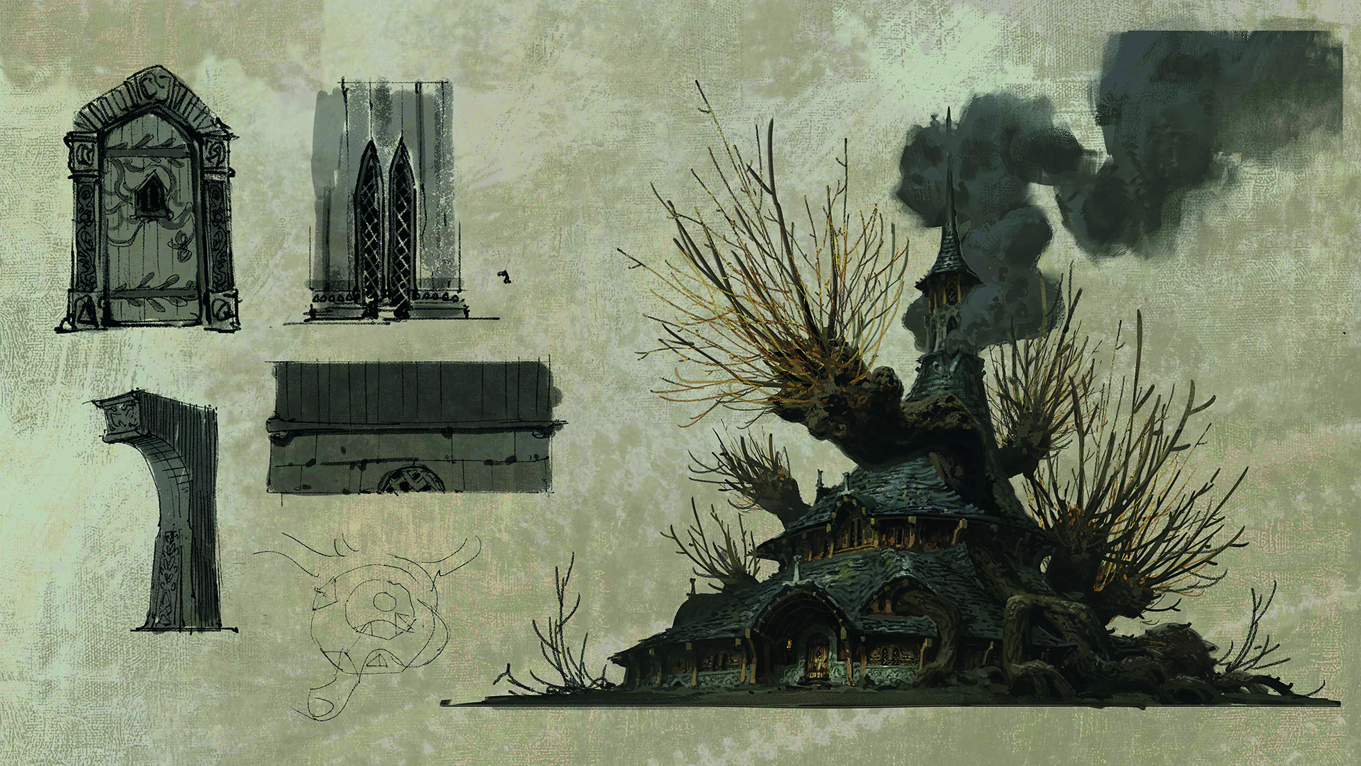
I paint the design to show materials and the local colour palette. When I’m designing the motifs I consider how to bring cohesion to the overall look, and add carvings depicting twisting vines, branches and leaves. Even the iron braces on the door will conform to that shape language
05. Thumbnails and Notan sketches
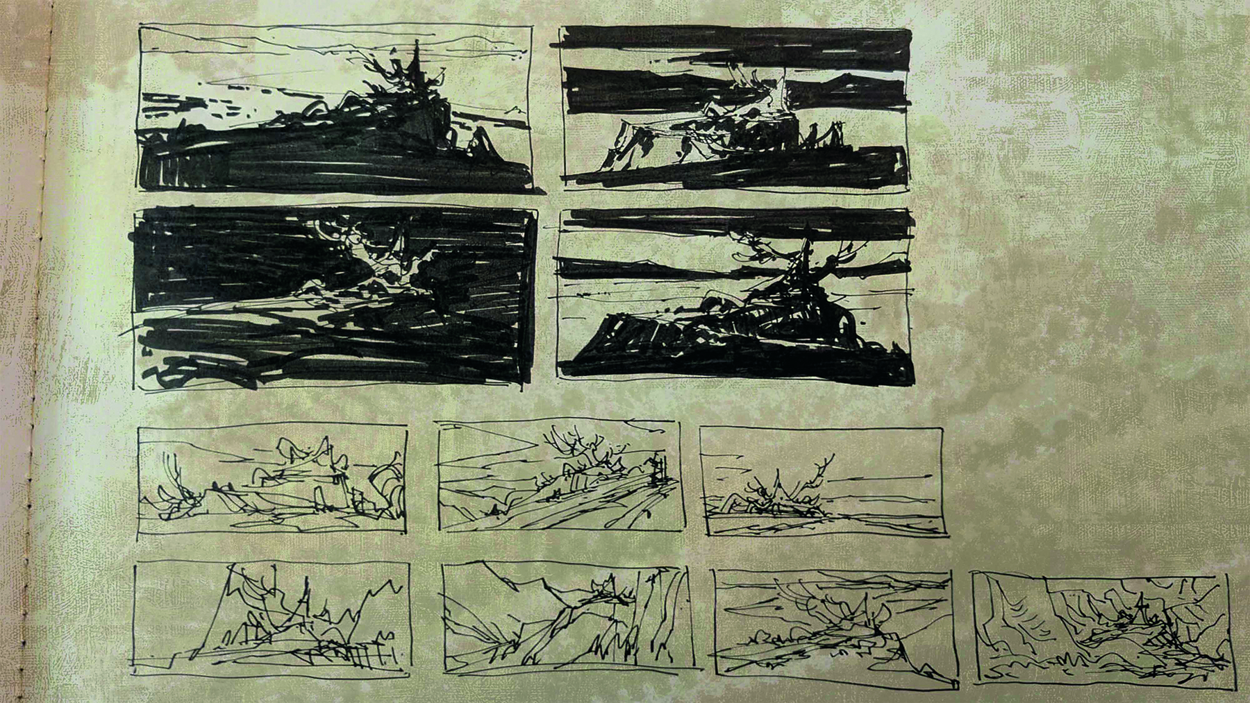
With my design established to a sufficient detail, I start creating environment thumbnails (bottom) in my sketchbook. These are really small and take between 30 seconds to a minute each. Once I like a few I start experimenting with Notan sketches (top) to plan where my dark and light shapes will be.
06. Blocking out the scene in Blender

Once I’m satisfied with one, I start blocking out a scene in Blender. The reason for using 3D here is that it’ll give me a perspective guide for the scene. I just have to make sure that the composition is aligned pretty close to my intention from my thumbnail.
07. Separate out the render in Photoshop
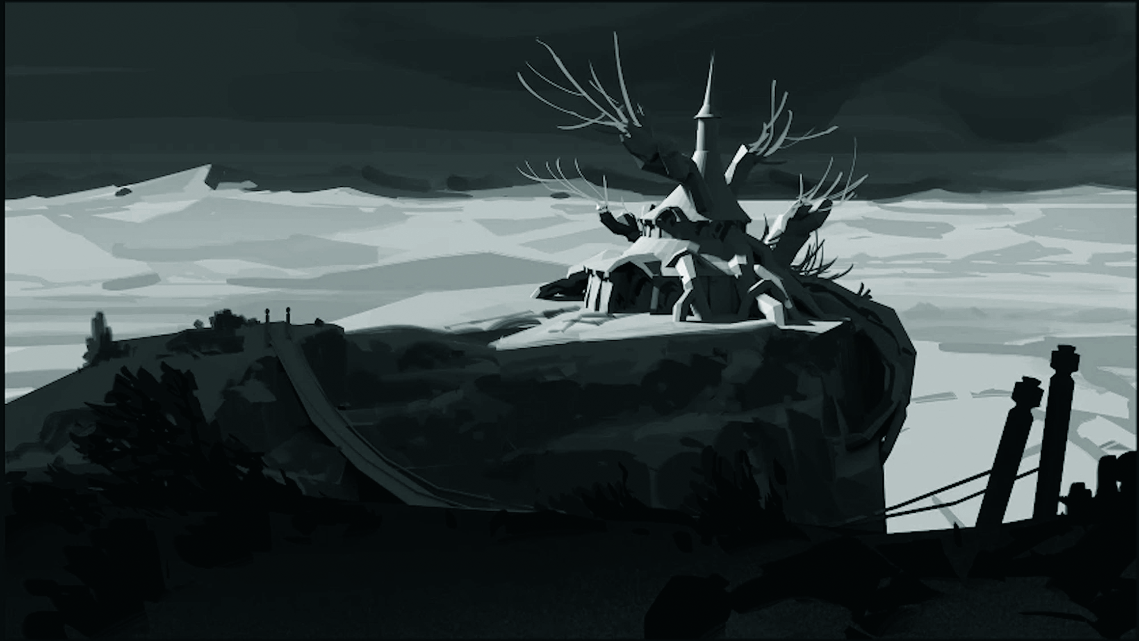
Once I’m happy with the basic composition and lighting, I take the render into Photoshop and separate it into layers: fore-, middle- and background, and the sky.
From here I just treat it like a value sketch, painting out the blocky shapes, adding elements such as foliage and texture, and adjusting some local values. This is because the whole 3D scene is made of the same grey material.
08. Assign colours to values
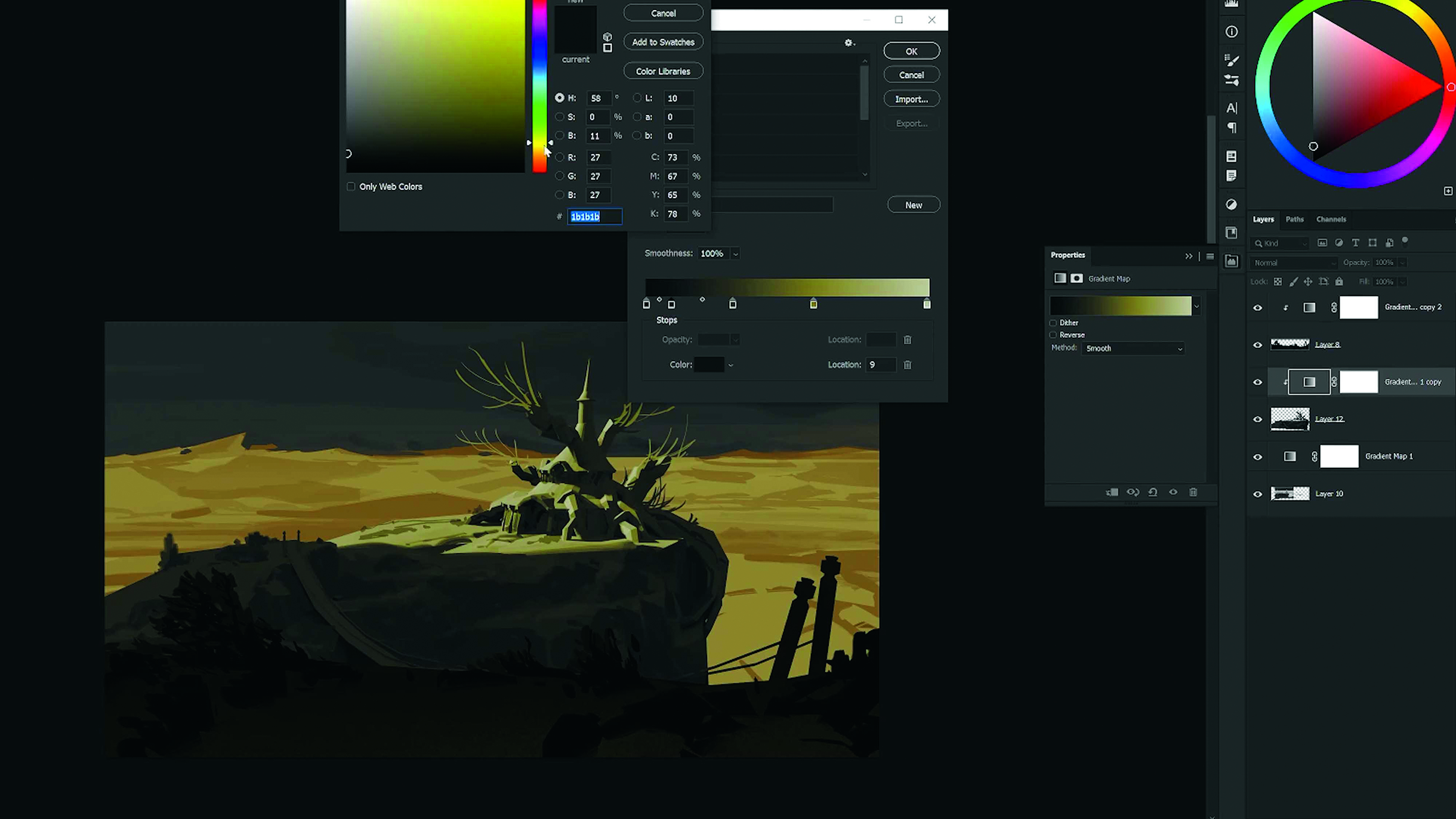
Next, I use a Gradient Map adjustment layer to assign certain colours to all of the different values in the scene. This step enables me to draw up a very basic colour palette. Then I’ll usually start painting directly on top with a new layer.
09. Enhance the chosen colour palette
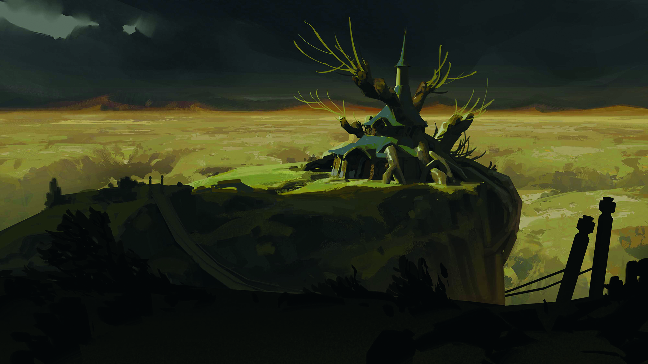
I paint directly onto a new layer, adding some colour variation, local colours such as the blue/grey roof, and generally try to enhance the colour palette that I established in the previous step.
10. Refining the image
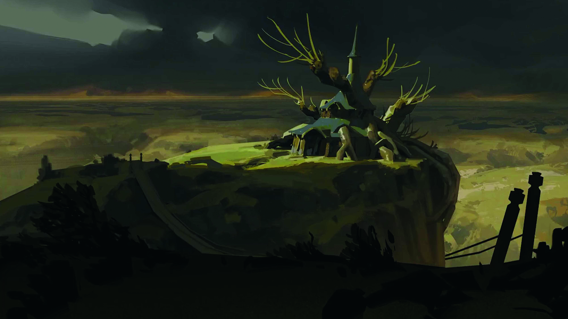
From here it’s really just a lot of small refinements. I try to get the whole image done as early as possible in a very rough state, and keep it as a backup to ensure I stay on track as I refine further and add details.
I want to get better at leaving things be, and one day I hope to find myself working very simply, efficiently and feeling less chaotic in my process
11. Create colour variations
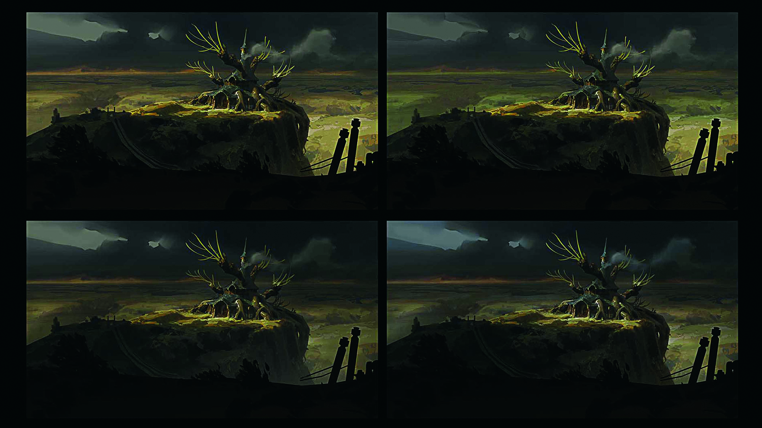
With the image in a good place, I create iterations to test small colour variations. This helps me pick stronger colour palettes. Often, when seeing new options next to my first version, I realise how the colour could be improved.
This is much harder to do if I continually make colour adjustments in my working file, because I have nothing to compare it with and it can be hard to see things objectively.
12. Final detailing
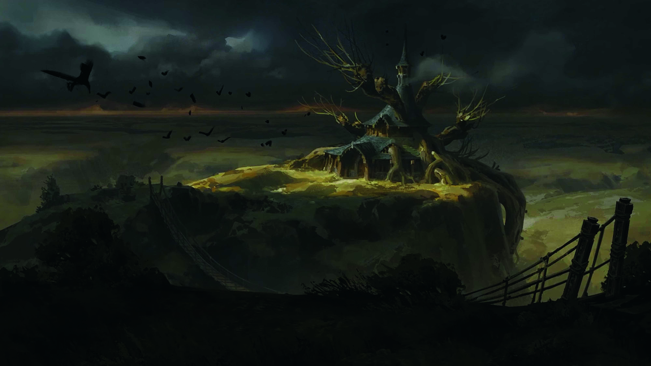
Now I’m starting to be a lot more precise about the rendering, and really thinking about the final details. I introduce atmosphere and lighting effects, and the addition of complementary details such as the birds to help lead the viewer’s eye through the scene.
13. Simplifying where possible
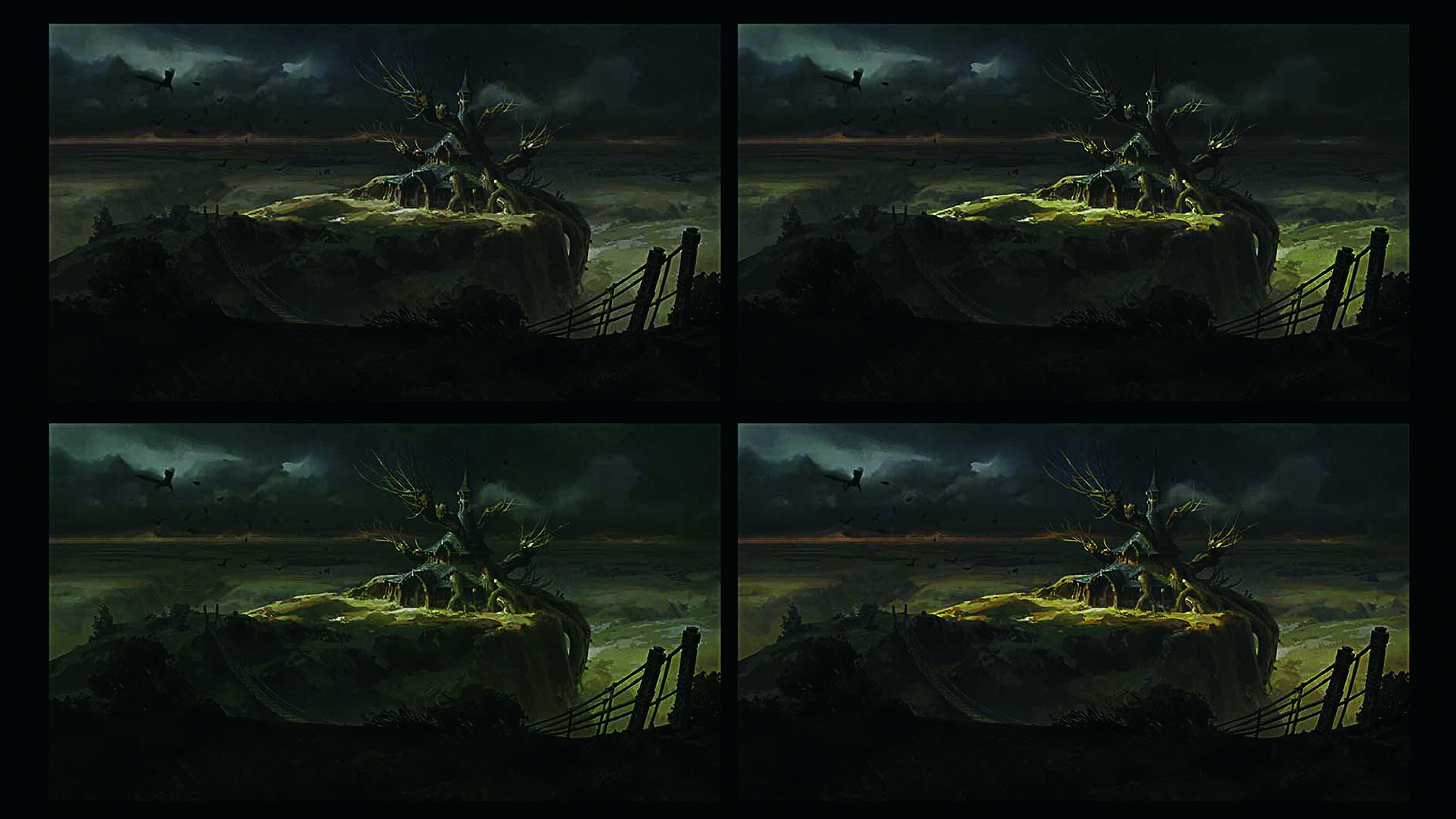
Now I make yet another set of colour iterations, this time testing some luminosity adjustments, as well as determining whether I can darken the non-focal areas to simplify the values. I’m all about simplifying, or at least trying to simplify.
In general, I always try to maintain a value hierarchy. I don’t want the lit areas to all be lit equally strongly. I want to be intentional about where my strongest values are, and have a natural falloff or slightly more subdued values elsewhere
14. Concentrate on the focal points
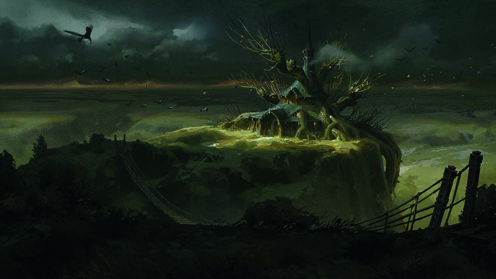
I always think about the most important parts of the image, and try to spend most of my painting time there. I don’t want to bring every square inch of the canvas up to the same level of detail as the focal point.
Not only does it not help the intention of the image, but it can weaken an image. Bringing up those areas will simultaneously bring down the impact of your focal areas. Once I feel satisfied with the most important parts of the image, I call it finished.
This article originally appeared in ImagineFX. Subscribe to ImagineFX to never miss an issue. Print and digital subscriptions are available.
Sign up to Creative Bloq's daily newsletter, which brings you the latest news and inspiration from the worlds of art, design and technology.
Grady is a senior concept artist and illustrator working at Eidos Montréal. He also creates art content on his YouTube and Patreon channels.
You must confirm your public display name before commenting
Please logout and then login again, you will then be prompted to enter your display name.
