Sign up to Creative Bloq's daily newsletter, which brings you the latest news and inspiration from the worlds of art, design and technology.
You are now subscribed
Your newsletter sign-up was successful
Want to add more newsletters?
This workshop breaks down the process for creating this artwork in Procreate, one of the best drawing apps for iPad. I'll go from the initial sketch to the final render.
The entire illustration was created using various brushes, with a strong emphasis on layer organisation, colour exploration and refining details over time. I like to work with greyscale early on to build up the values first, then experiment with colour later to ensure that the composition works well in both black and white, and full colour.
A big part of this process is using the Selection Tool to separate areas, making it easier to drop in flat colours or adjust specific sections without messing up the surrounding details.
Article continues belowI also use Clipping masks a lot to add shading and lighting in a controlled manner. By working in stages, it gives me the freedom to experiment – whether that’s trying out different palettes, testing lighting or rearranging compositional elements such as the birds in this piece.
One thing to keep in mind while working like this is patience. It’s tempting to rush into the details, but it pays to take the time to build up each layer of the work carefully, step by step. I also recommend zooming out often to check the composition and make sure things are balanced before committing to heavy rendering. This approach helps keep the whole piece cohesive from start to finish.
For more guides like this, see our roundup of Procreate tutorials.
01. Lay down a rough sketch
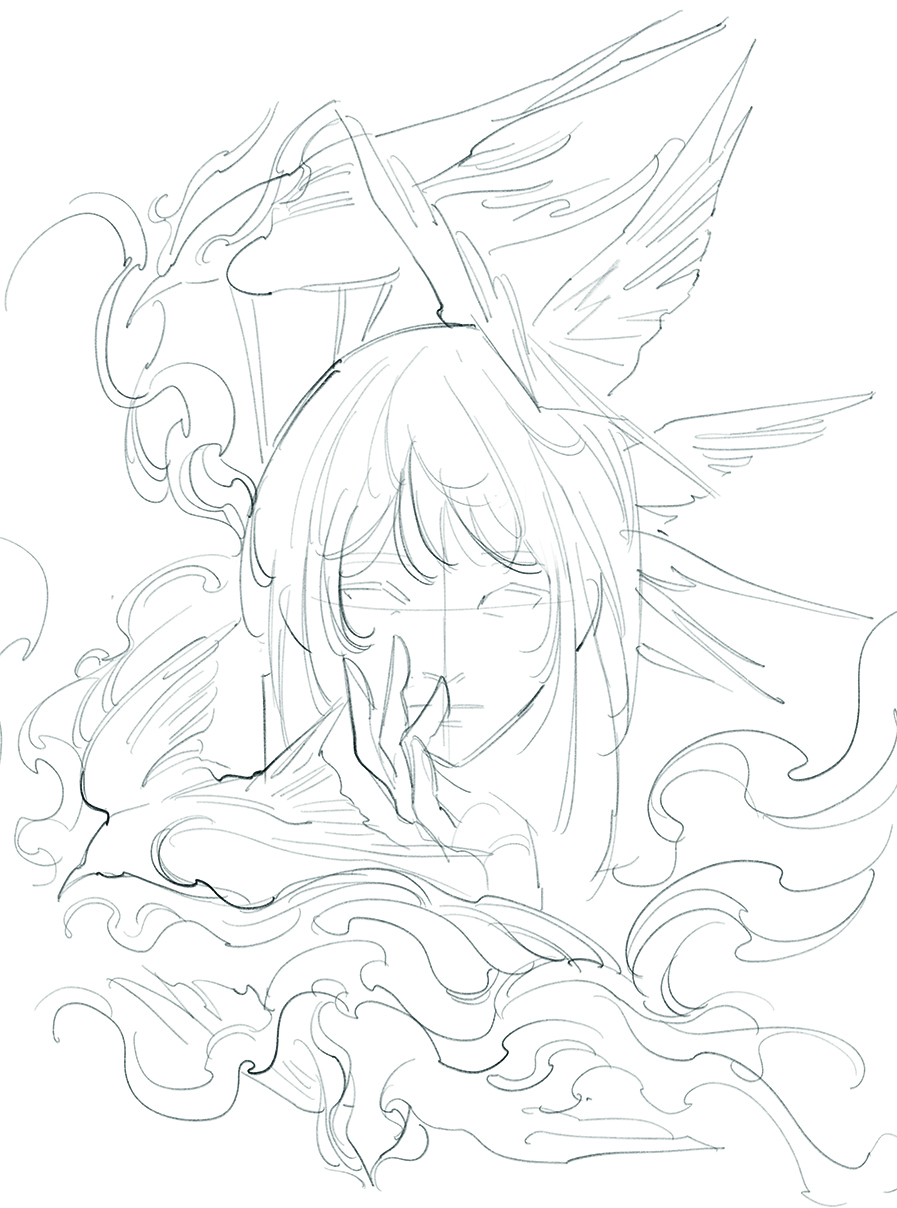
Have a general idea in mind, then lay down a loose black line sketch on a blank canvas to establish the basic composition and gesture. Keep things rough at first before getting too focused on fine detail and rendering.
Be expressive and make mistakes before committing to a composition. This foundation is typically drawn on a single layer using a pencil or technical brush, allowing flexibility before colour or value work begins
02. Block in shapes
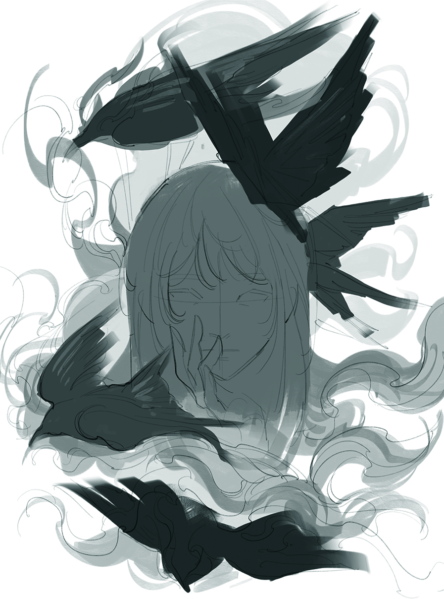
A large brush is used to roughly block in broad areas of greyscale. The figure’s silhouette and surrounding smoke are filled with light to mid-tone grey, while the hair and background elements are kept darker to create contrast.
Each element is placed on a separate layer, serving as a guideline for balancing lights and darks, and establishing visual clarity before any details are added.
03. Focus on layer management
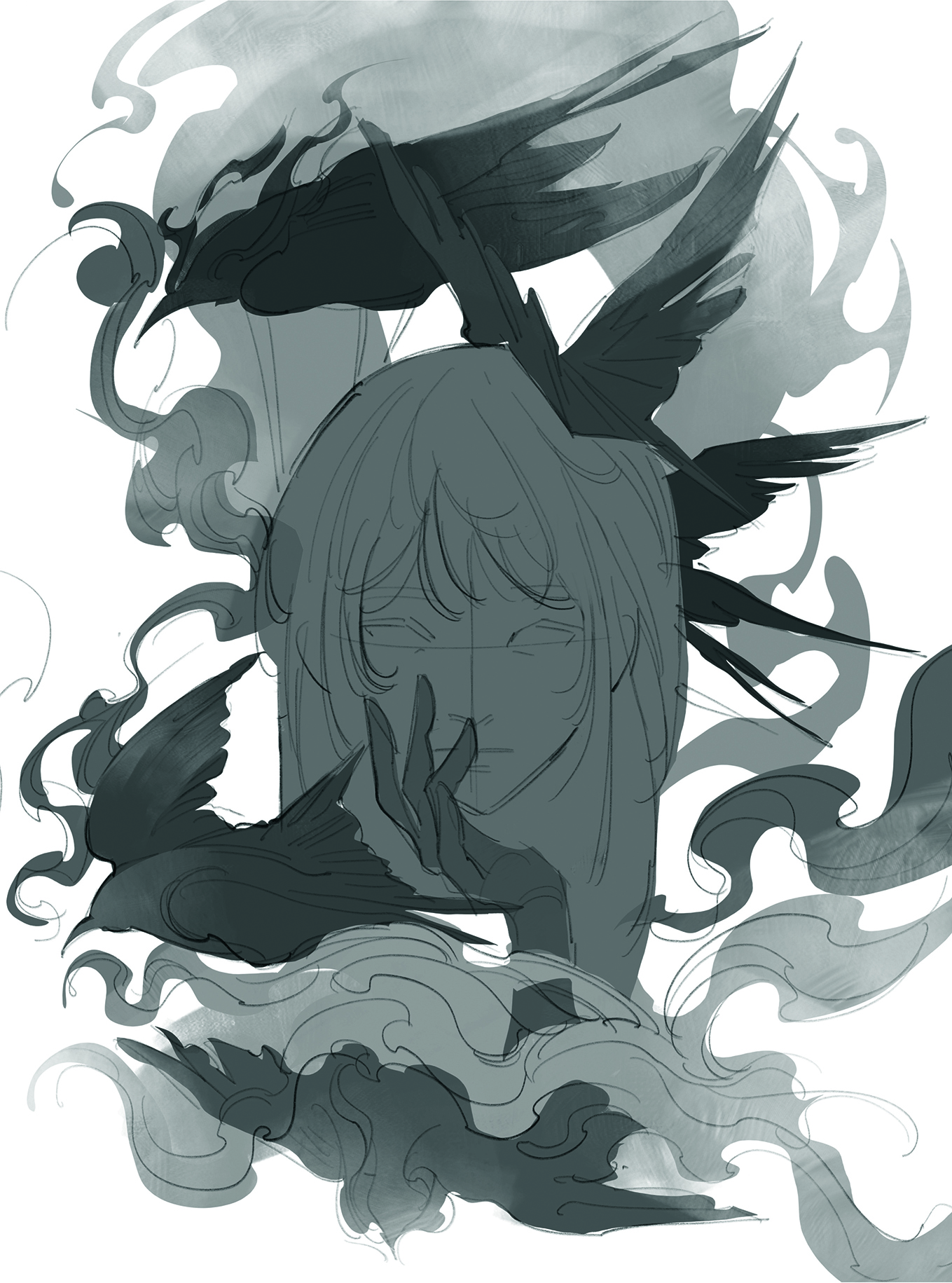
The Selection tool is used to precisely outline each individual object, helping to cleanly define shapes and edges. The smoke surrounding the figure is created by freehanding swirls and organic forms to maintain a sense of movement.
At this stage, careful layer management becomes important. Understanding which layers stack above or below others will make adjustments easier later on
04. Arrange values
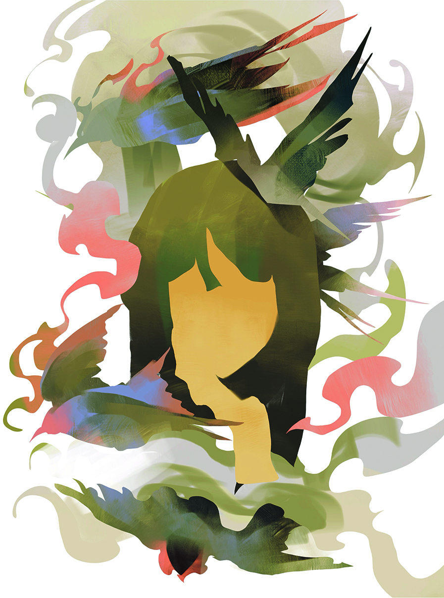
Flat colour is applied to the separated layers, each of which is alpha locked to allow quick and clean colour placement. An earthy tone is used for the figure, providing contrast against the vivid pink strokes.
Detailed rendering is avoided in favour of viewing the composition as a whole, maintaining a broad perspective on colour balance and visual harmon
05. Experiment with the colours
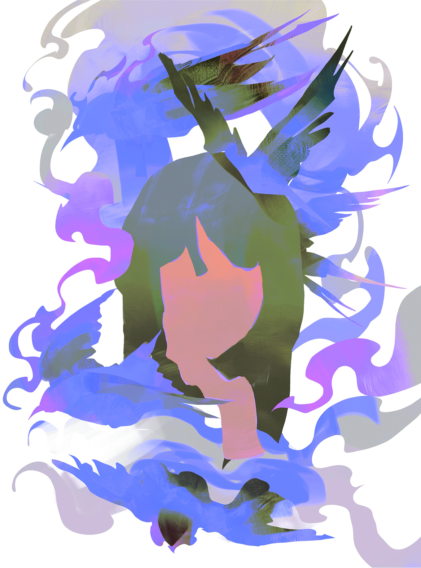
The colour scheme can be adjusted using tools such as Gradient Map and Curves to explore a wider range of variations. Have some fun experimenting with contrasts of hue, warm and cold, complementary colours and so on.
Colours have strong emotional associations, and exploring colour interactions will unlock so many more options when setting out to create an artwork.
06. Finalise the colours
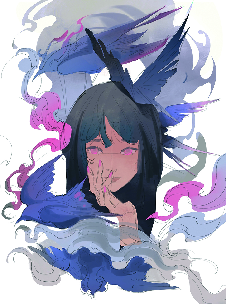
The colour palette is finalised, establishing a solid foundation for further rendering and detail work. Simple shading is introduced to begin shaping the forms, while any variation in brush stroke size is kept to a minimum.
This approach helps prevent over-rendering in small areas. It also mimics the limitations that one would experience when working with traditional media.
07. Begin rendering the portrait
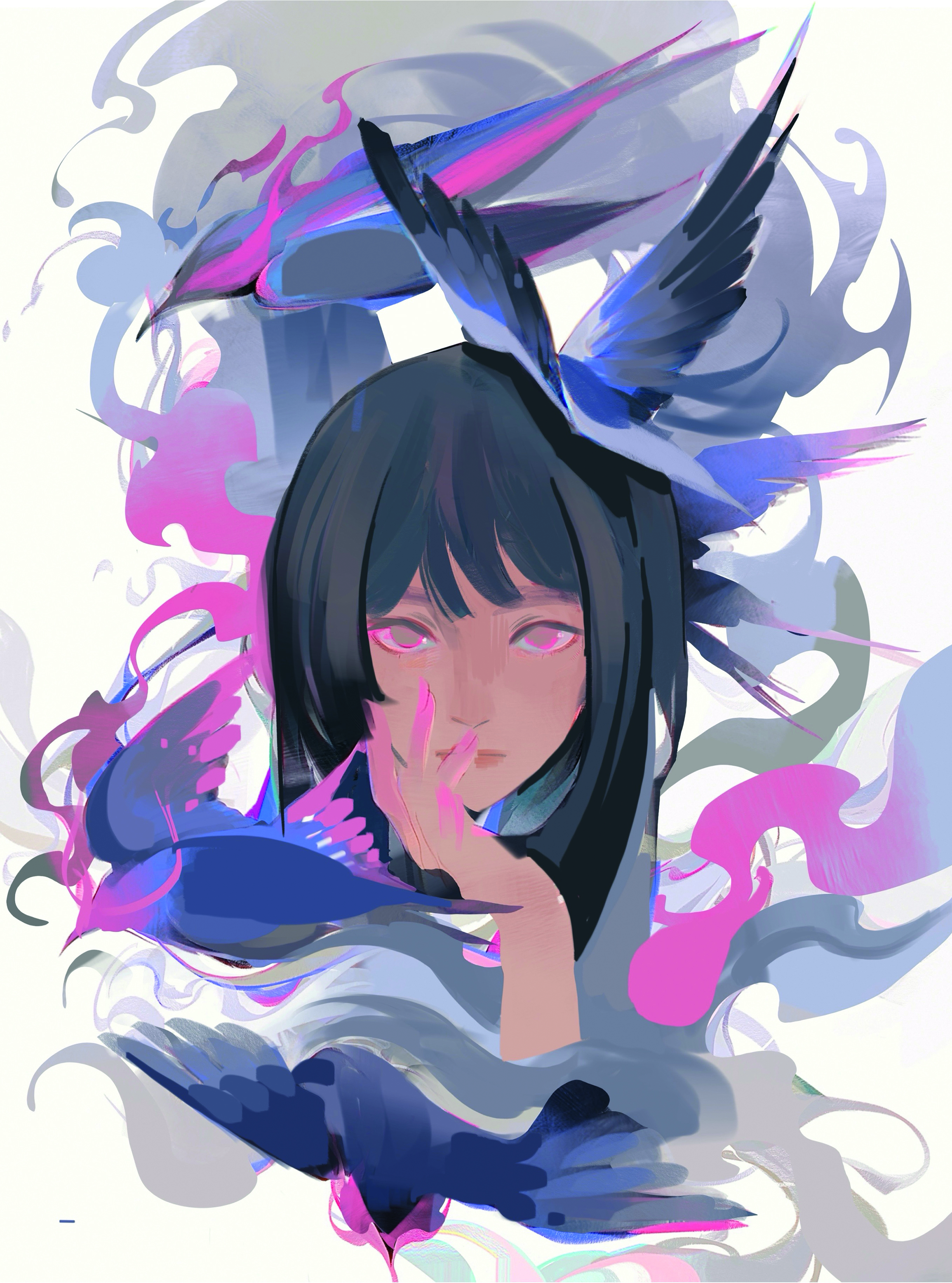
Simple rendering begins at this stage. Alpha locks previously used to preserve crisp edges can be turned off to allow for more organic rendering. A general rule of thumb is to avoid perfect, round brush strokes because they can be distractingly soft or hard edged.
Try to keep the brush strokes clean and big. Heavily textured brushes are best avoided: they can complicate the subject and reduce clarity
08. Define the main figure
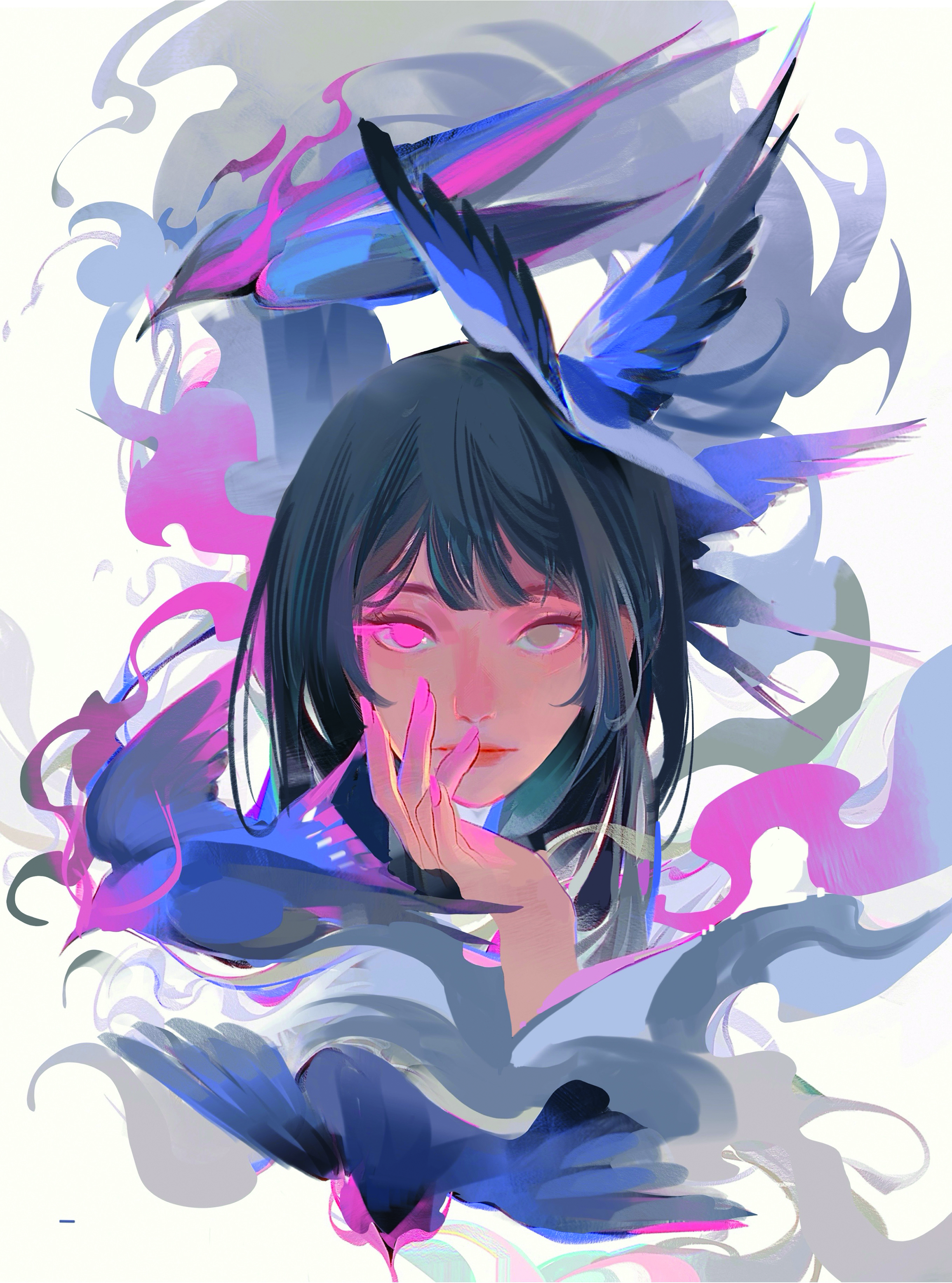
Details on the figure are gradually built up, with shadows developed around the eyes, nose and cheeks to add three-dimensionality and depth. Brush strokes transition from large and blocky to more refined and precise.
The hair is rendered using uniform line strokes following its natural direction. Attention is given to layering the hair, treating sections as groups rather than individual strands
09. Apply stylised texture
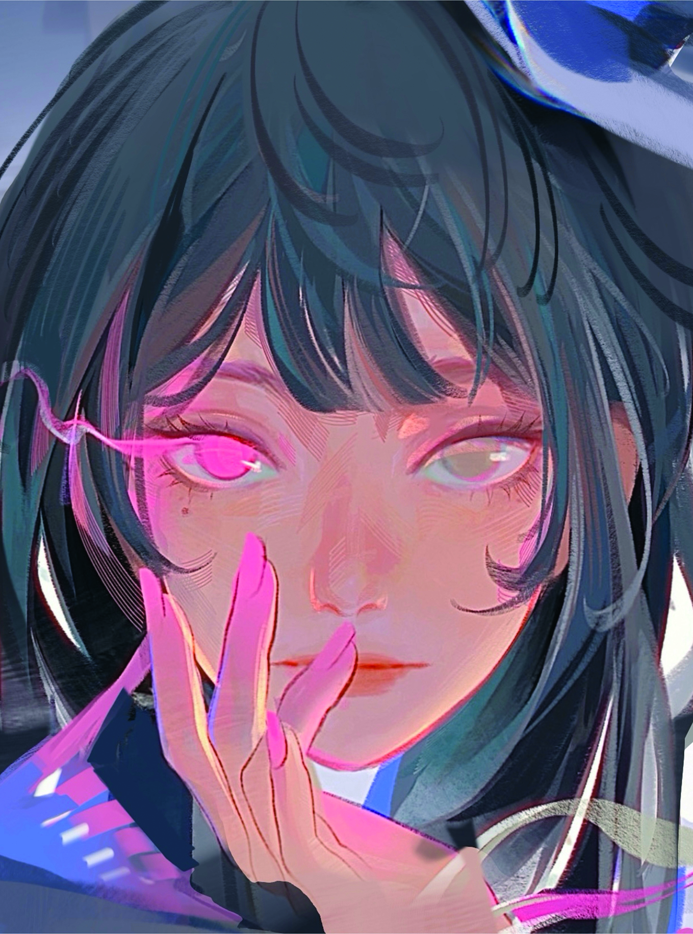
Tighten the face with greater details, adding a light source and highlights. Line direction, stroke weight, texture and colour can bring a lot of personality to the work. Customised line brushes are used to add subtle texture, enhancing the skin and hair details.
Play around with different brushes, approach the renders in a more expressive way, and just have some fun!
10. Render the background
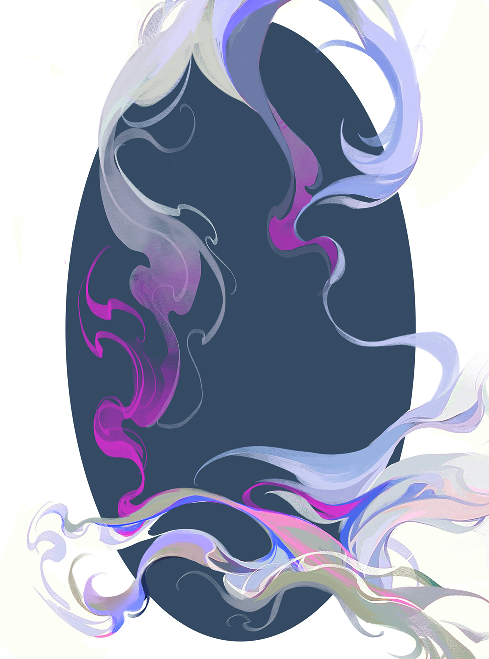
Decorative elements are worked on next. Often, the surrounding space in a painting can be as evocative as the subject itself, so attention to negative space is important.
The Selection tool is used to establish the general flow of the smoke, followed by the addition of smaller details to increase visual interest.
11. Render the birds
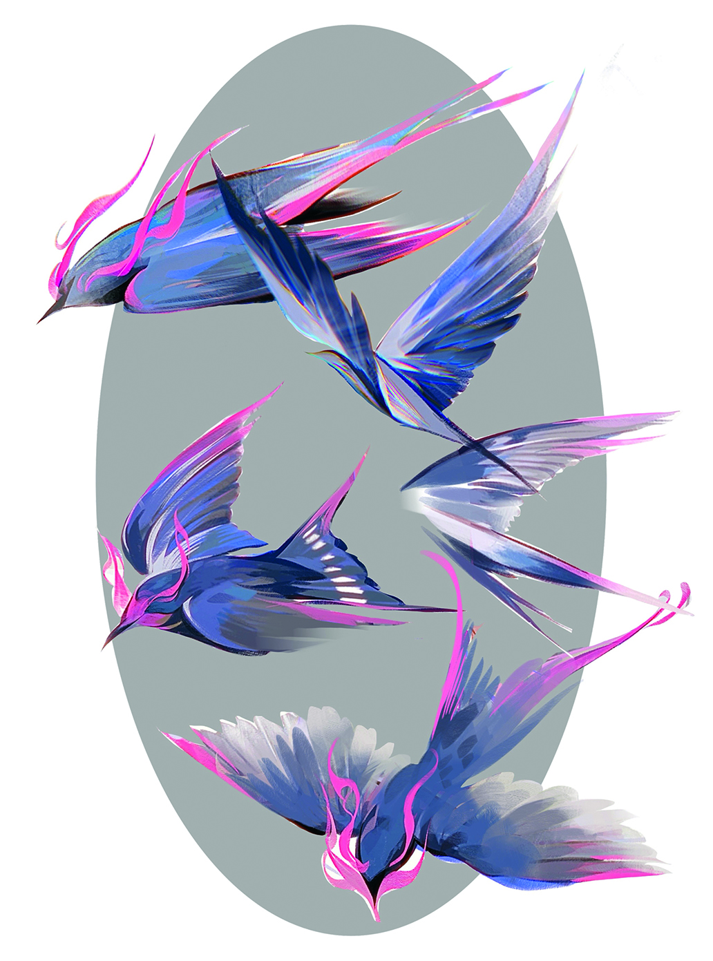
The background is rendered separately with other layers hidden to maintain visual clarity. The edges of the wings are made more transparent and softly faded to convey a sense of lightness.
Because the portrait is relatively static, the secondary subjects are given more dynamic poses to create contrast. Each bird is painted on its own layer, allowing for easy rearrangement to achieve a balanced composition around the figure
12. Add the final details
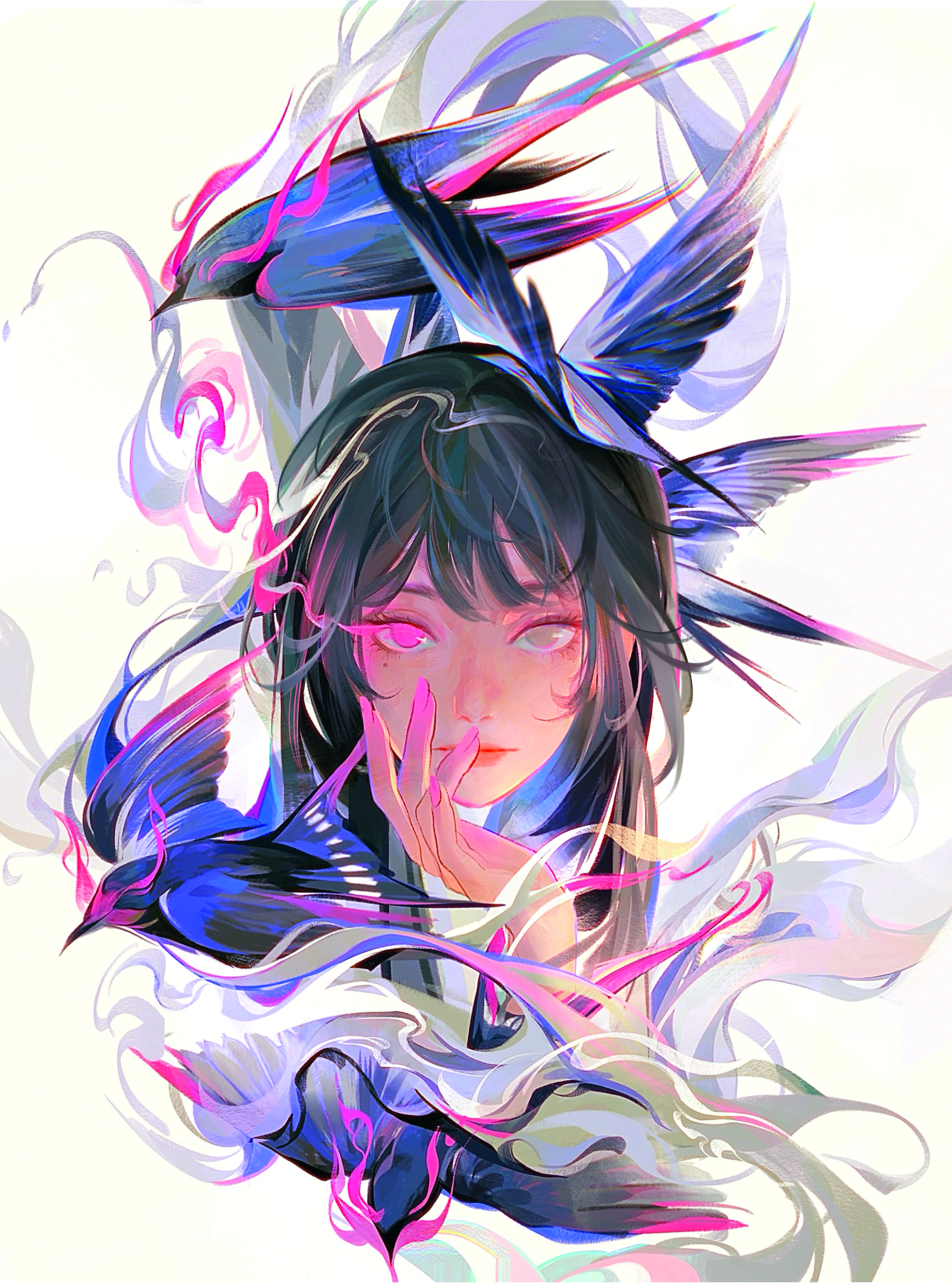
The figure and birds are combined. A mix of large areas of hair and smaller, loose strands adds visual interest. The outermost layers of hair are thinner
For more inspiration, see our feature on the current state of manga identity and Tony Valente's tips for making great manga.
Sign up to Creative Bloq's daily newsletter, which brings you the latest news and inspiration from the worlds of art, design and technology.
This article originally appeared in ImagineFX. Subscribe to ImagineFX to never miss an issue. Print and digital subscriptions are available.
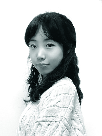
Lux is a freelance artist and creative mind living in Toronto. She creates portraiture based on literature and imagination.
You must confirm your public display name before commenting
Please logout and then login again, you will then be prompted to enter your display name.
