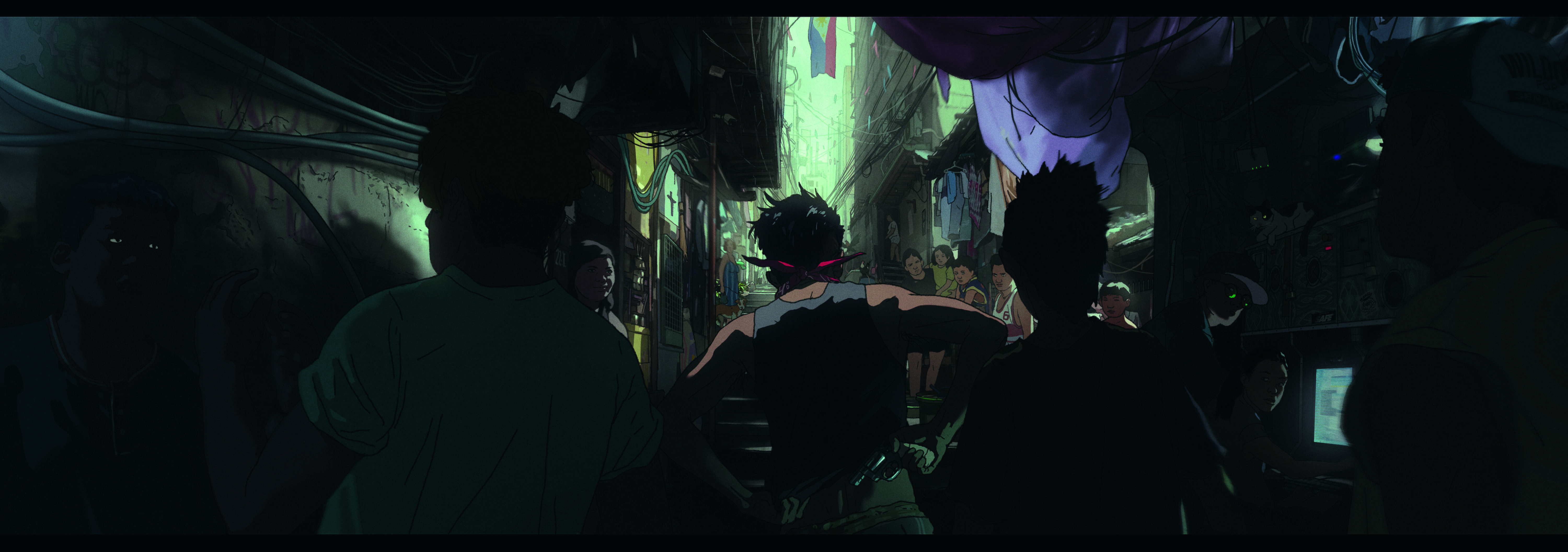
How I created the tense urban scenes in my graphic novel
Light, shape and colour were key to crafting the ominous atmosphere.
Sign up to Creative Bloq's daily newsletter, which brings you the latest news and inspiration from the worlds of art, design and technology.
You are now subscribed
Your newsletter sign-up was successful
Want to add more newsletters?
This scene is from Made In Manila, a graphic novel that I’m currently working on. For a project like this I start by writing a research checklist and grounding abstract ideas with sketches.
Digital art software like Photoshop and Blender help me to paint the scene broadly with an understanding of space, form and light. I then finish it off with stylised line work that expresses my style and influences.
Details add to the story – not just the image’s density – by communicating the illustrations’ visual subtext of eyes. Once the silhouettes and colours harmonise, I lit it dramatically with story-driven intent. Well-planned lighting always enhances a piece.”
Article continues below01. Start simple and graphic
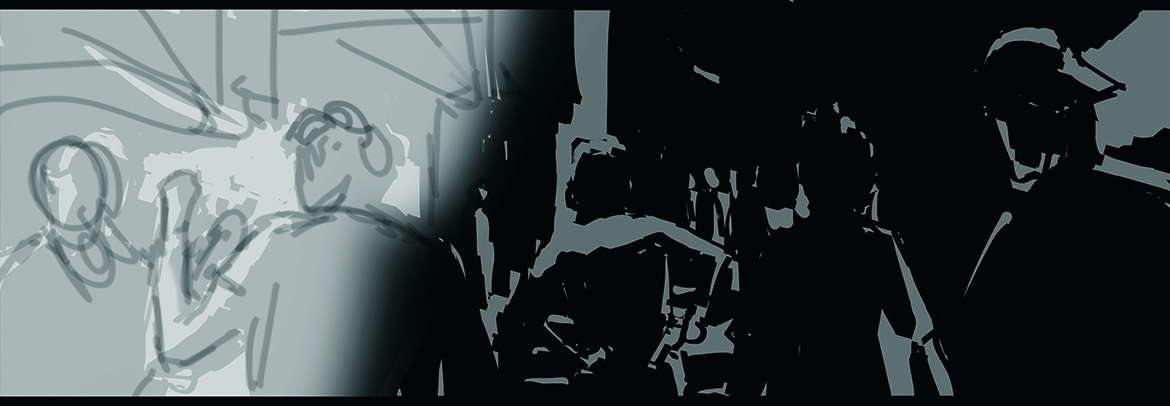
My approach comes from the basic structure of painting and then combining it with line work. I start by establishing the purpose of this shot, then the Notan design principle helps to make it readable with lighting and contrast.
Visualising the composition is easier thanks to the harmony of light and dark, and the shapes that I like
02. Paint, flats and line work
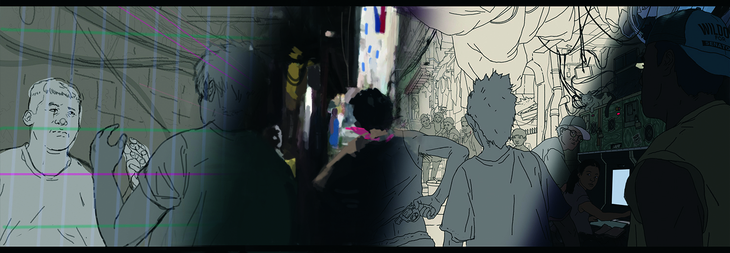
I begin with rough line work to define the visual information, then paint broadly to establish mood and colour. I treat each panel as a painting; shaping silhouettes and overlapping forms to build depth and avoid tangents.
Once the scene reads clearly, I simplify the colours into flats and finish with refined line work to sharpen the read and stylisation.
03. Light and colours
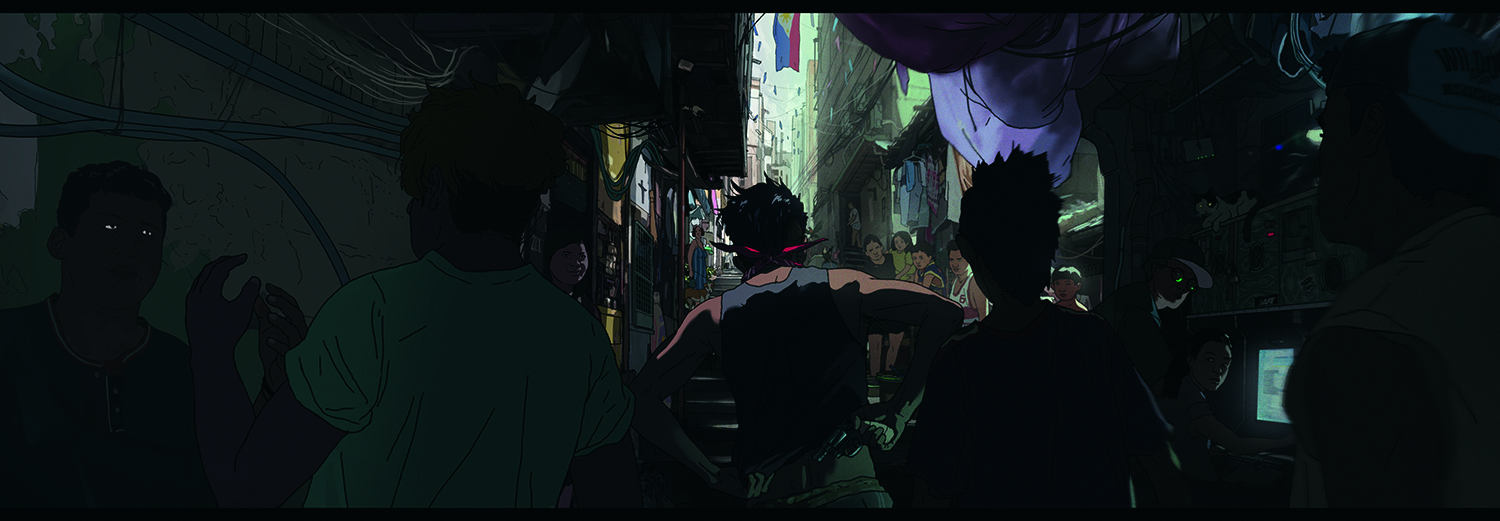
A key step is selecting the ambient light’s hue (sky) to establish the palette (flats), followed by adding ambient occlusion for depth. On the darks, I add artificial lights for colour accents.
To elevate the visual impact, I use a key light (sun) to highlight interesting subjects, and finish with a soft bloom, blending the cel-shading to enhance the vibe
For more inspiration, see our roundup of Photoshop tutorials.
This article originally appeared in ImagineFX. Subscribe to ImagineFX to never miss an issue. Print and digital subscriptions are available.
Sign up to Creative Bloq's daily newsletter, which brings you the latest news and inspiration from the worlds of art, design and technology.

Raymond is a senior concept artist who’s worked with Ubisoft, Lucasfilm and Capcom. He is a comic and manga enthusiastand the head instructor at Musings Art Academy.
You must confirm your public display name before commenting
Please logout and then login again, you will then be prompted to enter your display name.
