How to make a moody cyberpunk scene in Photoshop
Oleg Topor shares the creative techniques he uses to portray a meeting of criminals in the depths of a futuristic city.
Sign up to Creative Bloq's daily newsletter, which brings you the latest news and inspiration from the worlds of art, design and technology.
You are now subscribed
Your newsletter sign-up was successful
Want to add more newsletters?
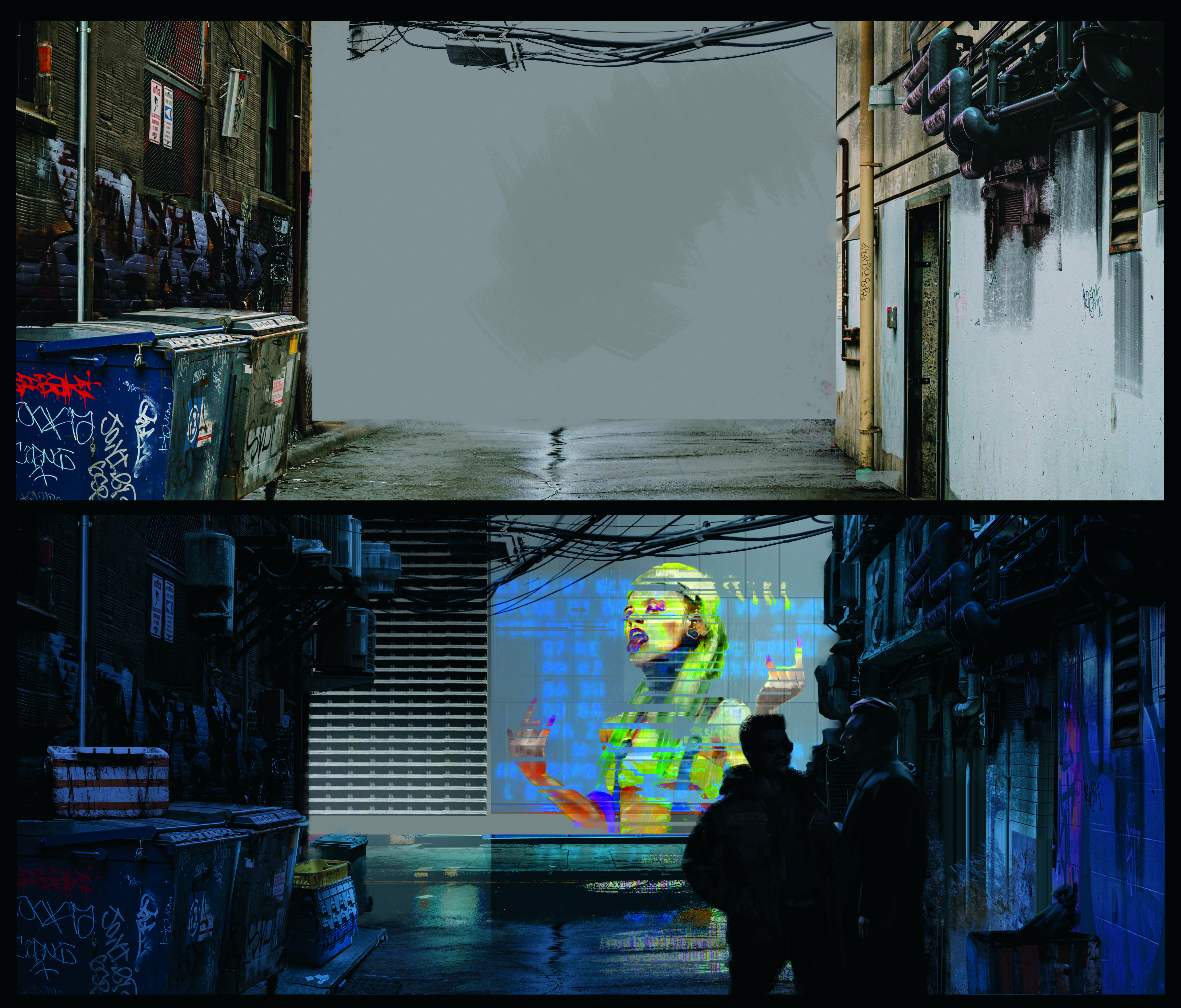
In this illustration, the action takes place in a futuristic metropolis. It’s here, in the depths of the sprawling city, that ruthless streets gangs conduct their dirty business.
Taking my initial inspiration from science fiction films such as Blade Runner, the adaptations of Ghost in the Shell and The Creator, and the video game Cyberpunk 2077, I wanted to create a piece of concept art that would convey a sense of dark noir atmosphere, but also be from the same cyberpunk/sci-fi stable as those celebrated titles.
My initial step is to collect reference images that inspire me. But to create the necessary mood I recognise that I need to play around with contrasts. This includes establishing the dark foreground of the alleyway versus the illuminated street in the background.
As I start detailing in Photoshop (see our guide to the best digital art software), I introduce poorly maintained, dirty environmental elements that can be seen in the foreground (garbage, pipes, dangling wires and air-conditioning units) set against the calm, empty-looking background.
The polarity of the two male figures and the advertising display that features a female character further builds on the contrasting elements in the scene. The steady rain amplifies and emphasises the play of light and colour.
Flashes of rain on the asphalt and on the building facades, smoke from the hatch… all this brings the artwork together so that it looks both harmonious and coherent.
Here's my process in more detail. For more inspiration, see our roundup of Photoshop tutorials.
Sign up to Creative Bloq's daily newsletter, which brings you the latest news and inspiration from the worlds of art, design and technology.
Composition options
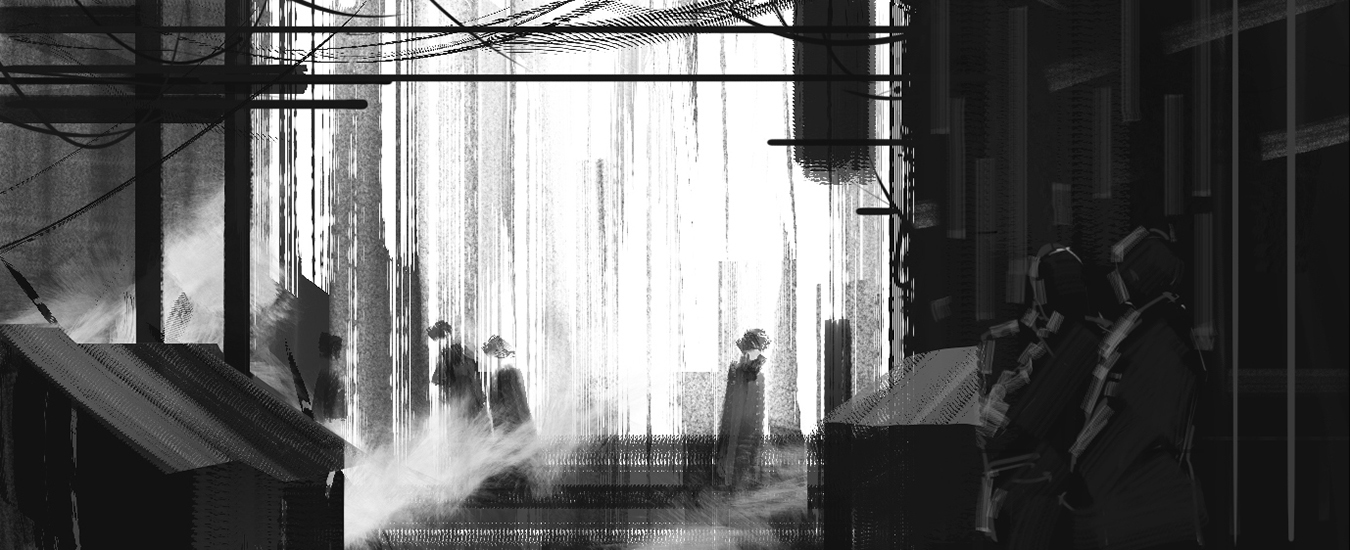
Before settling on the final composition I look for different options. I make quick sketches that help shape the final vision. These include: dark shapes among the scaffolding; fabrics and banners flapping in the wind; movement directed towards the characters; partially visible silhouettes; and a composition divided into light and dark.
At the beginning of any artwork I always make several black and white sketches. Then I divide the whole scene into the main elements. In this case there is the alley (the foreground), the illuminated street (the background), and the male characters together with the woman in the motion advert.
I start with the foreground. I select photos of suitable details of building facades and gradually form the plane of the alley walls. Then I add garbage, cans, air-conditioning units, wires and pipes, followed by the characters. I merge these elements into a folder and create a new fill or adjacent layer.
Amplify the sense of perspective
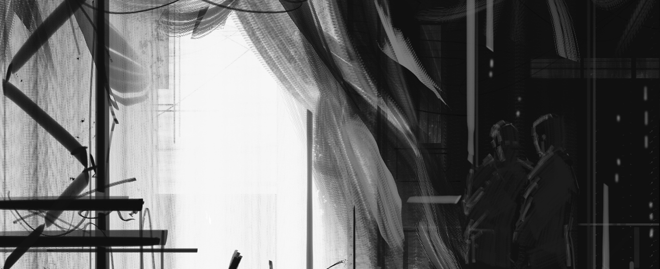
This version contains more vertical and clear lines. The idea is to reveal the perspective of the city. The windows and wires add rhythm and a sense of urban atmosphere. Then I bring in the figures.
Balance static and dynamic elements
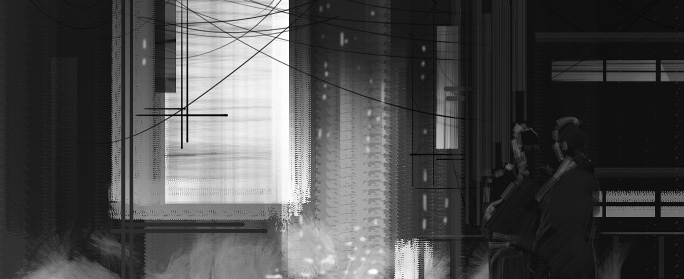
This version is similar to the first one, but there are more silhouettes at the edges. At this stage I’m happy with the contrasting dynamic and static elements that are present in the scene.
Work smarter
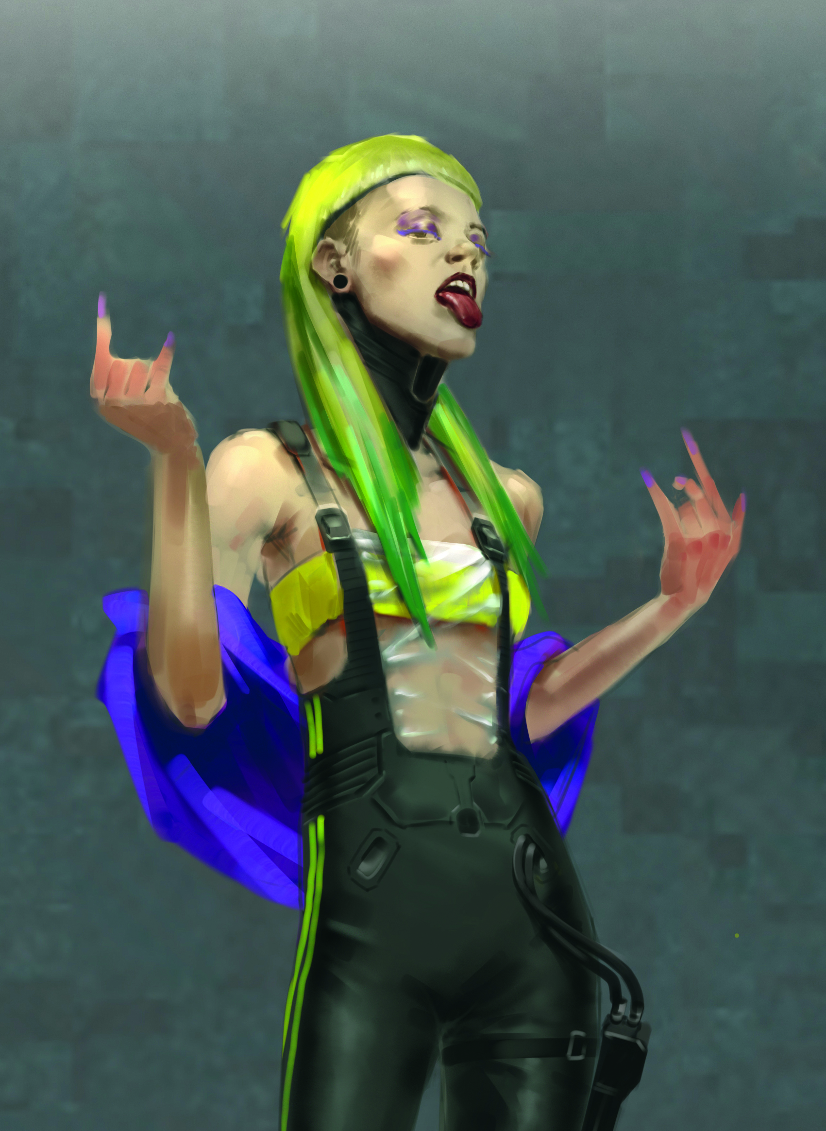
I use a female character that I had painted previously to create the advertisement banner. I paint over it to achieve the desired result, adding neon lighting and depicting simulated interference on the screen.
Create Contrast
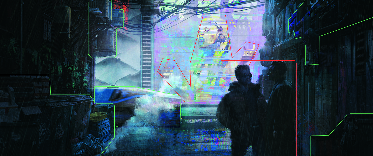
It’s important that I clearly separate the planes and focal points in my art. There is contrast in the nearest plane caused by the static positions of the characters, as opposed to the dynamics of the horizontal motion on the screen and the movement of the passing vehicle. The diagonals of the building’s panels and hanging wires create a visual rhythm
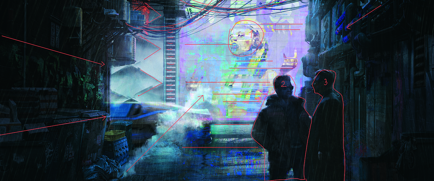
Enhancing the focal point
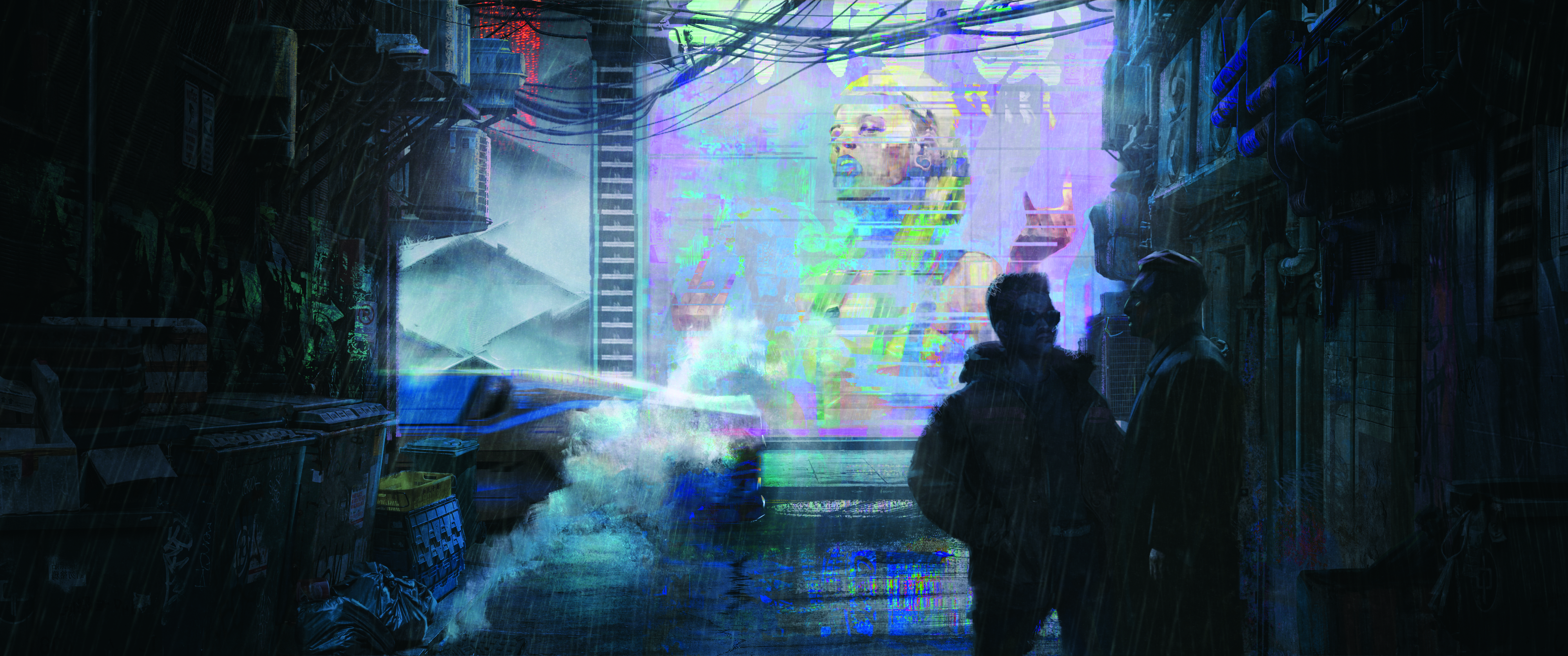
I constantly keep in mind the focal point and what is secondary in the composition to maintain balance. When everything is finally arranged and laid out, I use the Smudge tool to blur the edges.
To liven up and unite the scene I pay particular attention to the atmospheric lighting from the advertisement. It creates aerial perspective and brings everything together.
This article originally appeared in ImagineFX. Subscribe to ImagineFX to never miss an issue. Print and digital subscriptions are available.

Oleg has a background in academic painting and used to work as an architect. He changed disciplines and has been creating concept art for the games industry.
You must confirm your public display name before commenting
Please logout and then login again, you will then be prompted to enter your display name.
