How to create evocative art that sets the mood for movies and series
Carla Cordelia shares her tips for using daily life and memories to inspire one-of-a-kind environment concepts.
When I watch a film, the thing that stands out to me are the environments. Places really set the mood of the entire movie.
Growing up, it was the movies Ratatouille and How to Train Your Dragon that made me realise good world-building is what it takes to create an amazing, immersive film. I often imagine myself as a character walking around, exploring the places I watch.
Intentionally crafting each painting with little stories that invites the audience to experience can be a step to take when working on a concept. Having travelled and lived in different countries, I’ve noticed that sometimes what it takes to push your art further are the little details.
Article continues belowBelow, I'll share my 16 tips for crafting worlds. If you need to build your setup to be ready to work, see our guides to the best digital art software and the best drawing tablets.
01. Use environment design to tell stories
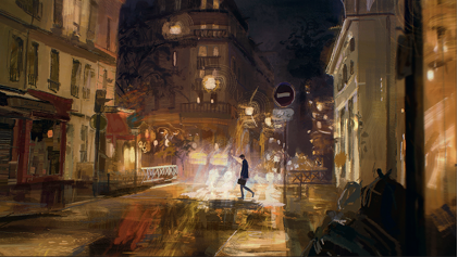
When I design a location in town or city, I think about its age, the many stories that it has witnessed, and how well it has been cared for. Has time worn it down, or left subtle marks? These questions shape how I build the scene.
No alleyway or shop is ever flawless – there are always cracks, scuffs and signs of wear. Those small imperfections add authenticity and depth, turning an ordinary setting into one that feels alive and rich with narrative
02. Draw inspiration from films and series
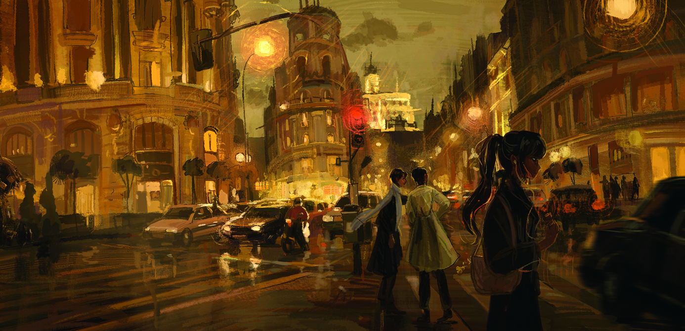
Watching a film or TV series is one of my favourite ways to spark ideas. I never know what emotions or thoughts will surface during the experience, but I pay attention to them closely. From there, I like to build a story around that initial feeling or impression. Using film in this way helps me bring fresh emotional depth into my paintings.
03. Gather references from real locations
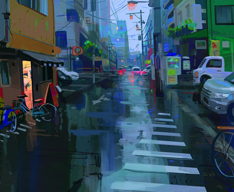
Whenever possible, I prefer working from my own references rather than relying only on images found online, so on my travels I’ll photograph signs, shops, streets and alleyways. Doing this reminds me of how the space felt and the emotions I experienced walking through it.
That memory gives my location more authenticity and a stronger sense of presence. One of my favourite compliments to receive is when someone says that they could see themselves walking through the place or if they feel as if they’ve been there.
04. Stay open at your block-in stage
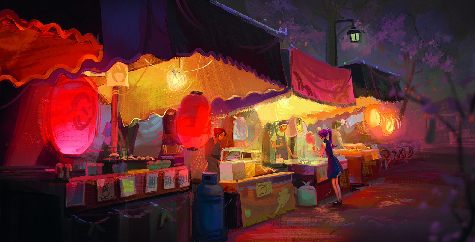
You don’t need to have every detail planned when you begin a painting. Part of the enjoyment, for me, is discovering elements along the way. I usually start with a somewhat broad idea – something like “a night matsuri” or “a marketplace with small vendors”.
From there, I decide what details to add as the piece develops, drawing inspiration from references I gather. This approach keeps the process flexible and playful, allowing the painting to grow naturally into something richer.
05. Sketch thumbnails and iterate
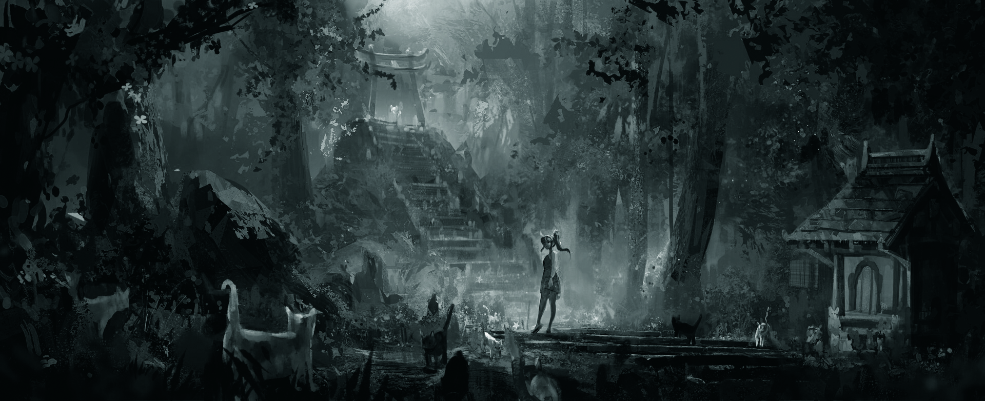
Before I add colour, I’ll begin with a greyscale value study to check that the composition reads clearly.
A strong value structure creates depth and keeps the painting from feeling flat. I work small – each thumbnail takes only a few minutes – so I can quickly test different directions. Once one of them feels right, I’ll refine and expand it. This process gives me confidence and a clear foundation before moving into colour.
06. Balance detail with simplicity
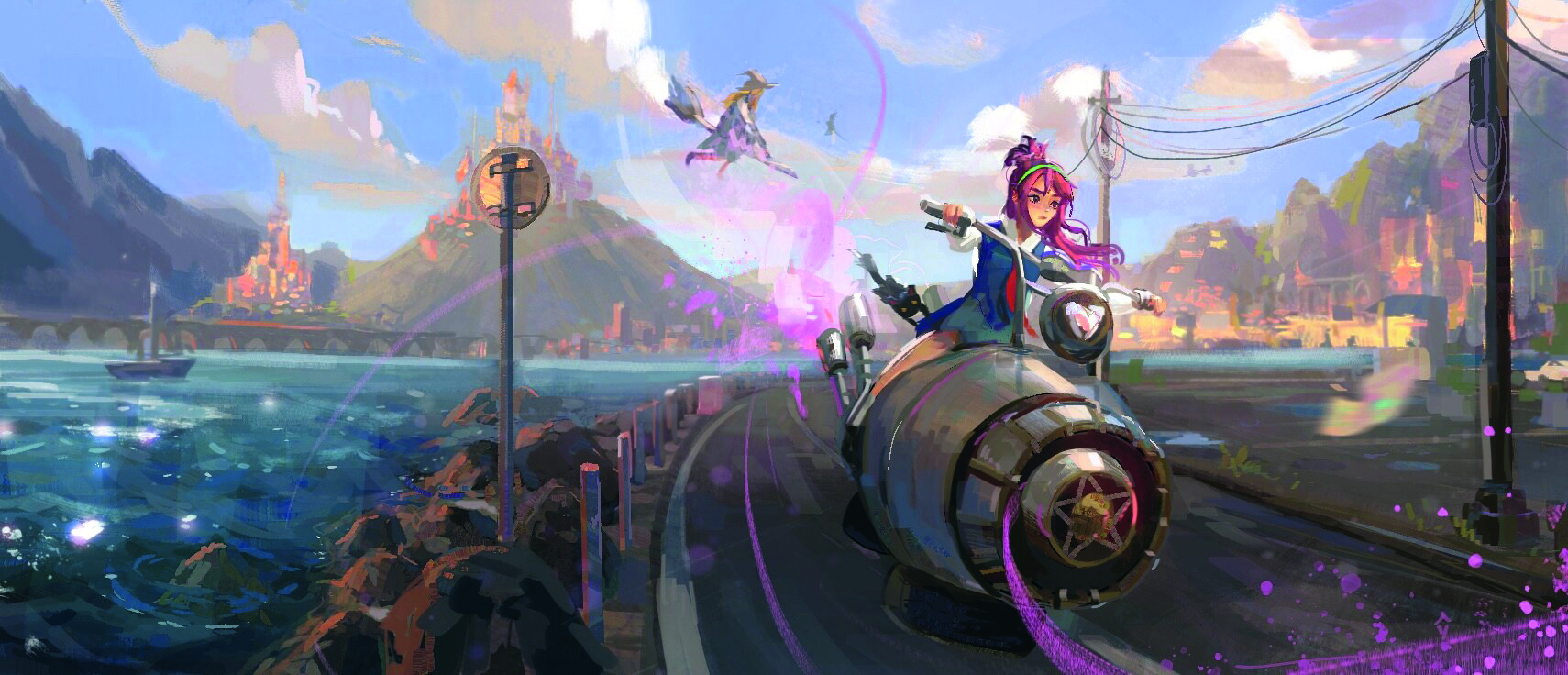
A primary focal point leads naturally to a secondary area of interest, while less-important elements remain softer or less detailed. Learning how to balance where you place detail and where you hold back can take your work much further.
This approach isn’t just about composition – it’s also about storytelling. By controlling focus, you lead the viewer through the scene and highlight the message that you want to share.
07. Play with perspective and leading lines

I often use elements within the scene to act as a frame for the focal point, guiding the viewer’s attention. Streets, walls or even shadows can serve as leading lines that direct the eye toward what matters most.
These lines not only highlight the focal point, but also encourage the viewer to explore secondary areas of the painting. By planning perspective and using subtle guides, you can create a more dynamic compositions that feels intentional and engaging.
08. Learn to observe light and colour
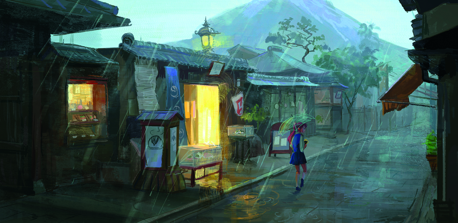
Warm shadows come from cool light, and – perhaps unsurprisingly – cool shadow comes from warm light. Using this as a guide will help you build that visual contrast.
The best way to start noticing how light and shadow and colour work is to do some plein-air painting. I find that this method improves my sense of colour and trains my eyes to see what looks natural and apply this knowledge to my digital work.
09. Challenge yourself with unfamiliar settings
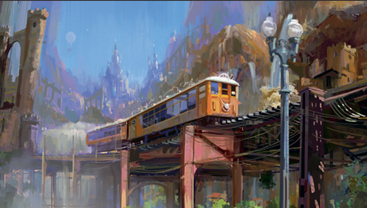
Push your art limits by exploring different time periods, places you’ve never been to and cultures you’re unfamiliar with. This helps build my visual library and design skills.
Relying on what we know is comfortable, but when working on a movie, we often need to create artwork of places we’ve never been before. Pinterest has so many amazing references to study from.
Another way to find inspiration is to go to a museum and study the brushwork. Sometimes I find a cool way to blend the brushstrokes of an oil painting and translate it into my digital art
Ground fantasy scenes in the real world

Work from a photo
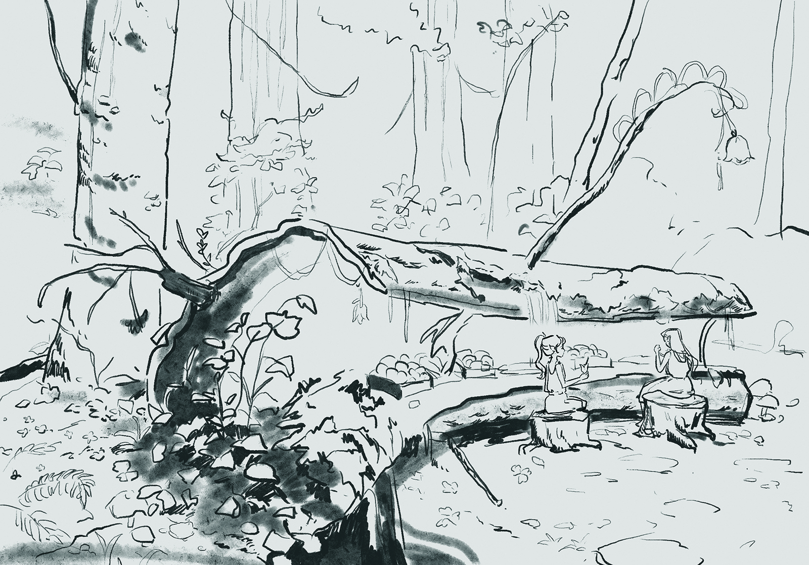
I like to start my painting with a simple line drawing using a reference photo I took. I then lock this layer and set the Adjustment layer to Multiply. This makes it easier to block in colours.
I typically use the Lasso tool to follow the outline of the line art. Once my canvas is blocked in with colours, I start selecting areas with the Magic wand tool and add textures using my brush pack.
Introduce complementary colours
Next, I build the forest with details like leaves, background trees, and keeping in mind the values of background trees vs the foreground. Taking elements that I like from the reference, I lasso some leaf shapes and fill the selection.
Having good reference pictures comes in handy as it aids me in creating a believable world. For picking a colour palette, I tend to like lush greens for forests and use a colour close to the complementary of it. In this case, red is the complement of green, so I’ll pick a bright pink for one of the fairies’ dresses and leave a bit of red hues on the branches
Sign up to Creative Bloq's daily newsletter, which brings you the latest news and inspiration from the worlds of art, design and technology.

Tie colours together and add depth
Finally, I’ll add a soft light layer and start harmonising colours on my painting. Soft light acts like a glaze and I usually set it around 30-40 per cent Opacity.
Often, I try to add last-minute touches such as dark foreground elements like leaves or branches and add blur to give the painting more dimension. Adjusting Color Balance can also create a more harmonious palette.
11. Use colour to shape mood
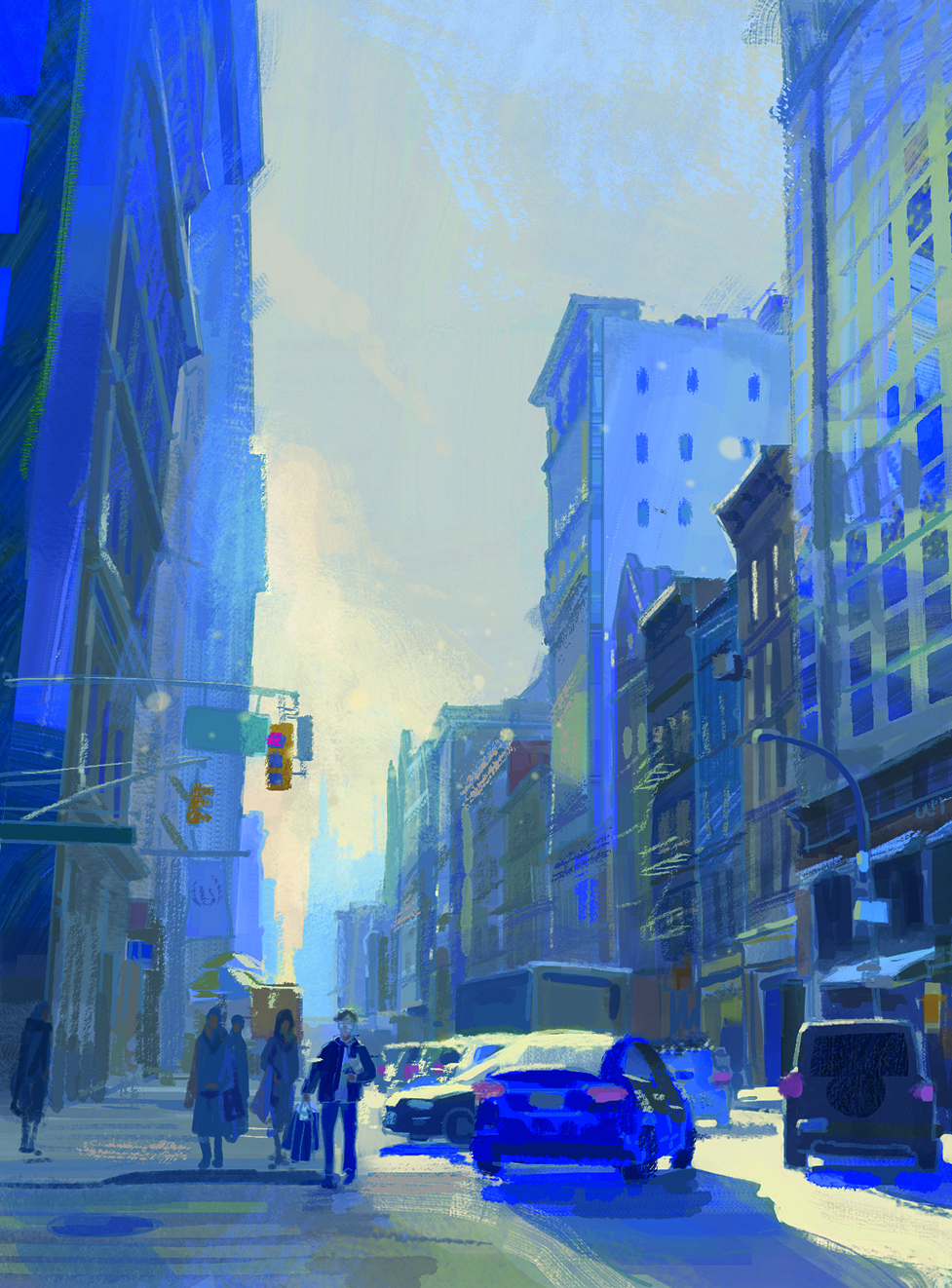
I always ask myself what kind of feeling I want the viewer to experience when they look at the painting. Am I aiming for something calm and serene, dramatic and tense, or warm and inviting?
Choosing the right colour palette is essential for building that atmosphere. The palette not only supports the subject, but also directs how the viewer responds emotionally. By being intentional with colour, I can create a mood that reinforces the story I want to tel
12. Experiment with painterly brushstrokes
When I run out of ideas, I visit a museum and study the brushwork of Old Masters up close. Observing how they layered strokes, suggested texture or implied form often sparks new approaches in my own work.
Once I’m back home, I try to recall and recreate some of those techniques, blending them into my own style. I also enjoy experimenting digitally, such as making custom Photoshop brushes and using them to develop unique marks. For example, I made a custom watercolour brush pack to recreate the look and feel of one digitally.
13. Use adjustment layers for finishing touches
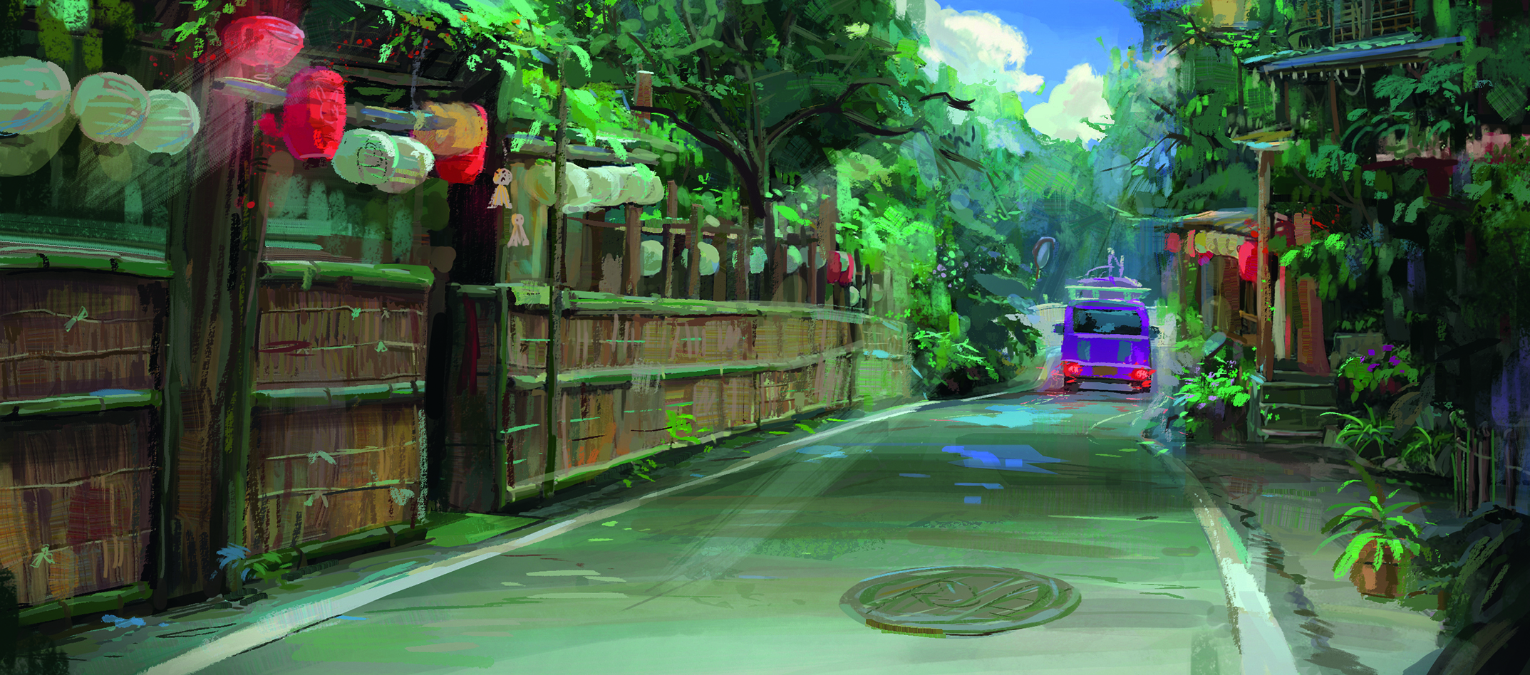
In my process, adjustment layers are one of the final steps. I use them to fine-tune values, shift tones and add subtle emphasis that strengthens the overall mood. They make it possible for me to push contrast where it matters most, soften areas that should recede, or introduce a hint of colour to reinforce the story.
The key is subtlety: small changes can have a big impact. Adjustment layers help me bring everything together into a cohesive and polished finish. My favourites to use are Soft light for values or Color and Lighten for atmosphere.
14. Capture personal memories
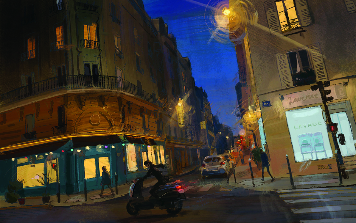
Have you noticed that some paintings stand out to you more than others? For me, it’s usually the ones where I can imagine exploring the place or when they remind me of certain memories.
I think about this a lot when I’m painting. As artists, we have the ability to share our experiences through art and often find that people connect with them. For example, I like to paint from memories of my time working in Paris: how I felt walking home from work and how alive I felt while travelling.
Even the fictional places I create are often inspired by real cities or countries to give them an authentic feel.
15. Keep a sketchbook for drawing outdoors
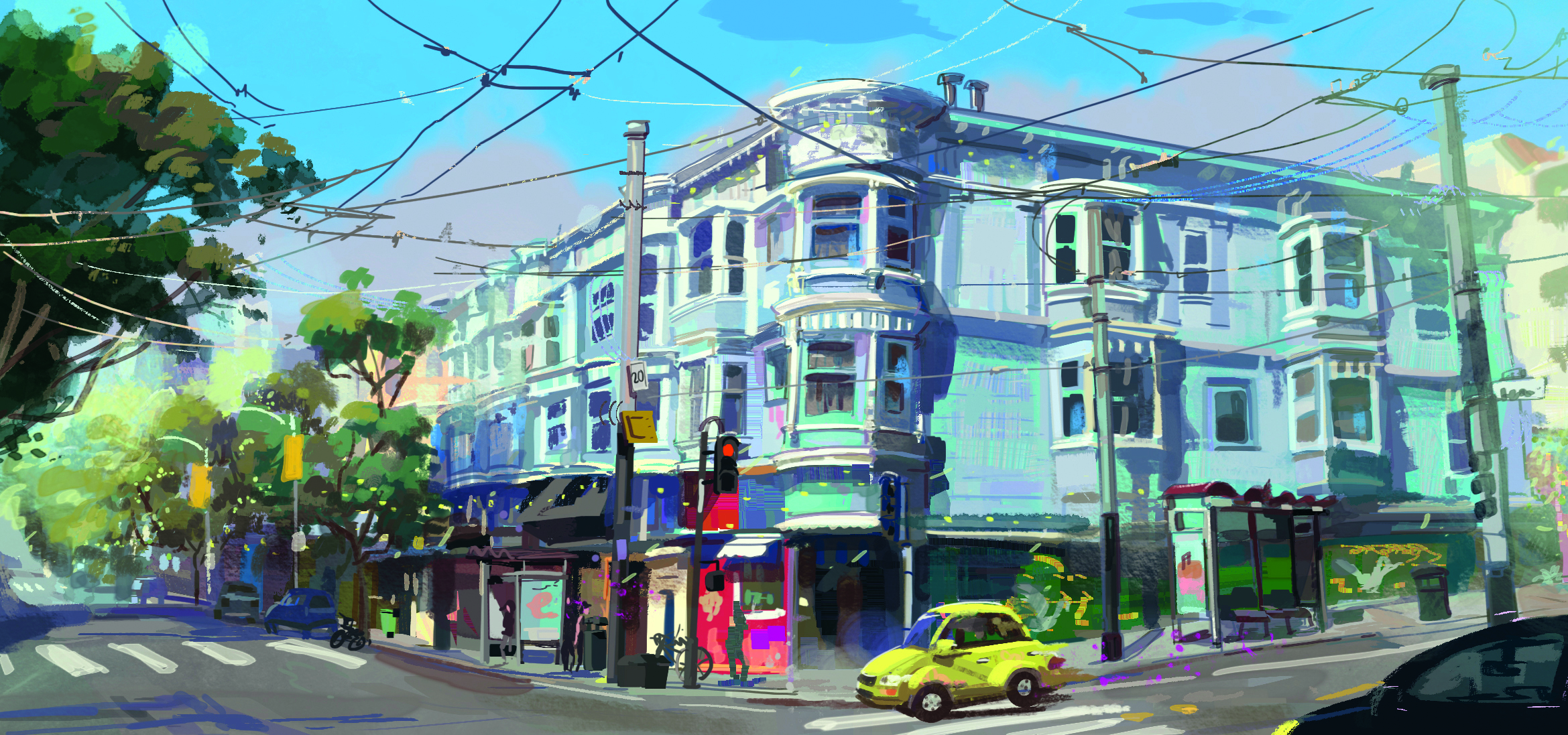
I’ve made it a routine to bring my sketchbook whenever I go outside. Filling pages has become easier with practice, and I’ve noticed how quickly my sketch style evolves.
The more I draw, the looser my lines feel, the simpler my shapes become and the stronger my sense of composition grows. My sketchbook also gives me space to experiment, and the techniques I enjoy often find their way into my digital work.
16. Stay curious in exploring your style
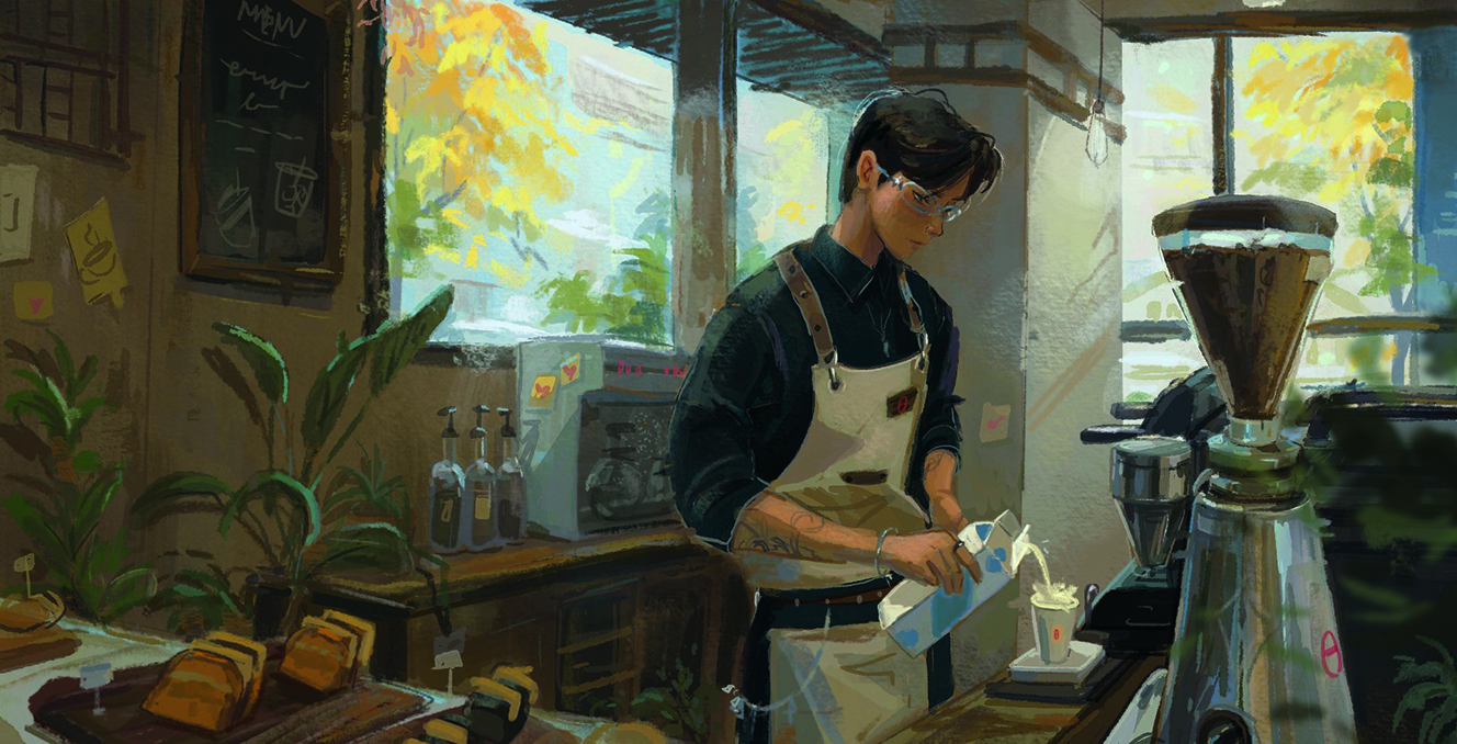
As an artist, I find it helpful to continually explore new tools, genres and techniques. I started out as a traditional artist doing watercolour illustrations before jumping into digital concept art.
Whenever I can, I try attending figure-drawing sessions to improve my characters. As an environment artist, I will not limit myself to just painting environments.
You can see more of Carla's work on her website.
For more inspiration, see our feature on what is concept art?
This article originally appeared in ImagineFX. Subscribe to ImagineFX to never miss an issue. Print and digital subscriptions are available.

Carla is a visual development artist for animation, specialising in environment art and colour keys. She has worked for Netflix and Zag Studio Paris, bringing imaginative worlds and compelling stories to life through her concept art and paintings.
You must confirm your public display name before commenting
Please logout and then login again, you will then be prompted to enter your display name.
