Soho Radio's rebrand nails the sticker book aesthetic
DJs can create their own assets using the fresh new look.
Sign up to Creative Bloq's daily newsletter, which brings you the latest news and inspiration from the worlds of art, design and technology.
You are now subscribed
Your newsletter sign-up was successful
Want to add more newsletters?
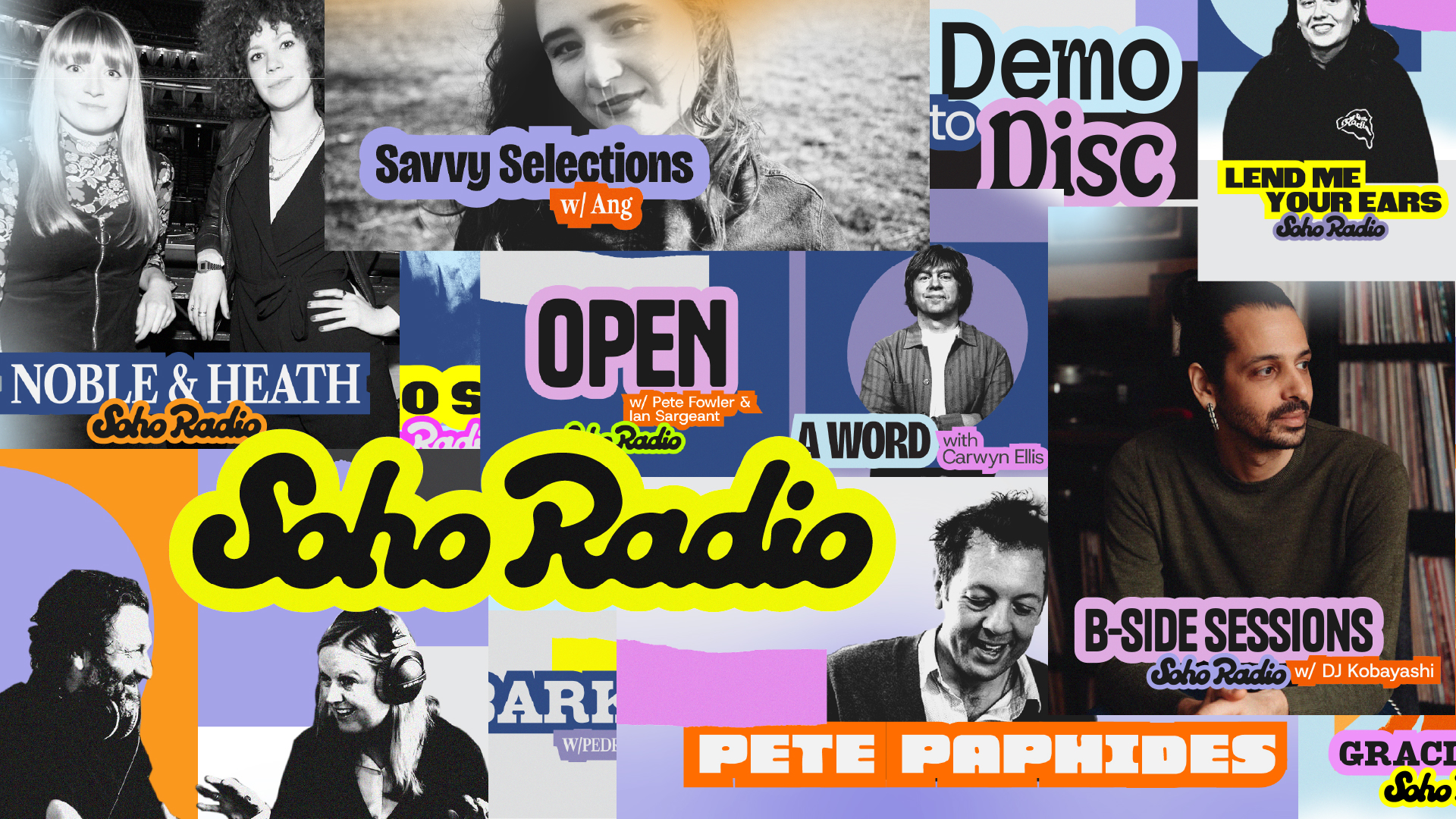
Soho Radio was established in 2014 and has built a cult following by championing music and subculture without compromise. Over a decade on, it's had a rebrand courtesy of Wonderhood Design (who were among the winners in this year's Brand Impact Awards), and its band sticker-vibe and low-fi feel are already making waves.
Behind the bold new vision is an equally bold ambition – to pull in one million listeners per week. The move also follows Soho Radio's expansion into DAB earlier in the year.
The new identity, the first in the station's history, mirrors Soho Radio's role in music culture, where musicians, producers and tastemakers come together to create a diverse and dynamic listening experience, and where it's not just about hearing the sounds you love, but also about being exposed to new music, too.
Article continues below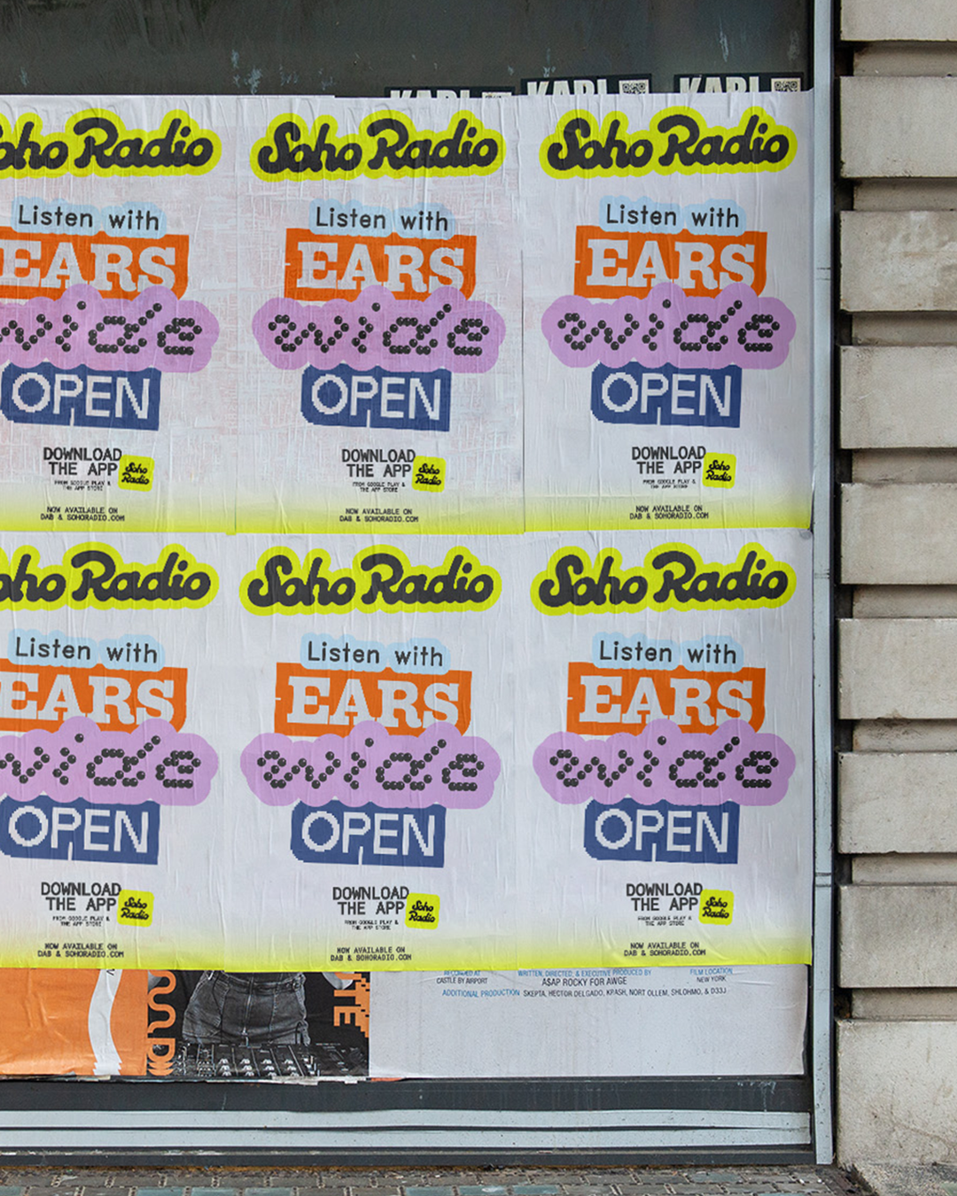
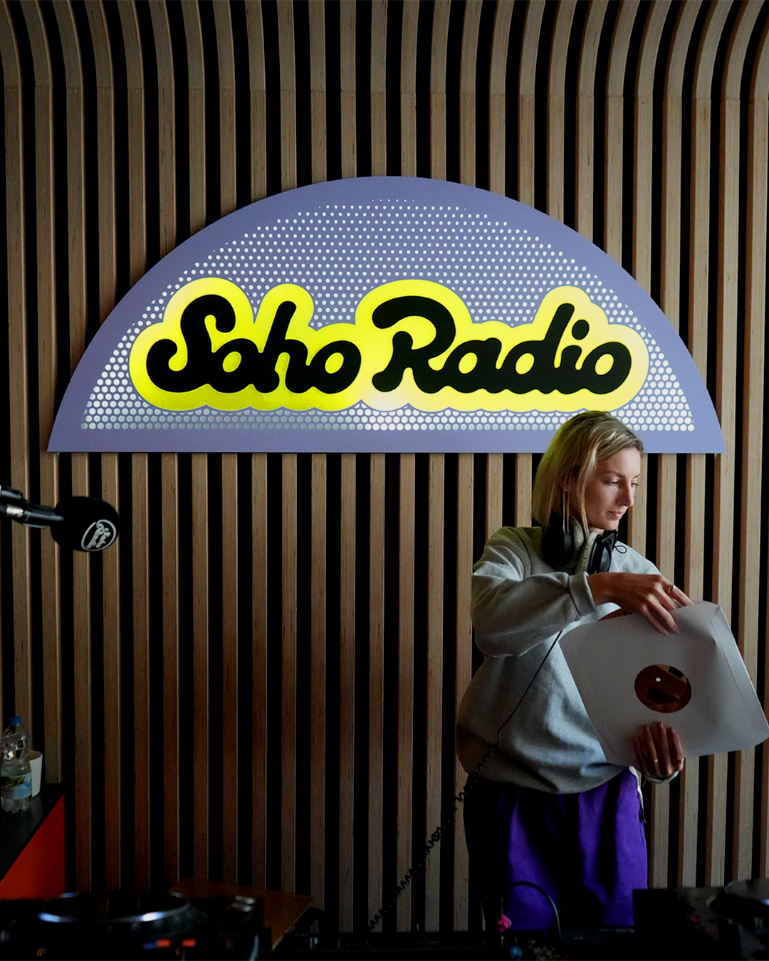
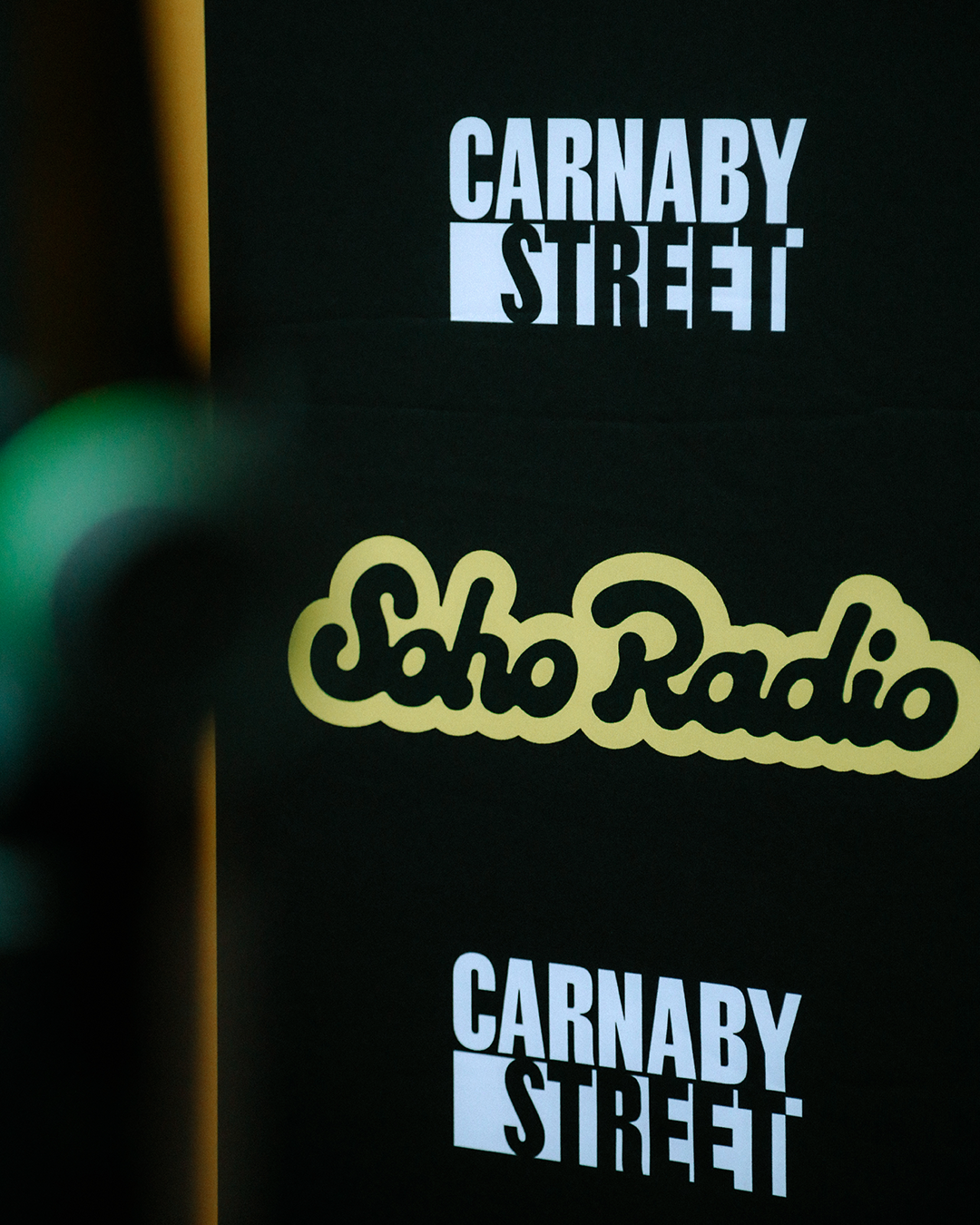
Soho Radio's new look reminds me of Never Mind the Buzzcocks, with its '90s lettering and sticker book aesthetic. It keeps the "soul" of the original wordmark, but brings it into the present, and the future, with a bold, flexible visual system.
Merchandise has a similar fun yet edgy feel, with taglines like 'Ears wide open' and 'Go off track', leaning on the radio's promise to keep radio unpredictable.
How will the assets be used in practice? Wonderhood Design has built a bespoke tech tool that enables producers and DJs to create their own assets. This means they can pick and choose their colour palette, fonts and image treatments, and build an identity that works for them and their show.
Elsewhere, Wonderhood Design has overhauled the design and UX of Soho Radio app, which was previously a single page through which you could play the station. Now, it's an immersive digital experience where users can listen to an archive of shows and get lost in Soho Radio's extensive coverage.
Sign up to Creative Bloq's daily newsletter, which brings you the latest news and inspiration from the worlds of art, design and technology.
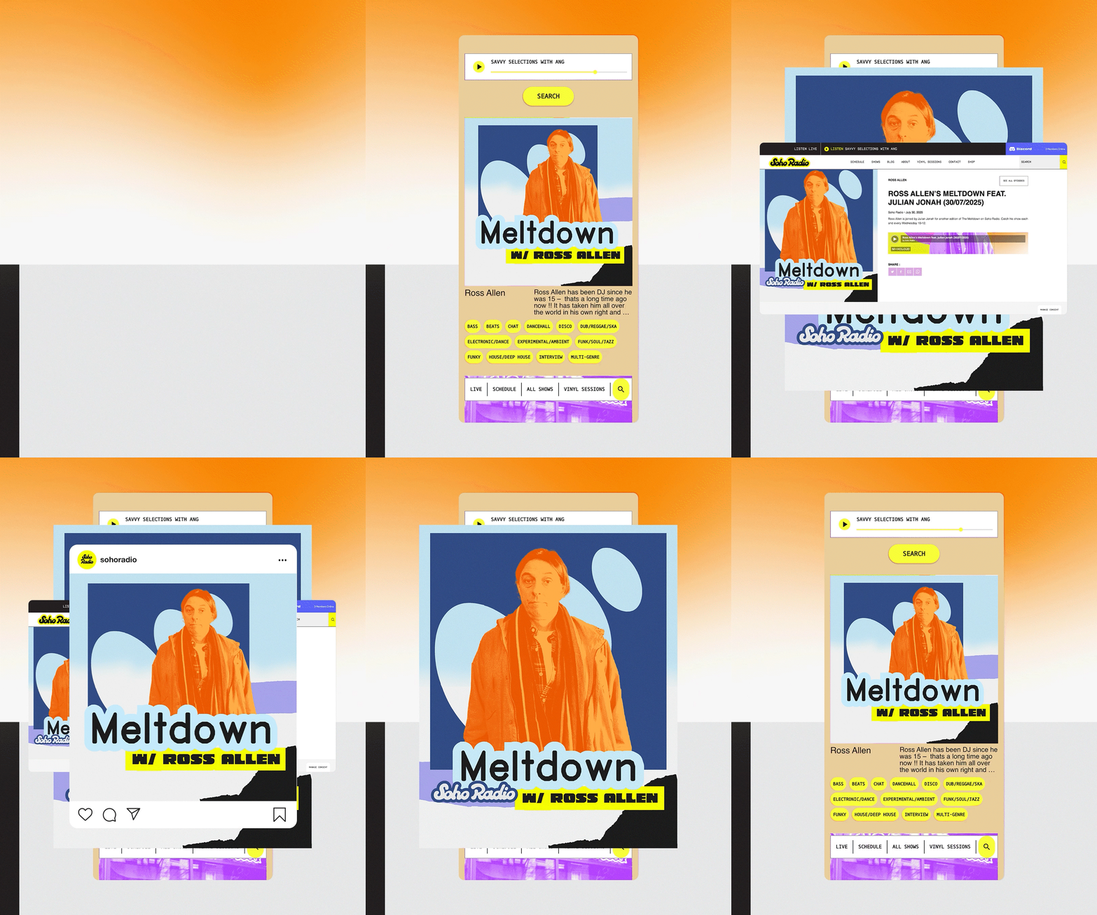
"Because Soho Radio's wide community of DJ’s is a huge part of their DNA, it was important to us that the DJs had room to tailor their artwork to represent them," says Tommy Spitter, design director at Wonderhood Design.
"This was at the heart of all our decisions, working to produce a flexible identity which also embodied the brand’s energy. At its core, a new logo that nods to the original while pushing it forward; a bold symbol of Soho Radio’s distinctive sound and energy."
This new look and feel will enable Soho Radio to serve its listeners even better, as Jon O'Donnell, CEO and founder of Viral Tribe Entertainment, parent company of Soho Radio, explains: “With our DAB launch, fresh new identity, and smarter app, we’re doubling down on serving the ‘rebellious middle’, music lovers raised on record stores and gigs, still craving connection, community, and discovery. We’re building a home for those who’ve outgrown algorithms but still want to explore.”
Overall I think this is a fun and funky approach to radio, which will hopefully help draw in plenty of listeners new and old.
Find out more about this Soho Radio project.

Rosie Hilder is Creative Bloq's Deputy Editor. After beginning her career in journalism in Argentina – where she worked as Deputy Editor of Time Out Buenos Aires – she moved back to the UK and joined Future Plc in 2016. Since then, she's worked as Operations Editor on magazines including Computer Arts, 3D World and Paint & Draw and Mac|Life. In 2018, she joined Creative Bloq, where she now assists with the daily management of the site, including growing the site's reach, getting involved in events, such as judging the Brand Impact Awards, and helping make sure our content serves the reader as best it can.
You must confirm your public display name before commenting
Please logout and then login again, you will then be prompted to enter your display name.
