PepsiCo rebrands for the first time in 25 years, and I'm underwhelmed
The new logo seems overly complicated.

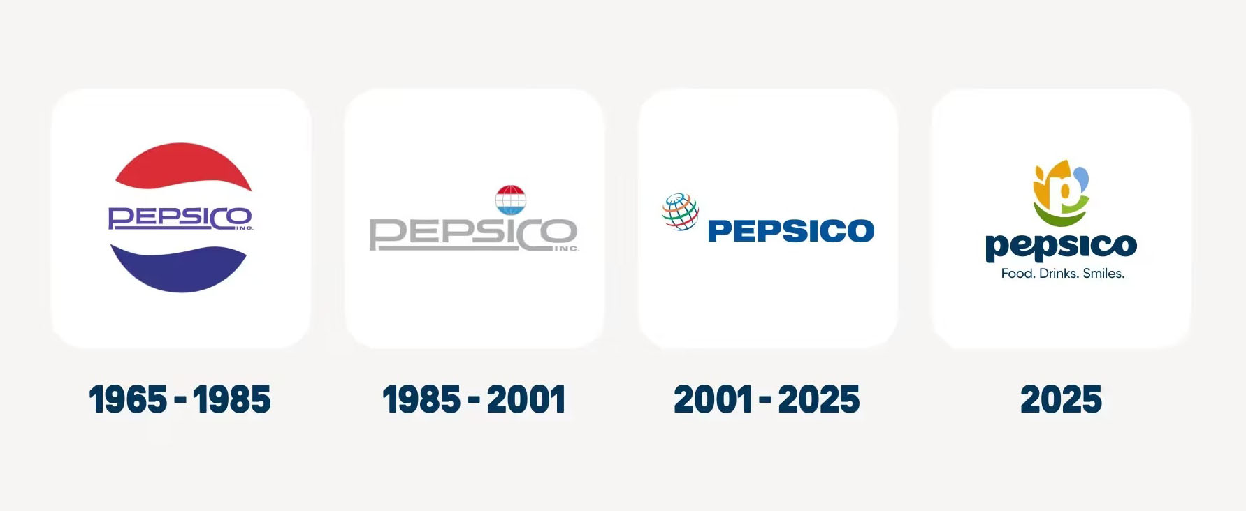
PepsiCo is home to over 500 brands, including Gatorade, Quaker, Siete, and of course, Pepsi. You probably weren't super-aware of its corporate brand logo, but it had been the same for almost 25 years and consisted of a globe with lines around it and the word 'PepsiCo' written in capital letters. Will the new look make it to our list of best logos?
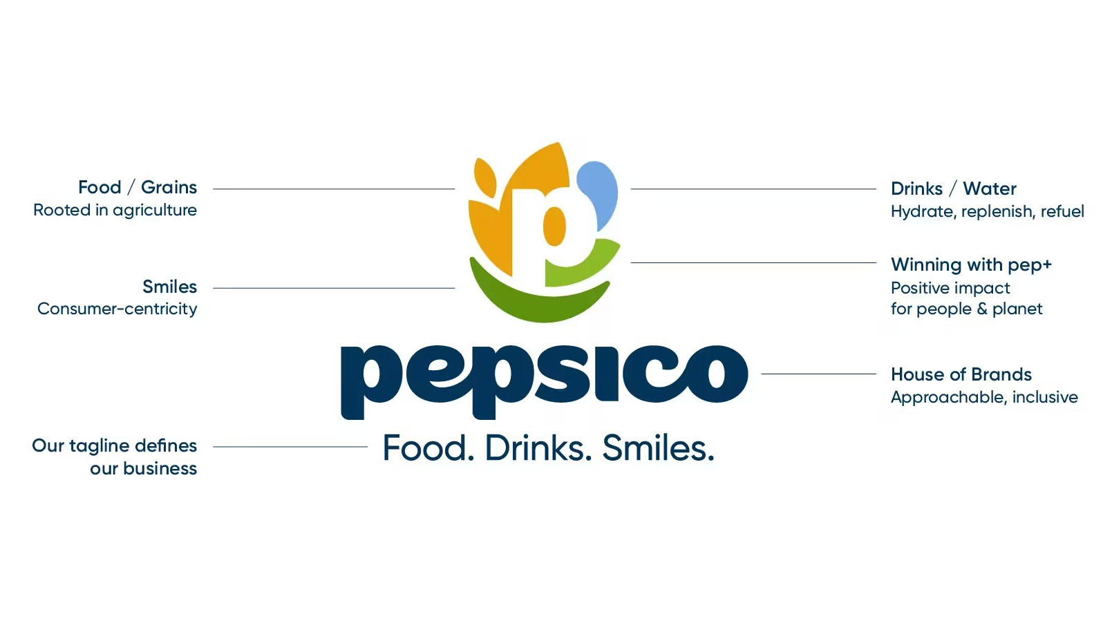
The new logo marks a shift to lower-case letters and a focus on the letter 'P'. Surrounding this 'P' are forms that are supposedly a nod to "the values guiding our future". There's a shape that represents food and grains, showing that PepsiCo is rooted in agriculture, there's a blue shape for drinks or water, showing PepsiCo's commitment to "hydrate, replenish, refuel" and there's a green leaf-like form that is supposed to represent "winning with pep+". This is to represent PepsiCo's positive impact for people and planet. I'm unclear on what the '+' means.
To top it all off, there's a darker green grin, to represent consumer-centricity. The tagline below 'PepsiCo' is Food. Drinks. Smiles.
Article continues below 
If all this sounds quite nauseating, that's probably because it is. There's something icky about any brand specifically saying that it's associated with Smiles. Sure, the Amazon brand includes a smile, but it doesn't specifically say that's what it's delivering.
I also think the logo is overly complicated. If you need a diagram with that many points on it just to explain what your logo is about, you've potentially gone too far.

PepsiCo says that its colour palette draws from the real world "the rich soils that nourish our foods, our refreshing drinks, and the vibrant hues that reflect our commitment to people and the planet". The problem is it simply isn't that vibrant or that exciting. I see how it wanted to move away from Pepsi's branding, apparently only 21 per cent of consumers are able to name a PepsiCo brand that isn't Pepsi, but I'm not sure that this is the answer.
Overall I find the logo underwhelming and a little on the dull side. If that's what PepsiCo was going for, then it's done well. If it was hoping to shake things up and get more people talking about what PepsiCo does apart from Pepsi, then I think it's missed a trick.
Sign up to Creative Bloq's daily newsletter, which brings you the latest news and inspiration from the worlds of art, design and technology.
The new brand will be rolled out across PepsiCo.com and PepsiCo's global social channels – LinkedIn, Instagram, TikTok and YouTube. It will be phased in over time across various markets, touchpoints and channels.
For a look at some identities that hit the spot, see our best rebrands of the 2020s (so far) piece.

Rosie Hilder is Creative Bloq's Deputy Editor. After beginning her career in journalism in Argentina – where she worked as Deputy Editor of Time Out Buenos Aires – she moved back to the UK and joined Future Plc in 2016. Since then, she's worked as Operations Editor on magazines including Computer Arts, 3D World and Paint & Draw and Mac|Life. In 2018, she joined Creative Bloq, where she now assists with the daily management of the site, including growing the site's reach, getting involved in events, such as judging the Brand Impact Awards, and helping make sure our content serves the reader as best it can.
You must confirm your public display name before commenting
Please logout and then login again, you will then be prompted to enter your display name.
