Every year has its share of rebrands that raise eyebrows. For every successful refresh there's another that sees the brand and its designers taken to task. Despite the impact of the global pandemic, 2020 was no different, with several launches provoking heated debate. But which caused the biggest stirs?
While many brands reigned in their marketing budgets in response to the Covid-19 pandemic, others moved forwards with planned refreshes or decided to dedicate more time to revising the brand's identity. That didn’t mean they were any more likely to get it right.
See our pro guide to logo design for how to develop a brand identity the right way. In the meantime, here are eight of the efforts that were most debated in 2020. They ruffled feathers either because they didn’t work, looked like something else, messed with a classic identity, or simply because there will always be people who don’t like change.
01. Space Force
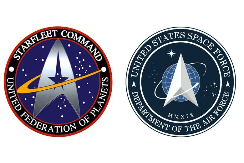
Space Force’s motto is Semper Supra, "always above" in Latin, and the saga of its logo designs suggested it believed it was above criticism. The first design unveiled in January showed a delta arrow orbited by a single loop. It was roundly ridiculed for its resemblance to the Starfleet insignia from the cult TV show Star Trek.
But that panning didn’t deter the newest branch of the US military. On the contrary, it upped the ante with a new design in July that seemed even more obviously Star Trek-influenced. The delta now contained a star just like the Starfleet delta (and also like the Pontiac logo, some noted).
This time round, the Force knew what it was in for. Almost as if to head off criticism, it issued a detailed breakdown of the logo’s symbolism as if intending to prove it wasn’t copied from Star Trek. It was a bumpy takeoff, but Space Force decided to ride it out. The second logo wasn’t strictly a rebrand since both logos are now in use. The original design is used on the Force’s seal and flag, and even on a limited edition $2 bill. The second design is used on service patches and on the Force’s website.
02. Gucci
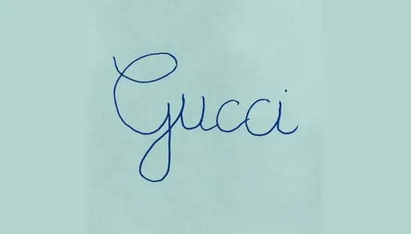
The Italian fashion house Gucci’s temporary rebranding for its Fall Winter 2020 menswear collection was one of the most talked-about of the year. First revealed as an avatar on social media accounts, the logo stunned everyone since it appeared to be the scrawl of a child learning to write with a fountain pen. It hardly suggested haute couture and caused some to question whether the collection would also be put together by children.
The design turned out to be part of a campaign with the tagline 'Rave Like You Are Five', and the lettering was indeed based on French children’s handwriting. Since Vietnamese children learn to write in the same way, the campaign unexpectedly went viral in Vietnam. It was a risky campaign, but designers largely came to approve of a high fashion brand breaking with the accepted notion that a logo is undefilable. Not unexpectedly, the logo didn’t stay around for long. Gucci promptly returned to its Granjon Roman-like serif logotype after the campaign finished.
03. Fisher Price

Changing a logo that forms part of childhood memories is a dangerous undertaking, so even the smallest of tweaks to Fisher Price's branding were going to cause debate. Pentagram retained the classic red but reduced the awning from four to three semicircles (representing the brand's founders (Herman Fisher, Irving Price and Helen Schelle), and changed the hyphen to a semicircle to echo the awning.
The slightly jaunty angle of some of the letters didn’t please everyone. Some also thought the abbreviated 'fp' avatar for social media use was too frivolous for the classic brand. But generally, Jeremy Mickel’s custom typeface drew on the brand's heritage enough to make it seem like it had always been there. The lower case letters continue to irritate grammar purists, but they help to make the logo feel more fun and playful, getting a thumbs up from most designers.
04. Hello Fresh


The rebranding of the food delivery app Hello Fresh seemed to have everything going for it. The logo's handwritten text was replaced by a clear serif type and the cartoonish lime was switched for a bolder flat version with speckled spray-like shading. It looked sharp and seemed more adaptable to different screen and print applications.
The problem was that while the colours worked on the logo, some customers felt that when applied to the app's icon on their phones, the same grungy shading in a slightly toxic shade of green looked far from fresh. "Those colours do not say "fresh food" to me," one user complained. "That looks like something that's been in the fridge too long." Others thought the icon "looked dirty" and seemed to have "mould creeping in from the corners."
Hello Fresh has stuck with the design for now, but the shading on the icon still feels like an unfortunate oversight. It serves to remind us that when it comes to a digital product, the app icon is often what customers see first. (See our best app icons for those that got it right.)
05. TGI Friday

Rebrandings are often criticised for being either too deferential or too callous with a brand’s tradition. TGI Fridays seemed determined to avoid both accusations with its UK rebrand and ended up pleading nobody. It brought back the original ornate border that it had dropped in an attempt to modernise in 2013, but also went for a simple, some would say bland, sans serif font that didn’t seem to fit with that tradition.
Designers were quick to respond that the wordmark appeared not to have been optically aligned within the border. But worst of all, customers complained that the new identity dropped a crucial part of the brand name. Nobody in the UK ever used to refer to the brand Fridays, but they did refer to it as TGIs.
The result was that this felt like a rebranding that failed to consider how customers actually interact with the brand. TGIs – sorry, Fridays, – has sensibly not carried the new identity to other territories. In the US and elsewhere it continues to be TGI Fridays.
06. Coors Light

Coors Light revealed a new visual identity in August. It had a fresh blue and silver colour palette with snowy mountains under red text. It certainly communicated refreshment, but it also looked somewhat familiar. The French mineral water brand Evian thought the same. It politely accused Coors of borrowing its previous identity following its own pink and grey rebranding earlier in the year. “Beautiful!! Should we send you our graphical guidelines next time?” Evian tweeted.
The mountains on the Coors design were, of course, the Rockies rather than the Alps and the swirling red script is quite distinct from Evian’s sans serif font, but the colour palette was similar enough that many agreed with bottled water maker.
There’s no sign of legal action from Evian yet. Meanwhile, Coors hasn’t finished rebranding. It's since announced it will be dropping the 'Light' to become simply Coors from March. It seems to be sticking with the Evian-esque colour palette despite jibes that this suggests the beer tastes like water.
07. Dune
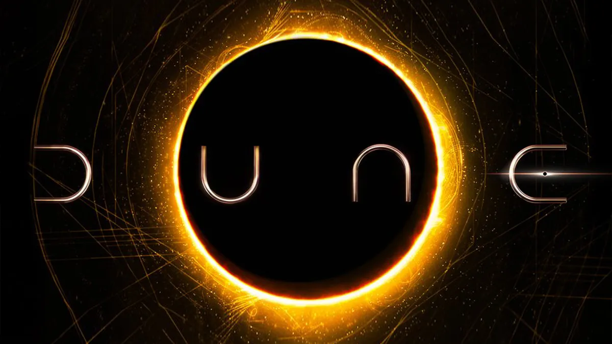
What was the sci-fi film we were all waiting for in 2020? 'Dunc', it seemed for a moment in January after a leaked logo emerged for Denis Villeneuve’s reboot of Frank Herbert's Dune. It had a clever, stripped-down font comprising four U-shapes in different orientations. It looked sleek, fit the genre and pulled off the neat trick of reading the same when turned upside down. That is, if you were prepared to accept that what looked like a 'C' was an 'E' without its crossbar.
The oversight was widely criticised as an example of a creative department’s attempt to be too clever until the official release of the logo came three months later. The problem had been corrected with some well-placed lens flare, or an eclipsed planet if you prefer, to represent the problematic missing crossbar. It turned out that the preview that had caused all the fuss was in fact a fan rendering based on photographs seen at a convention in France. As for the film, the launch was held up due to the Covid-19 pandemic. It’s now scheduled for release in October 2021.
08. UNO
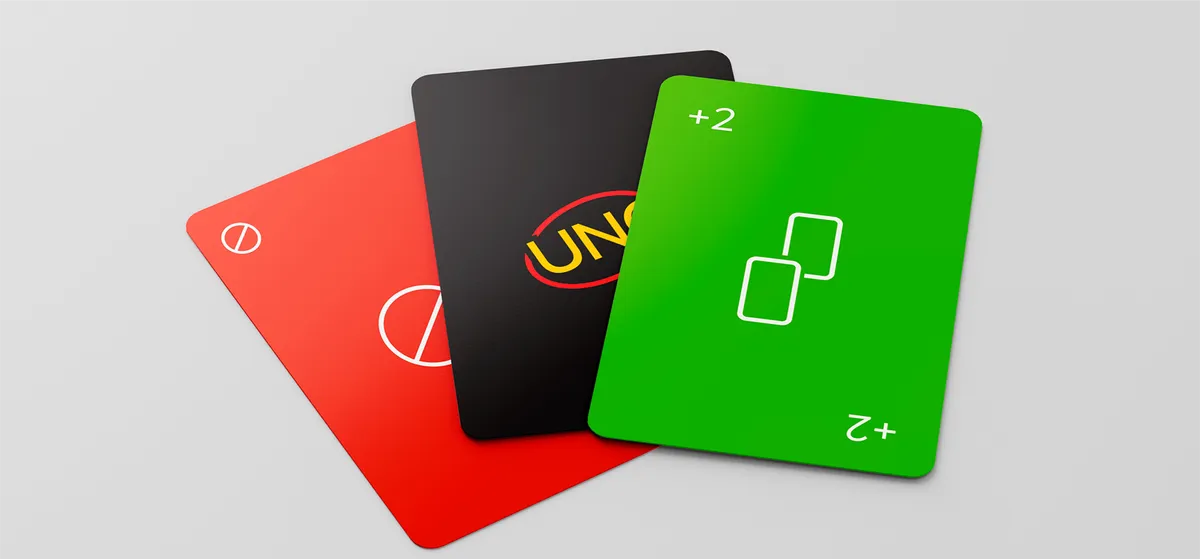
Designers went wild for a super sleek refreshed version of the UNO card game early in 2020. The design featured a streamlined logo, block colours, reduced symbols and a new, dark background on the reverse – yes, Dark Mode really was everywhere in 2020. Even the box was a beautiful piece of minimalist packaging design.
The problem was the game didn't actually exist. It was an unofficial project created by Brazilian designer Warleson Oliveira. But while Warner Bros wasn’t so impressed by a fan's rendering of the Dune Logo, this was one case where an unofficial treatment was well received. After the concept went viral and led to a change.org petition, Mattel decided to make UNO Minimalista a reality. The cards are now on sale.
Read more:

